Use Element Plus, the Vue 3 component library, in Shiny — inputs, tables, trees, dialogs, menus, every component it documents — each reporting through input$<id> and updatable from the server, like any other Shiny input.
Element Plus 2.14.7, its icons and Vue 3.5 ship inside the package, so apps work without a network connection.
Lifecycle
shiny.element is experimental: until 1.0.0 an argument or a function may change when a better design turns up, and every such change is listed under “Breaking changes” in NEWS. From the first CRAN release on, nothing is removed without first being deprecated, with a warning, for at least one minor release. Element Plus is followed as upstream changes: what it deprecates is deprecated here too, and what it removes goes with the next upgrade.
Quick start
library(shiny)
library(shiny.element)

ui <- el_page(
  el_input("name", label = "Name", placeholder = "Your name"),
  el_rate("score", value = 3),
  el_button("save", "Save", type = "primary"),
  el_alert("hint", title = "Nothing saved yet", type = "info")
)

server <- function(input, output, session) {
  observeEvent(input$save, {
    update_el_alert(session, "hint",
      title = paste0("Saved ", input$name, " (", input$score, "/5)"),
      type = "success"
    )
  })
}

shinyApp(ui, server)
el_page() sets up the Vue root and loads the dependencies. Inside an existing layout — a fluidPage(), or bslib’s page_sidebar() — call use_element() once at the top instead:
ui <- bslib::page_sidebar(
  theme = el_theme(),
  use_element(),
  sidebar = bslib::sidebar(el_select("metric", choices = c("Mean", "Median"))),
  el_table(data = head(iris), id = "summary")
)
el_theme() is the page’s look: a bslib theme carrying Element Plus’s own colours, font and sizes, so Shiny’s actionButton() or textInput() sit beside Element Plus components without clashing. It is el_page()’s default. el_theme(primary = "#7c3aed") changes the brand colour – on Element Plus’s components as well as Bootstrap’s – and el_theme(element =) any of its CSS variables; any bslib::bs_theme() replaces it, and theme = NULL leaves Shiny’s plain Bootstrap.
Components
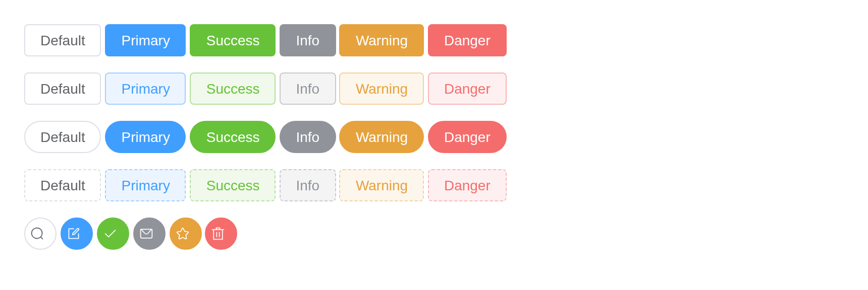
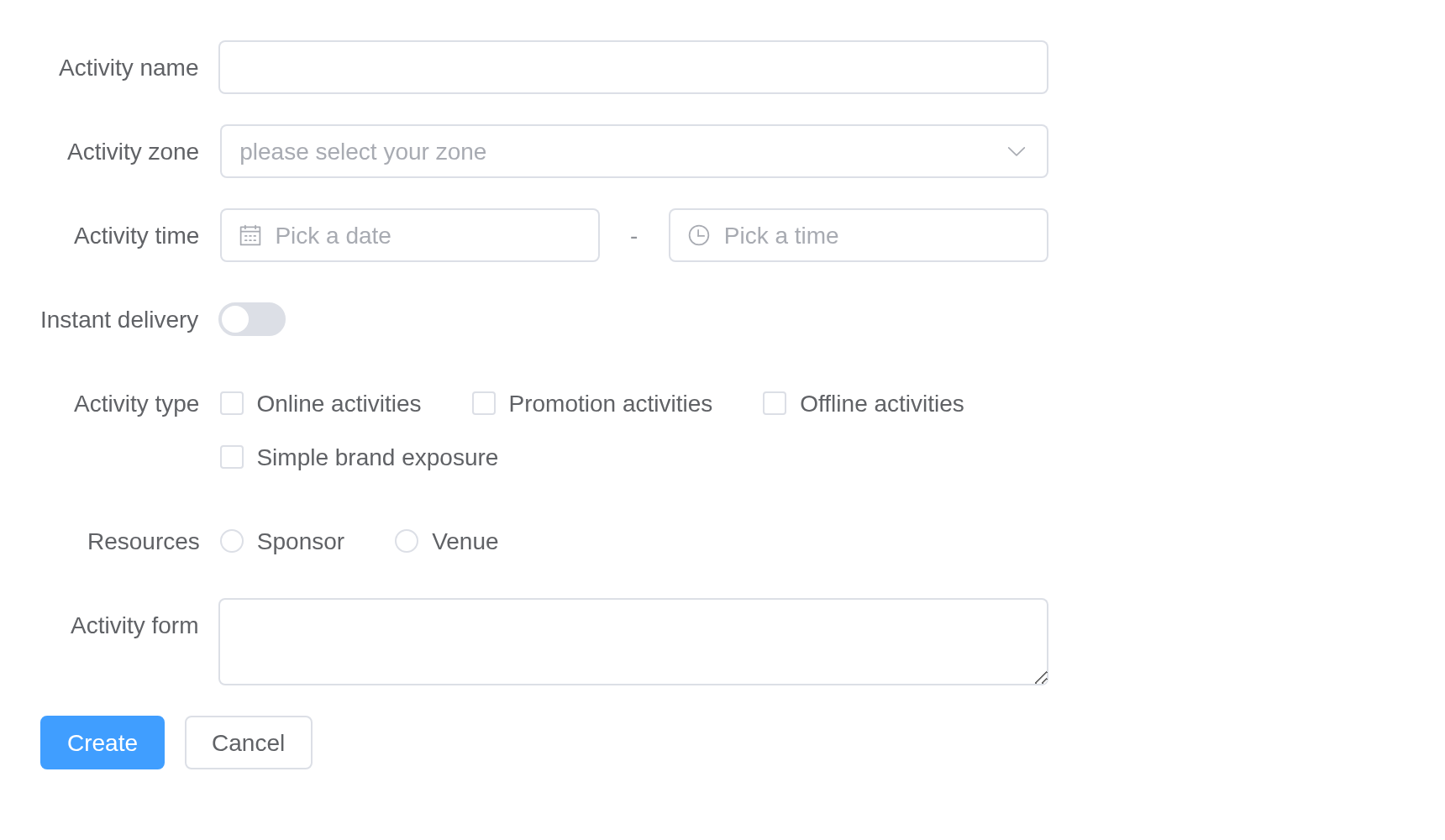
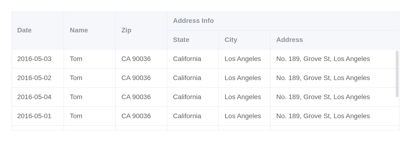
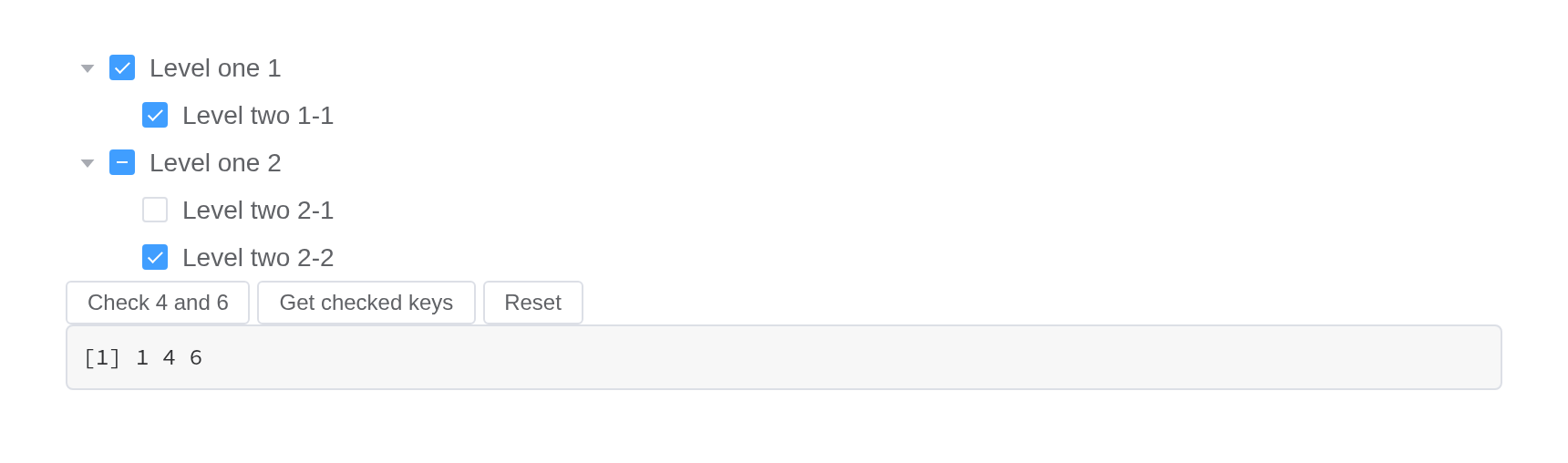
The components follow Element Plus’s own documentation, group by group:
Each has a page, as on element-plus.org: its demos in R and its API tables beside the R names.
el_page(dev = TRUE) loads Vue’s development build, which reports template errors in the browser console instead of failing silently. The package’s own test suite runs in this mode and asserts that the console stays clean.
Learn more
- Installation & Quick Start
- Components – one page per Element Plus component
- Element Plus’s guides from R: i18n, Theming, Dark Mode, Custom Defaults, Built-in Transitions, Migration from Element UI
- Forms and validation, Shiny integration
- Dashboards – whole apps: an admin layout, a sales overview, an orders admin page
- Function reference