Along with evolutionary web development, table component has always been the most popular component in our web apps especially for dashboards, data analysis. For Table V1, with even just 1000 records of data, it can be very annoying when using it, because of the poor performance.
With Virtualized Table, you can render massive chunks of data in a blink of an eye.
Tip
This component is still under testing, use at your own risk. If you find any bugs or issues, please report them at GitHub for us to fix. Also there were some APIs which are not mentioned in this documentation, some of them were not fully developed yet, which is why they are not mentioned here.
Even though Virtualized Table is efficient, when the data load is too large, your network and memory size can become the bottleneck of your app. So keep in mind that Virtualized Table is never the ultimate solution for everything, consider paginating your data, adding filters etc.
Basic usage
Let’s demonstrate the performance of the Virtualized Table by rendering a basic example with 10 columns and 1000 rows.
generate_columns <- function(length = 10, prefix = "column-") {
  lapply(seq_len(length) - 1, function(i) {
    el_table_v2_column(paste0(prefix, i), paste("Column", i), width = 150)
  })
}
generate_data <- function(columns, length = 200, prefix = "row-") {
  rows <- data.frame(id = paste0(prefix, seq_len(length) - 1))
  for (j in seq_along(columns)) {
    rows[[columns[[j]]$dataKey]] <- paste0(
      "Row ",
      seq_len(length) - 1,
      " - Col ",
      j - 1
    )
  }
  rows
}
columns <- generate_columns(10)
data <- generate_data(columns, 1000)
el_table_v2(
  "tv_basic",
  columns = columns,
  data = data,
  table_v2_width = 700,
  height = 400,
  fixed = TRUE
)
Auto resizer
When you do not want to manually pass the width and
height properties to the table, you can wrap the table
component with the AutoResizer. This will automatically update the width
and height for you.
Resize your browser to see how it works.
Tip
Make sure the parent node of the
AutoResizerHAS A FIXED HEIGHT, since its default height value is set to 100%. Alternatively, you can define it by passing thestyleattribute toAutoResizer.
auto_resize = TRUE sizes the table to its container,
which needs a height of its own.
generate_columns <- function(length = 10, prefix = "column-") {
  lapply(seq_len(length) - 1, function(i) {
    el_table_v2_column(paste0(prefix, i), paste("Column", i), width = 150)
  })
}
generate_data <- function(columns, length = 200, prefix = "row-") {
  rows <- data.frame(id = paste0(prefix, seq_len(length) - 1))
  for (j in seq_along(columns)) {
    rows[[columns[[j]]$dataKey]] <- paste0(
      "Row ",
      seq_len(length) - 1,
      " - Col ",
      j - 1
    )
  }
  rows
}
columns <- generate_columns(10)
data <- generate_data(columns, 200)
tags$div(
  style = "height: 400px",
  el_table_v2(
    "tv_auto",
    columns = columns,
    data = data,
    fixed = TRUE,
    auto_resize = TRUE
  )
)
Customize Cell Renderer
Of course, you can render the table cell according to your needs. Here’s a simple example of how to customize your cell.
The cells are drawn by each column’s cellRenderer, a
[JS()] function returning Vue’s h(), as upstream’s JSX
does.
columns <- list(
  el_table_v2_column(
    "date",
    "Date",
    width = 150,
    fixed = "left",
    cell_renderer = JS(
      "function({ cellData: date }) {",
      "  var p = date.split('-').map(function(n) { return n.padStart(2, '0'); });",
      "  var text = p.join('/');",
      "  return Vue.h(ElementPlus.ElTooltip, { content: text }, function() {",
      "    return Vue.h('span', { style: 'display: flex; align-items: center' }, [",
      "      Vue.h(ElementPlus.ElIcon, { style: 'margin-right: 12px' },",
      "        function() { return Vue.h(ElementPlusIconsVue.Timer); }),",
      "      text",
      "    ]);",
      "  });",
      "}"
    )
  ),
  el_table_v2_column(
    "name",
    "Name",
    width = 150,
    align = "center",
    cell_renderer = JS(
      "function({ cellData: name }) {",
      "  return Vue.h(ElementPlus.ElTag, null, function() { return name; });",
      "}"
    )
  ),
  el_table_v2_column(
    "operations",
    "Operations",
    cell_renderer = JS(
      "function() {",
      "  return [",
      "    Vue.h(ElementPlus.ElButton, { size: 'small' }, function() { return 'Edit'; }),",
      "    Vue.h(ElementPlus.ElButton, { size: 'small', type: 'danger' },",
      "      function() { return 'Delete'; })",
      "  ];",
      "}"
    ),
    width = 150,
    align = "center"
  )
)
data <- data.frame(
  id = paste0("random-id-", 1:200),
  name = "Tom",
  date = "2020-10-1"
)
el_table_v2(
  "tv_cell",
  columns = columns,
  data = data,
  table_v2_width = 700,
  height = 400,
  fixed = TRUE
)
Table with selections
Using customized cell renderer to allow selection for your table.
A checkbox column, drawn by the cell and
header-cell slots: a field of each row,
checked, holds the tick. $setInput() reports
the rows ticked to the server as input$tv_sel_checked; it
is Shiny’s setInputValue(), which a template cannot
otherwise reach.
# the grid upstream's examples use: Row i - Col j
grid <- function(cols = 10, rows = 200) {
  df <- data.frame(
    check.names = FALSE,
    setNames(
      lapply(seq_len(cols) - 1, function(j) {
        paste0("Row ", seq_len(rows) - 1, " - Col ", j)
      }),
      paste0("column-", seq_len(cols) - 1)
    )
  )
  cbind(id = paste0("row-", seq_len(rows) - 1), df)
}
grid_columns <- function(cols = 10, width = 150) {
  lapply(seq_len(cols) - 1, function(j) {
    k <- paste0("column-", j)
    el_table_v2_column(k, paste("Column", j), width = width)
  })
}
df <- grid()
df$checked <- FALSE
report <- "$setInput('tv_sel_checked', data.filter(r => r.checked).map(r => r.id))"
tags$div(
  style = "height: 400px",
  el_table_v2(
    "tv_sel",
    data = df,
    columns = c(
      list(el_table_v2_column("selection", width = 50)),
      grid_columns()
    ),
    auto_resize = TRUE,
    fixed = TRUE,
    slots = list(
      cell = template(
        HTML(paste0(
          "<el-checkbox v-if=\"column.key === 'selection'\" ",
          "v-model=\"rowData.checked\" @change=\"",
          report,
          "\" />",
          "<div v-else class=\"el-table-v2__cell-text\">",
          "{{ rowData[column.dataKey] }}</div>"
        )),
        slot = "cell",
        scope = "{ rowData, column }"
      ),
      "header-cell" = template(
        HTML(paste0(
          "<el-checkbox v-if=\"column.key === 'selection'\" ",
          ":model-value=\"data.every(r => r.checked)\" ",
          ":indeterminate=\"data.some(r => r.checked) && !data.every(r => r.checked)\" ",
          "@change=\"v => { data.forEach(r => r.checked = v); ",
          report,
          " }\" />",
          "<div v-else class=\"el-table-v2__header-cell-text\">",
          "{{ column.title }}</div>"
        )),
        slot = "header-cell",
        scope = "{ column }"
      )
    )
  )
)
Inline editing
Just as we demonstrated with selections above, you can use the same method to enable inline editing.
The first column edits in place: a click turns the cell into an
input, Enter or leaving it turns it back. Each edit is reported as
input$tv_edit_edited.
# the grid upstream's examples use: Row i - Col j
grid <- function(cols = 10, rows = 200) {
  df <- data.frame(
    check.names = FALSE,
    setNames(
      lapply(seq_len(cols) - 1, function(j) {
        paste0("Row ", seq_len(rows) - 1, " - Col ", j)
      }),
      paste0("column-", seq_len(cols) - 1)
    )
  )
  cbind(id = paste0("row-", seq_len(rows) - 1), df)
}
grid_columns <- function(cols = 10, width = 150) {
  lapply(seq_len(cols) - 1, function(j) {
    k <- paste0("column-", j)
    el_table_v2_column(k, paste("Column", j), width = width)
  })
}
df <- grid()
df$editing <- FALSE
cols <- grid_columns()
cols[[1]]$title <- "Editable Column"
tags$div(
  style = "height: 400px",
  el_table_v2(
    "tv_edit",
    data = df,
    columns = cols,
    auto_resize = TRUE,
    fixed = TRUE,
    slots = list(
      cell = template(
        HTML(paste0(
          "<template v-if=\"column.key === 'column-0'\">",
          "<el-input v-if=\"rowData.editing\" v-model=\"rowData[column.dataKey]\" ",
          ":ref=\"el => el && el.focus()\" ",
          "@blur=\"rowData.editing = false\" ",
          "@keydown.enter=\"rowData.editing = false\" ",
          "@change=\"v => $setInput('tv_edit_edited', {id: rowData.id, value: v})\" />",
          "<div v-else class=\"table-v2-inline-editing-trigger\" ",
          "@click=\"rowData.editing = true\">{{ rowData[column.dataKey] }}</div>",
          "</template>",
          "<div v-else class=\"el-table-v2__cell-text\">",
          "{{ rowData[column.dataKey] }}</div>"
        )),
        slot = "cell",
        scope = "{ rowData, column }"
      )
    )
  )
)
tags$style(
  ".table-v2-inline-editing-trigger {
    border: 1px transparent dotted;
    padding: 4px;
  }
  .table-v2-inline-editing-trigger:hover {
    border-color: var(--el-color-primary);
  }"
)
Table with status
You can highlight your table content to distinguish between “success, information, warning, danger” and other states.
To customize the appearance of rows, use the
row-class-name attribute. For example, every 10th row is
highlighted using the bg-blue-200 class, and every 5th row
with the bg-red-100 class.
columns <- list(
  el_table_v2_column(
    "date",
    "Date",
    width = 150,
    fixed = "left",
    cell_renderer = JS(
      "function({ cellData: date }) {",
      "  var p = date.split('-').map(function(n) { return n.padStart(2, '0'); });",
      "  var text = p.join('/');",
      "  return Vue.h(ElementPlus.ElTooltip, { content: text }, function() {",
      "    return Vue.h('span', { style: 'display: flex; align-items: center' }, [",
      "      Vue.h(ElementPlus.ElIcon, { style: 'margin-right: 12px' },",
      "        function() { return Vue.h(ElementPlusIconsVue.Timer); }),",
      "      text",
      "    ]);",
      "  });",
      "}"
    )
  ),
  el_table_v2_column(
    "name",
    "Name",
    width = 150,
    align = "center",
    cell_renderer = JS(
      "function({ cellData: name }) {",
      "  return Vue.h(ElementPlus.ElTag, null, function() { return name; });",
      "}"
    )
  ),
  el_table_v2_column(
    "operations",
    "Operations",
    cell_renderer = JS(
      "function() {",
      "  return [",
      "    Vue.h(ElementPlus.ElButton, { size: 'small' }, function() { return 'Edit'; }),",
      "    Vue.h(ElementPlus.ElButton, { size: 'small', type: 'danger' },",
      "      function() { return 'Delete'; })",
      "  ];",
      "}"
    ),
    width = 150,
    align = "center",
    flex_grow = 1
  )
)
data <- data.frame(
  id = paste0("random-id-", 1:200),
  name = "Tom",
  date = "2020-10-1"
)
tagList(
  tags$style(
    ".bg-red-100 { background-color: #fee2e2; }
.bg-blue-200 { background-color: #bfdbfe; }"
  ),
  el_table_v2(
    "tv_rowclass",
    columns = columns,
    data = data,
    row_class = JS(
      "function({ rowIndex }) {",
      "  if (rowIndex % 10 === 5) return 'bg-red-100';",
      "  if (rowIndex % 10 === 0) return 'bg-blue-200';",
      "  return '';",
      "}"
    ),
    table_v2_width = 700,
    height = 400
  )
)
Table with sticky rows
You can make some rows stick to the top of the table, and that can be
very easily achieved by using the fixed-data attribute.
You can dynamically set the sticky row based on scroll events, as shown in this example.
The first row stays at the top while the rest scroll. As the table
scrolls, the server hears input$tv_sticky_scroll and pins
the next fifth row with
update_el_table_v2(fixed_data =).
generate_columns <- function(length = 10, prefix = "column-") {
  lapply(seq_len(length) - 1, function(i) {
    el_table_v2_column(paste0(prefix, i), paste("Column", i), width = 150)
  })
}
generate_data <- function(columns, length = 200, prefix = "row-") {
  rows <- data.frame(id = paste0(prefix, seq_len(length) - 1))
  for (j in seq_along(columns)) {
    rows[[columns[[j]]$dataKey]] <- paste0(
      "Row ",
      seq_len(length) - 1,
      " - Col ",
      j - 1
    )
  }
  rows
}
columns <- generate_columns(10)
data <- generate_data(columns, 200)

ui <- el_page(
  tags$style(
    ".el-el-table-v2__fixed-header-row {
  background-color: var(--el-color-primary-light-5);
  font-weight: bold;
}"
  ),
  el_table_v2(
    "tv_sticky",
    columns = columns,
    data = data[-1, ],
    fixed_data = data[1, ],
    row_class = JS(
      "function({ rowIndex }) {",
      "  if (rowIndex < 0 || (rowIndex + 1) % 5 === 0) return 'sticky-row';",
      "}"
    ),
    table_v2_width = 700,
    height = 400,
    fixed = TRUE
  )
)

server <- function(input, output, session) {
  sticky <- reactiveVal(0)
  observeEvent(input$tv_sticky_scroll, {
    sticky(floor(input$tv_sticky_scroll$scrollTop / 250) * 5)
  })
  observeEvent(sticky(), ignoreInit = TRUE, {
    update_el_table_v2(id = "tv_sticky", fixed_data = data[sticky() + 1, ])
  })
}

shinyApp(ui, server)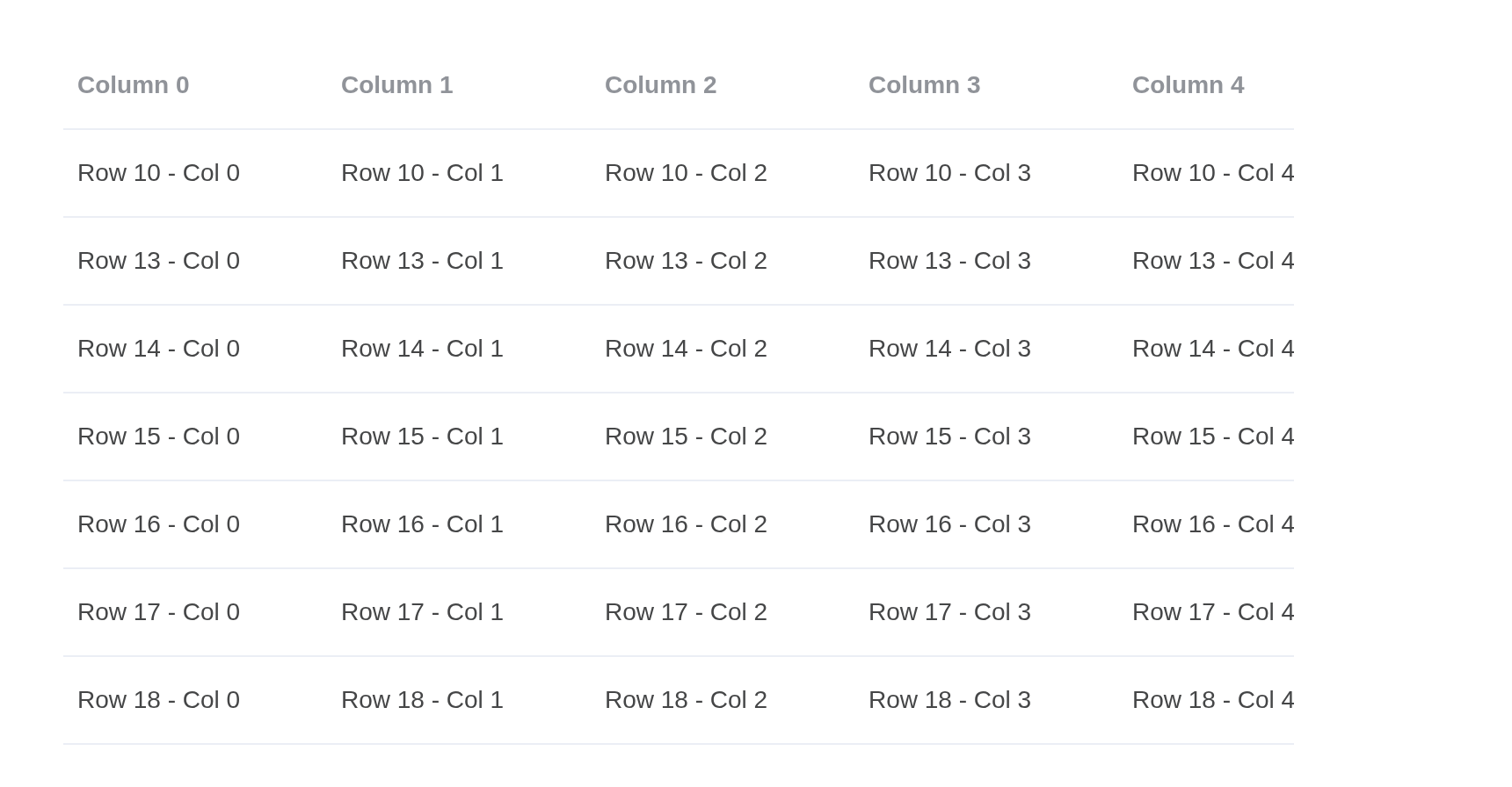
Table with fixed columns
If you want to have columns stick to the left or right for some reason, you can achieve this by adding special attributes to the table.
You can set the column’s attribute fixed to
true (representing FixedDir.LEFT) or
FixedDir.LEFT or FixedDir.RIGHT
Sorting is the server’s: a click on a sortable header arrives as
input$tv_fixed_column_sort, and the server sends the rows
back reversed and the new sort with
update_el_table_v2().
generate_columns <- function(length = 10, prefix = "column-") {
  lapply(seq_len(length) - 1, function(i) {
    el_table_v2_column(paste0(prefix, i), paste("Column", i), width = 150)
  })
}
generate_data <- function(columns, length = 200, prefix = "row-") {
  rows <- data.frame(id = paste0(prefix, seq_len(length) - 1))
  for (j in seq_along(columns)) {
    rows[[columns[[j]]$dataKey]] <- paste0(
      "Row ",
      seq_len(length) - 1,
      " - Col ",
      j - 1
    )
  }
  rows
}
columns <- generate_columns(10)
data <- generate_data(columns, 200)
columns[[1]]$fixed <- TRUE
columns[[2]]$fixed <- "left"
columns[[10]]$fixed <- "right"
for (i in 1:3) {
  columns[[i]]$sortable <- TRUE
}

ui <- el_page(
  el_table_v2(
    "tv_fixed",
    columns = columns,
    data = data,
    sort_by = list(key = "column-0", order = "asc"),
    table_v2_width = 700,
    height = 400,
    fixed = TRUE
  )
)

server <- function(input, output, session) {
  rows <- reactiveVal(data)
  observeEvent(input$tv_fixed_column_sort, {
    rows(rows()[rev(seq_len(nrow(rows()))), ])
    sort <- input$tv_fixed_column_sort
    update_el_table_v2(
      id = "tv_fixed",
      data = rows(),
      sort_by = list(key = sort$key, order = sort$order)
    )
  })
}

shinyApp(ui, server)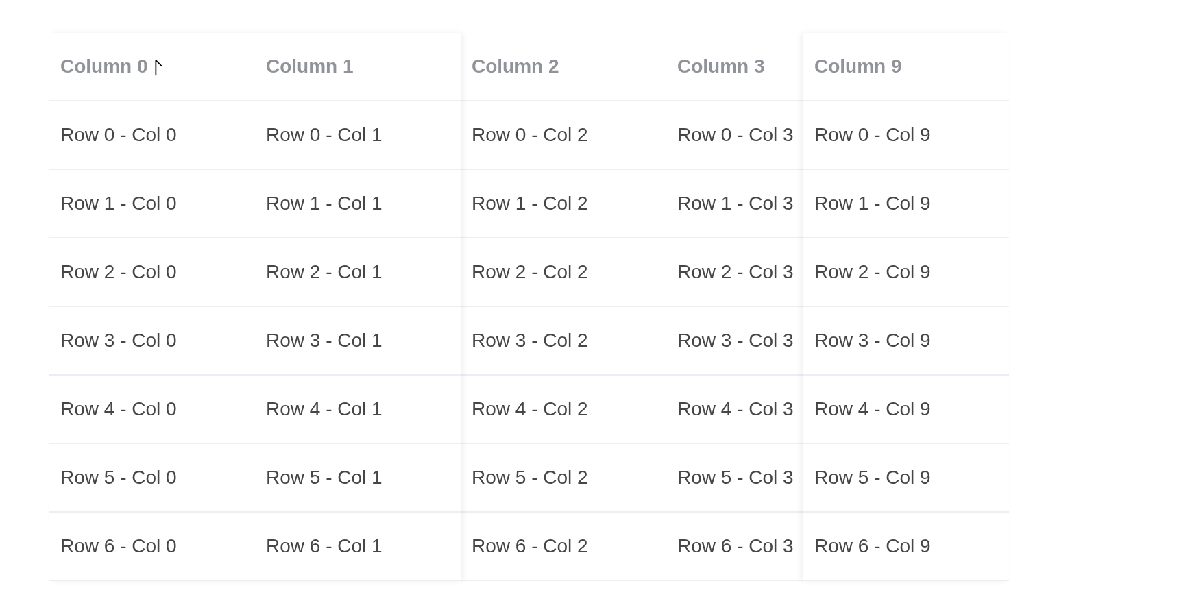
Grouping header
By customizing your header renderer, you can group your header as shown in this example.
Tip
In this case we used
JSXfeature which is not supported in the playground. You may try them out in your local environment or on online IDEs such ascodesandbox.It is recommended that you write your table component in JSX, since it contains VNode manipulations.
Three header rows, header_height = c(50, 40, 50). The
header slot redraws the first two as groups of four and two
columns; the grouping is upstream’s own function, given as
methods and drawing with Vue.h().
# the grid upstream's examples use: Row i - Col j
grid <- function(cols = 10, rows = 200) {
  df <- data.frame(
    check.names = FALSE,
    setNames(
      lapply(seq_len(cols) - 1, function(j) {
        paste0("Row ", seq_len(rows) - 1, " - Col ", j)
      }),
      paste0("column-", seq_len(cols) - 1)
    )
  )
  cbind(id = paste0("row-", seq_len(rows) - 1), df)
}
grid_columns <- function(cols = 10, width = 150) {
  lapply(seq_len(cols) - 1, function(j) {
    k <- paste0("column-", j)
    el_table_v2_column(k, paste("Column", j), width = width)
  })
}
cols <- grid_columns(15, width = 100)
for (j in 1:3) {
  cols[[j]]$fixed <- "left"
}
for (j in 14:15) {
  cols[[j]]$fixed <- "right"
}
el_table_v2(
  "tv_group",
  data = grid(15),
  columns = cols,
  header_height = c(50, 40, 50),
  header_class = JS(
    "function({ headerIndex }) { return headerIndex === 1 ? 'el-primary-color' : ''; }"
  ),
  table_v2_width = 700,
  height = 400,
  fixed = TRUE,
  methods = list(
    groupCells = JS(
      "function({ cells, columns, headerIndex }) {
        if (headerIndex === 2) return cells;
        var out = [], width = 0, idx = 0;
        columns.forEach(function(column, i) {
          if (column.placeholderSign === ElementPlus.TableV2Placeholder) {
            out.push(cells[i]);
            return;
          }
          width += cells[i].props.column.width;
          idx++;
          var next = columns[i + 1];
          if (i === columns.length - 1 ||
              next.placeholderSign === ElementPlus.TableV2Placeholder ||
              idx === (headerIndex === 0 ? 4 : 2)) {
            out.push(Vue.h('div', {
              class: 'custom-header-cell',
              role: 'columnheader',
              style: Object.assign({}, cells[i].props.style, {
                width: width + 'px', display: 'flex',
                alignItems: 'center', justifyContent: 'center'
              })
            }, 'Group width ' + width));
            width = 0;
            idx = 0;
          }
        });
        return out;
      }"
    )
  ),
  slots = list(
    header = template(
      HTML('<component v-for="c in groupCells(props)" :is="c" />'),
      slot = "header",
      scope = "props"
    )
  )
)
Filter
Virtualized Table provides custom header renderers for creating customized headers. We can then utilize these to render filters.
The header-cell slot puts a filter in the first column’s
header. The filtering is the server’s: Confirm sends the choice as
input$tv_filter_on, and the server answers with
update_el_table_v2(data =).
# the grid upstream's examples use: Row i - Col j
grid <- function(cols = 10, rows = 200) {
  df <- data.frame(
    check.names = FALSE,
    setNames(
      lapply(seq_len(cols) - 1, function(j) {
        paste0("Row ", seq_len(rows) - 1, " - Col ", j)
      }),
      paste0("column-", seq_len(cols) - 1)
    )
  )
  cbind(id = paste0("row-", seq_len(rows) - 1), df)
}
grid_columns <- function(cols = 10, width = 150) {
  lapply(seq_len(cols) - 1, function(j) {
    k <- paste0("column-", j)
    el_table_v2_column(k, paste("Column", j), width = width)
  })
}
cols <- grid_columns(width = 100)
for (j in 1:2) {
  cols[[j]]$fixed <- "left"
}
ui <- el_page(
  el_table_v2(
    "tv_filter",
    data = grid(),
    columns = cols,
    table_v2_width = 700,
    height = 400,
    fixed = TRUE,
    slots = list(
      "header-cell" = template(
        HTML(paste0(
          "<div v-if=\"column.key === 'column-0'\" ",
          "style=\"display: flex; align-items: center; gap: 8px\">",
          "<span>{{ column.title }}</span>",
          "<el-popover ref=\"filterPop\" trigger=\"click\" :width=\"200\">",
          "<template #reference><button type=\"button\" ",
          "class=\"el-table-v2__demo-filter-btn\" aria-label=\"Filter\">",
          "<el-icon :size=\"14\"><Filter /></el-icon></button></template>",
          "<el-checkbox v-model=\"column.filterOn\">Filter Text</el-checkbox>",
          "<div class=\"el-table-v2__demo-filter\">",
          "<el-button text @click=\"$refs.filterPop.hide(); ",
          "$setInput('tv_filter_on', !!column.filterOn)\">Confirm</el-button>",
          "<el-button text @click=\"column.filterOn = false; ",
          "$refs.filterPop.hide(); $setInput('tv_filter_on', false)\">",
          "Reset</el-button></div></el-popover></div>",
          "<div v-else class=\"el-table-v2__header-cell-text\">",
          "{{ column.title }}</div>"
        )),
        slot = "header-cell",
        scope = "{ column }"
      )
    )
  ),
  tags$style(
    ".el-table-v2__demo-filter {
      border-top: var(--el-border);
      margin: 12px -12px -12px;
      padding: 0 12px;
      display: flex;
      justify-content: space-between;
    }
    .el-table-v2__demo-filter-btn {
      display: flex;
      cursor: pointer;
      padding: 0;
      background: transparent;
      border: none;
    }"
  )
)
server <- function(input, output, session) {
  observeEvent(input$tv_filter_on, {
    rows <- if (input$tv_filter_on) 100 else 200
    update_el_table_v2(id = "tv_filter", data = grid(rows = rows))
  })
}
shinyApp(ui, server)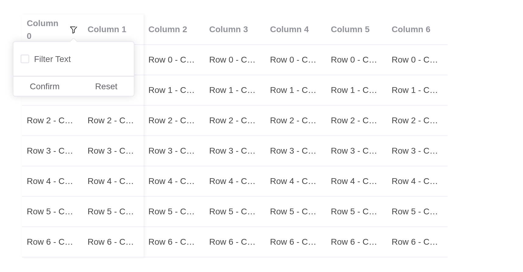
Sortable
You can sort the table with sort state.
Sorting is the server’s: input$tv_sort_column_sort says
which column and which way, and the server sends the rows back reversed
with the new sort_by.
generate_columns <- function(length = 10, prefix = "column-") {
  lapply(seq_len(length) - 1, function(i) {
    el_table_v2_column(paste0(prefix, i), paste("Column", i), width = 150)
  })
}
generate_data <- function(columns, length = 200, prefix = "row-") {
  rows <- data.frame(id = paste0(prefix, seq_len(length) - 1))
  for (j in seq_along(columns)) {
    rows[[columns[[j]]$dataKey]] <- paste0(
      "Row ",
      seq_len(length) - 1,
      " - Col ",
      j - 1
    )
  }
  rows
}
columns <- generate_columns(10)
data <- generate_data(columns, 200)
columns[[1]]$sortable <- TRUE

ui <- el_page(
  el_table_v2(
    "tv_sort",
    columns = columns,
    data = data,
    sort_by = list(key = "column-0", order = "asc"),
    table_v2_width = 700,
    height = 400,
    fixed = TRUE
  )
)

server <- function(input, output, session) {
  rows <- reactiveVal(data)
  observeEvent(input$tv_sort_column_sort, {
    rows(rows()[rev(seq_len(nrow(rows()))), ])
    sort <- input$tv_sort_column_sort
    update_el_table_v2(
      id = "tv_sort",
      data = rows(),
      sort_by = list(key = sort$key, order = sort$order)
    )
  })
}

shinyApp(ui, server)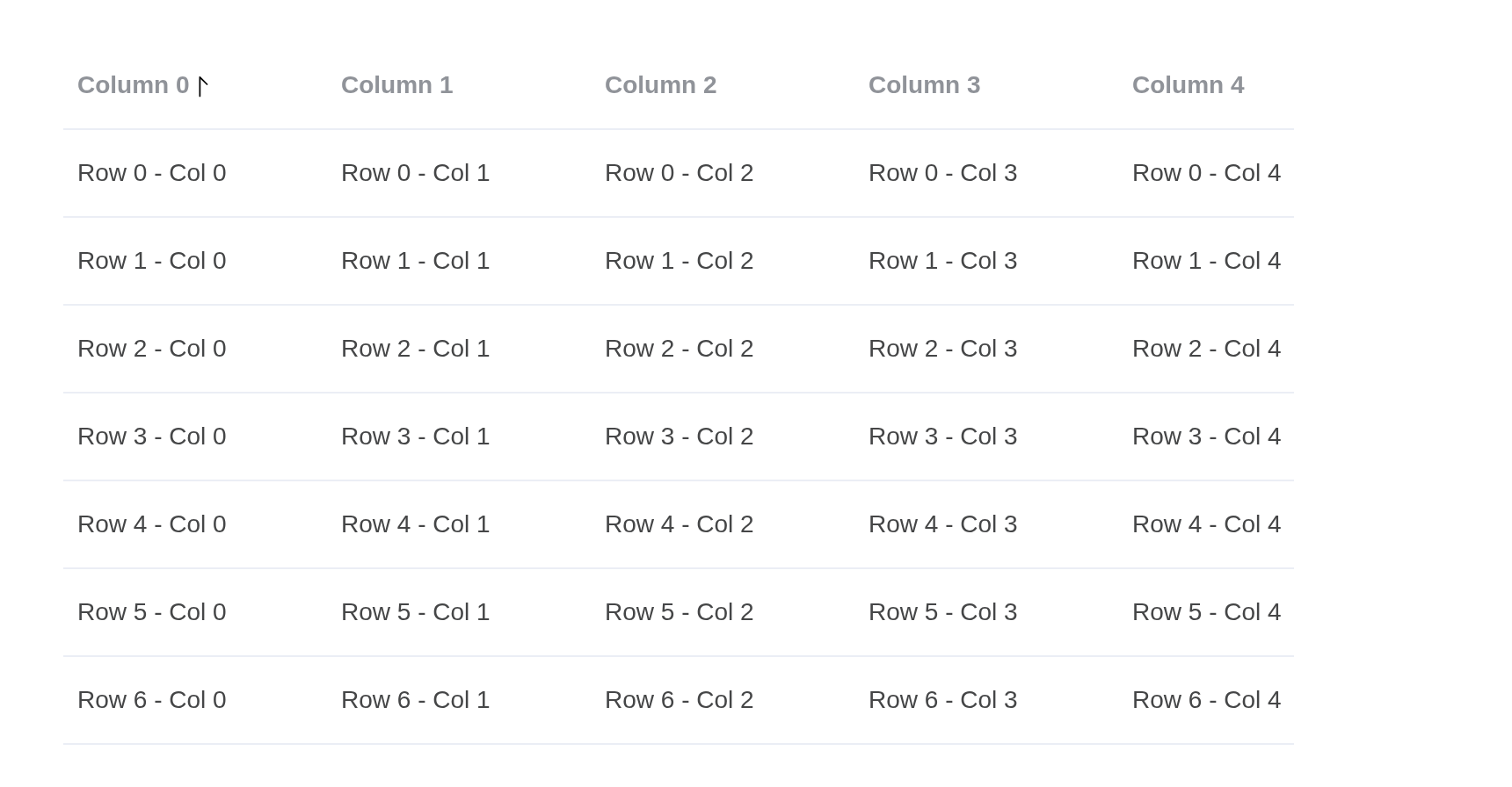
Controlled Sort
You can define multiple sortable columns as needed. Keep in mind that if you define multiple sortable columns, the UI may appear confusing to your users, as it becomes unclear which column is currently being sorted.
Two columns sorted at once: sort_state holds each
column’s order. A click sets that column’s order on the server, which
sends the state back with
update_el_table_v2(sort_state =).
generate_columns <- function(length = 10, prefix = "column-") {
  lapply(seq_len(length) - 1, function(i) {
    el_table_v2_column(paste0(prefix, i), paste("Column", i), width = 150)
  })
}
generate_data <- function(columns, length = 200, prefix = "row-") {
  rows <- data.frame(id = paste0(prefix, seq_len(length) - 1))
  for (j in seq_along(columns)) {
    rows[[columns[[j]]$dataKey]] <- paste0(
      "Row ",
      seq_len(length) - 1,
      " - Col ",
      j - 1
    )
  }
  rows
}
columns <- generate_columns(10)
data <- generate_data(columns, 200)
columns[[1]]$sortable <- TRUE
columns[[2]]$sortable <- TRUE

ui <- el_page(
  el_table_v2(
    "tv_csort",
    columns = columns,
    data = data,
    sort_state = list(`column-0` = "desc", `column-1` = "asc"),
    table_v2_width = 700,
    height = 400,
    fixed = TRUE
  )
)

server <- function(input, output, session) {
  state <- list(`column-0` = "desc", `column-1` = "asc")
  rows <- data
  observeEvent(input$tv_csort_column_sort, {
    sort <- input$tv_csort_column_sort
    state[[sort$key]] <<- sort$order
    rows <<- rows[rev(seq_len(nrow(rows))), ]
    update_el_table_v2(id = "tv_csort", data = rows, sort_state = state)
  })
}

shinyApp(ui, server)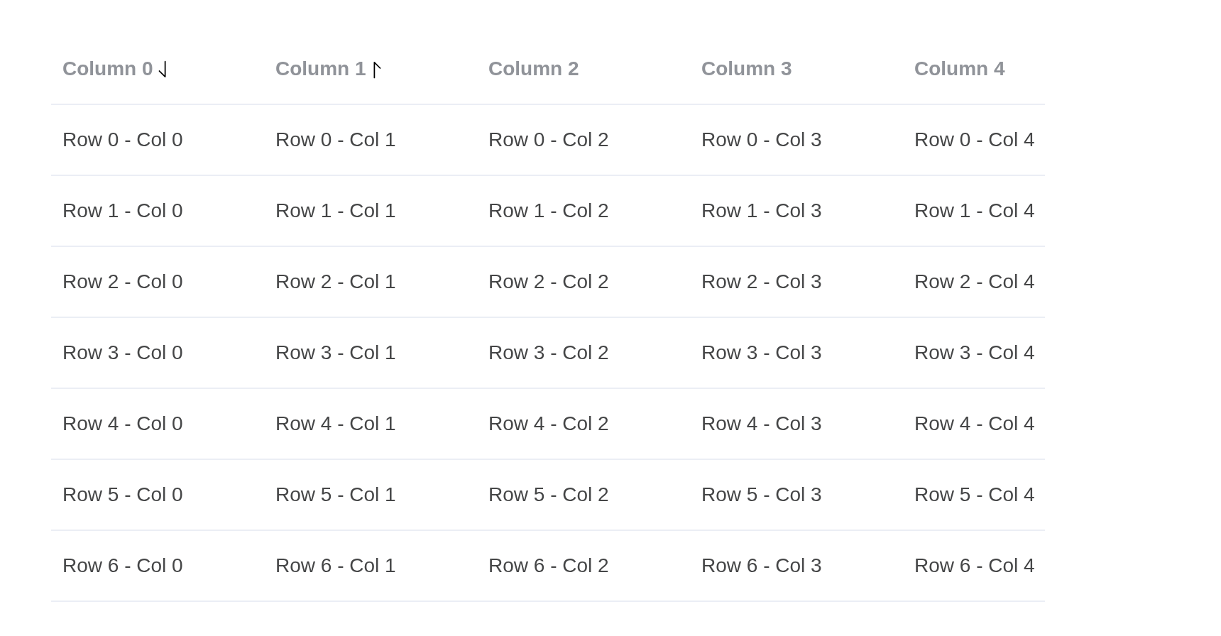
Cross hovering
When dealing with a large list, it’s easy to lose track of the current row and column you are visiting. In such cases, using this feature can be very helpful.
Hovering a cell lights its row and its column.
cell_props gives every cell a data-key naming
its column and marks the table with the column the pointer is over; the
stylesheet does the rest.
# the grid upstream's examples use: Row i - Col j
grid <- function(cols = 10, rows = 200) {
  df <- data.frame(
    check.names = FALSE,
    setNames(
      lapply(seq_len(cols) - 1, function(j) {
        paste0("Row ", seq_len(rows) - 1, " - Col ", j)
      }),
      paste0("column-", seq_len(cols) - 1)
    )
  )
  cbind(id = paste0("row-", seq_len(rows) - 1), df)
}
grid_columns <- function(cols = 10, width = 150) {
  lapply(seq_len(cols) - 1, function(j) {
    k <- paste0("column-", j)
    el_table_v2_column(k, paste("Column", j), width = width)
  })
}
cols <- c(
  list(el_table_v2_column(
    "column-n-1",
    "Row No.",
    width = 50,
    align = "center",
    cell_renderer = JS(
      "function({ rowIndex }) { return String(rowIndex + 1); }"
    )
  )),
  grid_columns()
)
tagList(
  tags$style(HTML(paste0(
    sprintf(
      "[data-hover-col='%d'] [data-key='hovering-col-%d']",
      0:10,
      0:10
    ),
    " { background: var(--el-table-row-hover-bg-color); }",
    collapse = "\n"
  ))),
  tags$div(
    style = "height: 400px",
    el_table_v2(
      "tv_cross",
      data = grid(),
      columns = cols,
      auto_resize = TRUE,
      cell_props = JS(
        "function({ columnIndex }) {
          var table = function(e) { return e.currentTarget.closest('.el-table-v2'); };
          return {
            'data-key': 'hovering-col-' + columnIndex,
            onMouseenter: function(e) { table(e).setAttribute('data-hover-col', columnIndex); },
            onMouseleave: function(e) { table(e).removeAttribute('data-hover-col'); }
          };
        }"
      )
    )
  )
)
Colspan
The virtualized table doesn’t use the built-in table
element, so colspan and rowspan behave a bit
differently compared to TableV1. However, with
a customized row renderer, these features can still be implemented. In
this section, we’ll demonstrate how to achieve this.
The row slot draws each row’s cells;
methods holds upstream’s own function, which widens the
second cell over the next ones with Vue.cloneVNode().
# the grid upstream's examples use: Row i - Col j
grid <- function(cols = 10, rows = 200) {
  df <- data.frame(
    check.names = FALSE,
    setNames(
      lapply(seq_len(cols) - 1, function(j) {
        paste0("Row ", seq_len(rows) - 1, " - Col ", j)
      }),
      paste0("column-", seq_len(cols) - 1)
    )
  )
  cbind(id = paste0("row-", seq_len(rows) - 1), df)
}
grid_columns <- function(cols = 10, width = 150) {
  lapply(seq_len(cols) - 1, function(j) {
    k <- paste0("column-", j)
    el_table_v2_column(k, paste("Column", j), width = width)
  })
}
el_table_v2(
  "tv_colspan",
  data = grid(),
  columns = grid_columns(),
  table_v2_width = 700,
  height = 400,
  fixed = TRUE,
  methods = list(
    rowCells = JS(
      "function({ rowIndex, cells }) {
        cells = cells.slice();
        var span = (rowIndex % 4) + 1;
        if (span > 1) {
          var width = parseInt(cells[1].props.style.width);
          for (var i = 1; i < span; i++) {
            width += parseInt(cells[1 + i].props.style.width);
            cells[1 + i] = null;
          }
          cells[1] = Vue.cloneVNode(cells[1], { style: Object.assign({},
            cells[1].props.style, { width: width + 'px',
              backgroundColor: 'var(--el-color-primary-light-3)' }) });
        }
        return cells.filter(Boolean);
      }"
    )
  ),
  slots = list(
    row = template(
      HTML('<component v-for="c in rowCells(props)" :is="c" />'),
      slot = "row",
      scope = "props"
    )
  )
)
Rowspan
Since we have covered Colspan, it’s worth noting that we also have row span. It’s a little bit different from colspan but the idea is basically the same.
The row slot draws each row’s cells;
methods holds upstream’s own function, which makes every
other first cell two rows tall.
# the grid upstream's examples use: Row i - Col j
grid <- function(cols = 10, rows = 200) {
  df <- data.frame(
    check.names = FALSE,
    setNames(
      lapply(seq_len(cols) - 1, function(j) {
        paste0("Row ", seq_len(rows) - 1, " - Col ", j)
      }),
      paste0("column-", seq_len(cols) - 1)
    )
  )
  cbind(id = paste0("row-", seq_len(rows) - 1), df)
}
grid_columns <- function(cols = 10, width = 150) {
  lapply(seq_len(cols) - 1, function(j) {
    k <- paste0("column-", j)
    el_table_v2_column(k, paste("Column", j), width = width)
  })
}
el_table_v2(
  "tv_rowspan",
  data = grid(),
  columns = grid_columns(),
  table_v2_width = 700,
  height = 400,
  fixed = TRUE,
  methods = list(
    rowCells = JS(
      "function({ rowIndex, cells }) {
        cells = cells.slice();
        if (rowIndex % 2 === 0 && rowIndex <= 198) {
          cells[0] = Vue.cloneVNode(cells[0], { style: Object.assign({},
            cells[0].props.style, { height: (2 * 50 - 1) + 'px',
              alignSelf: 'flex-start', zIndex: 1,
              backgroundColor: 'var(--el-color-primary-light-3)' }) });
        }
        return cells;
      }"
    )
  ),
  slots = list(
    row = template(
      HTML('<component v-for="c in rowCells(props)" :is="c" />'),
      slot = "row",
      scope = "props"
    )
  )
)
Rowspan and Colspan together
We can combine rowspan and colspan together to meet your business goal!
Column and row spans together, from one row function in
methods.
# the grid upstream's examples use: Row i - Col j
grid <- function(cols = 10, rows = 200) {
  df <- data.frame(
    check.names = FALSE,
    setNames(
      lapply(seq_len(cols) - 1, function(j) {
        paste0("Row ", seq_len(rows) - 1, " - Col ", j)
      }),
      paste0("column-", seq_len(cols) - 1)
    )
  )
  cbind(id = paste0("row-", seq_len(rows) - 1), df)
}
grid_columns <- function(cols = 10, width = 150) {
  lapply(seq_len(cols) - 1, function(j) {
    k <- paste0("column-", j)
    el_table_v2_column(k, paste("Column", j), width = width)
  })
}
el_table_v2(
  "tv_spans",
  data = grid(),
  columns = grid_columns(),
  table_v2_width = 700,
  height = 400,
  fixed = TRUE,
  methods = list(
    rowCells = JS(
      "function({ rowIndex, cells }) {
        cells = cells.slice();
        var span = (rowIndex % 4) + 1;
        if (span > 1) {
          var width = parseInt(cells[1].props.style.width);
          for (var i = 1; i < span; i++) {
            width += parseInt(cells[1 + i].props.style.width);
            cells[1 + i] = null;
          }
          cells[1] = Vue.cloneVNode(cells[1], { style: Object.assign({},
            cells[1].props.style, { width: width + 'px',
              backgroundColor: 'var(--el-color-primary-light-3)' }) });
        }
        var style = cells[0].props.style;
        if (rowIndex % 2 === 0 && rowIndex <= 198) {
          cells[0] = Vue.cloneVNode(cells[0], { style: Object.assign({}, style,
            { height: '100px', alignSelf: 'flex-start', zIndex: 1,
              backgroundColor: 'var(--el-color-danger-light-3)' }) });
        } else {
          // the cell above covers this one: an empty box keeps the width
          cells[0] = Vue.h('div', { style: Object.assign({}, style,
            { width: parseInt(style.width) + 'px' }) });
        }
        return cells.filter(Boolean);
      }"
    )
  ),
  slots = list(
    row = template(
      HTML('<component v-for="c in rowCells(props)" :is="c" />'),
      slot = "row",
      scope = "props"
    )
  )
)
Tree data
Virtual Table can also render data in a tree-like structure. By clicking the arrow icon, you can expand or collapse the tree nodes.
The rows nest through children; the arrow sits in the
column named by expand_column_key. Opening a row reports
input$tv_tree_row_expand, and the open rows
input$tv_tree_expanded_rows_change.
generate_columns <- function(length = 10, prefix = "column-") {
  lapply(seq_len(length) - 1, function(i) {
    el_table_v2_column(paste0(prefix, i), paste("Column", i), width = 150)
  })
}
generate_data <- function(columns, length = 200, prefix = "row-") {
  rows <- data.frame(id = paste0(prefix, seq_len(length) - 1))
  for (j in seq_along(columns)) {
    rows[[columns[[j]]$dataKey]] <- paste0(
      "Row ",
      seq_len(length) - 1,
      " - Col ",
      j - 1
    )
  }
  rows
}
columns <- generate_columns(10)
for (i in 1:2) {
  columns[[i]]$fixed <- "left"
}
columns[[10]]$fixed <- "right"

expand_column_key <- "column-0"
rows <- generate_data(columns, 200)
rows <- lapply(seq_len(nrow(rows)), function(i) as.list(rows[i, ]))
copy <- function(row, id, label) {
  row$id <- id
  row[[expand_column_key]] <- label
  row
}
rows[[1]]$children <- lapply(0:49, function(i) {
  copy(rows[[1]], paste0(rows[[1]]$id, "-sub-", i), paste("Sub", i))
})
rows[[3]]$children <- lapply(0:49, function(i) {
  sub <- copy(rows[[3]], paste0(rows[[3]]$id, "-sub-", i), paste("Sub", i))
  sub$children <- list(copy(
    rows[[3]],
    paste0(rows[[3]]$id, "-sub-sub-", i),
    paste("Sub-Sub", i)
  ))
  sub
})

el_table_v2(
  "tv_tree",
  columns = columns,
  data = rows,
  expand_column_key = expand_column_key,
  table_v2_width = 700,
  height = 400,
  fixed = TRUE
)
Dynamic height rows
Virtual Table is capable of rendering rows with dynamic heights. If
you’re working with data and are uncertain about the content size, this
feature is ideal for rendering rows that adjust to the content’s height.
To enable this, pass down the estimated-row-height
attribute. The closer the estimated height matches the actual content,
the smoother the rendering experience.
Tip
Each row’s height is dynamically measured during rendering the rows. As a result, if you’re trying to display a large amount of data, the UI might be bouncing.
estimated_row_height lets each row take the height of
its content. Sorting is the server’s: it sorts the rows and sends them
back with the new sort_by.
long_text <- "Quaerat ipsam necessitatibus eum quibusdam est id voluptatem cumque mollitia."
mid_text <- "Corrupti doloremque a quos vero delectus consequatur."
short_text <- "Eius optio fugiat."

set.seed(1)
data <- data.frame(
  id = paste0("random-", 1:200),
  name = "Tom",
  date = "2016-05-03",
  description = sample(c(short_text, mid_text, long_text), 200, TRUE)
)

columns <- list(
  el_table_v2_column("id", "Id", width = 150, sortable = TRUE, fixed = "left"),
  el_table_v2_column(
    "name",
    "Name",
    width = 150,
    align = "center",
    cell_renderer = JS(
      "function({ cellData: name }) {",
      "  return Vue.h(ElementPlus.ElTag, null, function() { return name; });",
      "}"
    )
  ),
  el_table_v2_column(
    "description",
    "Description",
    width = 150,
    cell_renderer = JS(
      "function({ cellData: description }) {",
      "  return Vue.h('div', { style: 'padding: 10px 0;' }, description);",
      "}"
    )
  ),
  el_table_v2_column(
    "operations",
    "Operations",
    cell_renderer = JS(
      "function() {",
      "  return [",
      "    Vue.h(ElementPlus.ElButton, { size: 'small' }, function() { return 'Edit'; }),",
      "    Vue.h(ElementPlus.ElButton, { size: 'small', type: 'danger' },",
      "      function() { return 'Delete'; })",
      "  ];",
      "}"
    ),
    width = 150,
    align = "center"
  )
)

ui <- el_page(
  el_table_v2(
    "tv_dyn",
    columns = columns,
    data = data,
    sort_by = list(key = "name", order = "asc"),
    estimated_row_height = 40,
    table_v2_width = 700,
    height = 400,
    fixed = TRUE
  )
)

server <- function(input, output, session) {
  observeEvent(input$tv_dyn_column_sort, {
    sort <- input$tv_dyn_column_sort
    rows <- data[order(data[[sort$key]], decreasing = sort$order == "desc"), ]
    update_el_table_v2(
      id = "tv_dyn",
      data = rows,
      sort_by = list(key = sort$key, order = sort$order)
    )
  })
}

shinyApp(ui, server)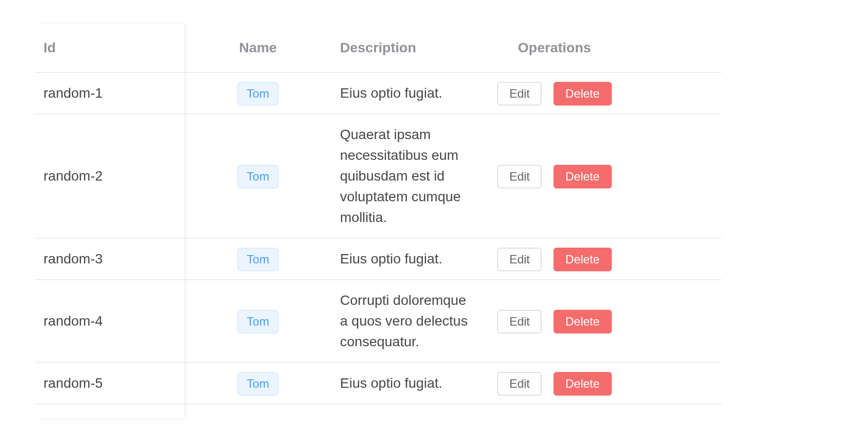
Detail view
Using dynamic height rendering, you can also display a detailed view within the table.
Each row has a child holding its detail; expanded, the
row slot draws the child as a block of text rather than
cells.
# the grid upstream's examples use: Row i - Col j
grid <- function(cols = 10, rows = 200) {
  df <- data.frame(
    check.names = FALSE,
    setNames(
      lapply(seq_len(cols) - 1, function(j) {
        paste0("Row ", seq_len(rows) - 1, " - Col ", j)
      }),
      paste0("column-", seq_len(cols) - 1)
    )
  )
  cbind(id = paste0("row-", seq_len(rows) - 1), df)
}
grid_columns <- function(cols = 10, width = 150) {
  lapply(seq_len(cols) - 1, function(j) {
    k <- paste0("column-", j)
    el_table_v2_column(k, paste("Column", j), width = width)
  })
}
detail <- paste(
  "Velit sed aspernatur tempora. Natus consequatur officiis dicta vel",
  "assumenda. Itaque est temporibus minus quis. Ipsum commodiab porro vel",
  "voluptas illum. Qui quam nulla et dolore autem itaque est."
)
df <- grid()
rows <- lapply(seq_len(nrow(df)), function(i) {
  row <- as.list(df[i, ])
  row$children <- list(list(id = paste0(row$id, "-detail"), detail = detail))
  row
})
el_table_v2(
  "tv_detail",
  data = rows,
  columns = grid_columns(),
  expand_column_key = "column-0",
  estimated_row_height = 50,
  table_v2_width = 700,
  height = 400,
  slots = list(
    row = template(
      HTML(paste0(
        "<div v-if=\"props.rowData.detail\" style=\"padding: 24px\">",
        "{{ props.rowData.detail }}</div>",
        "<component v-else v-for=\"c in props.cells\" :is=\"c\" />"
      )),
      slot = "row",
      scope = "props"
    )
  )
)
Customized Footer
Render a customized footer when you want to show a concluding message or information.
generate_columns <- function(length = 10, prefix = "column-") {
  lapply(seq_len(length) - 1, function(i) {
    el_table_v2_column(paste0(prefix, i), paste("Column", i), width = 150)
  })
}
generate_data <- function(columns, length = 200, prefix = "row-") {
  rows <- data.frame(id = paste0(prefix, seq_len(length) - 1))
  for (j in seq_along(columns)) {
    rows[[columns[[j]]$dataKey]] <- paste0(
      "Row ",
      seq_len(length) - 1,
      " - Col ",
      j - 1
    )
  }
  rows
}
columns <- generate_columns(10)
data <- generate_data(columns, 200)
el_table_v2(
  "tv_footer",
  columns = columns,
  data = data,
  row_height = 40,
  table_v2_width = 700,
  height = 400,
  footer_height = 50,
  fixed = TRUE,
  slots = list(
    footer = tags$div(
      style = paste(
        "display: flex; align-items: center; justify-content: center;",
        "height: 100%; background-color: var(--el-color-primary-light-7);"
      ),
      "Display a message in the footer"
    )
  )
)
Customized Empty Renderer
Render a customized empty element.
generate_columns <- function(length = 10, prefix = "column-") {
  lapply(seq_len(length) - 1, function(i) {
    el_table_v2_column(paste0(prefix, i), paste("Column", i), width = 150)
  })
}
columns <- generate_columns(10)
el_table_v2(
  "tv_empty",
  columns = columns,
  data = list(),
  row_height = 40,
  table_v2_width = 700,
  height = 400,
  footer_height = 50,
  slots = list(
    empty = tags$div(
      style = "display: flex; align-items: center; justify-content: center; height: 100%",
      el_empty()
    )
  )
)
Overlay
Render an overlay on top of the table when you want to show a loading indicator or something else.
generate_columns <- function(length = 10, prefix = "column-") {
  lapply(seq_len(length) - 1, function(i) {
    el_table_v2_column(paste0(prefix, i), paste("Column", i), width = 150)
  })
}
generate_data <- function(columns, length = 200, prefix = "row-") {
  rows <- data.frame(id = paste0(prefix, seq_len(length) - 1))
  for (j in seq_along(columns)) {
    rows[[columns[[j]]$dataKey]] <- paste0(
      "Row ",
      seq_len(length) - 1,
      " - Col ",
      j - 1
    )
  }
  rows
}
columns <- generate_columns(10)
data <- generate_data(columns, 200)
el_table_v2(
  "tv_overlay",
  columns = columns,
  data = data,
  row_height = 40,
  table_v2_width = 700,
  height = 400,
  slots = list(
    overlay = tags$div(
      class = "el-loading-mask",
      style = "display: flex; align-items: center; justify-content: center",
      el_icon(
        "Loading",
        class = "is-loading",
        color = "var(--el-color-primary)",
        size = 26
      )
    )
  )
)
Manual scrolling
Use the methods provided by Table V2 to scroll manually/programmatically with desired offset/rows.
Tip
The second parameter for
scrollToRowis the scrolling strategy which by default isauto, it calculates the position to scroll by itself. If you wish to scroll to a specific position, you can define the strategy yourself. The available options are"auto" | "center" | "end" | "start" | "smart"The difference between
smartandautois thatautois a subset ofsmartscroll strategy.
The buttons call the table’s scrollToTop() and
scrollToRow() from the server. scrollToRow()
is given the strategy "start": with the default, Element
Plus 2.14.7 also scrolls the table to its last column (see
“Limitations”).
generate_columns <- function(length = 10, prefix = "column-") {
  lapply(seq_len(length) - 1, function(i) {
    el_table_v2_column(paste0(prefix, i), paste("Column", i), width = 150)
  })
}
generate_data <- function(columns, length = 200, prefix = "row-") {
  rows <- data.frame(id = paste0(prefix, seq_len(length) - 1))
  for (j in seq_along(columns)) {
    rows[[columns[[j]]$dataKey]] <- paste0(
      "Row ",
      seq_len(length) - 1,
      " - Col ",
      j - 1
    )
  }
  rows
}
columns <- generate_columns(10)
data <- generate_data(columns, 200)

ui <- el_page(
  tags$div(
    style = "display: flex; gap: 16px; margin-bottom: 16px",
    el_input("delta", value = "200", label = "Scroll pixels"),
    el_input("rows", value = "10", label = "Scroll rows")
  ),
  tags$div(
    style = "margin-bottom: 16px",
    el_button("pixels_btn", "Scroll by pixels"),
    el_button("rows_btn", "Scroll by rows")
  ),
  tags$div(
    style = "height: 400px",
    el_table_v2(
      "tv_scroll",
      columns = columns,
      data = data,
      fixed = TRUE,
      auto_resize = TRUE
    )
  )
)

server <- function(input, output, session) {
  observeEvent(input$pixels_btn, {
    call_el(session, "tv_scroll", "scrollToTop", list(as.numeric(input$delta)))
  })
  observeEvent(input$rows_btn, {
    call_el(
      session,
      "tv_scroll",
      "scrollToRow",
      list(as.numeric(input$rows), "start")
    )
  })
}

shinyApp(ui, server)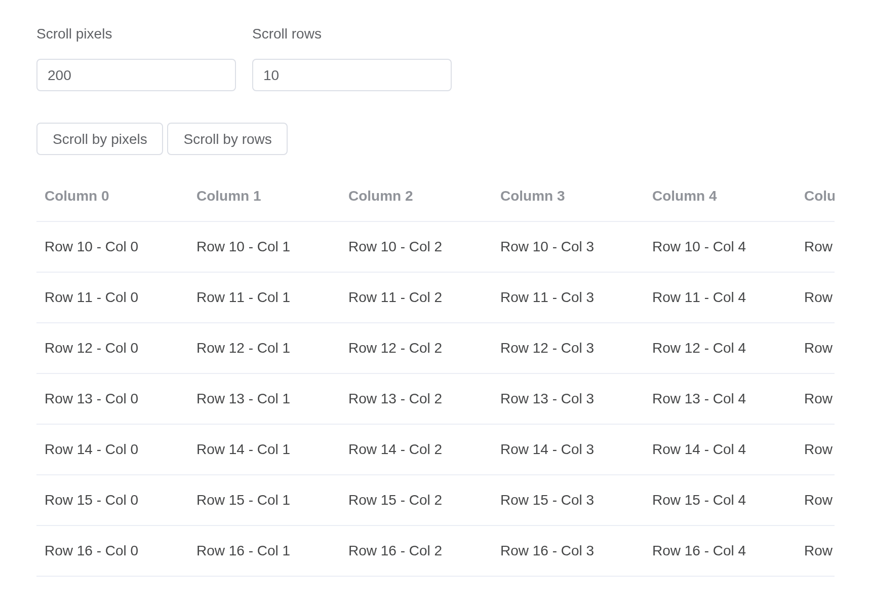
API
Element Plus’s tables, and beside each entry where it is in R.
TableV2 Attributes
| Element | In R | Description | Type | Accepted | Default |
|---|---|---|---|---|---|
cache |
cache |
Number of rows rendered in advance to boost the performance | number |
2 | |
estimated-row-height |
estimated_row_height |
The estimated row height for rendering dynamic height rows | number |
— | |
header-class |
header_class |
Customized class name passed to header wrapper |
string / Function<HeaderClassGetter> |
— | |
header-props |
header_props |
Customized props name passed to header component |
object / Function<HeaderPropsGetter> |
— | |
header-cell-props |
header_cell_props |
Customized props name passed to header cell component |
object / Function<HeaderCellPropsGetter> |
— | |
header-height |
header_height |
The height of the header is set by height. If given an
array, it renders header rows equal to its length |
number/ number[]
|
50 | |
footer-height |
footer_height |
The height of the footer element, when provided, will be part to the calculation of the table’s height. | number |
0 | |
row-class |
row_class |
Customized class name passed to row wrapper |
string / Function<RowClassGetter> |
— | |
row-key |
row_key |
The key of each row, if not provided, will be the index of the row |
string / Symbol / number
|
id | |
row-props |
row_props |
Customized props name passed to row component |
object / Function<RowPropsGetter> |
— | |
row-height |
row_height |
The height of each row, used for calculating the total height of the table | number |
50 | |
row-event-handlers |
row_event_handlers |
A collection of handlers attached to each row |
object<RowEventHandlers> |
— | |
cell-props |
cell_props |
extra props passed to each cell (except header cells) |
object / Function<CellPropsGetter> |
— | |
columns |
columns |
An array of column definitions. | Column[] | — | |
data |
data |
An array of data to be rendered in the table. | Data[] | [] | |
data-getter |
data_getter |
A method to customize data fetch from the data source. | Function<DataGetter<T>> | — | |
fixed-data |
fixed_data |
Data for rendering rows above the main content and below the header |
object<Data> |
— | |
expand-column-key |
expand_column_key |
The column key indicates which row is expandable | string |
— | |
expanded-row-keys |
expanded_row_keys |
An array of keys for expanded rows, can be used with
v-model
|
KeyType[] | — | |
default-expanded-row-keys |
default_expanded_row_keys |
An array of keys for default expanded rows, NON REACTIVE | KeyType[] | — | |
class |
an HTML attribute of the tag;
tagAppendAttributes()
|
Class name for the virtual table, will be applied to all three tables (left, right, main) |
string / array / object
|
— | |
fixed |
fixed |
Flag indicates the table column’s width to be fixed or flexible. | boolean |
false | |
width |
width |
Width of the table | number |
— | |
height |
height |
Height of the table | number |
— | |
max-height |
max_height |
Maximum height of the table | number |
— | |
indent-size |
indent_size |
horizontal indentation of tree table | number |
12 | |
h-scrollbar-size |
h_scrollbar_size |
Indicates the horizontal scrollbar’s size for the table, used to prevent the horizontal and vertical scrollbar to collapse | number |
6 | |
v-scrollbar-size |
v_scrollbar_size |
Indicates the vertical scrollbar’s size for the table, used to prevent the horizontal and vertical scrollbar to collapse | number |
6 | |
scrollbar-always-on |
scrollbar_always_on |
If true, the scrollbar will always be shown instead of when mouse is placed above the table | boolean |
false | |
sort-by |
sort_by |
Sort indicator |
object<SortBy> |
{} | |
sort-state |
sort_state |
Multiple sort indicator |
object<SortState> |
undefined |
TableV2 Slots
| Element | In R | Description |
|---|---|---|
cell |
slots = list(cell = ) |
object<CellSlotProps> |
header |
slots = list(header = ) |
object<HeaderSlotProps> |
header-cell |
slots = list(header-cell = ) |
object<HeaderCellSlotProps> |
row |
slots = list(row = ) |
object<RowSlotProps> |
footer |
slots = list(footer = ) |
— |
empty |
slots = list(empty = ) |
— |
overlay |
slots = list(overlay = ) |
— |
TableV2 Events
| Element | In R | Description |
|---|---|---|
column-sort |
input$<id>_column_sort |
Invoked when column sorted |
expanded-rows-change |
input$<id>_expanded_rows_change |
Invoked when expanded rows changed |
end-reached |
input$<id>_end_reached |
Invoked when the end of the table is reached. The callback contain the remain distance, it is the usually the scrollbar height. |
scroll |
input$<id>_scroll |
Invoked after scrolling |
rows-rendered |
input$<id>_rows_rendered |
Invoked when rows are rendered |
row-expand |
input$<id>_row_expand |
Invoked when expand/collapse the tree node by clicking the arrow icon |
TableV2 Exposes
| Element | In R | Description |
|---|---|---|
scrollTo |
call_el(session, id, "scrollTo") |
Scroll to a given position |
scrollToLeft |
call_el(session, id, "scrollToLeft") |
Scroll to a given horizontal position |
scrollToTop |
call_el(session, id, "scrollToTop") |
Scroll to a given vertical position |
scrollToRow |
call_el(session, id, "scrollToRow") |
scroll to a given row with specified scroll strategy |
Column Attribute
| Element | In R | Description | Type | Accepted | Default |
|---|---|---|---|---|---|
align |
el_table_v2_column(align =) |
Alignment of the table cell content | Alignment | left | |
class |
el_table_v2_column(class =) |
Class name for the column | string |
— | |
key |
el_table_v2_column(key =) |
Unique identification | KeyType | — | |
dataKey |
el_table_v2_column(data_key =) |
Unique identification of data | KeyType | — | |
fixed |
el_table_v2_column(fixed =) |
Fixed direction of the column |
boolean / FixedDir
|
false | |
flexGrow |
el_table_v2_column(flex_grow =) |
CSSProperties flex grow, Only useful when this is not a fixed table | number |
0 | |
flexShrink |
el_table_v2_column(flex_shrink =) |
CSSProperties flex shrink, Only useful when this is not a fixed table | number |
1 | |
headerClass |
el_table_v2_column(header_class =) |
Used for customizing header column class | string |
— | |
hidden |
el_table_v2_column(hidden =) |
Whether the column is invisible | boolean |
— | |
style |
el_table_v2_column(style =) |
Customized style for column cell, will be merged with grid cell |
1CSSProperties
|
— | |
sortable |
el_table_v2_column(sortable =) |
Indicates whether the column is sortable | boolean |
— | |
title |
el_table_v2_column(title =) |
The default text rendered in header cell | string |
— | |
maxWidth |
el_table_v2_column(max_width =) |
Maximum width for the column | number |
— | |
minWidth |
el_table_v2_column(min_width =) |
Minimum width for the column | number |
— | |
width |
el_table_v2_column(width =) |
Width for the column | number |
— | |
cellRenderer |
el_table_v2_column(cell_renderer =) |
Customized Cell renderer |
VueComponent / (props: CellRenderProps) => VNode |
— | |
headerCellRenderer |
el_table_v2_column(header_cell_renderer =) |
Customized Header renderer |
VueComponent / (props: HeaderRenderProps) => VNode |
— |