Element’s form components each report to
input$<id> and are set from the server with
update_el_*(). This covers what forms need beyond a single
component – labels and errors, choices, validation, typed values; each
component’s own page, under Components, shows the rest. Every example
runs as it stands; on the website, the components under one are live, or
a screenshot of the running app where it needs a server.
Labels
Every input takes a label, as Shiny’s do. It sits above
the component by default, or beside it with
label_position = "left", and it is the component’s
accessible name too: <label for> points at the native
input where there is one, aria-labelledby names the
component where there is not. Hiding or removing a component by its id
takes its label with it.
el_input("name", label = "Name", placeholder = "Ada Lovelace", width = "300px")
el_select(
  "city",
  choices = c("Beijing", "Shanghai"),
  label = "City",
  width = "300px"
)
el_switch("notify", label = "Email me", label_position = "left", value = TRUE)
el_rate("stars", label = "Rating", label_position = "left", value = 4)
The label is drawn as Element draws an el-form-item, and
takes the props of one that make sense for a single input.
label_position = "right" aligns a label beside the
component to its right edge, and a shared label_width lines
up a column of them; label_suffix follows each label, and
required adds Element’s red asterisk. error
frames the component in red with the message under it, or beside it with
inline_message = TRUE; show_message = FALSE
keeps the frame and drops the text. A component’s own size
sizes its label too.
el_input(
  "user",
  label = "Name",
  label_position = "right",
  label_width = "90px",
  label_suffix = ":",
  required = TRUE,
  width = "260px"
)
el_input(
  "email",
  label = "Email",
  label_position = "right",
  label_width = "90px",
  label_suffix = ":",
  required = TRUE,
  error = "That address is taken",
  width = "260px"
)
el_input_number(
  "seats",
  label = "Seats",
  label_position = "right",
  label_width = "90px",
  label_suffix = ":",
  value = 0,
  error = "At least one",
  inline_message = TRUE
)
el_select(
  "team",
  choices = c("Data", "Design"),
  label = "Team",
  label_position = "right",
  label_width = "90px",
  label_suffix = ":",
  size = "small",
  width = "260px"
)
update_el_*() changes the label, as Shiny’s
update*Input() do, and sets or clears the error – Element’s
use for error: a check only the server can make, such as
whether a name is taken. "" clears it.
taken <- c("admin", "root")

ui <- el_page(el_input("user", label = "Username", width = "300px"))

server <- function(input, output, session) {
  observeEvent(input$user, {
    update_el_input(
      id = "user",
      error = if (input$user %in% taken) "That name is taken" else ""
    )
  })
}

shinyApp(ui, server)
One that comes and goes with what is typed, by rules written in R, is
a validator’s job – shinyvalidate, below, or el_form()’s
rules.
Choices
Anything taking choices accepts the shapes Shiny does –
an unnamed vector, where value and label are the same; a named one,
label = value; or a list of objects, which is how a single choice
carries props of its own.
el_select("plain", choices = c("Beijing", "Shanghai"), value = "Beijing")

el_select("named", choices = c(Beijing = "bj", Shanghai = "sh"), value = "sh")

el_select(
  "objects",
  value = "sh",
  choices = list(
    list(value = "bj", label = "Beijing (full)", disabled = TRUE),
    list(value = "sh", label = "Shanghai")
  )
)
An option can be drawn with more than its label – Element’s “custom
template”. option_template is markup inside each option,
with the option in reach as opt and any field its choice
carries:
el_select(
  "airport",
  width = "240px",
  choices = list(
    list(value = "pek", label = "Beijing", code = "PEK"),
    list(value = "sha", label = "Shanghai", code = "SHA"),
    list(value = "ctu", label = "Chengdu", code = "CTU")
  ),
  option_template = tagList(
    tags$span(style = "float: left", "{{ opt.label }}"),
    tags$span(
      style = "float: right; color: #8492a6; font-size: 13px",
      "{{ opt.code }}"
    )
  )
)
For a checkbox or radio group, Element documents border,
name and disabled on the individual item
rather than the group, so they go on the choice:
el_checkbox_group(
  "terms",
  selected = "a",
  choices = list(
    list(value = "a", label = "Agree", border = TRUE),
    list(value = "b", label = "Subscribe", border = TRUE),
    list(value = "c", label = "Unavailable", border = TRUE, disabled = TRUE)
  )
)
Validation
el_form() renders its own fields rather than accepting
standalone input components, because Element’s validation only works
inside one component tree: a form item finds its control through Vue’s
child chain and listens for events dispatched up it. A separate Vue
instance dropped in is not in that chain.
The form reports three inputs: input$<id> is the
model as a list, input$<id>_valid whether validation
passed, and input$<id>_submit a counter. Here the
form was submitted empty:
ui <- el_page(
  el_form(
    id = "signup",
    label_width = "90px",
    el_form_field(
      "name",
      "input",
      label = "Name",
      rules = el_rule(required = TRUE, message = "Name is required")
    ),
    el_form_field("age", "input-number", label = "Age", value = 18),
    el_form_field(
      "city",
      "select",
      label = "City",
      options = c("Beijing", "Shanghai"),
      rules = el_rule(required = TRUE, message = "Pick a city")
    )
  ),
  verbatimTextOutput("result")
)

server <- function(input, output, session) {
  output$result <- renderPrint({
    req(input$signup_submit)
    list(valid = input$signup_valid, model = input$signup)
  })
}

shinyApp(ui, server)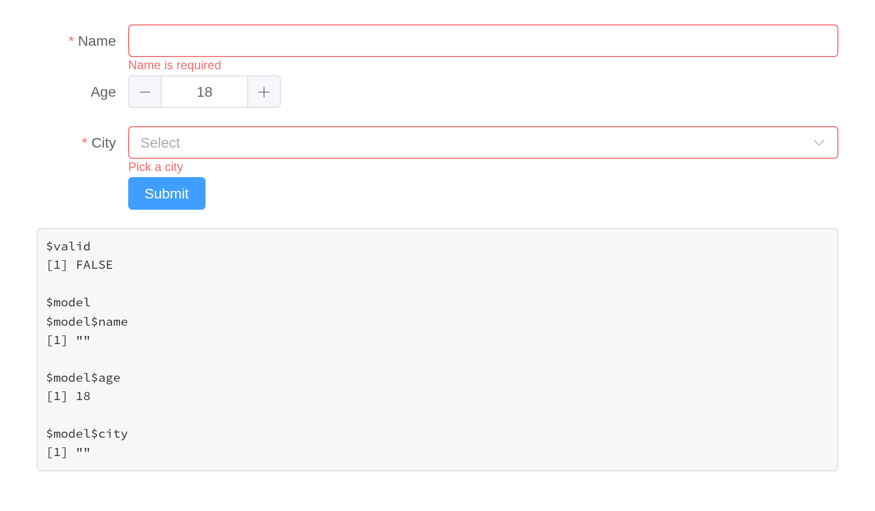
Validation can be driven from the server as well.
validate() returns a promise, which resolves when the form
is valid and rejects when it is not; both arrive as
input$<id>_validate:
ui <- el_page(
  el_form(
    id = "profile",
    submit_label = NULL,
    el_form_field(
      "email",
      "input",
      label = "Email",
      rules = el_rule(required = TRUE, message = "Email is required")
    )
  ),
  el_button("check", "Check from the server"),
  el_button("clear", "Clear messages"),
  verbatimTextOutput("answer")
)

server <- function(input, output, session) {
  observeEvent(input$check, call_el(session, "profile", "validate"))
  observeEvent(input$clear, call_el(session, "profile", "clearValidate"))
  output$answer <- renderPrint(input$profile_validate)
}

shinyApp(ui, server)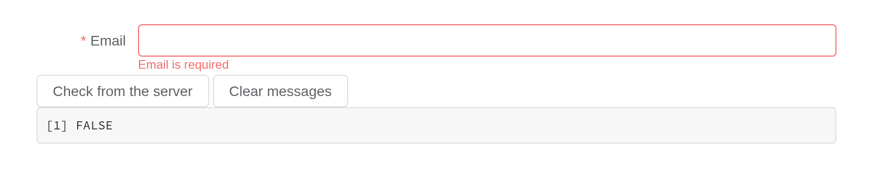
Custom rules, and fields that come and go
el_rule(validator = JS(...)) is Element’s custom rule: a
function that calls back with an error or without one. A check only the
server can make – is the address taken? – goes the other way, through
update_el_form(errors =). And
update_el_form(fields =) replaces the field list, for the
form that grows a row per item, as Element’s “add or delete form items
dynamically” does; what was already entered stays.
email_field <- function(i) el_form_field(paste0("email", i), "input",
  label = paste("Email", i), rules = el_rule(type = "email", message = "Not an email"))
seats_field <- el_form_field("seats", "input-number", label = "Seats", value = 3,
  rules = el_rule(trigger = "change", validator = JS(
    "function(rule, value, callback) {",
    "  value % 2 === 0 ? callback() : callback(new Error('Seats come in pairs'));",
    "}")))

ui <- el_page(
  el_form(id = "invite", submit_label = NULL, label_width = "90px", width = "420px",
          email_field(1), seats_field),
  el_button("more", "Add an address"),
  el_button("check", "Check", type = "primary")
)

server <- function(input, output, session) {
  n <- reactiveVal(1)
  observeEvent(input$more, {
    n(n() + 1)
    update_el_form(id = "invite",
                   fields = c(lapply(seq_len(n()), email_field), list(seats_field)))
  })
  observeEvent(input$check, el_form_validate(session, "invite"))
}

shinyApp(ui, server)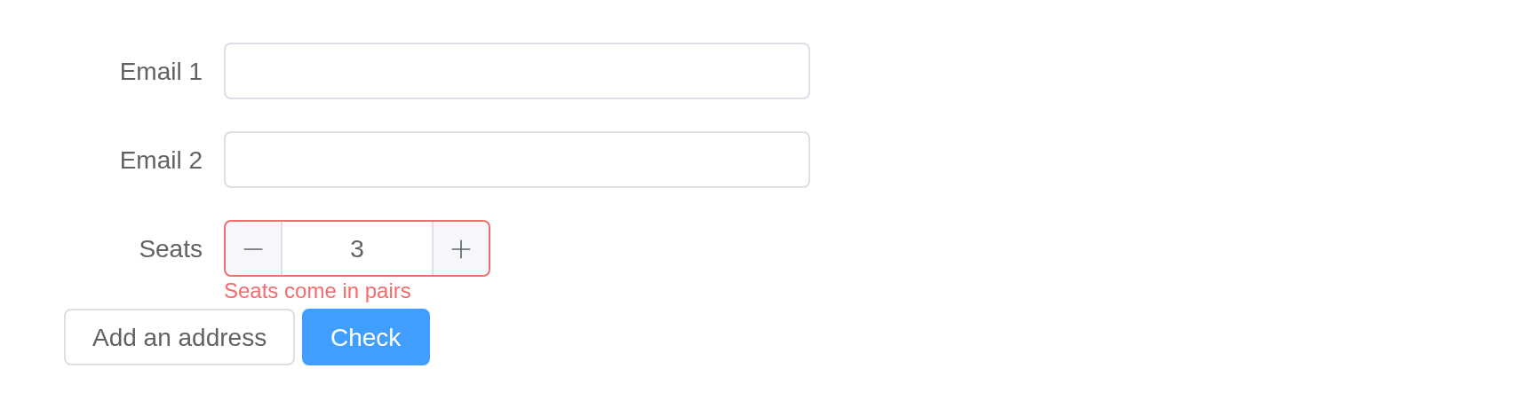
shinyvalidate
Standalone components work with shinyvalidate as Shiny’s own inputs
do. Its message is drawn as Element draws a failed rule – the component
framed in red, the message underneath – rather than as Bootstrap’s help
text, which assumes a .form-group the component does not
have:
library(shinyvalidate)

ui <- el_page(
  el_input("email", label = "Email", width = "300px"),
  el_select(
    "topic",
    choices = c("Billing", "Support"),
    label = "Topic",
    width = "300px"
  ),
  el_button("send", "Send", type = "primary")
)

server <- function(input, output, session) {
  iv <- InputValidator$new()
  iv$add_rule("email", sv_required("An email, please"))
  iv$add_rule("email", sv_email())
  iv$add_rule("topic", sv_required("Pick a topic"))
  observeEvent(input$send, iv$enable())
}

shinyApp(ui, server)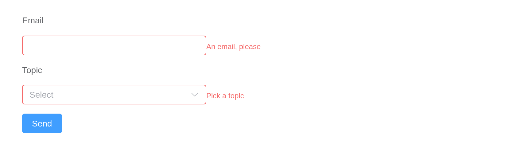
Dates
A date picker reports a Date, as
dateInput() does: two for a "daterange",
several for "dates", NULL while empty.
Element’s other types – "datetime", "month",
"week" – and a value_format of your own report
the text the picker produces, in that format, unconverted.
ui <- el_page(
  el_date_picker("due", value = Sys.Date()),
  el_date_picker(
    "trip",
    type = "daterange",
    value = c(Sys.Date(), Sys.Date() + 7)
  ),
  verbatimTextOutput("days")
)

server <- function(input, output, session) {
  output$days <- renderPrint(str(list(due = input$due, trip = input$trip)))
}

shinyApp(ui, server)
Searching on the server
A select or an autocomplete with remote = TRUE asks the
server for its options as the user types –
input$<id>_query, answered by
update_el_select() or
update_el_autocomplete(). The Select and Input pages show
both.
Typing
el_input(), el_autocomplete(),
el_input_number() and el_slider() report a
quarter-second after the user stops, as textInput() does,
rather than on every keystroke or step. An observer on one runs once per
pause, not once per letter.
Sizing and layout
Every component takes width, which behaves like the
width of a Shiny input: "200px",
"50%", or a number meaning pixels. For a form,
label_width and label_position do what
Element’s do:
el_form(
  id = "compact",
  label_width = "80px",
  label_position = "left",
  submit_label = NULL,
  el_form_field("name", "input", label = "Name"),
  el_form_field("team", "select", label = "Team", options = c("Data", "Design"))
)

el_input("wide", placeholder = "width = '100%'", width = "100%")
el_input("narrow", placeholder = "width = 160", width = 160)