Divide the area horizontally or vertically, and freely drag to adjust the size of each area.
Basic usage
The most basic usage, if no default size is passed, it will be automatically divided equally.
panel <- function(x) {
  tags$div(
    style = "display: flex; align-items: center; justify-content: center; height: 100%",
    x
  )
}
tags$div(
  style = "height: 250px; box-shadow: var(--el-border-color-light) 0px 0px 10px",
  el_splitter(
    el_splitter_panel(size = "30%", panel(1)),
    el_splitter_panel(panel(2))
  )
)
Vertical
Use vertical orientation.
panel <- function(x) {
  tags$div(
    style = "display: flex; align-items: center; justify-content: center; height: 100%",
    x
  )
}
tags$div(
  style = "height: 250px; box-shadow: var(--el-border-color-light) 0px 0px 10px",
  el_splitter(
    layout = "vertical",
    el_splitter_panel(panel(1)),
    el_splitter_panel(panel(2))
  )
)
Collapsible
Configuring collapsible provides quick shrinking
capability. You can use the min property to prevent
expanding through dragging after collapsing.
The switch makes the panels collapsible or not, each by its own id
with update_el_splitter_panel() – the inner splitter’s
too.
panel <- function(x) {
  tags$div(
    style = "display: flex; align-items: center; justify-content: center; height: 100%",
    x
  )
}
collapsible <- c("spl_p1", "spl_p2", "spl_p4", "spl_p4a", "spl_p4b")
ui <- el_page(
  tags$div(
    style = "margin-bottom: 8px",
    el_switch(
      "spl_collapsible",
      value = TRUE,
      active_text = "enable",
      inactive_text = "disable",
      inline_prompt = TRUE
    )
  ),
  tags$div(
    style = "height: 250px; box-shadow: var(--el-border-color-light) 0px 0px 10px",
    el_splitter(
      el_splitter_panel(id = "spl_p1", collapsible = TRUE, min = 50, panel(1)),
      el_splitter_panel(id = "spl_p2", collapsible = TRUE, panel(2)),
      el_splitter_panel(panel(3)),
      el_splitter_panel(
        id = "spl_p4",
        collapsible = TRUE,
        el_splitter(
          layout = "vertical",
          el_splitter_panel(id = "spl_p4a", collapsible = TRUE, panel(4)),
          el_splitter_panel(id = "spl_p4b", collapsible = TRUE, panel(5))
        )
      )
    )
  )
)
server <- function(input, output, session) {
  observeEvent(input$spl_collapsible, ignoreInit = TRUE, {
    for (id in collapsible) {
      update_el_splitter_panel(session, id, collapsible = input$spl_collapsible)
    }
  })
}
shinyApp(ui, server)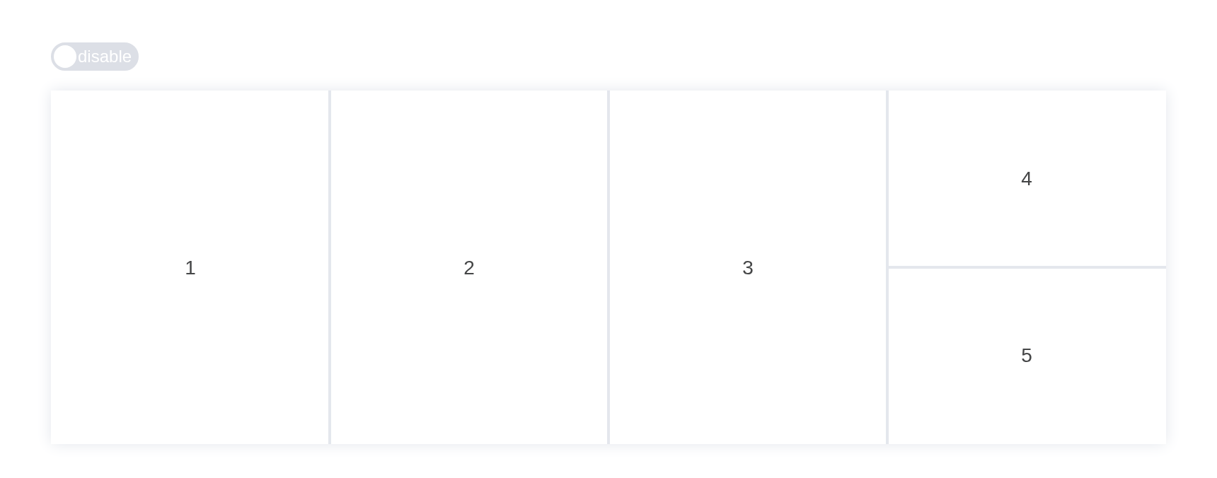
Disable drag
When either panel disables resizable, dragging will be
disabled.
The switch lets the middle panel be dragged or not, with
update_el_splitter_panel(resizable =).
panel <- function(x) {
  tags$div(
    style = "display: flex; align-items: center; justify-content: center; height: 100%",
    x
  )
}
ui <- el_page(
  tags$div(
    style = "margin-bottom: 8px",
    el_switch(
      "spl_resizable",
      value = FALSE,
      active_text = "enable",
      inactive_text = "disable",
      inline_prompt = TRUE
    )
  ),
  tags$div(
    style = "height: 250px; box-shadow: var(--el-border-color-light) 0px 0px 10px",
    el_splitter(
      el_splitter_panel(panel(1)),
      el_splitter_panel(
        id = "spl_middle",
        resizable = FALSE,
        panel(uiOutput("spl_drag"))
      ),
      el_splitter_panel(panel(3))
    )
  )
)
server <- function(input, output, session) {
  output$spl_drag <- renderUI({
    paste("drag", if (isTRUE(input$spl_resizable)) "enable" else "disable")
  })
  observeEvent(input$spl_resizable, ignoreInit = TRUE, {
    update_el_splitter_panel(
      session,
      "spl_middle",
      resizable = input$spl_resizable
    )
  })
}
shinyApp(ui, server)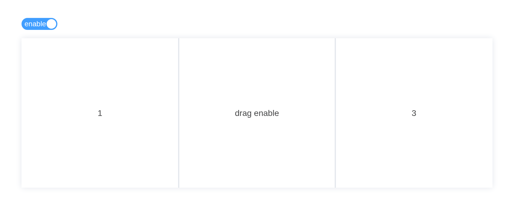
Panel size
v-model:size can get the panel size.
Dragging reports input$<id>_resize_start,
_resize and _resize_end.
panel <- function(x) {
  tags$div(
    style = "display: flex; align-items: center; justify-content: center; height: 100%",
    x
  )
}
tags$div(
  style = "height: 250px; box-shadow: var(--el-border-color-light) 0px 0px 10px",
  el_splitter(
    id = "split_size",
    el_splitter_panel(size = "200px", panel(1)),
    el_splitter_panel(panel(2))
  )
)
Lazy
When lazy is enabled, the panel size will not update in
real time during dragging, but only after the drag ends.
panel <- function(x) {
  tags$div(
    style = "display: flex; align-items: center; justify-content: center; height: 100%",
    x
  )
}
tags$div(
  style = "height: 250px; box-shadow: var(--el-border-color-light) 0px 0px 10px",
  el_splitter(
    lazy = TRUE,
    el_splitter_panel(panel(1)),
    el_splitter_panel(panel(2))
  )
)
API
Element Plus’s tables, and beside each entry where it is in R.
Splitter Attributes
| Element | In R | Description | Type | Accepted | Default |
|---|---|---|---|---|---|
layout |
el_splitter(layout =) |
Layout direction of the splitter |
1'horizontal' \\| 'vertical'
|
horizontal | |
lazy |
el_splitter(lazy =) |
Whether to enable lazy mode | 2 | false |
Splitter Events
| Element | In R | Description |
|---|---|---|
resize-start |
input$<id>_resize_start |
Triggered when starting to resize a panel, index is the
drag bar index |
resize |
input$<id>_resize |
Triggered while resizing a panel, index is the drag bar
index |
resize-end |
input$<id>_resize_end |
Triggered when panel resizing ends, index is the drag
bar index |
collapse |
input$<id>_collapse |
Triggered when a panel is collapsed, index is the drag
bar index |
SplitterPanel Attributes
| Element | In R | Description | Type | Accepted | Default |
|---|---|---|---|---|---|
size |
el_splitter_panel(size =) |
Size of the panel (in pixels or percentage) | 3 / 4 | - | |
min |
el_splitter_panel(min =) |
Minimum size of the panel (in pixels or percentage) | 5 / 6 | - | |
max |
el_splitter_panel(max =) |
Maximum size of the panel (in pixels or percentage) | 7 / 8 | - | |
resizable |
el_splitter_panel(resizable =) |
Whether the panel can be resized | 9 | true | |
collapsible |
el_splitter_panel(collapsible =) |
Whether the panel can be collapsed | 10 | false |