Use Collapse to store contents.
Basic usage
You can expand multiple panels
panels <- list(
  el_collapse_item(
    "Consistency",
    tags$div(
      "Consistent with real life: in line with the process and logic of real life, and comply with languages and habits that the users are used to;"
    ),
    name = "1"
  ),
  el_collapse_item(
    "Feedback",
    tags$div(
      "Operation feedback: enable the users to clearly perceive their operations by style updates and interactive effects;"
    ),
    name = "2"
  ),
  el_collapse_item(
    "Efficiency",
    tags$div(
      "Simplify the process: keep operating process simple and intuitive;"
    ),
    name = "3"
  ),
  el_collapse_item(
    "Controllability",
    tags$div(
      "Decision making: giving advices about operations is acceptable, but do not make decisions for the users;"
    ),
    name = "4"
  )
)
el_collapse("coll", items = panels, value = "1")Accordion
In accordion mode, only one panel can be expanded at once
Activate accordion mode using the accordion
attribute.
el_collapse(
  "coll_acc",
  value = "1",
  accordion = TRUE,
  items = list(
    el_collapse_item(
      "Consistency",
      tags$div("Consistent with real life."),
      name = "1"
    ),
    el_collapse_item("Feedback", tags$div("Operation feedback."), name = "2"),
    el_collapse_item(
      "Efficiency",
      tags$div("Simplify the process."),
      name = "3"
    ),
    el_collapse_item(
      "Controllability",
      tags$div("Decision making."),
      name = "4"
    )
  )
)Custom title
Besides using the title attribute, you can customize
panel title with named slots, which makes adding custom content,
e.g. icons, possible.
Tip
Starting from version 2.9.10, the
titleslot provides anisActiveproperty that indicates whether the current collapse item is active.
A title may be markup: an icon beside the text.
el_collapse(
  "coll_title",
  accordion = TRUE,
  items = list(
    el_collapse_item(
      tags$span(
        "Consistency ",
        el_icon("InfoFilled", class = "header-icon")
      ),
      tags$div("Consistent with real life."),
      name = "1"
    ),
    el_collapse_item("Feedback", tags$div("Operation feedback."), name = "2")
  )
)Custom icon
Besides using the icon attribute, you can customize icon
of panel item with named slots, which makes adding custom content.
el_collapse(
  "coll_icon",
  value = "1",
  items = list(
    el_collapse_item(
      "Consistency",
      tags$div("Consistent with real life."),
      name = "1",
      icon = "CaretRight"
    ),
    el_collapse_item(
      "Feedback",
      tags$div("Operation feedback."),
      name = "2",
      icon = "ArrowRightBold"
    )
  )
)Custom icon position
using the expand-icon-position attribute, you can
customize icon position.
The switch moves each header’s icon, with
update_el_collapse( expand_icon_position =).
ui <- el_page(
  tags$div(
    style = "display: flex; align-items: center; margin-bottom: 16px",
    tags$span(style = "margin-right: 16px", "expand icon position: "),
    el_switch(
      "position",
      value = "left",
      inactive_value = "left",
      active_value = "right",
      inactive_text = "left",
      active_text = "right",
      inactive_color = "#88b8fe"
    )
  ),
  el_collapse(
    "coll_pos",
    expand_icon_position = "left",
    items = list(
      el_collapse_item(
        "Consistency",
        tags$div(
          "Consistent with real life: in line with the process and logic of",
          "real life, and comply with languages and habits that the users are",
          "used to;"
        ),
        tags$div(
          "Consistent within interface: all elements should be consistent,",
          "such as: design style, icons and texts, position of elements, etc."
        ),
        name = "1"
      ),
      el_collapse_item(
        "Feedback",
        tags$div(
          "Operation feedback: enable the users to clearly perceive their",
          "operations by style updates and interactive effects;"
        ),
        tags$div(
          "Visual feedback: reflect current state by updating or rearranging",
          "elements of the page."
        ),
        name = "2"
      ),
      el_collapse_item(
        "Efficiency",
        tags$div(
          "Simplify the process: keep operating process simple and intuitive;"
        ),
        tags$div(
          "Definite and clear: enunciate your intentions clearly so that the",
          "users can quickly understand and make decisions;"
        ),
        name = "3"
      )
    )
  )
)
server <- function(input, output, session) {
  observeEvent(input$position, ignoreInit = TRUE, {
    update_el_collapse(
      session,
      "coll_pos",
      expand_icon_position = input$position
    )
  })
}
shinyApp(ui, server)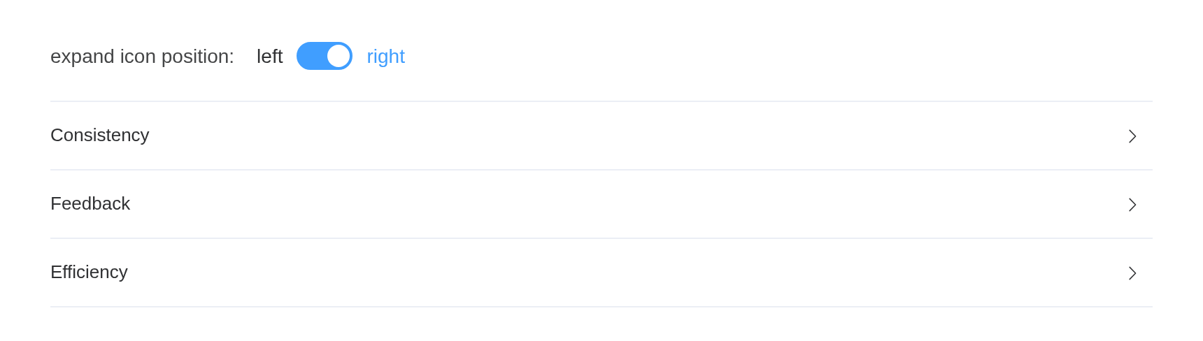
Prevent collapsing
set the before-collapse property, If false
is returned or a Promise is returned and then is rejected,
will stop collapsing.
before_collapse returns a promise: the panel turns after
a second, or stays, as the switch says. The switch replaces the function
with update_el_collapse(before_collapse =).
guard <- function(allow) {
  JS(sprintf(
    "function() { return new Promise(function(resolve) { setTimeout(function() { resolve(%s); }, 1000); }); }",
    tolower(allow)
  ))
}
ui <- el_page(
  tags$div(
    style = "display: flex; align-items: center; margin-bottom: 16px",
    tags$span(style = "margin-right: 16px", "before collapse return: "),
    el_switch(
      "before",
      value = TRUE,
      inactive_text = "false",
      active_text = "true"
    )
  ),
  el_collapse(
    "coll_guard",
    value = "1",
    before_collapse = guard(TRUE),
    items = list(
      el_collapse_item(
        "Consistency",
        tags$div(
          "Consistent with real life: in line with the process and logic of",
          "real life, and comply with languages and habits that the users are",
          "used to;"
        ),
        name = "1"
      ),
      el_collapse_item(
        "Feedback",
        tags$div(
          "Operation feedback: enable the users to clearly perceive their",
          "operations by style updates and interactive effects;"
        ),
        name = "2"
      )
    )
  )
)
server <- function(input, output, session) {
  observeEvent(input$before, ignoreInit = TRUE, {
    update_el_collapse(
      session,
      "coll_guard",
      before_collapse = guard(input$before)
    )
  })
}
shinyApp(ui, server)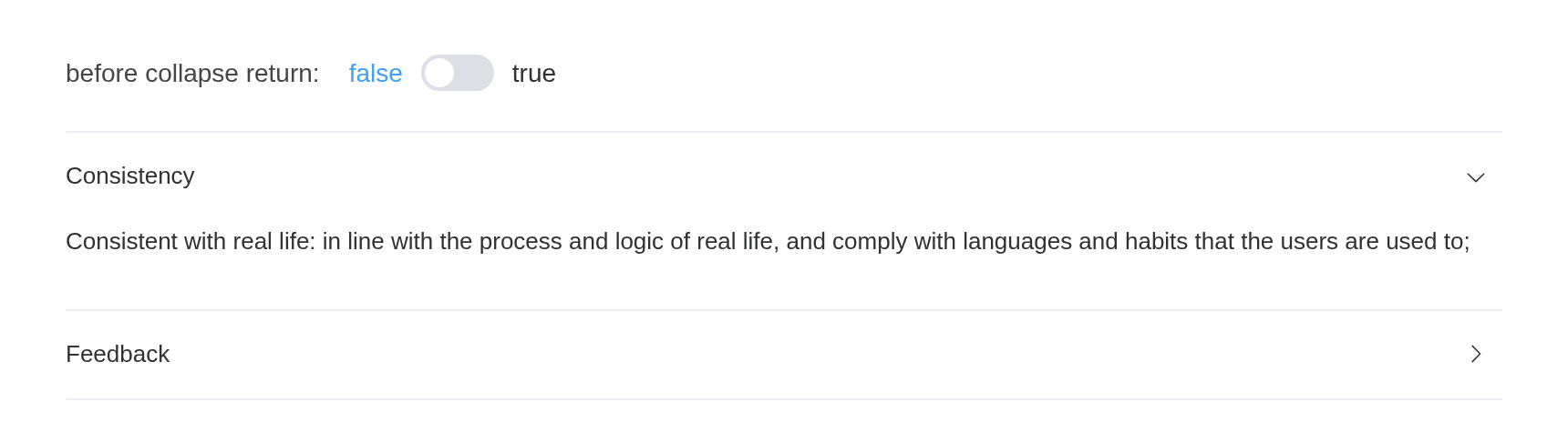
API
Element Plus’s tables, and beside each entry where it is in R.
Collapse Attributes
| Element | In R | Description | Type | Accepted | Default |
|---|---|---|---|---|---|
model-value |
value; input$<id>
|
currently active panel, the type is string in accordion
mode, otherwise it is array
|
1 / 2 | [] | |
accordion |
accordion |
whether to activate accordion mode | 3 | false | |
expand-icon-position |
expand_icon_position |
set expand icon position |
4'left' \\| 'right'
|
right | |
before-collapse |
before_collapse |
before-collapse hook before the collapse state changes. If
false is returned or a Promise is returned and
then is rejected, will stop collapsing |
5() => Promise<boolean> \\| boolean
|
— |
Collapse Events
| Element | In R | Description |
|---|---|---|
change |
input$<id>, the value |
triggers when active panels change, the parameter type is
string in accordion mode, otherwise it is
array
|
Collapse Exposes
| Element | In R | Description |
|---|---|---|
setActiveNames |
call_el(session, id, "setActiveNames") |
set active panel names |