Even though we have Divider, but sometimes we need more than one Divider to split the elements apart, so we stack each elements upon Divider, but doing so not only makes our code ugly but also makes it difficult to maintain. Space is this kind of component provides us both productivity and elegance.
Basic usage
The basic use case is using this component to provide unified space between each components
Using Space to provide space
card <- function(i) {
  el_card(
    style = "width: 250px",
    header = tags$div(
      style = "display: flex; justify-content: space-between; align-items: center",
      tags$span("Card name"),
      el_button(label = "Operation button", text = TRUE)
    ),
    lapply(1:4, function(o) tags$div(paste("List item", o)))
  )
}
el_space(wrap = TRUE, lapply(1:3, card))
Vertical layout
Using direction attribute to control the layout, we use
flex-direction to implement this.
We also provide vertical layout.
card <- function(i) {
  el_card(
    style = "width: 250px",
    header = tags$div(
      style = "display: flex; justify-content: space-between; align-items: center",
      tags$span("Card name"),
      el_button(label = "Operation button", text = TRUE)
    ),
    lapply(1:4, function(o) tags$div(paste("List item", o)))
  )
}
el_space(direction = "vertical", lapply(1:2, card))
Control the size of the space
Control the space size via size API.
You can set the size with built-in sizes small,
default, large, these size corresponds to
8px, 12px, 16px. The default size
is small, A.K.A. 8px
You can also using customized size to override it. Refer to the next part.
The radios set the inner space’s size with
update_el_space().
card <- function(i) {
  el_card(
    style = "width: 250px",
    header = tags$div(
      style = "display: flex; justify-content: space-between; align-items: center",
      tags$span("Card name"),
      el_button(label = "Operation button", text = TRUE)
    ),
    lapply(1:4, function(o) tags$div(paste("List item", o)))
  )
}
ui <- el_page(
  tags$div(
    style = "display: flex; flex-direction: column; align-items: flex-start; gap: 30px",
    el_radio_group(
      "sp_size",
      choices = c(Large = "large", Default = "default", Small = "small"),
      selected = "default"
    ),
    el_space(id = "sp_cards", wrap = TRUE, size = "default", lapply(1:3, card))
  )
)
server <- function(input, output, session) {
  observeEvent(input$sp_size, ignoreInit = TRUE, {
    update_el_space(session, "sp_cards", size = input$sp_size)
  })
}
shinyApp(ui, server)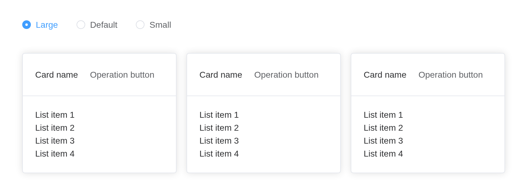
Customized Size
Sometimes built-in sizes could not meet the business needs, we can use custom size (number type) to control the space between items.
The slider sets the space’s size in pixels.
card <- function(i) {
  el_card(
    style = "width: 250px",
    header = tags$div(
      style = "display: flex; justify-content: space-between; align-items: center",
      tags$span("Card name"),
      el_button(label = "Operation button", text = TRUE)
    ),
    lapply(1:4, function(o) tags$div(paste("List item", o)))
  )
}
ui <- el_page(
  el_slider("sp_px", value = 20),
  el_space(id = "sp_px_cards", wrap = TRUE, size = 20, lapply(1:2, card))
)
server <- function(input, output, session) {
  observeEvent(input$sp_px, ignoreInit = TRUE, {
    update_el_space(session, "sp_px_cards", size = input$sp_px)
  })
}
shinyApp(ui, server)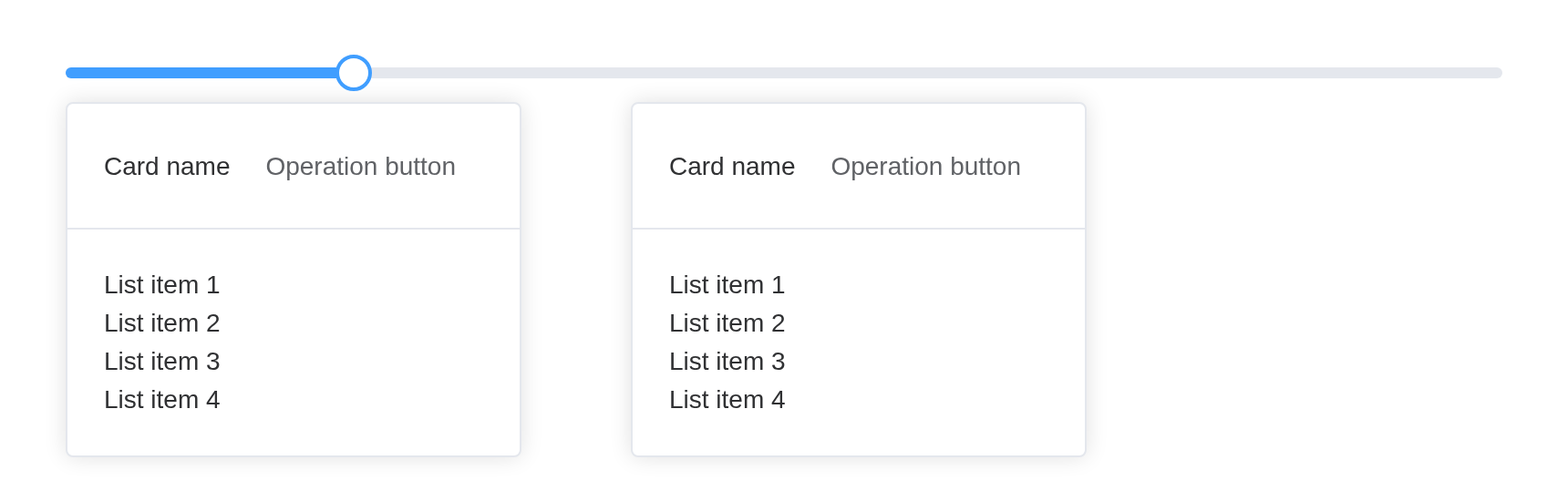
Tip
Do not use
ElSpacewith components that depend on ancestor width (height), e.g.ElSlider, in this case when you drag the trigger button the bar will grow which causes misplacement between cursor and trigger button.
Auto wrapping
When in horizontal mode, using wrap
(bool type) to control auto wrapping behavior.
Using wrap to control line wrap
el_space(
  wrap = TRUE,
  lapply(1:20, function(i) {
    tags$div(el_button(label = "Text button", text = TRUE))
  })
)Literal type spacer
el_space(
  size = 10,
  spacer = "|",
  lapply(1:2, function(i) tags$div(el_button(label = paste("button", i))))
)
Spacer can also be VNode
A spacer can be a VNode too, built in the browser from
JS() code.
el_space(
  size = 10,
  spacer = JS("Vue.h(ElementPlus.ElDivider, { direction: 'vertical' })"),
  lapply(1:2, function(i) tags$div(el_button(label = paste("button", i))))
)
Alignment
Setting this attribute can adjust the alignment of child nodes, the desirable value can be found at align-items.
Using alignment
box <- function(alignment = NULL) {
  tags$div(
    class = "alignment-container",
    el_space(
      alignment = alignment,
      "string",
      el_button(label = "button"),
      el_card(header = "header", "body")
    )
  )
}
tagList(
  tags$style(
    ".alignment-container { width: 240px; margin-bottom: 20px; padding: 8px;
       border: 1px solid var(--el-border-color); }"
  ),
  box(),
  box("flex-start"),
  box("flex-end")
)
Fill the container
Through the fill (Boolean type)
parameter, you can control whether the child node automatically fills
the container.
In the following example, when set to fill, the width of
the child node will automatically adapt to the width of the
container.
Use fill to automatically fill the container with child nodes
The switch sets fill with
update_el_space().
card <- function(i) {
  el_card(
    header = tags$div(
      style = "display: flex; justify-content: space-between; align-items: center",
      tags$span("Card name"),
      el_button(label = "Operation button", text = TRUE)
    ),
    lapply(1:4, function(o) tags$div(paste("List item", o)))
  )
}
ui <- el_page(
  tags$div(
    style = "margin-bottom: 15px",
    "fill: ",
    el_switch("sp_fill_on", value = TRUE)
  ),
  el_space(id = "sp_fill", fill = TRUE, wrap = TRUE, lapply(1:3, card))
)
server <- function(input, output, session) {
  observeEvent(input$sp_fill_on, ignoreInit = TRUE, {
    update_el_space(session, "sp_fill", fill = input$sp_fill_on)
  })
}
shinyApp(ui, server)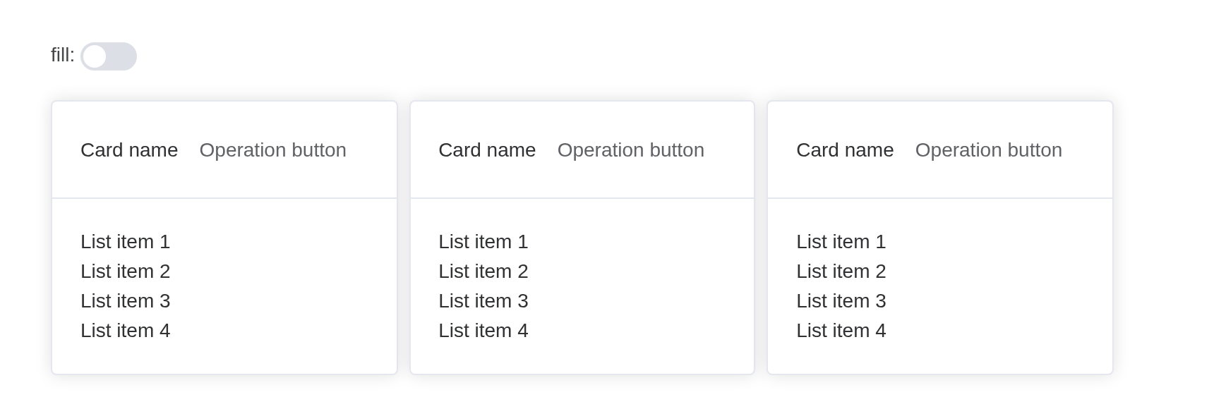
You can also use the fillRatio parameter to customize
the filling ratio. The default value is 100, which
represents filling based on the width of the parent container at
100%.
It should be noted that the expression of horizontal layout and vertical layout is slightly different, the specific effect can be viewed in the following example.
Use fillRatio to customize the fill ratio
The radios set direction, the slider
fill_ratio.
card <- function(i) {
  el_card(
    header = tags$div(
      style = "display: flex; justify-content: space-between; align-items: center",
      tags$span("Card name"),
      el_button(label = "Operation button", text = TRUE)
    ),
    lapply(1:4, function(o) tags$div(paste("List item", o)))
  )
}
ui <- el_page(
  tags$div(
    style = "margin-bottom: 15px",
    "direction: ",
    el_radio_group(
      "sp_dir",
      choices = c("horizontal", "vertical"),
      selected = "horizontal"
    )
  ),
  tags$div(
    style = "margin-bottom: 15px",
    "fillRatio:",
    el_slider("sp_ratio", value = 30)
  ),
  el_space(
    id = "sp_ratio_cards",
    fill = TRUE,
    wrap = TRUE,
    fill_ratio = 30,
    direction = "horizontal",
    width = "100%",
    lapply(1:5, card)
  )
)
server <- function(input, output, session) {
  observeEvent(input$sp_dir, ignoreInit = TRUE, {
    update_el_space(session, "sp_ratio_cards", direction = input$sp_dir)
  })
  observeEvent(input$sp_ratio, ignoreInit = TRUE, {
    update_el_space(session, "sp_ratio_cards", fill_ratio = input$sp_ratio)
  })
}
shinyApp(ui, server)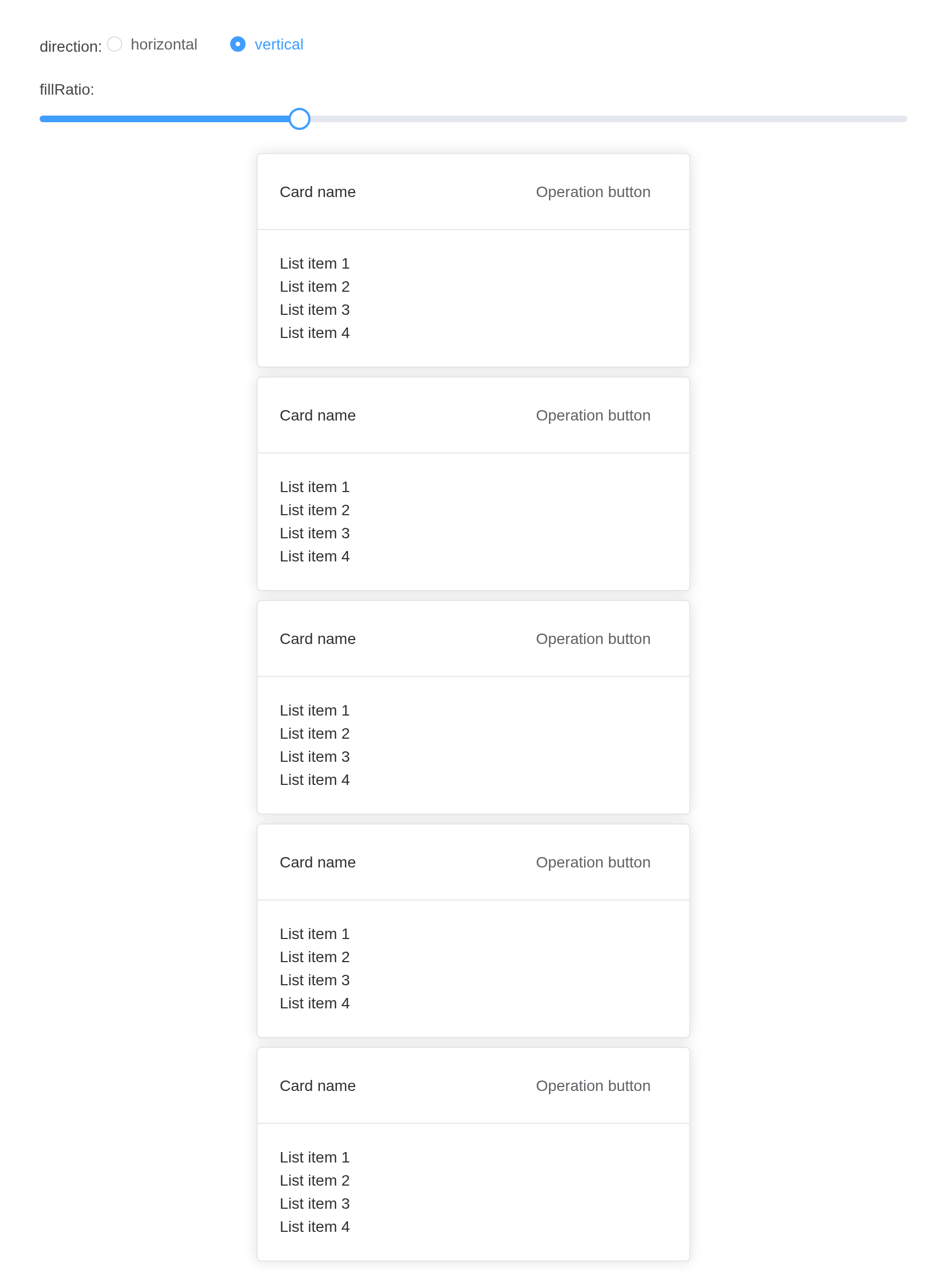
API
Element Plus’s tables, and beside each entry where it is in R.
Attributes
| Element | In R | Description | Type | Accepted | Default |
|---|---|---|---|---|---|
alignment |
alignment |
Controls the alignment of items |
1'center' \\| 'normal' \\| 'stretch' \\| ...
align-items
|
center | |
class |
an HTML attribute of the tag;
tagAppendAttributes()
|
className | 2 / 3 / 4 | — | |
direction |
direction |
Placement direction |
5'vertical' \\| 'horizontal'
|
horizontal | |
prefix-cls |
(internal upstream) |
Prefix for space-items | 6 | — | |
style |
an HTML attribute of the tag;
tagAppendAttributes()
|
Extra style rules |
7 /
8CSSProperties \\| CSSProperties[] \\| string[]
|
— | |
spacer |
spacer |
Spacer | 9 / 10 / 11 | — | |
size |
size |
Spacing size |
12'default' \\| 'small' \\| 'large'
/ 13 /
14[number, number]
|
small | |
wrap |
wrap |
Auto wrapping | 15 | false | |
fill |
fill |
Whether to fill the container | 16 | false | |
fill-ratio |
fill_ratio |
Ratio of fill | 17 | 100 |