Besides the native features of img, support lazy load, custom placeholder and load failure, etc.
Basic Usage
Indicate how the image should be resized to fit its container by
fit, same as native object-fit.
url <- "https://fuss10.elemecdn.com/e/5d/4a731a90594a4af544c0c25941171jpeg.jpeg"
tagList(
  tags$style(
    ".demo-image .block { padding: 30px 0; text-align: center;
       border-right: solid 1px var(--el-border-color); display: inline-block;
       width: 20%; min-width: 100px; box-sizing: border-box; vertical-align: top; }
     .demo-image .block:last-child { border-right: none; }
     .demo-image .demonstration { display: block; margin-bottom: 20px;
       color: var(--el-text-color-secondary); font-size: 14px; }"
  ),
  tags$div(
    class = "demo-image",
    lapply(c("fill", "contain", "cover", "none", "scale-down"), function(f) {
      tags$div(
        class = "block",
        tags$span(class = "demonstration", f),
        el_image(src = url, fit = f, style = "width: 100px; height: 100px")
      )
    })
  )
)Placeholder
Custom placeholder content when image hasn’t loaded yet by
slot = placeholder
src <- "https://cube.elemecdn.com/6/94/4d3ea53c084bad6931a56d5158a48jpeg.jpeg"
tagList(
  tags$style(
    ".demo-image__placeholder .block { padding: 30px 0; text-align: center;
       border-right: solid 1px var(--el-border-color); display: inline-block;
       width: 49%; box-sizing: border-box; vertical-align: top; }
     .demo-image__placeholder .demonstration { display: block; margin-bottom: 20px;
       color: var(--el-text-color-secondary); font-size: 14px; }
     .demo-image__placeholder .el-image { padding: 0 5px; max-width: 300px;
       max-height: 200px; }
     .demo-image__placeholder .image-slot { display: flex; justify-content: center;
       align-items: center; width: 100%; height: 100%;
       background: var(--el-fill-color-light);
       color: var(--el-text-color-secondary); font-size: 14px; }
     .demo-image__placeholder .dot { animation: dot 2s infinite steps(3, start);
       overflow: hidden; }"
  ),
  tags$div(
    class = "demo-image__placeholder",
    tags$div(
      class = "block",
      tags$span(class = "demonstration", "Default"),
      el_image(src = src)
    ),
    tags$div(
      class = "block",
      tags$span(class = "demonstration", "Custom"),
      el_image(
        src = src,
        slots = list(
          placeholder = tags$div(
            class = "image-slot",
            "Loading",
            tags$span(class = "dot", "...")
          )
        )
      )
    )
  )
)Load Failed
Custom failed content when error occurs to image load by
slot = error and slot = viewer-error.
The third image’s preview has a picture that fails to load, drawn by
its viewer-error slot; the button opens the same list in an
el_image_viewer(), with
update_el_image_viewer(visible = TRUE).
url <- "https://fuss10.elemecdn.com/a/3f/3302e58f9a181d2509f3dc0fa68b0jpeg.jpeg"
src_list <- c(url, "https://errorSrc")
viewer_error <- template(
  slot = "viewer-error",
  scope = "{ activeIndex, src }",
  tags$div(
    class = "image-slot viewer-error",
    el_icon("Picture"),
    tags$span(
      "this is viewer-error slot. current index: {{ activeIndex }}. src:",
      "{{ src }}"
    )
  )
)
ui <- el_page(
  tags$style(
    ".demo-image__error .el-image { max-width: 300px; max-height: 200px;
       width: 100%; }
     .demo-image__error .image-slot { display: flex; justify-content: center;
       align-items: center; flex-direction: column; font-size: 30px;
       height: 200px; background: #fff; }
     .demo-image__error .image-slot .el-icon { font-size: 30px; }
     .image-viewer-slot { background: var(--el-fill-color-light); }
     .viewer-error { color: #000; }"
  ),
  tags$div(
    class = "demo-image__error",
    style = "display: flex; gap: 8px",
    el_image(),
    el_image(
      slots = list(
        error = tags$div(
          class = "image-viewer-slot image-slot",
          el_icon("Picture")
        )
      )
    ),
    el_image(
      src = url,
      preview_src_list = src_list,
      show_progress = TRUE,
      slots = list(`viewer-error` = viewer_error)
    ),
    tags$div(el_button("err_open", "preview controlled")),
    el_image_viewer(
      "err_viewer",
      url_list = src_list,
      show_progress = TRUE,
      slots = list(`viewer-error` = viewer_error)
    )
  )
)
server <- function(input, output, session) {
  observeEvent(input$err_open, {
    update_el_image_viewer(session, "err_viewer", visible = TRUE)
  })
}
shinyApp(ui, server)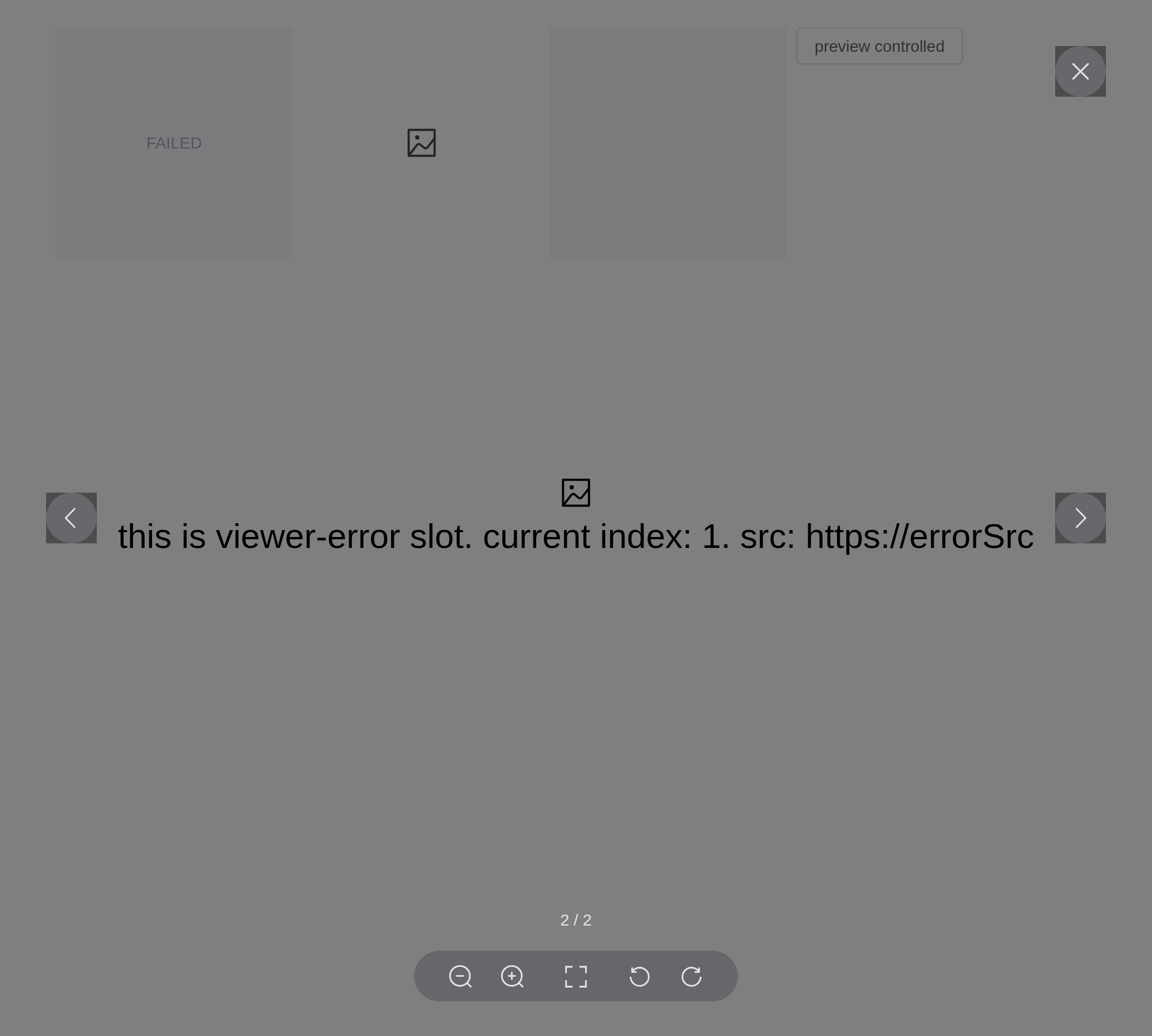
Lazy Load
Tip
Native
loadinghas been supported since 2.2.3, you can useloading = "lazy"to replacelazy = true.If the current browser supports native lazy loading, the native lazy loading will be used first, otherwise will be implemented through scroll.
Use lazy load by lazy = true. Image will load until
scroll into view when set. You can indicate scroll container that adds
scroll listener to by scroll-container. If undefined, will
be the nearest parent container whose overflow property is auto or
scroll.
urls <- paste0(
  "https://fuss10.elemecdn.com/",
  c(
    "a/3f/3302e58f9a181d2509f3dc0fa68b0jpeg.jpeg",
    "1/34/19aa98b1fcb2781c4fba33d850549jpeg.jpeg",
    "0/6f/e35ff375812e6b0020b6b4e8f9583jpeg.jpeg",
    "9/bb/e27858e973f5d7d3904835f46abbdjpeg.jpeg",
    "d/e6/c4d93a3805b3ce3f323f7974e6f78jpeg.jpeg",
    "3/28/bbf893f792f03a54408b3b7a7ebf0jpeg.jpeg",
    "2/11/6535bcfb26e4c79b48ddde44f4b6fjpeg.jpeg"
  )
)
tagList(
  tags$style(
    ".demo-image__lazy { height: 400px; overflow-y: auto; }
     .demo-image__lazy .el-image { display: block; min-height: 200px;
       margin-bottom: 10px; }
     .demo-image__lazy .el-image:last-child { margin-bottom: 0; }"
  ),
  tags$div(
    class = "demo-image__lazy",
    lapply(urls, function(u) el_image(src = u, lazy = TRUE))
  )
)
Image Preview
allow big image preview by setting previewSrcList prop.
You can initialize the position of the first picture previewed by
initial-index. The default initial position is 0.
url <- "https://fuss10.elemecdn.com/a/3f/3302e58f9a181d2509f3dc0fa68b0jpeg.jpeg"
src_list <- paste0(
  "https://fuss10.elemecdn.com/",
  c(
    "a/3f/3302e58f9a181d2509f3dc0fa68b0jpeg.jpeg",
    "1/34/19aa98b1fcb2781c4fba33d850549jpeg.jpeg",
    "0/6f/e35ff375812e6b0020b6b4e8f9583jpeg.jpeg",
    "9/bb/e27858e973f5d7d3904835f46abbdjpeg.jpeg",
    "d/e6/c4d93a3805b3ce3f323f7974e6f78jpeg.jpeg",
    "3/28/bbf893f792f03a54408b3b7a7ebf0jpeg.jpeg",
    "2/11/6535bcfb26e4c79b48ddde44f4b6fjpeg.jpeg"
  )
)
tags$div(
  class = "demo-image__preview",
  el_image(
    src = url,
    zoom_rate = 1.2,
    max_scale = 7,
    min_scale = 0.2,
    preview_src_list = src_list,
    show_progress = TRUE,
    initial_index = 4,
    fit = "cover",
    style = "width: 100px; height: 100px"
  )
)
Manually Open Preview
The first button opens the image’s preview from the server with
call_el(session, "pic", "showPreview"); the second opens an
el_image_viewer(), the viewer alone, with
update_el_image_viewer(visible = TRUE).
url <- "https://fuss10.elemecdn.com/a/3f/3302e58f9a181d2509f3dc0fa68b0jpeg.jpeg"
src_list <- paste0(
  "https://fuss10.elemecdn.com/",
  c(
    "a/3f/3302e58f9a181d2509f3dc0fa68b0jpeg.jpeg",
    "1/34/19aa98b1fcb2781c4fba33d850549jpeg.jpeg",
    "0/6f/e35ff375812e6b0020b6b4e8f9583jpeg.jpeg",
    "9/bb/e27858e973f5d7d3904835f46abbdjpeg.jpeg",
    "d/e6/c4d93a3805b3ce3f323f7974e6f78jpeg.jpeg",
    "3/28/bbf893f792f03a54408b3b7a7ebf0jpeg.jpeg",
    "2/11/6535bcfb26e4c79b48ddde44f4b6fjpeg.jpeg"
  )
)
ui <- el_page(
  tags$div(
    style = "display: flex; gap: 48px",
    tags$div(
      style = "display: grid; gap: 12px",
      el_button("pic_open", "openPreview with showPreview method"),
      el_image(
        "pic",
        src = url,
        show_progress = TRUE,
        preview_src_list = src_list,
        fit = "cover",
        style = "width: 100px; height: 100px"
      )
    ),
    tags$div(
      el_button("viewer_open", "preview controlled"),
      el_image_viewer(
        "viewer",
        url_list = src_list,
        show_progress = TRUE,
        initial_index = 4
      )
    )
  )
)
server <- function(input, output, session) {
  observeEvent(input$pic_open, call_el(session, "pic", "showPreview"))
  observeEvent(input$viewer_open, {
    update_el_image_viewer(session, "viewer", visible = TRUE)
  })
}
shinyApp(ui, server)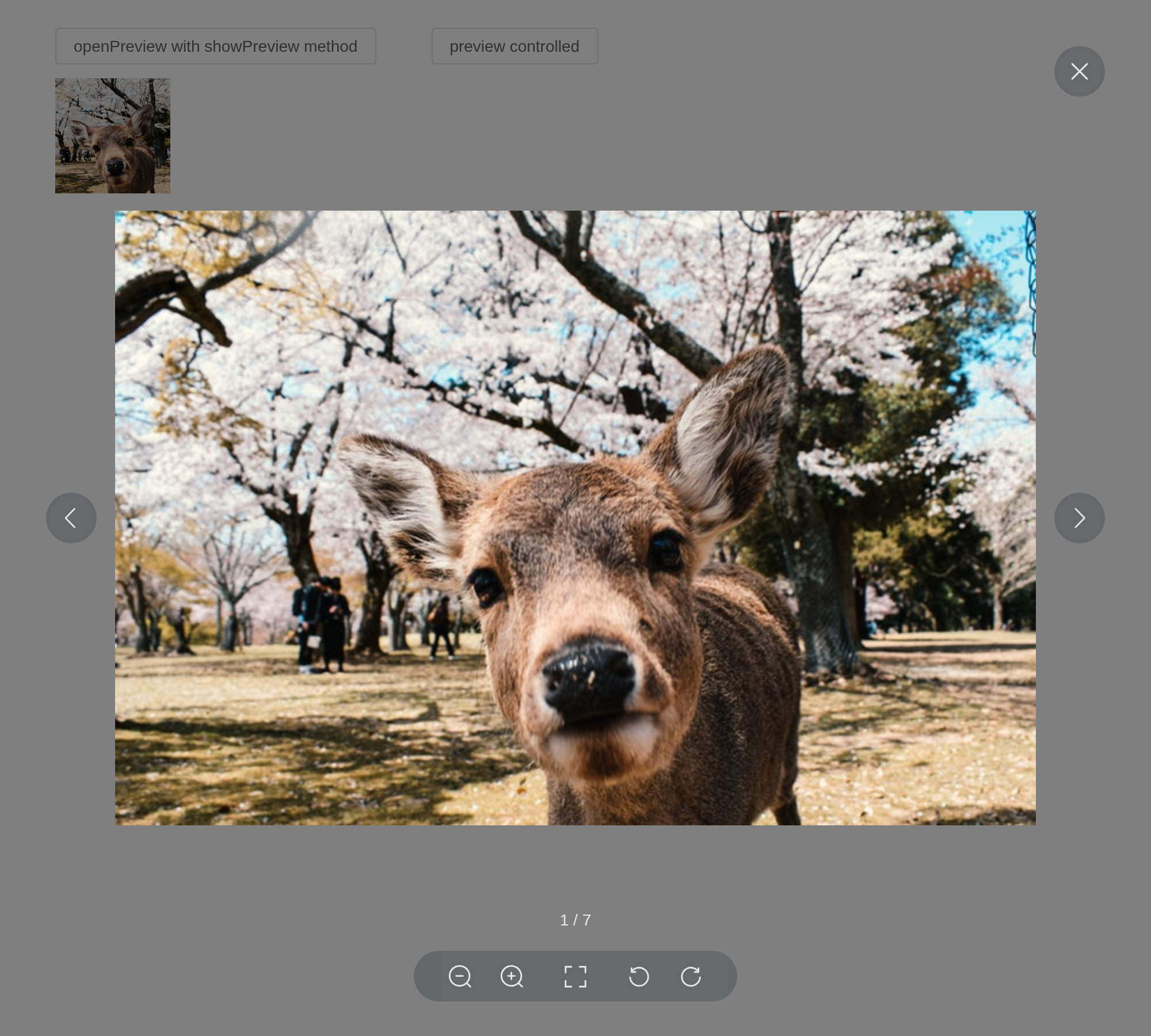
Custom Toolbar
Custom toolbar content by toolbar slot, starting from
version 2.9.7, the slot has a new setActiveItem function,
which can be switched according to the index.
The toolbar slot’s scope has the viewer’s actions; the
download link reads the image’s own previewSrcList.
url <- "https://fuss10.elemecdn.com/a/3f/3302e58f9a181d2509f3dc0fa68b0jpeg.jpeg"
src_list <- paste0(
  "https://fuss10.elemecdn.com/",
  c(
    "a/3f/3302e58f9a181d2509f3dc0fa68b0jpeg.jpeg",
    "1/34/19aa98b1fcb2781c4fba33d850549jpeg.jpeg",
    "0/6f/e35ff375812e6b0020b6b4e8f9583jpeg.jpeg",
    "9/bb/e27858e973f5d7d3904835f46abbdjpeg.jpeg",
    "d/e6/c4d93a3805b3ce3f323f7974e6f78jpeg.jpeg",
    "3/28/bbf893f792f03a54408b3b7a7ebf0jpeg.jpeg",
    "2/11/6535bcfb26e4c79b48ddde44f4b6fjpeg.jpeg"
  )
)
tags$div(
  class = "demo-image__custom-toolbar",
  el_image(
    src = url,
    preview_src_list = src_list,
    fit = "cover",
    show_progress = TRUE,
    style = "width: 100px; height: 100px",
    slots = list(
      toolbar = template(
        slot = "toolbar",
        scope = "{ actions, prev, next, reset, activeIndex, setActiveItem }",
        htmltools::HTML(paste0(
          "<el-icon @click=\"prev\"><Back /></el-icon>",
          "<el-icon @click=\"next\"><Right /></el-icon>",
          "<el-icon @click=\"setActiveItem(previewSrcList.length - 1)\">",
          "<DArrowRight /></el-icon>",
          "<el-icon @click=\"actions('zoomOut')\"><ZoomOut /></el-icon>",
          "<el-icon @click=\"actions('zoomIn', { enableTransition: false, zoomRate: 2 })\">",
          "<ZoomIn /></el-icon>",
          "<el-icon @click=\"actions('clockwise', { rotateDeg: 180, enableTransition: false })\">",
          "<RefreshRight /></el-icon>",
          "<el-icon @click=\"actions('anticlockwise')\"><RefreshLeft /></el-icon>",
          "<el-icon @click=\"reset\"><Refresh /></el-icon>",
          "<a :href=\"previewSrcList[activeIndex]\" download target=\"_blank\" ",
          "style=\"color: inherit; display: flex\">",
          "<el-icon><Download /></el-icon></a>"
        ))
      )
    )
  )
)
Custom progress
By setting the show-progress prop to control whether to
display progress when previewing an image. After version 2.9.8, the
progress content will be displayed as long as the progress
slot is used.
url <- "https://fuss10.elemecdn.com/a/3f/3302e58f9a181d2509f3dc0fa68b0jpeg.jpeg"
src_list <- paste0(
  "https://fuss10.elemecdn.com/",
  c(
    "a/3f/3302e58f9a181d2509f3dc0fa68b0jpeg.jpeg",
    "1/34/19aa98b1fcb2781c4fba33d850549jpeg.jpeg",
    "0/6f/e35ff375812e6b0020b6b4e8f9583jpeg.jpeg",
    "9/bb/e27858e973f5d7d3904835f46abbdjpeg.jpeg",
    "d/e6/c4d93a3805b3ce3f323f7974e6f78jpeg.jpeg",
    "3/28/bbf893f792f03a54408b3b7a7ebf0jpeg.jpeg",
    "2/11/6535bcfb26e4c79b48ddde44f4b6fjpeg.jpeg"
  )
)
tags$div(
  class = "demo-image__custom-progress",
  el_image(
    src = url,
    preview_src_list = src_list,
    fit = "cover",
    style = "width: 100px; height: 100px",
    slots = list(
      progress = template(
        slot = "progress",
        scope = "{ activeIndex, total }",
        htmltools::HTML("<span>{{ activeIndex + 1 + '-' + total }}</span>")
      )
    )
  )
)
API
Element Plus’s tables, and beside each entry where it is in R.
Image Attributes
| Element | In R | Description | Type | Accepted | Default |
|---|---|---|---|---|---|
src |
el_image(src =) |
image source, same as native. | 1 | ’’ | |
fit |
el_image(fit =) |
indicate how the image should be resized to fit its container, same as object-fit. |
2'' \\| 'fill' \\| 'contain' \\| 'cover' \\| 'none' \\| 'scale-down'
|
’’ | |
hide-on-click-modal |
el_image(hide_on_click_modal =) |
when enabling preview, use this flag to control whether clicking on backdrop can exit preview mode. | 3 | false | |
loading |
el_image(loading =) |
Indicates how the browser should load the image, same as native. |
4'eager' \\| 'lazy'
|
— | |
lazy |
el_image(lazy =) |
whether to use lazy load. | 5 | false | |
scroll-container |
el_image(scroll_container =) |
the container to add scroll listener when using lazy load. By default, the container to add scroll listener when using lazy load. |
6 /
7HTMLElement
|
— | |
alt |
el_image(alt =) |
native attribute alt. |
8 | — | |
referrerpolicy |
el_image(referrerpolicy =) |
native attribute referrerPolicy. | 9 | — | |
crossorigin |
el_image(crossorigin =) |
native attribute crossorigin. |
10'' \\| 'anonymous' \\| 'use-credentials'
|
— | |
preview-src-list |
el_image(preview_src_list =) |
allow big image preview. |
11string[]
|
[] | |
z-index |
el_image(z_index =) |
set image preview z-index. | 12 | — | |
initial-index |
el_image(initial_index =) |
initial preview image index, less than the length of
url-list. |
13 | 0 | |
close-on-press-escape |
el_image(close_on_press_escape =) |
whether the image-viewer can be closed by pressing ESC. | 14 | true | |
preview-teleported |
el_image(preview_teleported =) |
whether to append image-viewer to body. A nested parent element
attribute transform should have this attribute set to
true. |
15 | false | |
infinite |
el_image(infinite =) |
whether the viewer preview is infinite. | 16 | true | |
zoom-rate |
el_image(zoom_rate =) |
the zoom rate of the image viewer zoom event. | 17 | 1.2 | |
scale |
el_image(scale =) |
the preview image scale. | 18 | 1 | |
min-scale |
el_image(min_scale =) |
the min scale of the image viewer zoom event. | 19 | 0.2 | |
max-scale |
el_image(max_scale =) |
the max scale of the image viewer zoom event. | 20 | 7 | |
show-progress |
el_image(show_progress =) |
whether to display the preview image progress content. | 21 | false |
Image Events
| Element | In R | Description |
|---|---|---|
load |
input$<id>_load |
same as native load. |
error |
input$<id>_error |
same as native error. |
switch |
input$<id>_switch |
trigger when switching images. |
close |
input$<id>_close |
trigger when clicking on close button or when
hide-on-click-modal enabled clicking on backdrop. |
show |
input$<id>_show |
trigger when the viewer displays |
Image Slots
| Element | In R | Description |
|---|---|---|
placeholder |
slots = list(placeholder = ) |
custom placeholder content when image hasn’t loaded yet. |
error |
slots = list(error = ) |
custom image load failed content. |
viewer |
slots = list(viewer = ) |
custom content when image preview. |
Image Exposes
| Element | In R | Description |
|---|---|---|
showPreview |
call_el(session, id, "showPreview") |
manually open preview big image |
Image Viewer Attributes
| Element | In R | Description | Type | Accepted | Default |
|---|---|---|---|---|---|
url-list |
el_image_viewer(url_list =) |
preview link list. |
22string[]
|
[] | |
z-index |
el_image(z_index =) |
preview backdrop z-index. | 23 / 24 | — | |
initial-index |
el_image(initial_index =) |
the initial preview image index, less than or equal to the length of
url-list. |
25 | 0 | |
infinite |
el_image(infinite =) |
whether preview is infinite. | 26 | true | |
hide-on-click-modal |
el_image(hide_on_click_modal =) |
whether user can emit close event when clicking backdrop. | 27 | false | |
teleported |
el_image_viewer(teleported =) |
whether to append image itself to body. A nested parent element
attribute transform should have this attribute set to
true. |
28 | false | |
zoom-rate |
el_image(zoom_rate =) |
the zoom rate of the image viewer zoom event. | 29 | 1.2 | |
scale |
el_image(scale =) |
the preview image scale. | 30 | 1 | |
min-scale |
el_image(min_scale =) |
the min scale of the image viewer zoom event. | 31 | 0.2 | |
max-scale |
el_image(max_scale =) |
the max scale of the image viewer zoom event. | 32 | 7 | |
close-on-press-escape |
el_image(close_on_press_escape =) |
whether the image-viewer can be closed by pressing ESC. | 33 | true | |
show-progress |
el_image(show_progress =) |
whether to display the preview image progress content | 34 | false |
Image Viewer Events
| Element | In R | Description |
|---|---|---|
close |
input$<id>_close |
trigger when clicking on close button or when
hide-on-click-modal enabled clicking on backdrop. |
error |
input$<id>_error |
same as native error. |
switch |
input$<id>_switch |
trigger when switching images. |
rotate |
input$<id>_rotate |
trigger when rotating images. |
Image Viewer Slots
| Element | In R | Description |
|---|---|---|
default |
default content | custom content |
progress |
slots = list(progress = ) |
custom progress content (Priority is higher than
show-progress prop) |
toolbar |
slots = list(toolbar = ) |
custom toolbar content |
viewer-error |
slots = list(viewer-error = ) |
custom image load failed content. |