Used to show feedback after an activity. The difference with Notification is that the latter is often used to show a system level passive notification.
Basic usage
Displays at the top by default, and disappears after 3 seconds. You
can control the position using the placement property.
The setup of Message is very similar to notification, so parts of the
options won’t be explained in detail here. You can check the options
table below combined with notification doc to understand it. Element
Plus has registered a $message method for invoking. Message
can take a string or a VNode as parameter, and it will be shown as the
main body.
Messages are sent from the server,
el_message(session, ...).
ui <- el_page(el_button("show", "Show message", plain = TRUE))
server <- function(input, output, session) {
  observeEvent(input$show, el_message(session, "This is a message."))
}
shinyApp(ui, server)
Types
Used to show the feedback of Primary, Success, Warning, Info and Error activities.
When you need more customizations, Message component can also take an
object as parameter. For example, setting value of type can
define different types, and its default is info. In such
cases the main body is passed in as the value of message.
Also, we have registered methods for different types, so you can
directly call it without passing a type like open4.
primary has been added in 2.9.11.
types <- c("primary", "success", "warning", "info", "error")
ui <- el_page(lapply(types, function(t) {
  el_button(paste0("m_", t), tools::toTitleCase(t), plain = TRUE)
}))
server <- function(input, output, session) {
  for (t in types) {
    local({
      t <- t
      observeEvent(
        input[[paste0("m_", t)]],
        el_message(
          session,
          paste("Congrats, this is a", t, "message."),
          type = t
        )
      )
    })
  }
}
shinyApp(ui, server)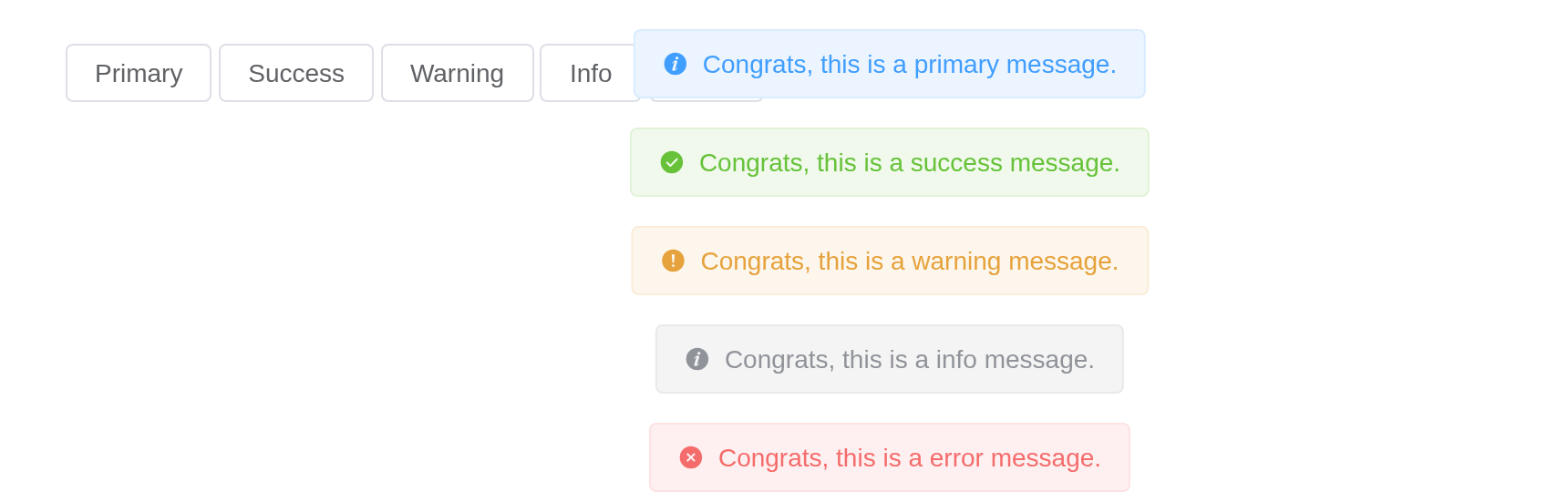
Plain
Set plain to have a plain background.
ui <- el_page(el_button("show", "Success", plain = TRUE))
server <- function(input, output, session) {
  observeEvent(
    input$show,
    el_message(
      session,
      "Congrats, this is a success message.",
      type = "success",
      plain = TRUE
    )
  )
}
shinyApp(ui, server)
Closable
A close button can be added.
A default Message cannot be closed manually. If you need a closable
message, you can set showClose field. Besides, same as
notification, message has a controllable duration. Default
duration is 3000 ms, and it won’t disappear when set to
0.
ui <- el_page(el_button("show", "Message", plain = TRUE))
server <- function(input, output, session) {
  observeEvent(
    input$show,
    el_message(session, "This is a message.", show_close = TRUE, duration = 0)
  )
}
shinyApp(ui, server)
Use HTML string
message supports HTML string.
Set dangerouslyUseHTMLString to true and
message will be treated as an HTML string.
ui <- el_page(el_button("show", "Use HTML String", plain = TRUE))
server <- function(input, output, session) {
  observeEvent(
    input$show,
    el_message(
      session,
      "<strong>This is <i>HTML</i> string</strong>",
      dangerously_use_html_string = TRUE
    )
  )
}
shinyApp(ui, server)
Warning
Although
messageproperty supports HTML strings, dynamically rendering arbitrary HTML on your website can be very dangerous because it can easily lead to XSS attacks. So whendangerouslyUseHTMLStringis on, please make sure the content ofmessageis trusted, and never assignmessageto user-provided content.
Grouping
merge messages with the same content.
Set grouping to true and the same content of
message will be merged.
ui <- el_page(el_button("show", "Show grouping message", plain = TRUE))
server <- function(input, output, session) {
  observeEvent(
    input$show,
    el_message(session, "This is a message", grouping = TRUE, type = "success")
  )
}
shinyApp(ui, server)
Placement
Control the position where messages appear. Messages can be displayed at the top (default) or other placements of the viewport.
ui <- el_page(el_button("show", "Bottom", plain = TRUE))
server <- function(input, output, session) {
  observeEvent(
    input$show,
    el_message(session, "This is a message at the bottom", placement = "bottom")
  )
}
shinyApp(ui, server)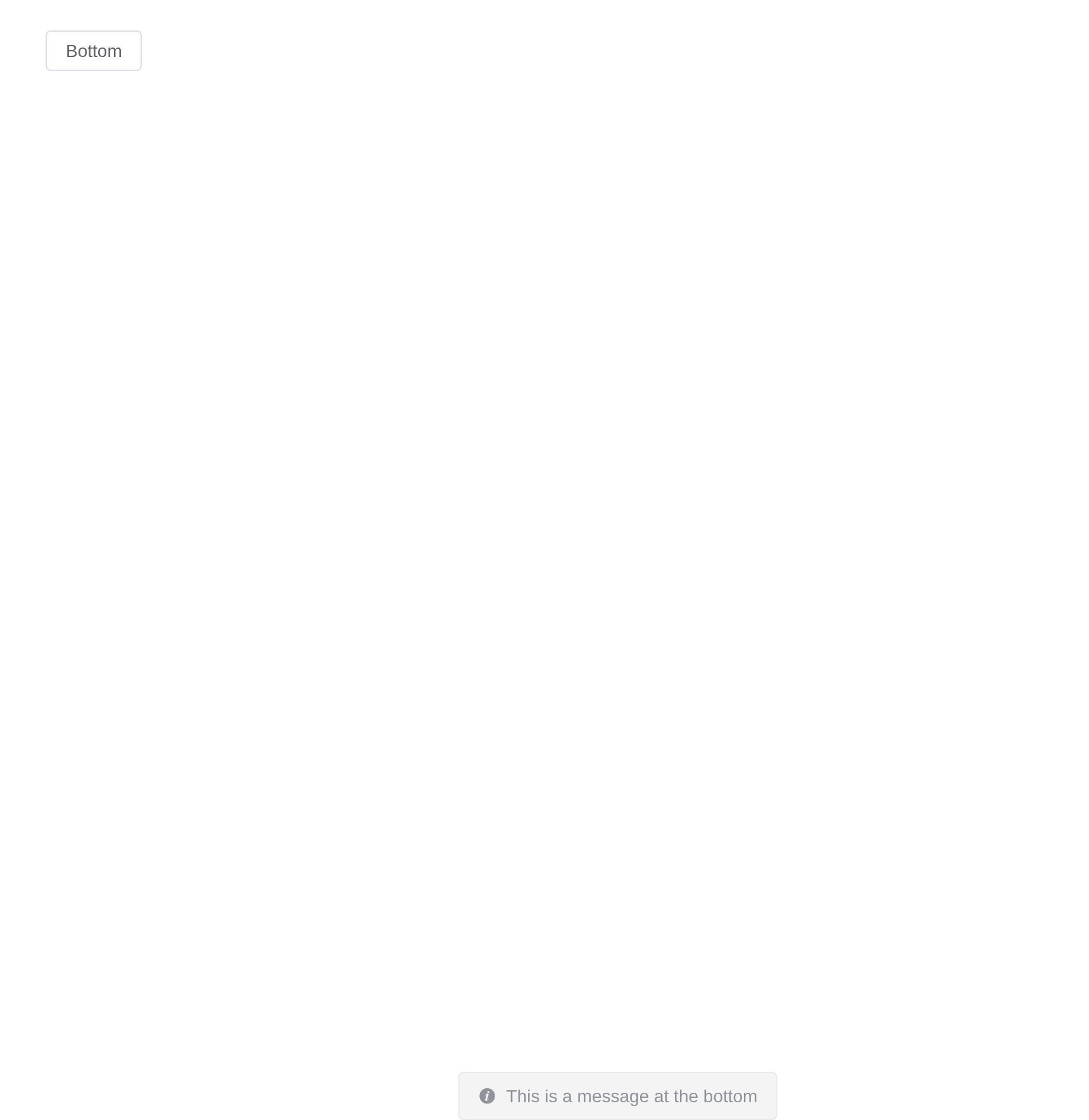
Global method
Element Plus has added a global method $message for
app.config.globalProperties. So in a vue instance you can
call Message like what we did in this page.
Local import
In this case you should call ElMessage(options). We have
also registered methods for different types,
e.g. ElMessage.success(options). You can call
ElMessage.closeAll() to manually close all the
instances.
App context inheritance
Now message accepts a context as second parameter of the
message constructor which allows you to inject current app’s context to
message which allows you to inherit all the properties of the app.
You can use it like this:
Tip
If you globally registered ElMessage component, it will automatically inherit your app context.
API
Element Plus’s tables, and beside each entry where it is in R.
Options
| Element | In R | Description | Type | Accepted | Default |
|---|---|---|---|---|---|
message |
message |
message text |
1 /
2 / 3() => VNode
|
’’ | |
type |
type |
message type |
4'primary' (2.9.11) \\| 'success' \\| 'warning' \\| 'info' \\| 'error'
|
info | |
plain |
plain |
whether message is plain | 5 | false | |
icon |
icon |
custom icon component, overrides type
|
6 / 7 | — | |
dangerouslyUseHTMLString |
dangerously_use_html_string |
whether message is treated as HTML string |
8 | false | |
customClass |
custom_class |
custom class name for Message | 9 | ’’ | |
duration |
duration |
display duration, millisecond. If set to 0, it will not turn off automatically | 10 | 3000 | |
showClose |
show_close |
whether to show a close button | 11 | false | |
onClose |
(JS only; Shiny hears through the id) |
callback function when closed with the message instance as the parameter |
12() => void
|
— | |
offset |
offset |
set the distance to the viewport edge (top when placement is ‘top’, bottom when placement is ‘bottom’) | 13 | 16 | |
placement |
placement |
message placement position |
14'top' \\| 'top-left' \\| 'top-right' \\| 'bottom' \\| 'bottom-left' \\| 'bottom-right'
|
top | |
appendTo |
append_to |
set the root element for the message, default to
document.body
|
15 / 16 | — | |
grouping |
grouping |
merge messages with the same content, type of VNode message is not supported | 17 | false | |
repeatNum |
repeat_num |
The number of repetitions, similar to badge, is used as the initial
number when used with grouping
|
18 | 1 |