Tree view with blazing fast scrolling performance for any amount of data
Basic usage
Basic tree structure.
Nodes are list(id =, label =, children =); only those in
view are drawn, so ten thousand cost little.
make_nodes <- function(depth, prefix = "") {
  lapply(1:10, function(i) {
    key <- paste0(prefix, i)
    node <- list(id = key, label = paste("Node", key))
    if (depth > 1) {
      node$children <- make_nodes(depth - 1, paste0(key, "-"))
    }
    node
  })
}
el_tree_v2("tv2_basic", data = make_nodes(3), height = 208)
Selectable
Used for node selection.
make_nodes <- function(depth, prefix = "") {
  lapply(1:10, function(i) {
    key <- paste0(prefix, i)
    node <- list(id = key, label = paste("Node", key))
    if (depth > 1) {
      node$children <- make_nodes(depth - 1, paste0(key, "-"))
    }
    node
  })
}
el_tree_v2("tv2_sel", data = make_nodes(3), show_checkbox = TRUE, height = 208)
Warning
When using show-checkbox, since
check-on-click-leafis true by default, last tree children’s can be checked by clicking their nodes.
Disabled checkbox
The checkbox of a node can be set as disabled.
In the example, disabled property is declared in
defaultProps, and some nodes are set as disabled: true. The
corresponding checkboxes are disabled and can’t be clicked.
nodes <- list(
  list(
    id = "1",
    label = "Level one 1",
    children = list(
      list(id = "1-1", label = "Level two 1-1", disabled = TRUE),
      list(id = "1-2", label = "Level two 1-2")
    )
  ),
  list(id = "2", label = "Level one 2", disabled = TRUE)
)
el_tree_v2(
  "tv2_dis",
  data = nodes,
  show_checkbox = TRUE,
  default_expanded_keys = "1",
  height = 208
)
Default expanded and default checked
Tree nodes can be initially expanded or checked
Use default-expanded-keys and
default-checked-keys to set initially expanded and
initially checked nodes respectively.
make_nodes <- function(depth, prefix = "") {
  lapply(1:10, function(i) {
    key <- paste0(prefix, i)
    node <- list(id = key, label = paste("Node", key))
    if (depth > 1) {
      node$children <- make_nodes(depth - 1, paste0(key, "-"))
    }
    node
  })
}
el_tree_v2(
  "tv2_def",
  data = make_nodes(3),
  show_checkbox = TRUE,
  height = 208,
  default_expanded_keys = c("1", "1-1"),
  default_checked_keys = c("1-1-1", "1-1-2")
)
Custom node content
The content of tree nodes can be customized, so you can add icons or buttons as you will
The default slot, scoped with node, draws each node: an
icon by its state, and a prefix coloured by whether it is a leaf.
make_nodes <- function(depth, key = "node") {
  lapply(seq_len(if (depth == 1) 10 else 4), function(i) {
    id <- paste0(key, "-", i)
    node <- list(id = id, label = id)
    if (depth < 3) {
      node$children <- make_nodes(depth + 1, id)
    }
    node
  })
}
tagList(
  tags$style(
    ".prefix { color: var(--el-color-primary); margin-right: 10px; }
     .prefix.is-leaf { color: var(--el-color-success); }"
  ),
  el_tree_v2(
    "tv2_cus",
    data = make_nodes(1),
    props = list(value = "id", label = "label", children = "children"),
    height = 200,
    width = "600px",
    slots = list(
      default = template(
        scope = "{ node }",
        htmltools::HTML(paste0(
          "<el-icon class=\"el-icon--left\"><Document v-if=\"node.isLeaf\" />",
          "<Folder v-else-if=\"!node.expanded\" /><FolderOpened v-else /></el-icon>",
          "<span class=\"prefix\" :class=\"{ 'is-leaf': node.isLeaf }\">[ElementPlus]</span>",
          "<span>{{ node.label }}</span>"
        ))
      )
    )
  )
)
Custom node class
The class of tree nodes can be customized
props = list(class =) gives each node a class of its
own, from a JS() function of its data.
nodes <- list(
  list(
    id = "1",
    label = "Level one 1",
    children = list(list(
      id = 4,
      label = "Level two 1-1",
      isPenultimate = TRUE,
      children = list(
        list(id = 9, label = "Level three 1-1-1"),
        list(id = 10, label = "Level three 1-1-2")
      )
    ))
  ),
  list(
    id = 2,
    label = "Level one 2",
    children = list(
      list(
        id = 5,
        label = "Level two 2-1",
        isPenultimate = TRUE,
        children = list(
          list(id = 11, label = "Level three 2-1-1"),
          list(id = 12, label = "Level three 2-1-2")
        )
      ),
      list(id = 6, label = "Level two 2-2")
    )
  )
)
tagList(
  el_tree_v2(
    "tv2_classed",
    data = nodes,
    show_checkbox = TRUE,
    expand_on_click_node = FALSE,
    height = 208,
    default_expanded_keys = c("1", "2"),
    props = list(
      value = "id",
      label = "label",
      children = "children",
      class = JS(
        "function(data) { return data.isPenultimate ? 'is-penultimate' : ''; }"
      )
    )
  ),
  tags$style(".is-penultimate .el-tree-node__label { color: #626aef; }")
)
Custom node icon
You can customize icons for different node states. Tree nodes expose
the expanded property and isLeaf property,
allowing you to dynamically render different icons based on the node’s
state: leaf nodes, expanded nodes, or collapsed nodes.
The default slot, scoped with node, draws each node’s
icon by its state: a folder, open or shut, or a document for a leaf.
make_nodes <- function(depth, key = "node") {
  lapply(seq_len(if (depth == 1) 10 else 4), function(i) {
    id <- paste0(key, "-", i)
    node <- list(id = id, label = id)
    if (depth < 3) {
      node$children <- make_nodes(depth + 1, id)
    }
    node
  })
}
tagList(
  tags$style(
    ".node-icon { margin-right: 5px; color: var(--el-color-warning); }"
  ),
  el_tree_v2(
    "tv2_icon",
    data = make_nodes(1),
    props = list(value = "id", label = "label", children = "children"),
    height = 200,
    width = "600px",
    slots = list(
      default = template(
        scope = "{ node }",
        htmltools::HTML(paste0(
          "<el-icon class=\"node-icon\" :class=\"{ 'is-leaf': node.isLeaf }\">",
          "<Document v-if=\"node.isLeaf\" /><Folder v-else-if=\"!node.expanded\" />",
          "<FolderOpened v-else /></el-icon><span>{{ node.label }}</span>"
        ))
      )
    )
  )
)
Tree node filtering
The filter-method method can only accept the third
parameter after version 2.9.1. Tree nodes can be
filtered
Invoke the filter method of the Tree instance to filter
tree nodes. Its parameter is the filtering keyword. Note that for it to
work, filter-method is required, and its value is the
filtering method.
filter(), run with call_el(), keeps the
nodes filter_method passes.
make_nodes <- function(depth, prefix = "") {
  lapply(1:10, function(i) {
    key <- paste0(prefix, i)
    node <- list(id = key, label = paste("Node", key))
    if (depth > 1) {
      node$children <- make_nodes(depth - 1, paste0(key, "-"))
    }
    node
  })
}

ui <- el_page(
  el_input("q", placeholder = "Please enter keyword", width = "240px"),
  el_tree_v2(
    "tv2_filter",
    data = make_nodes(3),
    height = 208,
    filter_method = JS(
      "function(query, node) { return node.label.includes(query); }"
    )
  )
)

server <- function(input, output, session) {
  observeEvent(
    input$q,
    call_el(session, "tv2_filter", "filter", list(input$q), result = FALSE)
  )
}

shinyApp(ui, server)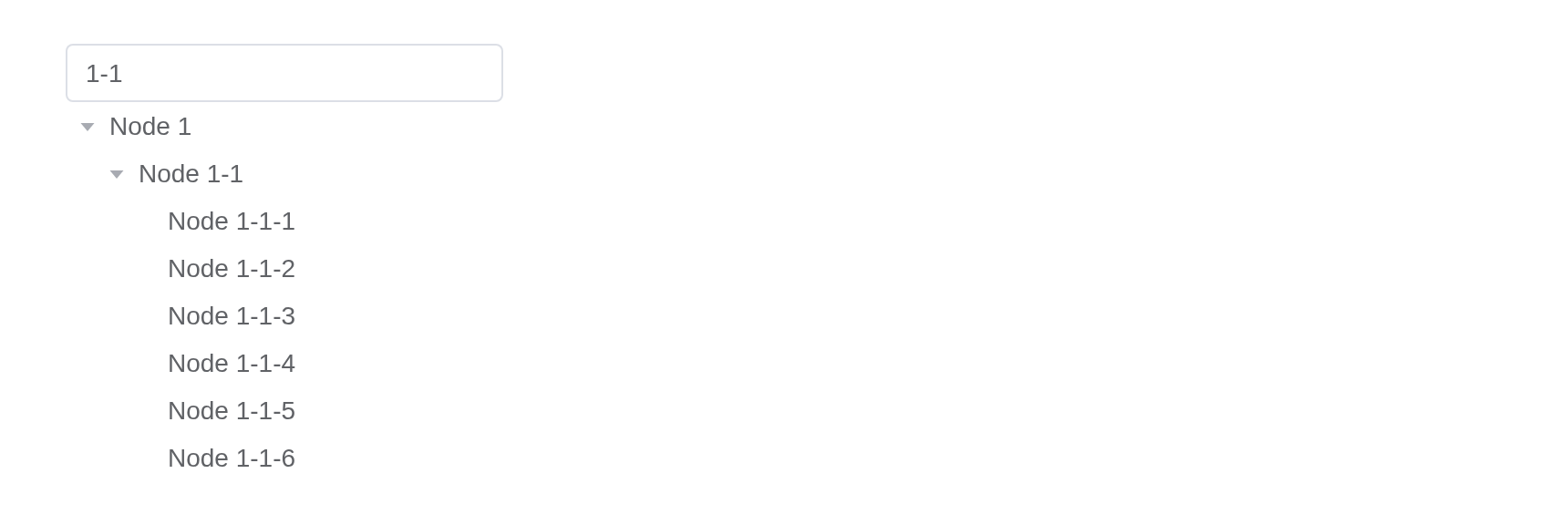
API
Element Plus’s tables, and beside each entry where it is in R.
TreeV2 Attributes
| Element | In R | Description | Type | Accepted | Default |
|---|---|---|---|---|---|
data |
data |
tree data |
1Array<{[key: string]: any}>
|
— | |
empty-text |
empty_text |
text displayed when data is void | 2 | — | |
props |
props |
configuration options, see the following table | 3 | — | |
highlight-current |
highlight_current |
whether current node is highlighted | 4 | false | |
expand-on-click-node |
expand_on_click_node |
whether to expand or collapse node when clicking on the node, if false, then expand or collapse node only when clicking on the arrow icon. | 5 | true | |
check-on-click-node |
check_on_click_node |
whether to check or uncheck node when clicking on the node, if false, the node can only be checked or unchecked by clicking on the checkbox. | 6 | false | |
check-on-click-leaf |
check_on_click_leaf |
whether to check or uncheck node when clicking on leaf node (last children). | 7 | true | |
default-expanded-keys |
default_expanded_keys |
array of keys of initially expanded nodes |
8Array<string \\| number>
|
— | |
show-checkbox |
show_checkbox |
whether node is selectable | 9 | false | |
check-strictly |
check_strictly |
whether checked state of a node not affects its father and child
nodes when show-checkbox is true
|
10 | false | |
default-checked-keys |
default_checked_keys |
array of keys of initially checked nodes |
11Array<string \\| number>
|
— | |
current-node-key |
current_node_key |
key of initially selected node | 12 / 13 | — | |
filter-method |
filter_method |
this function will be executed on each node when use filter method.
if return false, tree node will be hidden. |
14(query: string, data: TreeNodeData, node: TreeNode) => boolean
|
— | |
indent |
indent |
horizontal indentation of nodes in adjacent levels in pixels | 15 | 16 | |
icon |
icon |
custom tree node icon component | 16 / 17 | — | |
item-size |
item_size |
custom tree node height | 18 | 26 | |
scrollbar-always-on |
scrollbar_always_on |
always show scrollbar | 19 | false | |
height |
height |
height of the tree | 20 | 200 |
TreeV2 Exposes
| Element | In R | Description |
|---|---|---|
filter |
call_el(session, id, "filter") |
filter all tree nodes, filtered nodes will be hidden |
getCheckedNodes |
call_el(session, id, "getCheckedNodes") |
If the node can be selected (show-checkbox is
true), it returns the currently selected array of
nodes |
getCheckedKeys |
call_el(session, id, "getCheckedKeys") |
If the node can be selected (show-checkbox is
true), it returns the currently selected array of node’s
keys |
setCheckedKeys |
call_el(session, id, "setCheckedKeys") |
set certain nodes to be checked |
setChecked |
call_el(session, id, "setChecked") |
set node to be checked or not, deep (added in
^(2.14.0)) indicates whether child nodes should be recursively
checked/unchecked. |
setExpandedKeys |
call_el(session, id, "setExpandedKeys") |
set certain nodes to be expanded |
getHalfCheckedNodes |
call_el(session, id, "getHalfCheckedNodes") |
If the node can be selected (show-checkbox is
true), it returns the currently half selected array of
nodes |
getHalfCheckedKeys |
call_el(session, id, "getHalfCheckedKeys") |
If the node can be selected (show-checkbox is
true), it returns the currently half selected array of
node’s keys |
getCurrentKey |
call_el(session, id, "getCurrentKey") |
return the highlight node’s key (undefined if no node is highlighted) |
getCurrentNode |
call_el(session, id, "getCurrentNode") |
return the highlight node’s data (undefined if no node is highlighted) |
setCurrentKey |
call_el(session, id, "setCurrentKey") |
set highlighted node by key |
getNode |
call_el(session, id, "getNode") |
get node by key or data |
expandNode |
call_el(session, id, "expandNode") |
expand specified node |
collapseNode |
call_el(session, id, "collapseNode") |
collapse specified node |
setData |
call_el(session, id, "setData") |
When the data is very large, using reactive data will cause the poor performance, so we provide a way to avoid this situation |
scrollTo |
call_el(session, id, "scrollTo") |
scroll to a given position |
scrollToNode |
call_el(session, id, "scrollToNode") |
scroll to a given tree key with specified scroll strategy |
TreeV2 Events
| Element | In R | Description |
|---|---|---|
node-click |
input$<id>_node_click |
triggers when a node is clicked |
node-drop |
input$<id>_node_drop |
triggers when drag something and drop on a node |
node-contextmenu |
input$<id>_node_contextmenu |
triggers when a node is clicked by right button |
check-change |
input$<id>_check_change |
triggers when the selected state of the node changes |
check |
input$<id>_check |
triggers after clicking the checkbox of a node |
current-change |
input$<id>_current_change |
triggers when current node changes |
node-expand |
input$<id>_node_expand |
triggers when current node open |
node-collapse |
input$<id>_node_collapse |
triggers when current node close |