Display a set of data with hierarchies.
Basic usage
Basic tree structure.
Nodes are list(id =, label =, children =);
df_to_tree_data() builds them from a data frame.
input$<id> is the key of the node last clicked,
input$<id>_checked the keys checked.
levels <- list(
  list(
    id = 1,
    label = "Level one 1",
    children = list(
      list(
        id = 4,
        label = "Level two 1-1",
        children = list(list(id = 9, label = "Level three 1-1-1"))
      )
    )
  ),
  list(
    id = 2,
    label = "Level one 2",
    children = list(
      list(id = 5, label = "Level two 2-1"),
      list(id = 6, label = "Level two 2-2")
    )
  ),
  list(
    id = 3,
    label = "Level one 3",
    children = list(
      list(id = 7, label = "Level two 3-1"),
      list(id = 8, label = "Level two 3-2")
    )
  )
)
el_tree("basic", data = levels, node_key = "id")
Selectable
Used for node selection.
This example also shows how to load node data asynchronously.
With lazy = TRUE each node’s children come from the
server, asked for through input$<id>_load and
answered with el_load_children().
ui <- el_page(el_tree(
  "zones",
  lazy = TRUE,
  node_key = "id",
  show_checkbox = TRUE
))

server <- function(input, output, session) {
  observeEvent(input$zones_load, {
    q <- input$zones_load
    kids <- if (q$level == 0) {
      list(
        list(id = "region1", label = "Region"),
        list(id = "region2", label = "Region2")
      )
    } else if (q$level > 3) {
      list()
    } else {
      lapply(1:2, function(i) {
        list(id = paste0(q$key, "-", i), label = paste0("zone", i))
      })
    }
    el_load_children(id = "zones", request = q, children = kids)
  })
}

shinyApp(ui, server)
Warning
When using show-checkbox, since
check-on-click-leafis true by default, last tree children’s can be checked by clicking their nodes.
Custom leaf node in lazy mode
A node’s data is not fetched until it is clicked, so the Tree cannot predict whether a node is a leaf node. That’s why a drop-down button is added to each node, and if it is a leaf node, the drop-down button will disappear when clicked. That being said, you can also tell the Tree in advance whether the node is a leaf node, avoiding the render of the drop-down button before a leaf node.
props = list(isLeaf =) names the field that says a node
has no children, so it draws no expand arrow.
ui <- el_page(el_tree(
  "zones",
  lazy = TRUE,
  node_key = "id",
  show_checkbox = TRUE,
  props = list(isLeaf = "leaf")
))

server <- function(input, output, session) {
  observeEvent(input$zones_load, {
    q <- input$zones_load
    kids <- if (q$level == 0) {
      list(list(id = "region", label = "region"))
    } else {
      lapply(1:2, function(i) {
        list(
          id = paste0(q$key, i),
          label = paste0("zone", i),
          leaf = q$level >= 2
        )
      })
    }
    el_load_children(id = "zones", request = q, children = kids)
  })
}

shinyApp(ui, server)
Lazy loading multiple times
When lazily loading node data remotely, lazy loading may sometimes fail. In this case, you can call reject to keep the node status as is and allow remote loading to continue.
A load can fail: el_load_children(reject = TRUE) is
Element Plus’s reject(), and the node can be expanded again
to retry. Here the server refuses the first three tries.
ui <- el_page(el_tree("regions", lazy = TRUE, props = list(isLeaf = "leaf")))

server <- function(input, output, session) {
  tries <- 0
  observeEvent(input$regions_load, {
    q <- input$regions_load
    if (q$level == 0) {
      el_load_children(
        id = "regions",
        request = q,
        children = list(list(label = "region"))
      )
      return()
    }
    tries <<- tries + 1
    later::later(
      function() {
        if (tries > 3) {
          el_load_children(
            id = "regions",
            request = q,
            children = lapply(1:3, function(i) {
              list(label = paste0("zone", i), leaf = TRUE)
            }),
            session = session
          )
        } else {
          el_load_children(
            id = "regions",
            request = q,
            reject = TRUE,
            session = session
          )
        }
      },
      3
    )
  })
}

shinyApp(ui, server)
Disabled checkbox
The checkbox of a node can be set as disabled.
In the example, ‘disabled’ property is declared in defaultProps, and some nodes are set as ‘disabled:true’. The corresponding checkboxes are disabled and can’t be clicked.
el_tree(
  "dis",
  show_checkbox = TRUE,
  node_key = "id",
  default_expand_all = TRUE,
  data = list(
    list(
      id = 1,
      label = "Level one 1",
      children = list(
        list(
          id = 3,
          label = "Level two 2-1",
          children = list(
            list(id = 4, label = "Level three 3-1-1"),
            list(id = 5, label = "Level three 3-1-2", disabled = TRUE)
          )
        ),
        list(
          id = 2,
          label = "Level two 2-2",
          disabled = TRUE,
          children = list(
            list(id = 6, label = "Level three 3-2-1"),
            list(id = 7, label = "Level three 3-2-2", disabled = TRUE)
          )
        )
      )
    )
  )
)
Default expanded and default checked
Tree nodes can be initially expanded or checked
Use default-expanded-keys and
default-checked-keys to set initially expanded and
initially checked nodes respectively. Note that for them to work,
node-key is required. Its value is the name of a key in the
data object, and the value of that key should be unique across the whole
tree.
The tree keeps its own state from the keys it is given;
update_el_tree() sets them again, and
input$defs_checked reports what is checked.
el_tree(
  "defs",
  show_checkbox = TRUE,
  node_key = "id",
  default_expanded_keys = c(2, 3),
  default_checked_keys = 5,
  data = list(
    list(
      id = 1,
      label = "Level one 1",
      children = list(list(id = 4, label = "Level two 1-1"))
    ),
    list(
      id = 2,
      label = "Level one 2",
      children = list(
        list(id = 5, label = "Level two 2-1"),
        list(id = 6, label = "Level two 2-2")
      )
    ),
    list(
      id = 3,
      label = "Level one 3",
      children = list(
        list(id = 7, label = "Level two 3-1"),
        list(id = 8, label = "Level two 3-2")
      )
    )
  )
)
Checking tree nodes
This example shows how to get and set checked nodes. They both can be
done in two approaches: node and key. If you are taking the key
approach, node-key is required.
update_el_tree(default_checked_keys =) sets them;
call_el() runs Element Plus’s
getCheckedKeys(), setCheckedKeys() and the
rest.
nodes <- list(
  list(
    id = 1,
    label = "Level one 1",
    children = list(list(id = 4, label = "Level two 1-1"))
  ),
  list(
    id = 2,
    label = "Level one 2",
    children = list(
      list(id = 5, label = "Level two 2-1"),
      list(id = 6, label = "Level two 2-2")
    )
  )
)

ui <- el_page(
  el_tree(
    "tree",
    data = nodes,
    show_checkbox = TRUE,
    node_key = "id",
    default_expand_all = TRUE
  ),
  el_button("set", "Check 4 and 6", size = "small"),
  el_button("get", "Get checked keys", size = "small"),
  el_button("reset", "Reset", size = "small"),
  verbatimTextOutput("keys")
)

server <- function(input, output, session) {
  observeEvent(
    input$set,
    update_el_tree(id = "tree", default_checked_keys = c(4, 6))
  )
  observeEvent(
    input$reset,
    update_el_tree(id = "tree", default_checked_keys = character(0))
  )
  observeEvent(input$get, call_el(session, "tree", "getCheckedKeys"))
  output$keys <- renderPrint(input$tree_checked)
}

shinyApp(ui, server)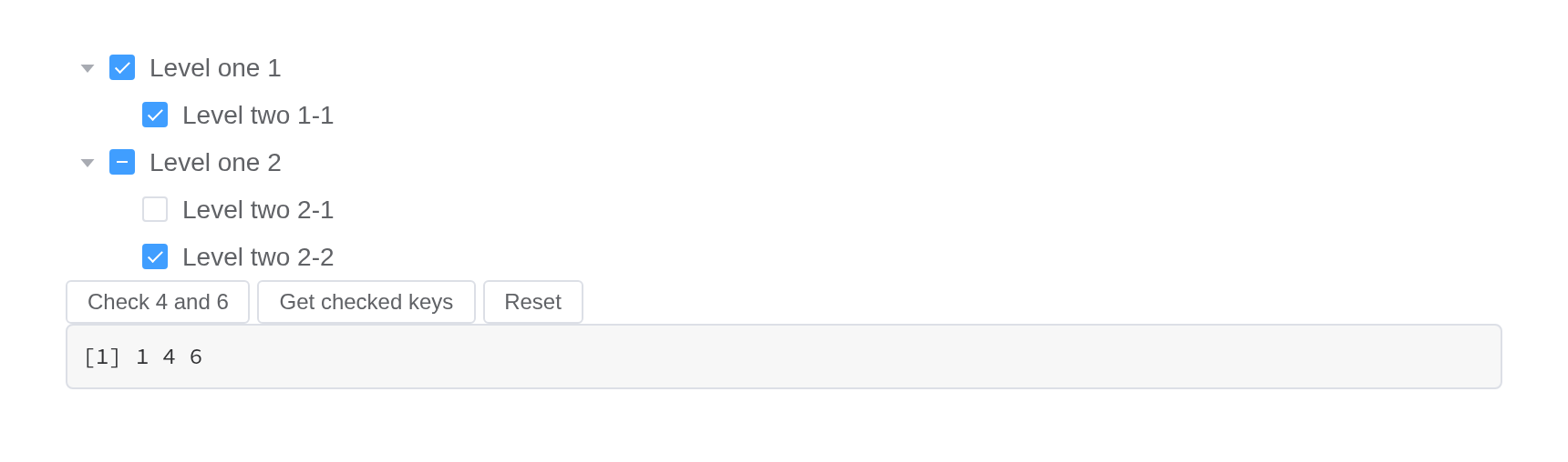
Custom node content
The content of tree nodes can be customized, so you can add icons or buttons as you will
There are two ways to customize template for tree nodes:
render-content and scoped slot. Use
render-content to assign a render function that returns the
content of tree nodes. See Vue’s documentation for a detailed
introduction of render functions. If you prefer scoped slot, you’ll have
access to node and data in the scope, standing
for the TreeNode object and node data of the current node respectively.
Note that the render-content demo can’t run in JSFiddle
because it doesn’t support JSX syntax. In a real project,
render-content will work if relevant dependencies are
correctly configured.
The first tree draws its nodes with render_content, a
function given h; the second with the default slot, scoped
with node and data. Their buttons ask the
server, which appends or removes the node in both trees with
call_el(session, id, "append" | "remove", ...).
node <- function(id, label, ...) {
  list(id = id, label = label, children = list(...))
}
tree_data <- list(
  node(
    1,
    "Level one 1",
    node(
      4,
      "Level two 1-1",
      node(9, "Level three 1-1-1"),
      node(10, "Level three 1-1-2")
    )
  ),
  node(2, "Level one 2", node(5, "Level two 2-1"), node(6, "Level two 2-2")),
  node(3, "Level one 3", node(7, "Level two 3-1"), node(8, "Level two 3-2"))
)
tree <- function(id, ...) {
  el_tree(
    id,
    data = tree_data,
    show_checkbox = TRUE,
    node_key = "id",
    default_expand_all = TRUE,
    expand_on_click_node = FALSE,
    width = "600px",
    ...
  )
}
ui <- el_page(
  tags$style(
    ".custom-tree-node { flex: 1; display: flex; align-items: center;
       justify-content: space-between; font-size: 14px; padding-right: 8px; }"
  ),
  tags$p("Using render-content"),
  tree(
    "cus_render",
    render_content = JS(
      "function(h, ctx) {",
      "  var send = function(what) { Shiny.setInputValue('cus_' + what, ctx.data.id, {priority: 'event'}); };",
      "  return h('div', { class: 'custom-tree-node' }, [",
      "    h('span', null, ctx.node.label),",
      "    h('div', null, [",
      "      h(ElementPlus.ElButton, { type: 'primary', link: true, onClick: function() { send('append'); } }, { default: function() { return 'Append'; } }),",
      "      h(ElementPlus.ElButton, { type: 'danger', link: true, style: 'margin-left: 4px', onClick: function() { send('remove'); } }, { default: function() { return 'Delete'; } })",
      "    ])",
      "  ]);",
      "}"
    )
  ),
  tags$p("Using scoped slot"),
  tree(
    "cus_slot",
    slots = list(
      default = template(
        scope = "{ node, data }",
        tags$div(
          class = "custom-tree-node",
          tags$span("{{ node.label }}"),
          tags$div(
            el$button(
              type = "primary",
              link = NA,
              `@click` = "$setInput('cus_append', data.id)",
              "Append"
            ),
            el$button(
              style = "margin-left: 4px",
              type = "danger",
              link = NA,
              `@click` = "$setInput('cus_remove', data.id)",
              "Delete"
            )
          )
        )
      )
    )
  )
)
server <- function(input, output, session) {
  next_id <- 1000
  observeEvent(input$cus_append, {
    child <- list(id = next_id, label = "testtest", children = list())
    next_id <<- next_id + 1
    for (id in c("cus_render", "cus_slot")) {
      call_el(session, id, "append", list(child, input$cus_append))
    }
  })
  observeEvent(input$cus_remove, {
    for (id in c("cus_render", "cus_slot")) {
      call_el(session, id, "remove", list(input$cus_remove))
    }
  })
}
shinyApp(ui, server)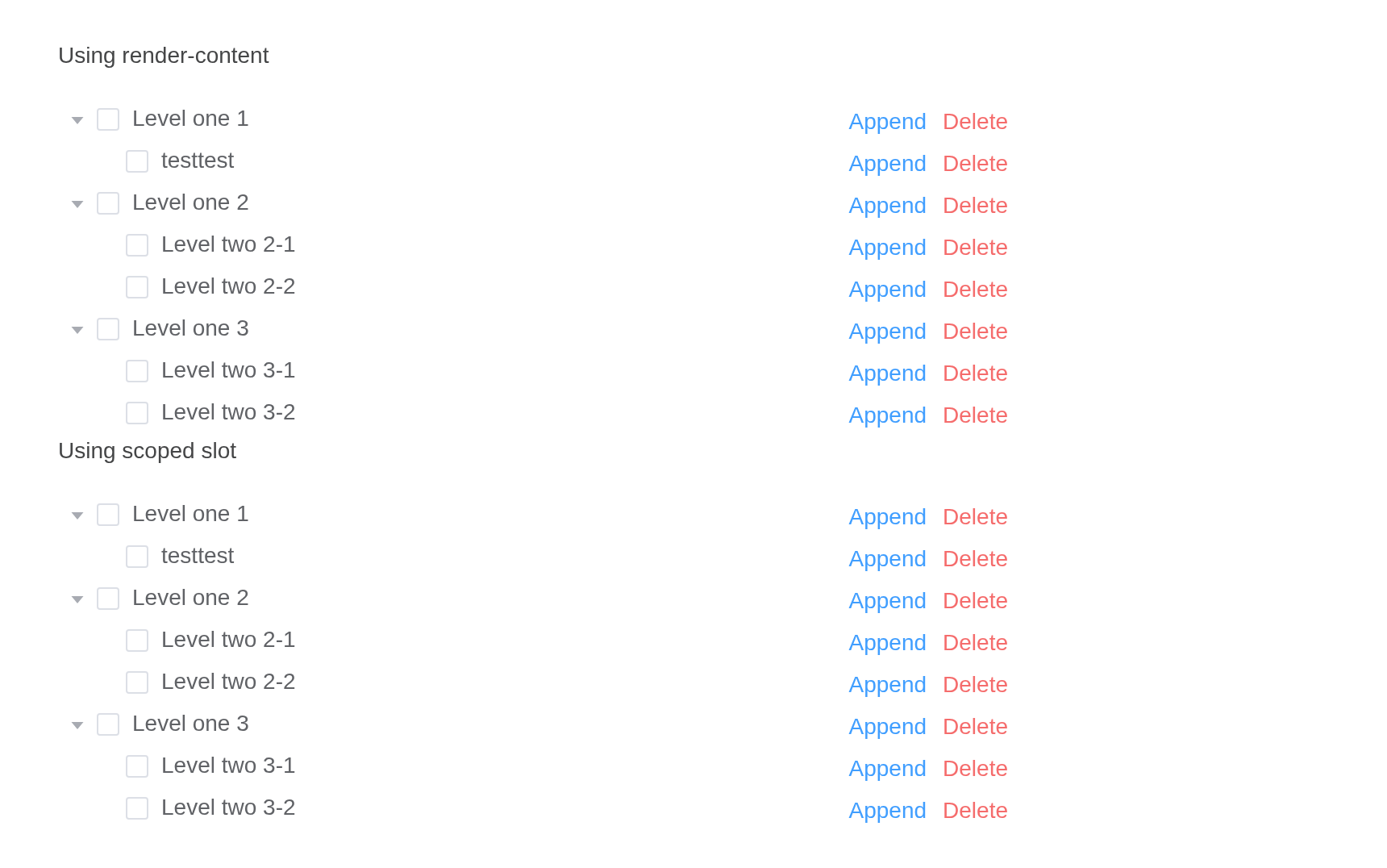
Custom node class
The class of tree nodes can be customized
. Use props.class to build class name of nodes.
props = list(class =) gives each node a class of its
own: a field, or a JS() function of the node’s data.
nodes <- list(
  list(
    id = 1,
    label = "Level one 1",
    children = list(list(
      id = 4,
      label = "Level two 1-1",
      isPenultimate = TRUE,
      children = list(
        list(id = 9, label = "Level three 1-1-1"),
        list(id = 10, label = "Level three 1-1-2")
      )
    ))
  ),
  list(
    id = 2,
    label = "Level one 2",
    children = list(
      list(
        id = 5,
        label = "Level two 2-1",
        isPenultimate = TRUE,
        children = list(
          list(id = 11, label = "Level three 2-1-1"),
          list(id = 12, label = "Level three 2-1-2")
        )
      ),
      list(id = 6, label = "Level two 2-2")
    )
  )
)
tagList(
  el_tree(
    "classed",
    data = nodes,
    show_checkbox = TRUE,
    default_expand_all = TRUE,
    expand_on_click_node = FALSE,
    props = list(
      class = JS(
        "function(data) { return data.isPenultimate ? 'is-penultimate' : ''; }"
      )
    )
  ),
  tags$style(HTML(
    ".is-penultimate > .el-tree-node__content { color: #626aef; }
    .el-tree-node.is-expanded.is-penultimate > .el-tree-node__children {
      display: flex;
      flex-direction: row;
    }
    .is-penultimate > .el-tree-node__children > div { width: 25%; }"
  ))
)
Tree node filtering
Tree nodes can be filtered
Invoke the filter method of the Tree instance to filter
tree nodes. Its parameter is the filtering keyword. Note that for it to
work, filter-node-method is required, and its value is the
filtering method.
filter() keeps the nodes whose label contains the text;
give filter_node_method to decide otherwise.
ui <- el_page(
  el_input("q", placeholder = "Filter keyword", width = "300px"),
  el_tree(
    "filtered",
    node_key = "id",
    default_expand_all = TRUE,
    data = list(
      list(
        id = 1,
        label = "Level one 1",
        children = list(list(id = 4, label = "Level two 1-1"))
      ),
      list(
        id = 2,
        label = "Level one 2",
        children = list(list(id = 5, label = "Level three 2-1"))
      )
    )
  )
)

server <- function(input, output, session) {
  observeEvent(
    input$q,
    call_el(session, "filtered", "filter", list(input$q), result = FALSE)
  )
}

shinyApp(ui, server)
Accordion
Only one node among the same level can be expanded at one time.
Only one node of a level open at a time.
el_tree(
  "acc",
  accordion = TRUE,
  node_key = "id",
  data = list(
    list(
      id = 1,
      label = "Level one 1",
      children = list(list(id = 4, label = "Level two 1-1"))
    ),
    list(
      id = 2,
      label = "Level one 2",
      children = list(list(id = 5, label = "Level two 2-1"))
    ),
    list(
      id = 3,
      label = "Level one 3",
      children = list(list(id = 6, label = "Level two 3-1"))
    )
  )
)
Draggable
You can drag and drop Tree nodes by adding a draggable
attribute.
draggable lets nodes be dragged; allow_drag
and allow_drop, JS() functions, say which and
where, and input$<id>_node_drop reports where one
landed.
el_tree(
  "drag",
  draggable = TRUE,
  node_key = "id",
  default_expand_all = TRUE,
  allow_drop = JS(
    "function(dragging, drop, type) {",
    "  return drop.data.label !== 'Level two 3-1' || type !== 'inner';",
    "}"
  ),
  data = list(
    list(
      id = 1,
      label = "Level one 1",
      children = list(list(id = 4, label = "Level two 1-1"))
    ),
    list(
      id = 3,
      label = "Level one 3",
      children = list(list(id = 7, label = "Level two 3-1"))
    )
  )
)
API
Element Plus’s tables, and beside each entry where it is in R.
Attributes
| Element | In R | Description | Type | Accepted | Default |
|---|---|---|---|---|---|
data |
data |
tree data |
1Array<{[key: string]: any}>
|
— | |
empty-text |
empty_text |
text displayed when data is void | 2 | — | |
node-key |
node_key |
unique identity key name for nodes, its value should be unique across the whole tree | 3 | — | |
props |
props |
configuration options, see the following table | 4 | — | |
render-after-expand |
render_after_expand |
whether to render child nodes only after a parent node is expanded for the first time | 5 | true | |
load |
load |
method for loading subtree data, only works when lazy
is true |
6(node, resolve, reject) => void
|
— | |
render-content |
render_content |
render function for tree node |
7(h, { node, data, store }) => void
|
— | |
highlight-current |
highlight_current |
whether current node is highlighted | 8 | false | |
default-expand-all |
default_expand_all |
whether to expand all nodes by default | 9 | false | |
expand-on-click-node |
expand_on_click_node |
whether to expand or collapse node when clicking on the node, if false, then expand or collapse node only when clicking on the arrow icon. | 10 | true | |
check-on-click-node |
check_on_click_node |
whether to check or uncheck node when clicking on the node, if false, the node can only be checked or unchecked by clicking on the checkbox. | 11 | false | |
check-on-click-leaf |
check_on_click_leaf |
whether to check or uncheck node when clicking on leaf node (last children). | 12 | true | |
auto-expand-parent |
auto_expand_parent |
whether to expand father node when a child node is expanded | 13 | true | |
default-expanded-keys |
expanded |
array of keys of initially expanded nodes |
14Array<string \\| number>
|
— | |
show-checkbox |
show_checkbox |
whether node is selectable | 15 | false | |
check-strictly |
check_strictly |
whether checked state of a node not affects its father and child
nodes when show-checkbox is true
|
16 | false | |
default-checked-keys |
checked |
array of keys of initially checked nodes |
17Array<string \\| number>
|
— | |
current-node-key |
current_node_key |
key of initially selected node | 18 / 19 | — | |
filter-node-method |
filter_node_method |
this function will be executed on each node when use filter method.
if return false, tree node will be hidden. |
20(value, data, node) => boolean
|
— | |
accordion |
accordion |
whether only one node among the same level can be expanded at one time | 21 | false | |
indent |
indent |
horizontal indentation of nodes in adjacent levels in pixels | 22 | 18 | |
icon |
icon |
custom tree node icon component | 23 / 24 | — | |
lazy |
lazy |
whether to lazy load leaf node, used with load
attribute |
25 | false | |
draggable |
draggable |
whether enable tree nodes drag and drop | 26 | false | |
allow-drag |
allow_drag |
this function will be executed before dragging a node. If
false is returned, the node can not be dragged |
27(node) => boolean
|
— | |
allow-drop |
allow_drop |
this function will be executed before the dragging node is dropped.
If false is returned, the dragging node can not be dropped
at the target node. type has three possible values: ‘prev’
(inserting the dragging node before the target node), ‘inner’ (inserting
the dragging node to the target node) and ‘next’ (inserting the dragging
node after the target node) |
28(draggingNode, dropNode, type) => boolean
|
— |
Exposes
| Element | In R | Description |
|---|---|---|
filter |
call_el(session, id, "filter") |
filter all tree nodes, filtered nodes will be hidden |
updateKeyChildren |
call_el(session, id, "updateKeyChildren") |
set new data to node, only works when node-key is
assigned |
getCheckedNodes |
call_el(session, id, "getCheckedNodes") |
If the node can be selected (show-checkbox is
true), it returns the currently selected array of
nodes |
setCheckedNodes |
call_el(session, id, "setCheckedNodes") |
set certain nodes to be checked, only works when
node-key is assigned |
getCheckedKeys |
call_el(session, id, "getCheckedKeys") |
If the node can be selected (show-checkbox is
true), it returns the currently selected array of node’s
keys |
setCheckedKeys |
call_el(session, id, "setCheckedKeys") |
set certain nodes to be checked, only works when
node-key is assigned |
setChecked |
call_el(session, id, "setChecked") |
set node to be checked or not, only works when node-key
is assigned |
getHalfCheckedNodes |
call_el(session, id, "getHalfCheckedNodes") |
If the node can be selected (show-checkbox is
true), it returns the currently half selected array of
nodes |
getHalfCheckedKeys |
call_el(session, id, "getHalfCheckedKeys") |
If the node can be selected (show-checkbox is
true), it returns the currently half selected array of
node’s keys |
getCurrentKey |
call_el(session, id, "getCurrentKey") |
return the highlight node’s key (null if no node is highlighted) |
getCurrentNode |
call_el(session, id, "getCurrentNode") |
return the highlight node’s data (null if no node is highlighted) |
setCurrentKey |
call_el(session, id, "setCurrentKey") |
set highlighted node by key, only works when node-key
is assigned |
setCurrentNode |
call_el(session, id, "setCurrentNode") |
set highlighted node, only works when node-key is
assigned |
getNode |
call_el(session, id, "getNode") |
get node by data or key |
remove |
call_el(session, id, "remove") |
remove a node, only works when node-key is assigned |
append |
call_el(session, id, "append") |
append a child node to a given node in the tree |
insertBefore |
call_el(session, id, "insertBefore") |
insert a node before a given node in the tree |
insertAfter |
call_el(session, id, "insertAfter") |
insert a node after a given node in the tree |
Events
| Element | In R | Description |
|---|---|---|
node-click |
one of the component’s inputs – see its reference page | triggers when a node is clicked |
node-contextmenu |
input$<id>_node_contextmenu |
triggers when a node is clicked by right button |
check-change |
input$<id>_check_change |
triggers when the selected state of the node changes |
check |
one of the component’s inputs – see its reference page | triggers after clicking the checkbox of a node |
current-change |
input$<id>_current_change |
triggers when current node changes |
node-expand |
input$<id>_node_expand |
triggers when current node open |
node-collapse |
input$<id>_node_collapse |
triggers when current node close |
node-drag-start |
input$<id>_node_drag_start |
triggers when dragging starts |
node-drag-enter |
input$<id>_node_drag_enter |
triggers when the dragging node enters another node |
node-drag-leave |
input$<id>_node_drag_leave |
triggers when the dragging node leaves a node |
node-drag-over |
input$<id>_node_drag_over |
triggers when dragging over a node (like mouseover event) |
node-drag-end |
input$<id>_node_drag_end |
triggers when dragging ends |
node-drop |
input$<id>_node_drop |
triggers after the dragging node is dropped |