A popup component for guiding users through a product. Use when you want to guide users through a product.
Basic usage
The most basic usage
A step’s target is a CSS selector; the server opens the
tour with update_el_tour().
ui <- el_page(
  el_button("begin", "Begin Tour", type = "primary"),
  el_divider(),
  el_space(
    tags$span(id = "t_up", el_button("up", "Upload")),
    tags$span(id = "t_save", el_button("save", "Save", type = "primary")),
    tags$span(id = "t_more", el_button("more", "", icon = "MoreFilled"))
  ),
  el_tour(
    "tour",
    steps = list(
      el_tour_step("#t_up", "Upload File", "Put you files here."),
      el_tour_step("#t_save", "Save", "Save your changes"),
      el_tour_step("#t_more", "Other Actions", "Click to see other")
    )
  )
)

server <- function(input, output, session) {
  observeEvent(
    input$begin,
    update_el_tour(id = "tour", open = TRUE, current = 0)
  )
}

shinyApp(ui, server)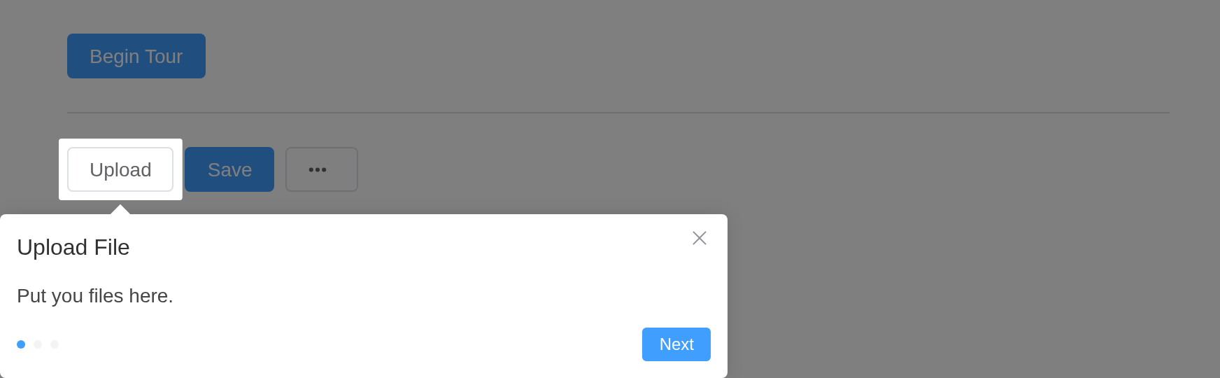
Non modal
Use :mask="false" to make Tour non-modal. At the
meantime it is recommended to use with type="primary" to
emphasize the guide itself.
mask = FALSE leaves the page undimmed;
type = "primary" colours the card.
ui <- el_page(
  el_button("begin", "Begin Tour", type = "primary"),
  el_divider(),
  el_space(
    tags$span(id = "t_up", el_button("up", "Upload")),
    tags$span(id = "t_save", el_button("save", "Save", type = "primary")),
    tags$span(id = "t_more", el_button("more", "", icon = "MoreFilled"))
  ),
  el_tour(
    "tour",
    type = "primary",
    mask = FALSE,
    steps = list(
      el_tour_step("#t_up", "Upload File", "Put you files here."),
      el_tour_step("#t_save", "Save", "Save your changes"),
      el_tour_step("#t_more", "Other Actions", "Click to see other")
    )
  )
)

server <- function(input, output, session) {
  observeEvent(
    input$begin,
    update_el_tour(id = "tour", open = TRUE, current = 0)
  )
}

shinyApp(ui, server)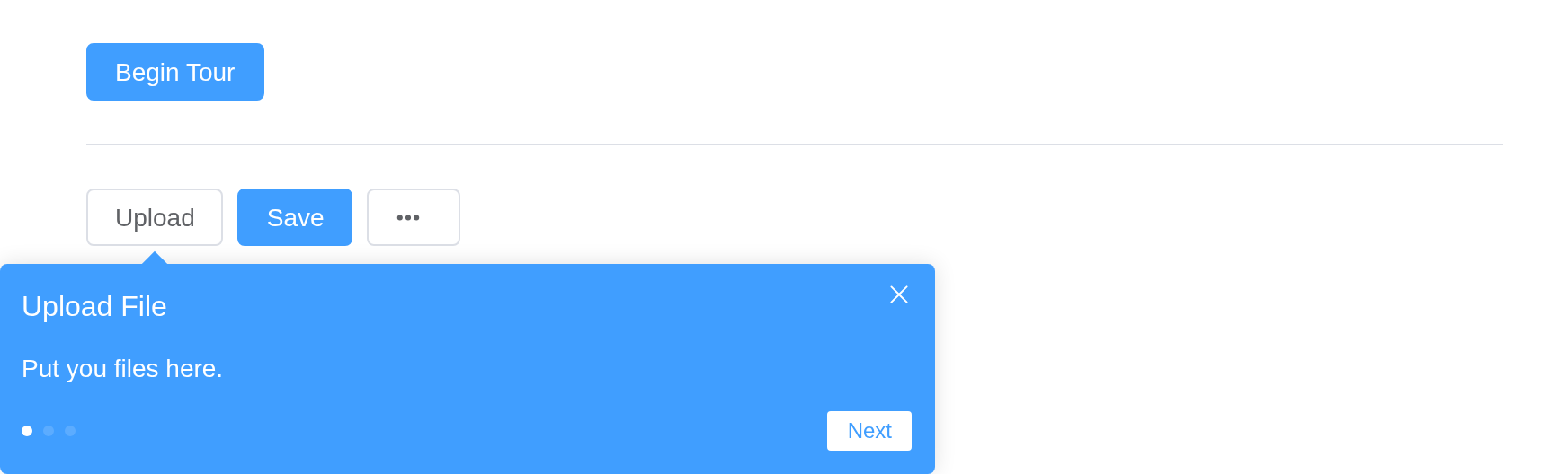
Placement
Change the placement of the guide relative to the target, there are
12 placements available. When target is empty the guide
will show in the center.
ui <- el_page(
  tags$span(id = "t_btn", el_button("begin", "Begin Tour", type = "primary")),
  el_tour(
    "tour",
    steps = list(
      el_tour_step(
        title = "Center",
        description = "Displayed in the center of screen."
      ),
      el_tour_step(
        "#t_btn",
        "Right",
        "On the right of target.",
        placement = "right"
      ),
      el_tour_step("#t_btn", "Top", "On the top of target.", placement = "top")
    )
  )
)

server <- function(input, output, session) {
  observeEvent(
    input$begin,
    update_el_tour(id = "tour", open = TRUE, current = 0)
  )
}

shinyApp(ui, server)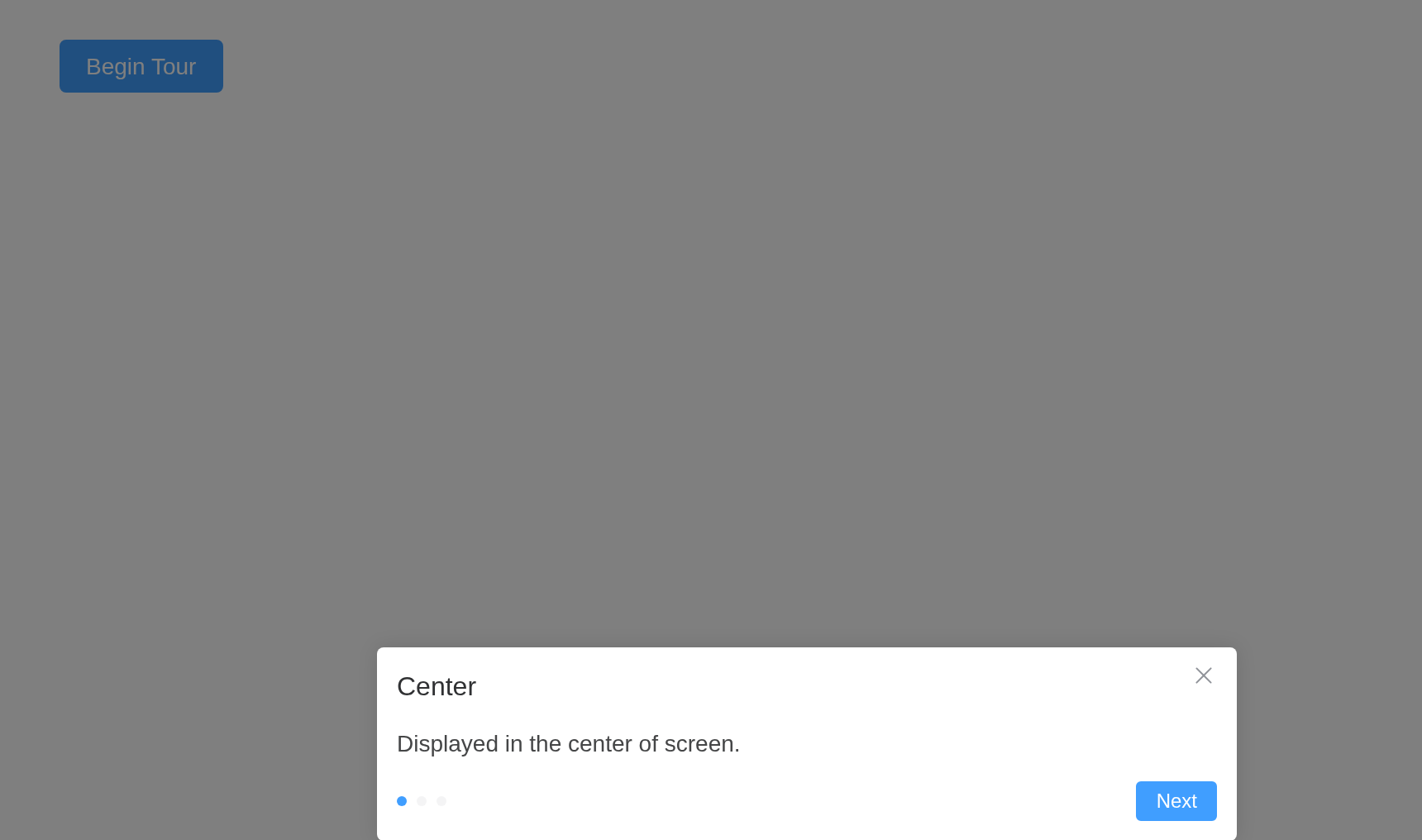
Custom mask style
Custom mask style.
mask takes Element Plus’s object: its style
and color.
ui <- el_page(
  el_button("begin", "Begin Tour", type = "primary"),
  el_divider(),
  el_space(
    tags$span(id = "t_up", el_button("up", "Upload")),
    tags$span(id = "t_save", el_button("save", "Save", type = "primary"))
  ),
  el_tour(
    "tour",
    mask = list(
      style = list(boxShadow = "inset 0 0 15px #333"),
      color = "rgba(80, 255, 255, .4)"
    ),
    steps = list(
      el_tour_step("#t_up", "Upload File", "Put you files here."),
      el_tour_step(
        "#t_save",
        "Save",
        "Save your changes",
        mask = list(
          style = list(boxShadow = "inset 0 0 15px #fff"),
          color = "rgba(40, 0, 255, .4)"
        )
      )
    )
  )
)

server <- function(input, output, session) {
  observeEvent(
    input$begin,
    update_el_tour(id = "tour", open = TRUE, current = 0)
  )
}

shinyApp(ui, server)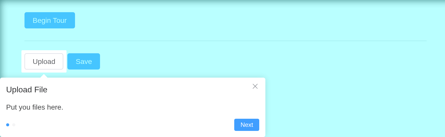
Custom indicator
Custom indicator.
The indicators slot draws the step counter; its scope is
current and total.
ui <- el_page(
  el_button("begin", "Begin Tour", type = "primary"),
  el_divider(),
  el_space(
    tags$span(id = "t_up", el_button("up", "Upload")),
    tags$span(id = "t_save", el_button("save", "Save", type = "primary"))
  ),
  el_tour(
    "tour",
    steps = list(
      el_tour_step("#t_up", "Upload File", "Put you files here."),
      el_tour_step("#t_save", "Save", "Save your changes")
    ),
    slots = list(
      indicators = template(
        tags$span("{{ current + 1 }} / {{ total }}"),
        slot = "indicators",
        scope = "{ current, total }"
      )
    )
  )
)

server <- function(input, output, session) {
  observeEvent(
    input$begin,
    update_el_tour(id = "tour", open = TRUE, current = 0)
  )
}

shinyApp(ui, server)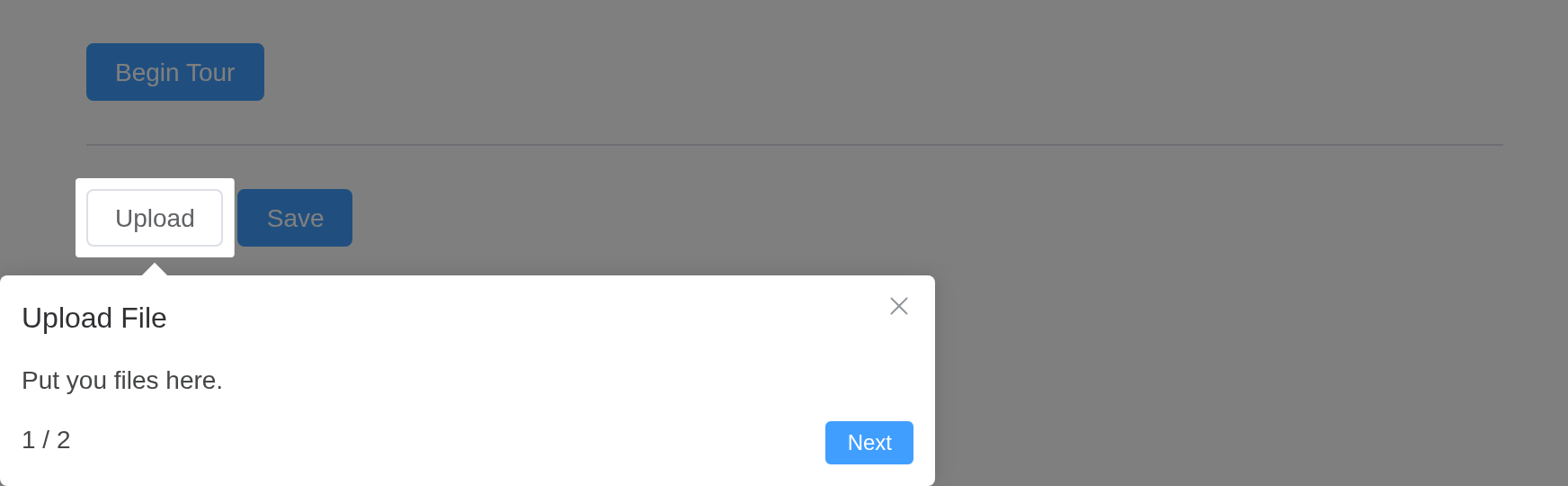
Target
Various parameter passing types of target. The string and Function types are supported since 2.5.2.
A target may be any selector, and need not exist until the step is shown.
ui <- el_page(
  el_button("begin", "Begin Tour", type = "primary"),
  el_divider(),
  tags$div(
    id = "first",
    style = "display: inline-block; padding: 8px; border: 1px dashed #ccc",
    "First"
  ),
  tags$div(
    class = "second",
    style = "display: inline-block; padding: 8px; border: 1px dashed #ccc",
    "Second"
  ),
  el_tour(
    "tour",
    steps = list(
      el_tour_step("#first", "By id", "A selector for an id."),
      el_tour_step(".second", "By class", "A selector for a class.")
    )
  )
)

server <- function(input, output, session) {
  observeEvent(
    input$begin,
    update_el_tour(id = "tour", open = TRUE, current = 0)
  )
}

shinyApp(ui, server)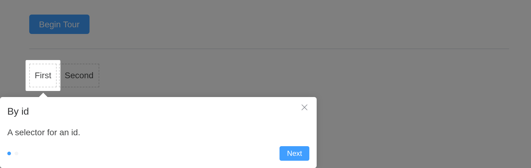
API
Element Plus’s tables, and beside each entry where it is in R.
Tour Attributes
| Element | In R | Description | Type | Accepted | Default |
|---|---|---|---|---|---|
append-to |
append_to |
which element the TourContent appends to | 1 / 2 | body |
|
show-arrow |
show_arrow |
whether to show the arrow | boolean |
true | |
placement |
placement |
position of the guide card relative to the target element |
3'top' \\| 'top-start' \\| 'top-end' \\| 'bottom' \\| 'bottom-start' \\| 'bottom-end' \\| 'left' \\| 'left-start' \\| 'left-end' \\| 'right' \\| 'right-start' \\| 'right-end'
|
bottom |
|
content-style |
content_style |
custom style for content | CSSProperties |
— | |
mask |
mask |
whether to enable masking, change mask style and fill color by pass custom props |
boolean \ |
4{ style?: CSSProperties; color?: string; }
|
|
gap |
gap |
transparent gap between mask and target | TourGap |
5{ offset: 6, radius: 2}
|
|
type |
type |
type, affects the background color and text color |
default \ |
primary |
|
model-value |
open; input$<id>
|
open tour | boolean |
false |
|
current |
current |
what is the current step | number |
0 |
|
scroll-into-view-options |
scroll_into_view_options |
support pass custom scrollIntoView options |
boolean \ |
ScrollIntoViewOptions |
|
z-index |
z_index |
Tour’s zIndex | number |
2001 |
|
show-close |
show_close |
whether to show a close button | boolean |
true |
|
close-icon |
close_icon |
custom close icon, default is Close |
string \ |
Component |
|
close-on-press-escape |
close_on_press_escape |
whether the Dialog can be closed by pressing ESC | boolean |
true |
|
target-area-clickable |
target_area_clickable |
whether the target element can be clickable, when using mask | boolean |
true |
Tour slots
| Element | In R | Description |
|---|---|---|
default |
default content | tourStep component list |
indicators |
slots = list(indicators = ) |
custom indicator |
Tour events
| Element | In R | Description |
|---|---|---|
close |
one of the component’s inputs – see its reference page | callback function on shutdown |
finish |
input$<id>_finish |
callback function on finished |
change |
input$<id>_change |
callback when the step changes |
TourStep Attributes
| Element | In R | Description | Type | Accepted | Default |
|---|---|---|---|---|---|
target |
el_tour_step(target =) |
get the element the guide card points to. Empty makes it show in center of screen. the string and Function types are supported since ^(2.5.2). the string type is selectors of document.querySelector. |
HTMLElement \ |
string \ |
6() => HTMLElement
|
show-arrow |
el_tour_step(show_arrow =) |
whether to show the arrow | boolean |
— | |
title |
el_tour_step(title =) |
title | string |
— | |
description |
el_tour_step(description =) |
description | string |
— | |
placement |
el_tour_step(placement =) |
position of the guide card relative to the target element |
7'top' \\| 'top-start' \\| 'top-end' \\| 'bottom' \\| 'bottom-start' \\| 'bottom-end' \\| 'left' \\| 'left-start' \\| 'left-end' \\| 'right' \\| 'right-start' \\| 'right-end'
|
bottom |
|
content-style |
el_tour_step(content_style =) |
custom style for content | CSSProperties |
— | |
mask |
el_tour_step(mask =) |
whether to enable masking, change mask style and fill color by pass custom props |
boolean \ |
8{ style?: CSSProperties; color?: string; }
|
|
type |
el_tour_step(type =) |
type, affects the background color and text color |
default \ |
primary |
|
next-button-props |
el_tour_step(next_button_props =) |
properties of the Next button |
9{ children: VueNode \\| string; onClick: Function }
|
— | |
prev-button-props |
el_tour_step(prev_button_props =) |
properties of the previous button |
10{ children: VueNode \\| string; onClick: Function }
|
— | |
scroll-into-view-options |
el_tour_step(scroll_into_view_options =) |
support pass custom scrollIntoView options, the default follows the
scrollIntoViewOptions property of Tour |
boolean \ |
ScrollIntoViewOptions |
|
show-close |
el_tour_step(show_close =) |
whether to show a close button | boolean |
— | |
close-icon |
el_tour_step(close_icon =) |
custom close icon, default is Close |
string \ |
Component |