DatePickerPanel is the core component of
DatePicker.
Border
By default the date-picker-panel is bordered but in some case you
don’t want it. For example DatePicker don’t inherit
border.
border = FALSE: the panel on its own, and inside a
card.
tags$div(
  tags$div(style = "text-align: center", "No border:"),
  el_divider(),
  tags$div(
    style = "display: flex; flex-wrap: wrap; gap: 16px; justify-content: center",
    tags$div(
      style = "padding: 20px",
      el_date_picker_panel("dpp_border", border = FALSE)
    ),
    el_divider(direction = "vertical", style = "height: auto"),
    el_card(el_date_picker_panel("dpp_border_card", border = FALSE))
  )
)Disabled
The disabled attribute determines if the date picker is
fully disabled.
The switch disables the panel with
update_el_date_picker_panel(disabled =).
ui <- el_page(
  tags$div(
    style = "display: flex; flex-direction: column; align-items: center",
    el_switch(
      "dpp_switch",
      value = TRUE,
      active_text = "Disabled",
      inactive_text = "Enabled"
    ),
    el_date_picker_panel("dpp_dis", disabled = TRUE)
  )
)
server <- function(input, output, session) {
  observeEvent(input$dpp_switch, {
    update_el_date_picker_panel(session, "dpp_dis", disabled = input$dpp_switch)
  })
}
shinyApp(ui, server)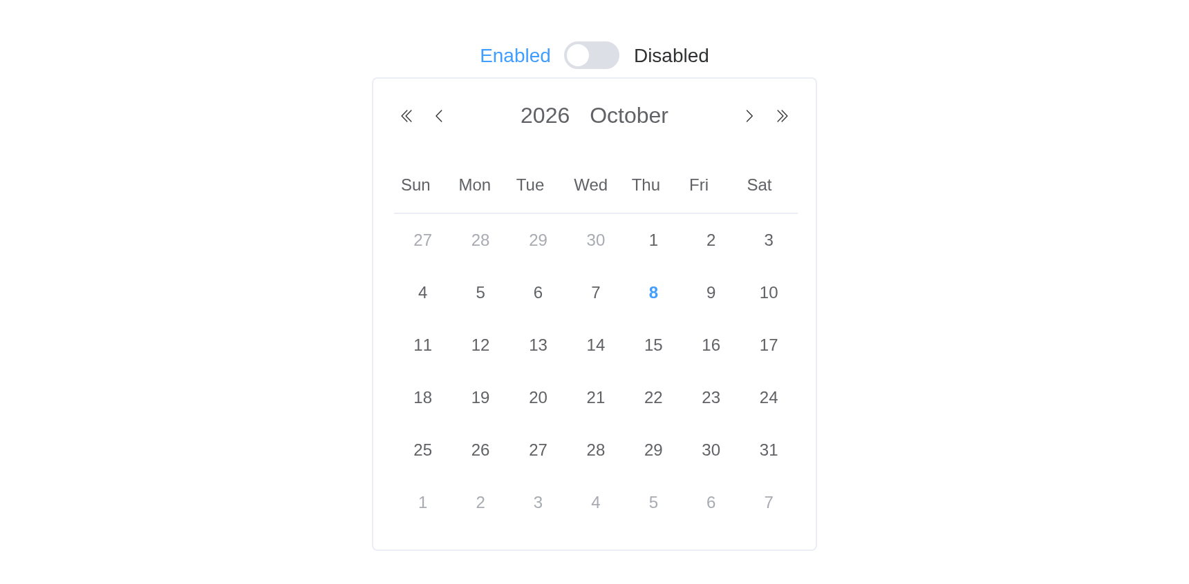
Types
The measurement is determined by the type attribute.
The select changes the panel’s type, and clears its
value as it does (value = NA).
types <- c(
  "year",
  "years",
  "month",
  "months",
  "date",
  "dates",
  "week",
  "quarter",
  "quarters",
  "quarterrange",
  "datetime",
  "datetimerange",
  "daterange",
  "monthrange",
  "yearrange"
)
ui <- el_page(
  tags$div(
    style = "display: flex; gap: 16px",
    tags$div(
      style = "display: flex; flex-direction: column; flex-basis: 150px; gap: 4px",
      tags$span("Type:"),
      el_select("dpp_type", choices = types, selected = "date")
    )
  ),
  el_divider(),
  tags$div(
    style = "display: flex; justify-content: center",
    el_date_picker_panel("dpp_all", type = "date")
  )
)
server <- function(input, output, session) {
  observeEvent(input$dpp_type, ignoreInit = TRUE, {
    update_el_date_picker_panel(
      session,
      "dpp_all",
      type = input$dpp_type,
      value = NA
    )
  })
}
shinyApp(ui, server)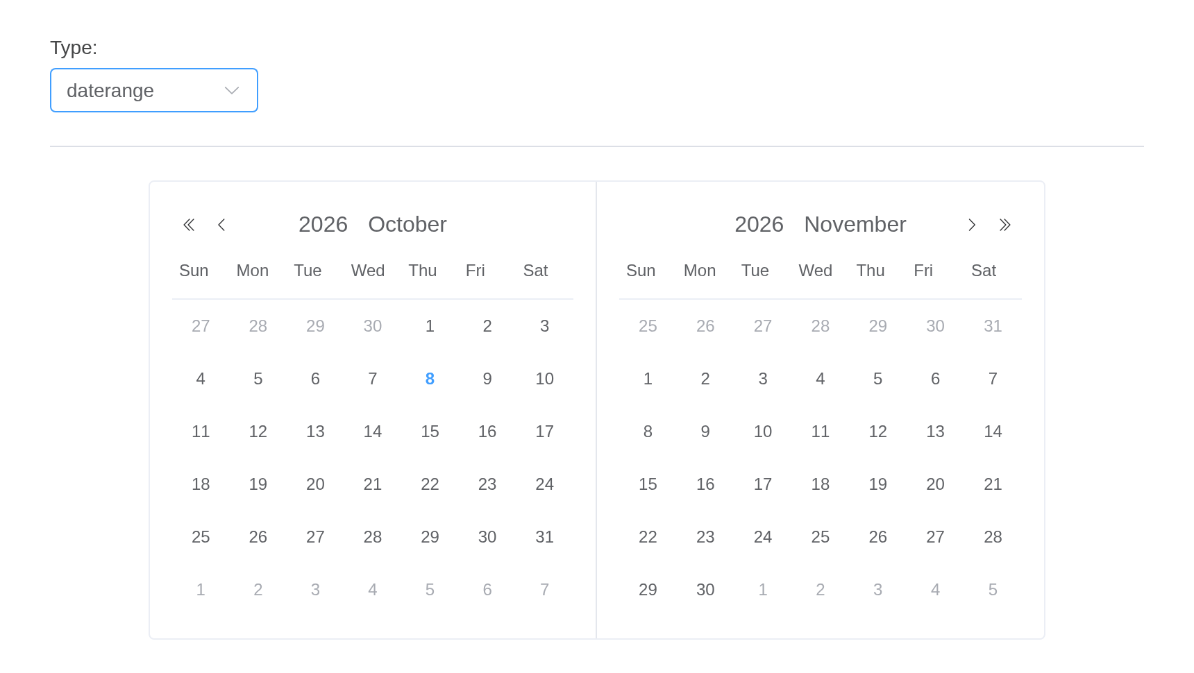
Localization
The default locale of is English, if you need to use other languages, please check Internationalization
Note, date time locale (month name, first day of the week …) are also configured in localization.
API
Element Plus’s tables, and beside each entry where it is in R.
Attributes
| Element | In R | Description | Type | Accepted | Default |
|---|---|---|---|---|---|
model-value |
value; input$<id>
|
binding value, if it is an range picker, the length of
the array should be 2 |
1 /
2 / 3 / 4number[] \\| string[] \\| Date[]
|
’’ | |
border |
border |
whether the date picker is bordered | 5 | true | |
disabled |
disabled |
whether DatePicker is disabled | 6 | false | |
clearable |
clearable |
whether to show clear button | 7 | true | |
editable |
editable |
whether the input is editable | 8 | true | |
type |
type |
type of the picker. quarter, quarters, and
quarterrange are supported since ^(2.14.5) |
9'year' \\| 'years' \\|'month' \\| 'months' \\| 'date' \\| 'dates' \\| 'datetime' \\| 'week' \\| 'quarter' \\| 'quarters' \\| 'datetimerange' \\| 'daterange' \\| 'monthrange' \\| 'yearrange' \\| 'quarterrange'
|
date | |
default-value |
default_value |
optional, default date of the calendar |
10Date \\| [Date, Date]
|
— | |
default-time |
default_time |
optional, the time value to use when selecting date range |
11Date \\| [Date, Date]
|
— | |
value-format |
value_format |
optional, format of binding value. If not specified, the binding value will be a Date object | 12 | — | |
date-format |
date_format |
optional, format of the date displayed in input’s inner panel | 13 see date formats | YYYY-MM-DD | |
time-format |
time_format |
optional, format of the time displayed in input’s inner panel | 14 see date formats | HH:mm:ss | |
unlink-panels |
unlink_panels |
unlink two date-panels in range-picker | 15 | false | |
single-panel |
single_panel |
show only one panel in range-picker | 16 | false | |
disabled-date |
disabled_date |
a function determining if a date is disabled with that date as its parameter. Should return a Boolean |
17(data: Date) => boolean
|
— | |
shortcuts |
shortcuts |
an object array to set shortcut options |
18Array<{ text: string, value: Date \\| Function }>
|
[] | |
cell-class-name |
cell_class_name |
set custom className |
19(data: Date) => string
|
— | |
show-footer |
show_footer |
whether to show footer where the date picker is one 20'dates' \\| 'months' \\| 'years' \\| 'quarters' \\| 'datetime' \\| 'datetimerange'
|
21 | false | |
show-confirm |
show_confirm |
whether to show the confirm button | 22 | false | |
show-week-number |
show_week_number |
show the week number besides the week | 23 | false |