Commonly used button.
Basic usage
Use type, plain, round,
dashed and circle to define Button’s
style.
types <- c("default", "primary", "success", "info", "warning", "danger")
label <- function(t) tools::toTitleCase(t)
row <- function(...) tags$div(style = "margin-bottom: 16px", ...)
tagList(
  row(lapply(types, function(t) {
    el_button(paste0("b_", t), label(t), type = t)
  })),
  row(lapply(types, function(t) {
    el_button(paste0("p_", t), label(t), type = t, plain = TRUE)
  })),
  row(lapply(types, function(t) {
    el_button(paste0("r_", t), label(t), type = t, round = TRUE)
  })),
  row(lapply(types, function(t) {
    el_button(paste0("d_", t), label(t), type = t, dashed = TRUE)
  })),
  row(Map(
    function(t, i) {
      el_button(paste0("c_", t), NULL, type = t, circle = TRUE, icon = i)
    },
    types,
    c("Search", "Edit", "Check", "Message", "Star", "Delete")
  ))
)
Disabled Button
The disabled attribute determines if the button is
disabled.
Use disabled attribute to determine whether a button is
disabled. It accepts a Boolean value.
types <- c("default", "primary", "success", "info", "warning", "danger")
tagList(
  tags$div(
    style = "margin-bottom: 16px",
    lapply(types, function(t) {
      el_button(
        paste0("dis_", t),
        tools::toTitleCase(t),
        type = t,
        disabled = TRUE
      )
    })
  ),
  lapply(types, function(t) {
    el_button(
      paste0("disp_", t),
      tools::toTitleCase(t),
      type = t,
      plain = TRUE,
      disabled = TRUE
    )
  })
)
Link Button
Warning
type="text"has been deprecated, and will be removed in 3.0.0, consider switching to new API.New API
linkhas been added in 2.2.1, you can usetypeAPI to set the theme of your link button
types <- c("default", "primary", "success", "info", "warning", "danger")
tagList(
  tags$p("Basic link button"),
  tags$div(lapply(types, function(t) {
    el_button(paste0("l_", t), t, type = t, link = TRUE)
  })),
  tags$p("Disabled link button"),
  tags$div(lapply(types, function(t) {
    el_button(paste0("ld_", t), t, type = t, link = TRUE, disabled = TRUE)
  }))
)
Basic link button
Disabled link button
Text Button
Tip
Text button has been upgraded with a new design since 2.2.0 , if you want to use the previous version like button, you might want to check Link out.
The API is also updated, because the
typeattribute also represents the button’s style. So we have to make a new APItext: booleanfor text button.
Buttons without border and background.
types <- c("default", "primary", "success", "info", "warning", "danger")
tagList(
  tags$p("Basic text button"),
  tags$div(lapply(types, function(t) {
    el_button(paste0("t_", t), t, type = t, text = TRUE)
  })),
  tags$p("Background color always on"),
  tags$div(lapply(types, function(t) {
    el_button(paste0("tb_", t), t, type = t, text = TRUE, bg = TRUE)
  })),
  tags$p("Disabled text button"),
  tags$div(lapply(types, function(t) {
    el_button(paste0("td_", t), t, type = t, text = TRUE, disabled = TRUE)
  }))
)
Basic text button
Background color always on
Disabled text button
Icon Button
Use icons to add more meaning to Button. You can use icon alone to save some space, or use it with text.
Use the icon attribute to add icon. You can find the
icon list in Element Plus icon component. Adding icons to the right side
of the text is achievable with an <i> tag. Custom
icons can be used as well.
tagList(
  el_button("i1", NULL, type = "primary", icon = "Edit"),
  el_button("i2", NULL, type = "primary", icon = "Share"),
  el_button("i3", NULL, type = "primary", icon = "Delete"),
  el_button("i4", "Search", type = "primary", icon = "Search"),
  el_button("i5", "Upload", type = "primary", icon = "Upload")
)
Button Group
Displayed as a button group, can be used to group a series of similar operations.
In 2.11.9 you can use the direction attribute.
Use tag <el-button-group> to group your
buttons.
The radios turn the second group, with
update_el_button_group(direction =).
ui <- el_page(
  el_button_group(
    el_button("prev", "Previous Page", type = "primary", icon = "ArrowLeft"),
    el_button(
      "next",
      tagList("Next Page", el_icon("ArrowRight", class = "el-icon--right")),
      type = "primary"
    )
  ),
  tags$br(),
  el_radio_group(
    "direction",
    choices = c(Horizontal = "horizontal", Vertical = "vertical"),
    value = "horizontal"
  ),
  tags$br(),
  el_button_group(
    id = "dir_group",
    direction = "horizontal",
    el_button("g1", NULL, type = "primary", icon = "House"),
    el_button("g2", NULL, type = "primary", icon = "Operation"),
    el_button("g3", NULL, type = "primary", icon = "Notification")
  )
)
server <- function(input, output, session) {
  observeEvent(input$direction, ignoreInit = TRUE, {
    update_el_button_group(session, "dir_group", direction = input$direction)
  })
}
shinyApp(ui, server)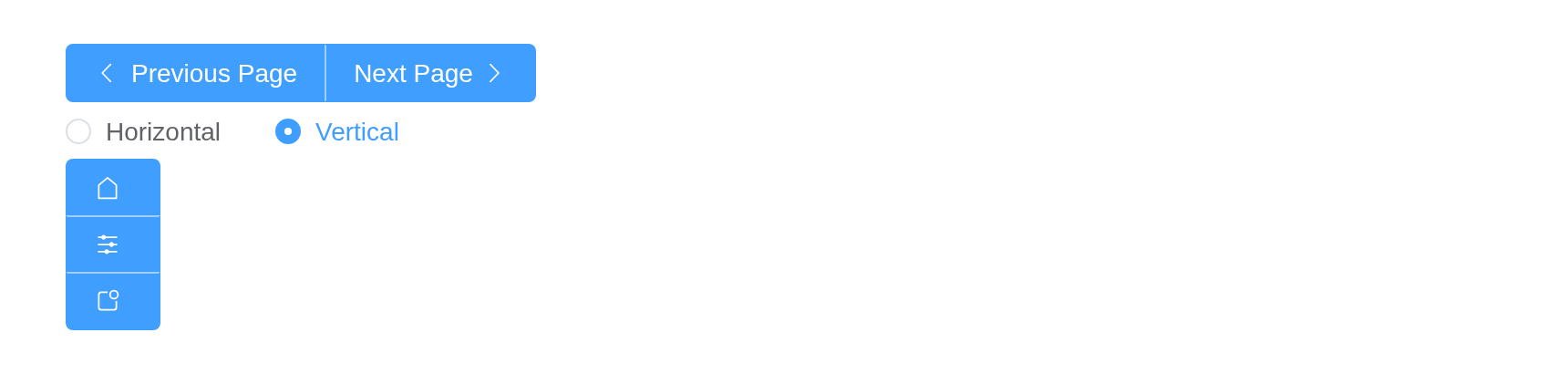
Loading Button
Click the button to load data, then the button displays a loading state.
Set loading attribute to true to display
loading state.
Tip
You can use the
loadingslot orloadingIconto customize your loading componentps:
loadingslot has higher priority than loadingIcon
tagList(
  el_button("ld1", "Loading", type = "primary", loading = TRUE),
  el_button(
    "ld2",
    "Loading",
    type = "primary",
    loading = TRUE,
    loading_icon = "Eleme"
  )
)
Sizes
Besides default size, Button component provides three additional sizes for you to choose among different scenarios.
Use attribute size to set additional sizes with
large, small.
row <- function(...) {
  tags$div(
    style = "margin-bottom: 16px; display: flex; align-items: center; gap: 12px",
    ...
  )
}
sizes <- c(large = "Large", default = "Default", small = "Small")
tagList(
  row(
    Map(
      function(s, l) el_button(paste0("s_", s), l, size = s),
      names(sizes),
      sizes
    ),
    Map(
      function(s) {
        el_button(paste0("si_", s), "Search", size = s, icon = "Search")
      },
      names(sizes)
    )
  ),
  row(
    Map(
      function(s, l) el_button(paste0("sr_", s), l, size = s, round = TRUE),
      names(sizes),
      sizes
    ),
    Map(
      function(s) {
        el_button(
          paste0("sri_", s),
          "Search",
          size = s,
          icon = "Search",
          round = TRUE
        )
      },
      names(sizes)
    )
  ),
  row(Map(
    function(s) {
      el_button(
        paste0("sc_", s),
        NULL,
        size = s,
        icon = "Search",
        circle = TRUE
      )
    },
    names(sizes)
  ))
)Custom Color (beta)
You can custom button color.
We will calculate hover color & active color automatically.
The color prop also works with link and
text buttons since 2.13.7.
color makes the hover and active shades for it;
dark for a dark page.
opts <- list(
  list("Default"),
  list("Plain", plain = TRUE),
  list("Link", link = TRUE),
  list("Text", text = TRUE),
  list("Text BG", text = TRUE, bg = TRUE)
)
tagList(
  lapply(seq_along(opts), function(i) {
    do.call(
      el_button,
      c(list(paste0("cc", i), opts[[i]][[1]], color = "#626aef"), opts[[i]][-1])
    )
  }),
  lapply(seq_along(opts), function(i) {
    do.call(
      el_button,
      c(
        list(
          paste0("ccd", i),
          paste("Disabled", opts[[i]][[1]]),
          color = "#626aef",
          disabled = TRUE
        ),
        opts[[i]][-1]
      )
    )
  })
)
API
Element Plus’s tables, and beside each entry where it is in R.
Button Attributes
| Element | In R | Description | Type | Accepted | Default |
|---|---|---|---|---|---|
size |
el_button(size =) |
button size |
1'large' \\| 'default' \\| 'small'
|
— | |
type |
el_button(type =) |
button type, when setting color, the latter
prevails |
2'default' \\| 'primary' \\| 'success' \\| 'warning' \\| 'danger' \\| 'info' \\| '' \\| 'text' (deprecated)
|
— | |
plain |
el_button(plain =) |
determine whether it’s a plain button | 3 | false | |
text |
el_button(text =) |
determine whether it’s a text button | 4 | false | |
bg |
el_button(bg =) |
determine whether the text button background color is always on | 5 | false | |
link |
el_button(link =) |
determine whether it’s a link button | 6 | false | |
round |
el_button(round =) |
determine whether it’s a round button | 7 | false | |
circle |
el_button(circle =) |
determine whether it’s a circle button | 8 | false | |
dashed |
el_button(dashed =) |
determine whether it’s a dashed button | 9 | false | |
loading |
el_button(loading =) |
determine whether it’s loading | 10 | false | |
loading-icon |
el_button(loading_icon =) |
customize loading icon component | 11 / 12 | Loading | |
disabled |
el_button(disabled =) |
disable the button | 13 | false | |
icon |
el_button(icon =) |
icon component | 14 / 15 | — | |
autofocus |
el_button(autofocus =) |
same as native button’s autofocus
|
16 | false | |
native-type |
el_button(native_type =) |
same as native button’s type
|
17'button' \\| 'submit' \\| 'reset'
|
button | |
auto-insert-space |
el_button(auto_insert_space =) |
automatically insert a space between two chinese characters(this will only take effect when the text length is 2 and all characters are in Chinese.) | 18 | false | |
color |
el_button(color =) |
custom button color, automatically calculate hover and
active color. Works with
link/text buttons since ^(2.13.7) |
19 | — | |
dark |
el_button(dark =) |
dark mode, which automatically converts color to dark
mode colors |
20 | false | |
tag |
el_button(tag =) |
custom element tag | 21 / 22 | button |
Button Slots
| Element | In R | Description |
|---|---|---|
default |
default content | customize default content |
loading |
slots = list(loading = ) |
customize loading component |
icon |
slots = list(icon = ) |
customize icon component |
ButtonGroup Attributes
| Element | In R | Description | Type | Accepted | Default |
|---|---|---|---|---|---|
size |
el_button(size =) |
control the size of buttons in this button-group |
23'large' \\| 'default' \\| 'small'
|
— | |
type |
el_button(type =) |
control the type of buttons in this button-group |
24'primary' \\| 'success' \\| 'warning' \\| 'danger' \\| 'info'
|
— | |
direction |
el_button_group(direction =) |
display direction |
25'horizontal' \\| 'vertical'
|
horizontal |