Sometimes, Dialog does not always satisfy our
requirements, let’s say you have a massive form, or you need space to
display something like terms & conditions,
Drawer has almost identical API with Dialog,
but it introduces different user experience.
Tip
Since v-model is natively supported for all components,
visible.synchas been deprecated, usev-model="visibilityBinding"to control the visibility of the current drawer.
Basic Usage
Callout a temporary drawer, from multiple direction
You must set model-value for Drawer like
Dialog does to control the visibility of
Drawer itself, it’s boolean type.
Drawer has three parts: title &
body & footer, the title is a
named slot, you can also set the title through attribute named
title, default to an empty string, the body
part is the main area of Drawer, which contains user
defined content. When opening, Drawer expand itself from
the right corner to left which size is
30% of the browser window by default. You can change
that default behavior by setting direction and
size attribute. This show case also demonstrated how to use
the before-close API, check the Attribute section for more
detail
The radios set the edge it slides from, with
update_el_drawer(direction =); closing the first asks
first, through before_close.
ui <- el_page(
  el_radio_group(
    "direction",
    choices = c(
      "left to right" = "ltr",
      "right to left" = "rtl",
      "top to bottom" = "ttb",
      "bottom to top" = "btt"
    ),
    value = "rtl"
  ),
  el_button("open", "open", type = "primary"),
  el_button("open2", "with footer", type = "primary"),
  el_drawer(
    "drw",
    title = "I am the title",
    direction = "rtl",
    before_close = JS(
      "function(done) { if (confirm('Are you sure you want to close this?')) done(); }"
    ),
    content = tags$span("Hi, there!")
  ),
  el_drawer(
    "drw2",
    title = tags$h4("set title by slot"),
    direction = "rtl",
    content = el_radio_group(
      "radio1",
      choices = c("Option 1", "Option 2"),
      value = "Option 1",
      size = "large"
    ),
    footer = tags$div(
      style = "flex: auto",
      el_button("cancel", "cancel"),
      el_button("confirm", "confirm", type = "primary")
    )
  )
)
server <- function(input, output, session) {
  observeEvent(input$direction, ignoreInit = TRUE, {
    update_el_drawer(id = "drw", direction = input$direction)
    update_el_drawer(id = "drw2", direction = input$direction)
  })
  observeEvent(input$open, update_el_drawer(id = "drw", visible = TRUE))
  observeEvent(input$open2, update_el_drawer(id = "drw2", visible = TRUE))
  observeEvent(input$cancel, update_el_drawer(id = "drw2", visible = FALSE))
  observeEvent(input$confirm, {
    update_el_drawer(id = "drw2", visible = FALSE)
    el_message(paste("You chose", input$radio1))
  })
}
shinyApp(ui, server)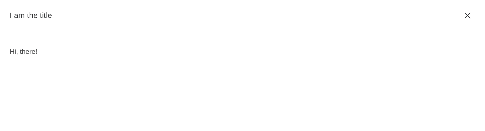
No Title
When you no longer need a title, you can remove it from the drawer.
Set the withHeader attribute to false,
you can remove the title from drawer, thus your drawer can have more
space on screen. If you want to be accessible, make sure to set the
title attribute.
ui <- el_page(
  el_button("open", "open", type = "primary"),
  el_drawer(
    "drw",
    title = "I am the title",
    with_header = FALSE,
    content = tags$span("Hi there!")
  )
)
server <- function(input, output, session) {
  observeEvent(input$open, update_el_drawer(id = "drw", visible = TRUE))
}
shinyApp(ui, server)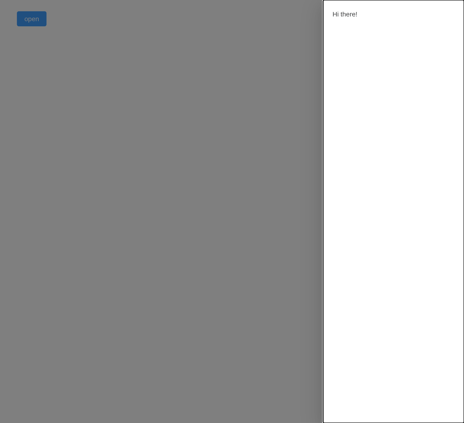
Customized Content
Like Dialog, Drawer can be used to display
a multitude of diverse interactions.
ui <- el_page(
  el_button("open", "Open Drawer with nested form", text = TRUE),
  el_drawer(
    "drw",
    title = "I have a nested form inside!",
    direction = "ltr",
    size = "40%",
    content = tagList(
      el_input(
        "name",
        label = "Name",
        label_position = "left",
        label_width = "80px"
      ),
      el_select(
        "area",
        choices = c("Area1" = "shanghai", "Area2" = "beijing"),
        label = "Area",
        label_position = "left",
        label_width = "80px"
      )
    ),
    footer = tagList(
      el_button("cancel", "Cancel"),
      el_button("submit", "Submit", type = "primary")
    )
  )
)
server <- function(input, output, session) {
  observeEvent(input$open, update_el_drawer(id = "drw", visible = TRUE))
}
shinyApp(ui, server)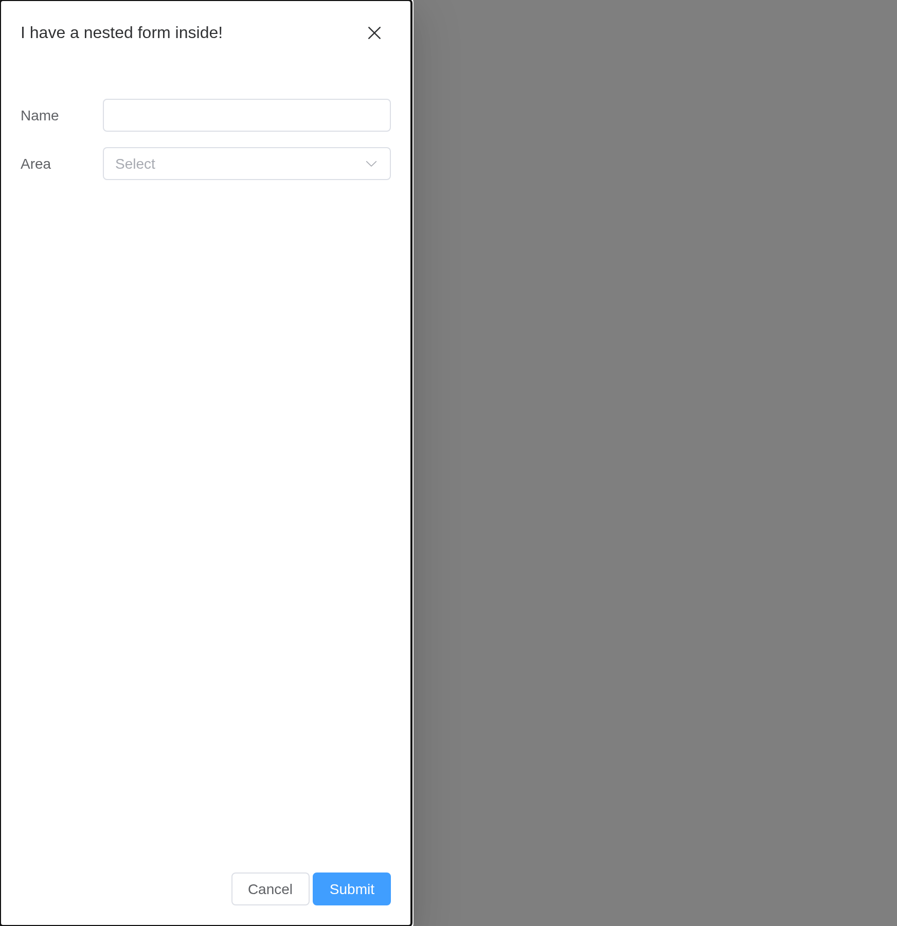
Customized Header
The header slot can be used to customize the area where
the title is displayed. In order to maintain accessibility, use the
title attribute in addition to using this slot, or use the
titleId slot property to specify which element should be
read out as the drawer title.
ui <- el_page(
  el_button("open", "Open Drawer with customized header"),
  el_drawer(
    "drw",
    show_close = FALSE,
    content = "This is drawer content.",
    title = tags$div(
      style = "display: flex; justify-content: space-between; align-items: center",
      tags$h4("This is a custom header!"),
      el_button("close", "Close", type = "danger", icon = "CircleCloseFilled")
    )
  )
)
server <- function(input, output, session) {
  observeEvent(input$open, update_el_drawer(id = "drw", visible = TRUE))
  observeEvent(input$close, update_el_drawer(id = "drw", visible = FALSE))
}
shinyApp(ui, server)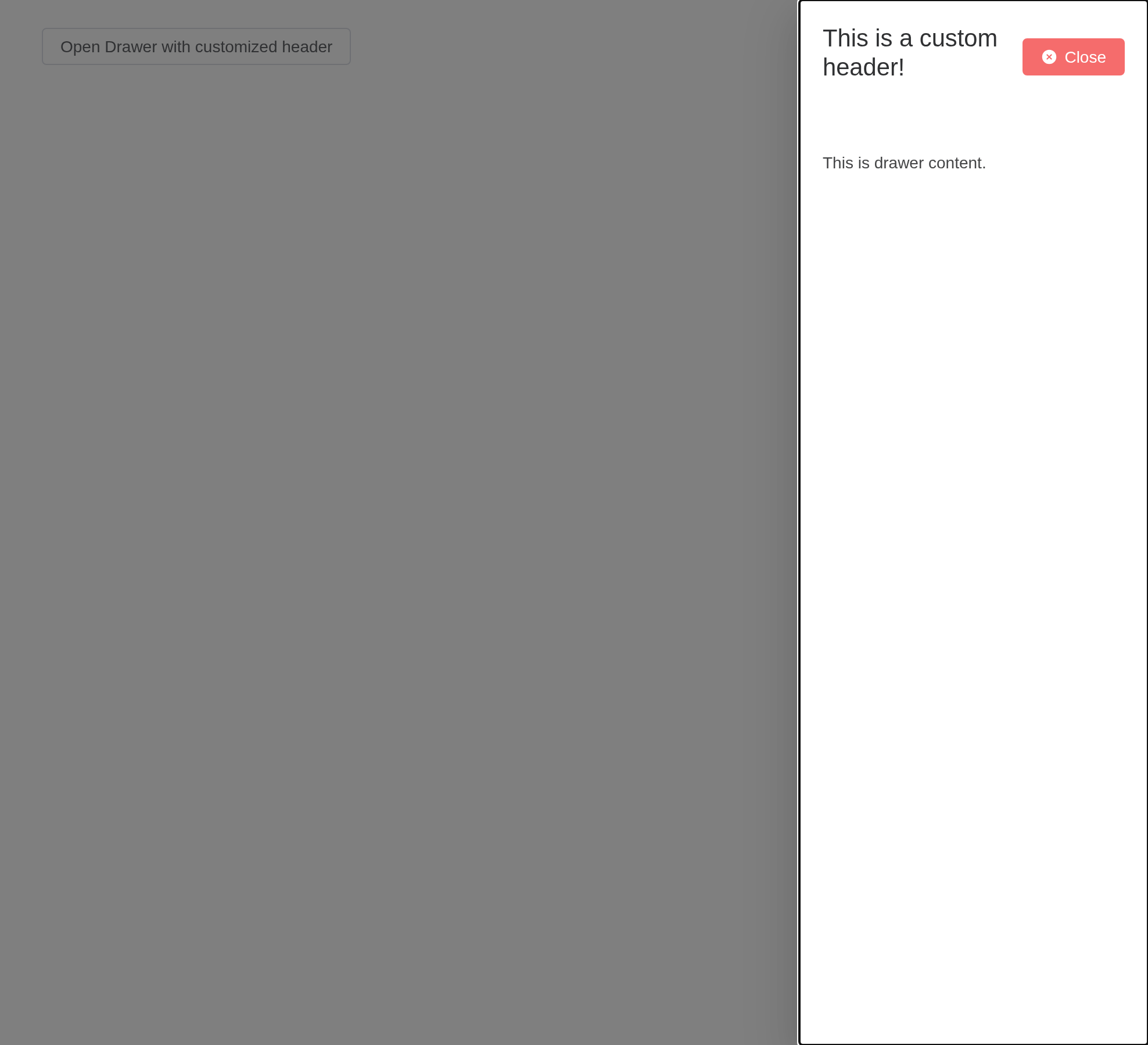
Resizable Drawer
Try to drag the edge part.
Set resizable to true to resize.
Picking an edge opens it there; dragging its inner edge resizes it,
reported as input$<id>_resize.
ui <- el_page(
  el_radio_group(
    "direction",
    choices = c(top = "ttb", right = "rtl", bottom = "btt", left = "ltr"),
    value = "rtl",
    button = TRUE
  ),
  el_drawer(
    "drw",
    direction = "rtl",
    resizable = TRUE,
    content = "This is drawer content."
  )
)
server <- function(input, output, session) {
  observeEvent(input$direction, ignoreInit = TRUE, {
    update_el_drawer(id = "drw", direction = input$direction, visible = TRUE)
  })
}
shinyApp(ui, server)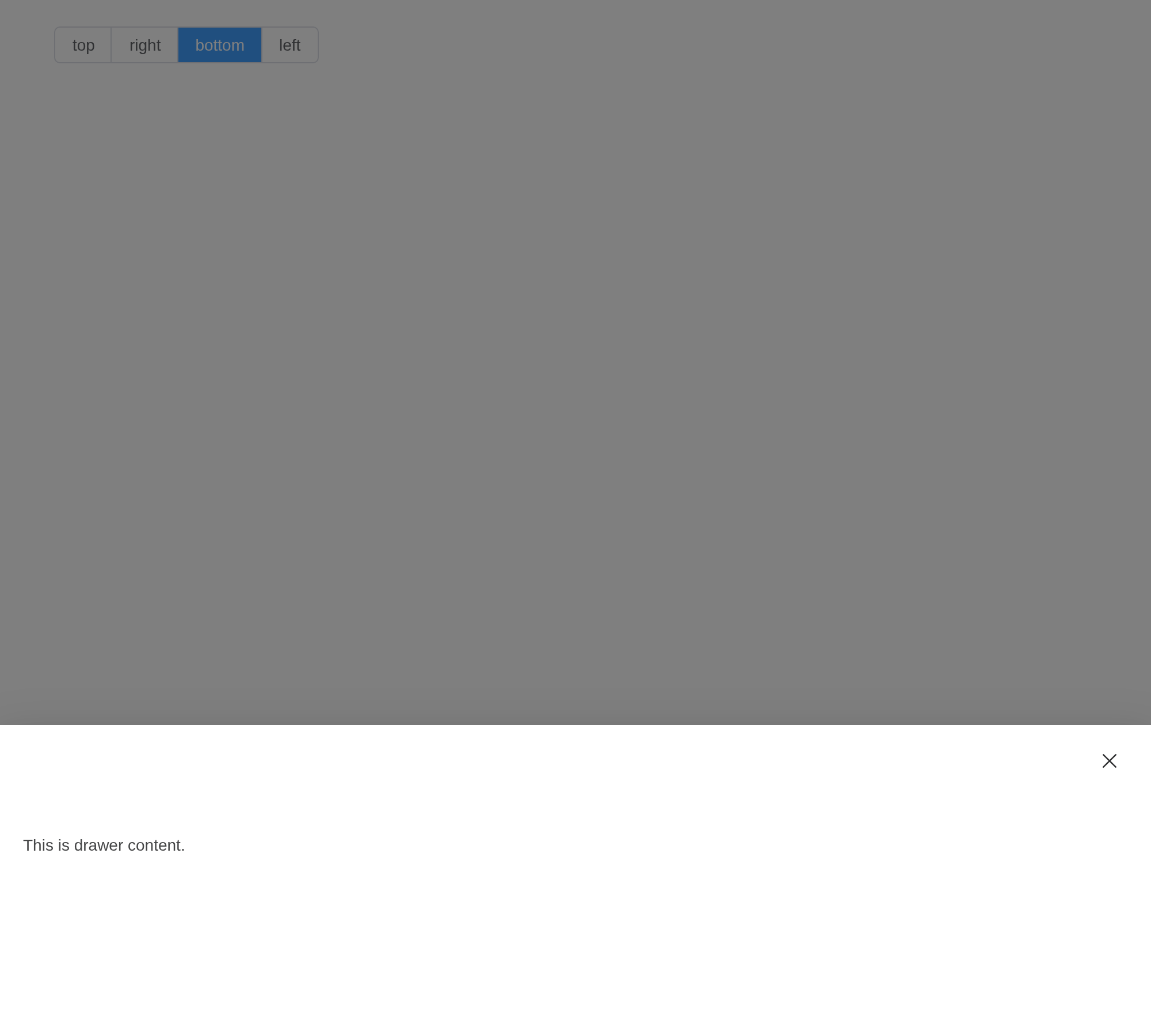
Nested Drawer
You can also have multiple layer of Drawer just like
Dialog.
If you need multiple Drawer in different layer, you must set the
append-to-body attribute to true
ui <- el_page(
  el_button("open", "open", type = "primary"),
  el_drawer(
    "outer",
    title = "I'm outer Drawer",
    size = "50%",
    content = tagList(
      el_button("inner_open", "Click me!"),
      el_drawer(
        "inner",
        title = "I'm inner Drawer",
        append_to_body = TRUE,
        content = tags$p("_(:з)∠)_")
      )
    )
  )
)
server <- function(input, output, session) {
  observeEvent(input$open, update_el_drawer(id = "outer", visible = TRUE))
  observeEvent(input$inner_open, update_el_drawer(id = "inner", visible = TRUE))
}
shinyApp(ui, server)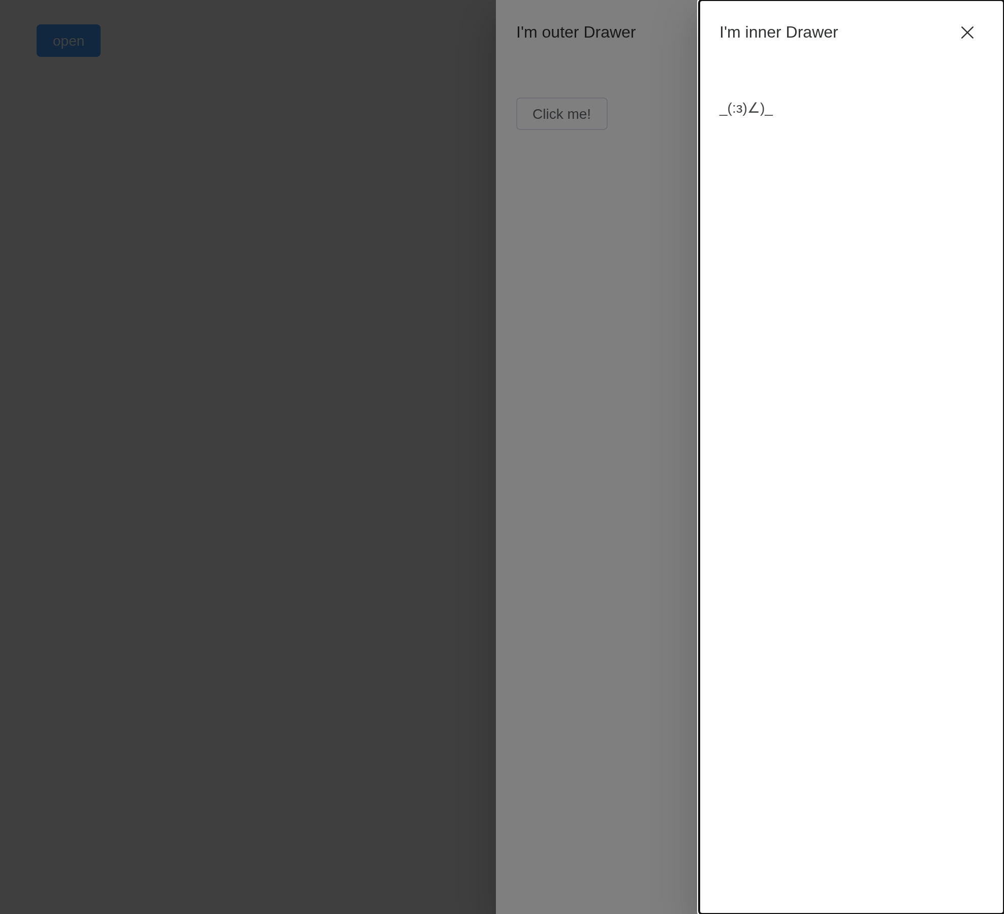
Modal
Setting modal to false will hide modal
(overlay) of drawer.
Starting from version 2.11.7, modal-penetrable attribute
is added, which can be penetrable.
ui <- el_page(
  el_button("open", "Open the modal Drawer", plain = TRUE),
  el_drawer(
    "drw",
    modal = FALSE,
    modal_penetrable = TRUE,
    content = tags$span("It's a modal Drawer"),
    footer = tagList(
      el_button("cancel", "Cancel"),
      el_button("confirm", "Confirm", type = "primary")
    )
  )
)
server <- function(input, output, session) {
  observeEvent(input$open, update_el_drawer(id = "drw", visible = TRUE))
}
shinyApp(ui, server)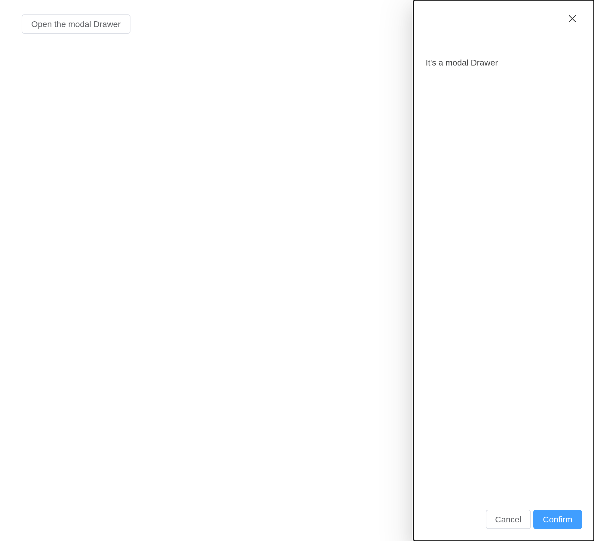
Tip
The content inside Drawer should be lazy rendered, which means that the content inside Drawer will not impact the initial render performance, therefore any DOM operation should be performed through
refor afteropenevent emitted.
Tip
Drawer provides an API called
destroy-on-close, which is a flag variable that indicates should destroy the children content inside Drawer after Drawer was closed. You can use this API when you need yourmountedlife cycle to be called every time the Drawer opens.
API
Element Plus’s tables, and beside each entry where it is in R.
Attributes
| Element | In R | Description | Type | Accepted | Default |
|---|---|---|---|---|---|
model-value |
visible; input$<id>
|
Should Drawer be displayed | 1 | false | |
append-to-body |
append_to_body |
Controls should Drawer be inserted to DocumentBody Element, nested Drawer must assign this param to true | 2 | false | |
append-to |
append_to |
which element the Drawer appends to. Will override
append-to-body
|
3 / 4 | body | |
lock-scroll |
lock_scroll |
whether scroll of body is disabled while Drawer is displayed | 5 | true | |
before-close |
before_close |
If set, closing procedure will be halted |
6(done: (cancel?: boolean) => void) => void(done is function type that accepts a boolean as parameter, calling done with true or without parameter will abort the close procedure)
|
— | |
close-on-click-modal |
close_on_click_modal |
whether the Drawer can be closed by clicking the mask | 7 | true | |
close-on-press-escape |
close_on_press_escape |
Indicates whether Drawer can be closed by pressing ESC | 8 | true | |
open-delay |
open_delay |
Time(milliseconds) before open | 9 | 0 | |
close-delay |
close_delay |
Time(milliseconds) before close | 10 | 0 | |
destroy-on-close |
destroy_on_close |
Indicates whether children should be destroyed after Drawer closed | 11 | false | |
modal |
modal |
Should show shadowing layer | 12 | true | |
modal-penetrable |
modal_penetrable |
whether the mask is penetrable. The modal attribute must be
false. |
13 | false | |
direction |
direction |
Drawer’s opening direction |
14'rtl' \\| 'ltr' \\| 'ttb' \\| 'btt'
|
rtl | |
resizable |
resizable |
enable resizable feature for Drawer | 15 | false | |
show-close |
show_close |
Should show close button at the top right of Drawer | 16 | true | |
size |
size |
Drawer’s size, if Drawer is horizontal mode, it effects the width
property, otherwise it effects the height property, when size is
number type, it describes the size by unit of pixels; when
size is string type, it should be used with x%
notation, other wise it will be interpreted to pixel unit |
17 / 18 | 30% | |
title |
title |
Drawer’s title, can also be set by named slot, detailed descriptions can be found in the slot form | 19 | — | |
with-header |
with_header |
Flag that controls the header section’s existence, default to true,
when withHeader set to false, both title attribute and
title slot won’t work |
20 | true | |
modal-class |
modal_class |
Extra class names for shadowing layer | 21 | — | |
header-class |
header_class |
custom class names for header wrapper | 22 | — | |
body-class |
body_class |
custom class names for body wrapper | 23 | — | |
footer-class |
footer_class |
custom class names for footer wrapper | 24 | — | |
z-index |
z_index |
set z-index | 25 | — | |
header-aria-level |
header_aria_level |
header’s aria-level attribute |
26 | 2 | |
custom-class |
custom_class |
Extra class names for Drawer | 27 | — |
Events
| Element | In R | Description |
|---|---|---|
open |
input$<id>_open |
Triggered before Drawer opening animation begins |
opened |
input$<id>_opened |
Triggered after Drawer opening animation ended |
close |
input$<id>_close |
Triggered before Drawer closing animation begins |
closed |
input$<id>_closed |
Triggered after Drawer closing animation ended |
open-auto-focus |
input$<id>_open_auto_focus |
triggers after Drawer opens and content focused |
close-auto-focus |
input$<id>_close_auto_focus |
triggers after Drawer closed and content focused |
resize-start |
input$<id>_resize_start |
Triggered when resizing starts (when resizable is
enabled) |
resize |
input$<id>_resize |
Triggered while resizing (when resizable is
enabled) |
resize-end |
input$<id>_resize_end |
Triggered when resizing ends (when resizable is
enabled) |
Slots
| Element | In R | Description |
|---|---|---|
default |
default content | Drawer’s Content |
header |
slots = list(header = ) |
Drawer header section; Replacing this removes the title, but does not remove the close button. |
footer |
slots = list(footer = ) |
Drawer footer Section |
title |
slots = list(title = ) |
Works the same as the header slot. Use that instead. |