Integrate information in a card container.
Basic usage
Card includes title, content and operations.
Card is made up of header, body and
footer. header and footer are
optional, and its content distribution depends on a named slot.
el_card(
  header = tags$div(class = "card-header", tags$span("Card name")),
  footer = "Footer content",
  style = "max-width: 480px",
  lapply(1:4, function(o) tags$p(class = "text item", paste("List item", o)))
)
Card name
List item 1
List item 2
List item 3
List item 4
Simple card
The header part can be omitted.
el_card(
  style = "max-width: 480px",
  lapply(1:4, function(o) tags$p(class = "text item", paste("List item", o)))
)
List item 1
List item 2
List item 3
List item 4
With images
Display richer content by adding some configs.
The body-style attribute defines CSS style of custom
body.
el_card(
  header = "Yummy hamburger",
  style = "max-width: 480px",
  tags$img(
    src = "https://shadow.elemecdn.com/app/element/hamburger.9cf7b091-55e9-11e9-a976-7f4d0b07eef6.png",
    alt = "A hamburger",
    style = "width: 100%"
  )
)
Yummy hamburger
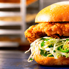
Shadow
You can define when to show the card shadows
The shadow attribute determines when the card shadows
are displayed. It can be always, hover or
never.
tags$div(
  style = "display: flex; flex-wrap: wrap; gap: 16px",
  el_card("Always", shadow = "always", style = "width: 480px"),
  el_card("Hover", shadow = "hover", style = "width: 480px"),
  el_card("Never", shadow = "never", style = "width: 480px")
)
Always
Hover
Never
API
Element Plus’s tables, and beside each entry where it is in R.
Attributes
| Element | In R | Description | Type | Accepted | Default |
|---|---|---|---|---|---|
header |
header |
title of the card. Also accepts a DOM passed by
slot#header
|
1 | — | |
footer |
footer |
footer of the card. Also accepts a DOM passed by
slot#footer
|
2 | — | |
body-style |
body_style |
CSS style of card body |
3CSSProperties
|
— | |
header-class |
header_class |
custom class name of card header | 4 | — | |
body-class |
body_class |
custom class name of card body | 5 | — | |
footer-class |
footer_class |
custom class name of card footer | 6 | — | |
shadow |
shadow |
when to show card shadows |
7always \\| never \\| hover
|
always |