A set of modal boxes simulating system message box, mainly for alerting information, confirm operations and prompting messages.
Tip
By design MessageBox provides simulations of system’s
alert,confirmandprompt,so it’s content should be simple. For more complicated contents, please use Dialog.
Alert
Alert interrupts user operation until the user confirms.
Open an alert by calling the ElMessageBox.alert method.
It simulates the system’s alert, and cannot be closed by
pressing ESC or clicking outside the box. In this example, two
parameters message and title are received. It
is worth mentioning that when the box is closed, it returns a
Promise object for further processing. If you are not sure
if your target browsers support Promise, you should import
a third party polyfill or use callbacks instead like this example.
The answer is input$<id>: "confirm",
"cancel" or "close".
ui <- el_page(el_button("open", "Click to open the Message Box", plain = TRUE))
server <- function(input, output, session) {
  observeEvent(
    input$open,
    el_message_box(
      session,
      "answer",
      "This is a message",
      title = "Title",
      box_type = "alert",
      confirm_button_text = "OK"
    )
  )
}
shinyApp(ui, server)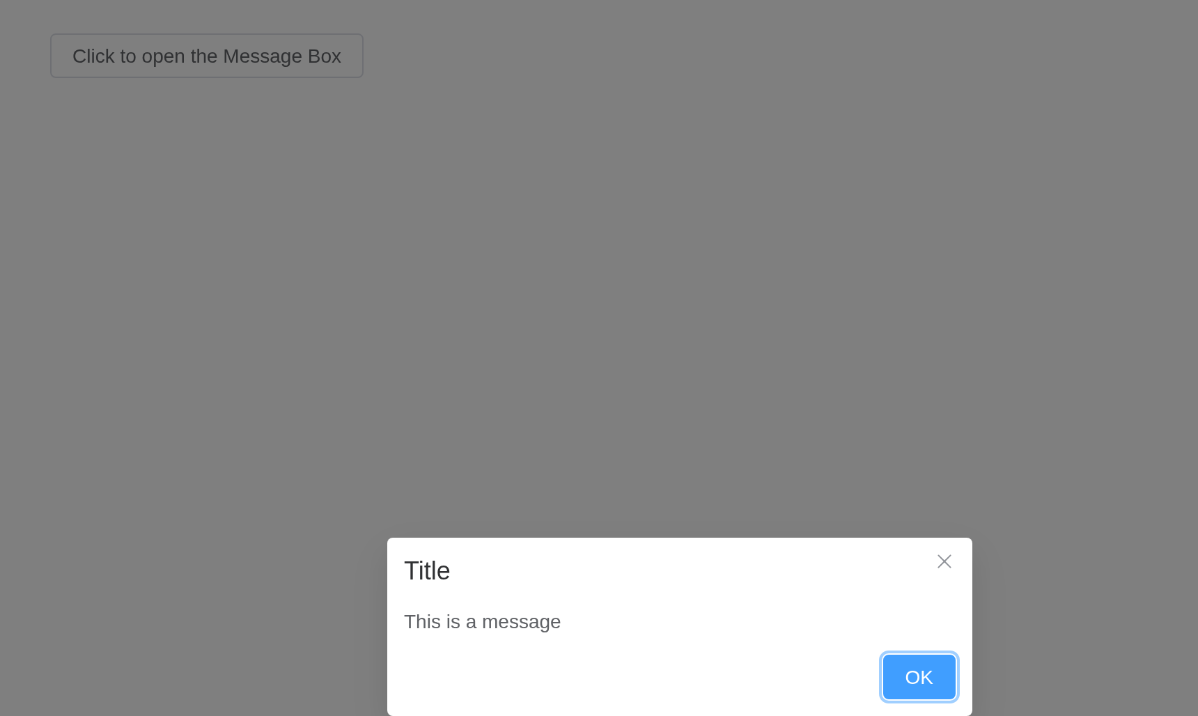
Confirm
Confirm is used to ask users’ confirmation.
Call ElMessageBox.confirm method to open a confirm, and
it simulates the system’s confirm. We can also highly
customize Message Box by passing a third attribute options
which is a literal object. The attribute type indicates the
message type, and it’s value can be primary,
success, error, info and
warning. Note that the second attribute title
must be a string, and if it is an object, it
will be handled as the attribute options. Here we use
Promise to handle further processing. primary
has been added in 2.9.11.
ui <- el_page(el_button("open", "Click to open the Message Box", plain = TRUE))
server <- function(input, output, session) {
  observeEvent(
    input$open,
    el_message_box(
      session,
      "answer",
      "proxy will permanently delete the file. Continue?",
      title = "Warning",
      type = "warning",
      confirm_button_text = "OK",
      cancel_button_text = "Cancel"
    )
  )
  observeEvent(
    input$answer,
    el_message(session, paste("Answer:", input$answer))
  )
}
shinyApp(ui, server)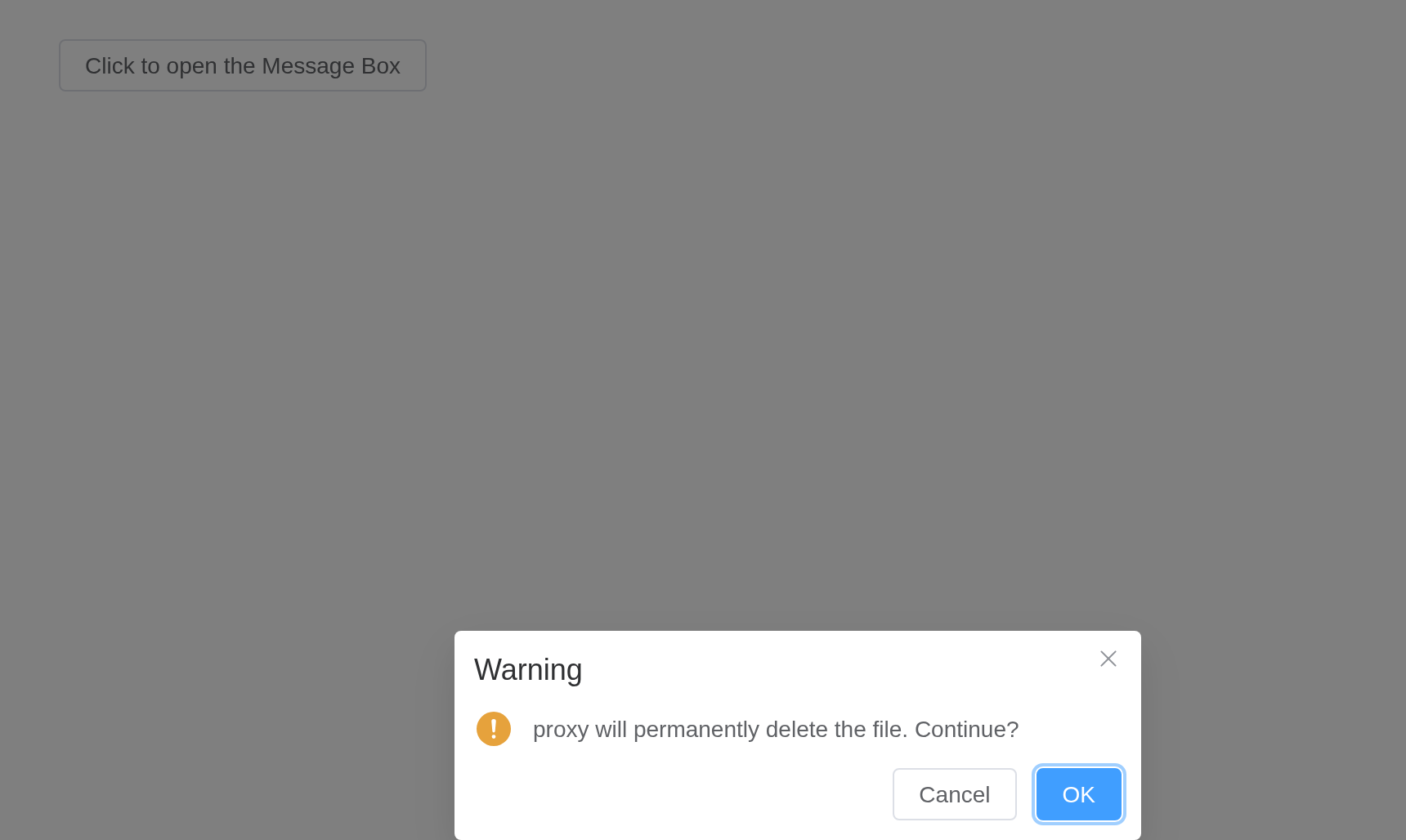
Prompt
Prompt is used when user input is required.
Call ElMessageBox.prompt method to open a prompt, and it
simulates the system’s prompt. You can use
inputPattern parameter to specify your own RegExp pattern.
Use inputValidator to specify validation method, and it
should return Boolean or String. Returning
false or String means the validation has
failed, and the string returned will be used as the
inputErrorMessage. In addition, you can customize the
placeholder of the input box with inputPlaceholder
parameter.
ui <- el_page(el_button("open", "Click to open Message Box", plain = TRUE))
server <- function(input, output, session) {
  observeEvent(
    input$open,
    el_message_box(
      session,
      "email",
      "Please input your e-mail",
      title = "Tip",
      box_type = "prompt",
      confirm_button_text = "OK",
      cancel_button_text = "Cancel",
      input_pattern = "[\\w!#$%&'*+/=?^_`{|}~-]+(?:\\.[\\w!#$%&'*+/=?^_`{|}~-]+)*@(?:[\\w](?:[\\w-]*[\\w])?\\.)+[\\w](?:[\\w-]*[\\w])?",
      input_error_message = "Invalid Email"
    )
  )
}
shinyApp(ui, server)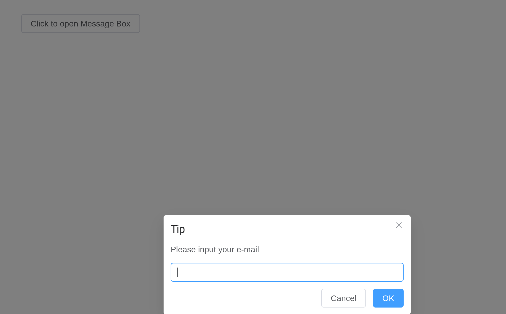
Use VNode
message can be VNode.
A message can be a VNode, built in the browser: give it as
JS() code calling Vue.h(). One with props that
change – the switch – is a function returning the VNode, as upstream
says.
ui <- el_page(
  el_button("open", "Common VNode", plain = TRUE),
  el_button("open1", "Dynamic props", plain = TRUE)
)
server <- function(input, output, session) {
  observeEvent(input$open, {
    el_message_box(
      session,
      "vn",
      JS(
        "Vue.h('p', null, [
          Vue.h('span', null, 'Message can be '),
          Vue.h('i', { style: 'color: teal' }, 'VNode')
        ])"
      ),
      title = "Message",
      box_type = "alert"
    )
  })
  observeEvent(input$open1, {
    el_message_box(
      session,
      "vn1",
      JS(
        "(function() {
          var checked = Vue.ref(false);
          return function() {
            return Vue.h(ElementPlus.ElSwitch, {
              modelValue: checked.value,
              'onUpdate:modelValue': function(v) { checked.value = v; }
            });
          };
        })()"
      ),
      title = "Message",
      box_type = "alert"
    )
  })
}
shinyApp(ui, server)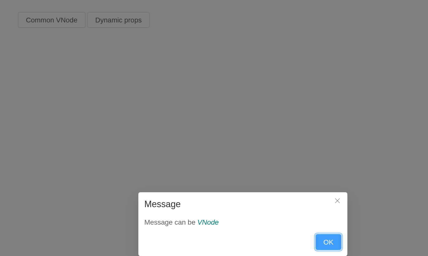
Use VNode With Action Handlers
You can receive { confirm, cancel, close } as parameters
in message, which allows custom content to trigger the same
MessageBox actions programmatically and automatically close the
instance.
A function message is handed the box’s own actions,
confirm, cancel and close, for
buttons of its own. The answer reaches the server as
input$handled, as for any message box.
ui <- el_page(el_button("open", "Click to open Message Box", plain = TRUE))
server <- function(input, output, session) {
  observeEvent(input$open, {
    el_message_box(
      session,
      "handled",
      JS(
        "function({ confirm, cancel, close }) {
          var button = function(props, text) {
            return Vue.h(ElementPlus.ElButton, props, function() { return text; });
          };
          return Vue.h('div', [
            Vue.h('p', { style: 'margin-bottom: 8px' },
              'Custom buttons with MessageBox action handlers'),
            button({ type: 'primary', onClick: function() { confirm(); } }, 'Resolve'),
            button({ type: 'danger', onClick: function() { cancel(); } }, 'Reject'),
            button({ onClick: function() { close(); } }, 'Close')
          ]);
        }"
      ),
      title = "Message",
      show_confirm_button = FALSE,
      show_cancel_button = FALSE,
      distinguish_cancel_and_close = TRUE
    )
  })
  observeEvent(
    input$handled,
    el_message(session, paste("Answer:", input$handled))
  )
}
shinyApp(ui, server)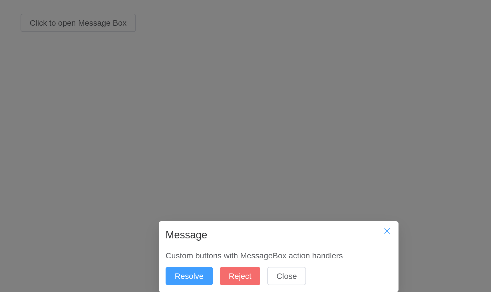
Customization
Can be customized to show various content.
The three methods mentioned above are repackagings of the
ElMessageBox method. This example calls
ElMessageBox method directly using the
showCancelButton attribute, which is used to indicate if a
cancel button is displayed. Besides we can use
cancelButtonClass to add a custom style and
cancelButtonText to customize the button text (the confirm
button also has these fields, and a complete list of fields can be found
at the end of this documentation). This example also uses the
beforeClose attribute. It is a method and will be triggered
when the MessageBox instance will be closed, and its execution will stop
the instance from closing. It has three parameters: action,
instance and done. Using it enables you to
manipulate the instance before it closes, e.g. activating
loading for confirm button; you can invoke the
done method to close the MessageBox instance (if
done is not called inside beforeClose, the
instance will not be closed).
ui <- el_page(el_button("open", "Click to open Message Box", plain = TRUE))
server <- function(input, output, session) {
  observeEvent(
    input$open,
    el_message_box(
      session,
      "answer",
      "This is a message",
      title = "Title",
      show_cancel_button = TRUE,
      confirm_button_text = "OK",
      cancel_button_text = "Cancel",
      confirm_button_type = "danger",
      button_size = "small"
    )
  )
}
shinyApp(ui, server)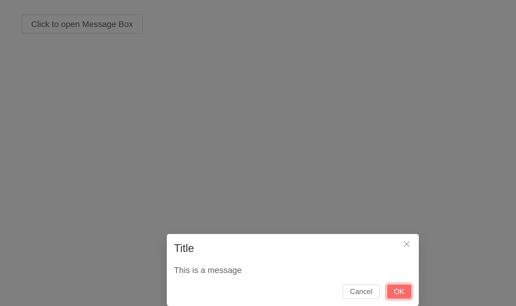
Use HTML String
message supports HTML string.
Set dangerouslyUseHTMLString to true and
message will be treated as an HTML string.
ui <- el_page(el_button("open", "Click to open Message Box", plain = TRUE))
server <- function(input, output, session) {
  observeEvent(
    input$open,
    el_message_box(
      session,
      "answer",
      "<strong>proxy is <i>HTML</i> string</strong>",
      title = "HTML String",
      box_type = "alert",
      dangerously_use_html_string = TRUE
    )
  )
}
shinyApp(ui, server)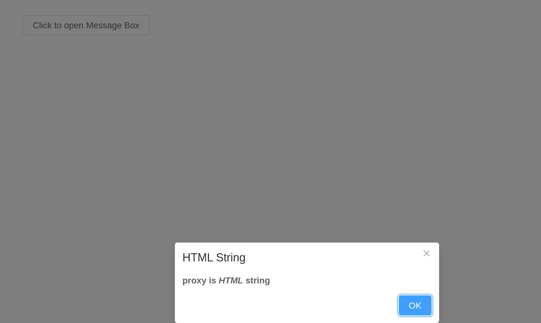
Warning
Although
messageproperty supports HTML strings, dynamically rendering arbitrary HTML on your website can be very dangerous because it can easily lead to XSS attacks. So whendangerouslyUseHTMLStringis on, please make sure the content ofmessageis trusted, and never assignmessageto user-provided content.
Distinguishing cancel and close
In some cases, clicking the cancel button and close button may have different meanings.
By default, the parameters of Promise’s reject callback and
callback are ‘cancel’ when the user cancels (clicking the
cancel button) and closes (clicking the close button or mask layer,
pressing the ESC key) the MessageBox. If
distinguishCancelAndClose is set to true, the parameters of
the above two operations are ‘cancel’ and ‘close’ respectively.
ui <- el_page(el_button("open", "Click to open Message Box", plain = TRUE))
server <- function(input, output, session) {
  observeEvent(
    input$open,
    el_message_box(
      session,
      "answer",
      "You have unsaved changes, save and proceed?",
      title = "Confirm",
      distinguish_cancel_and_close = TRUE,
      confirm_button_text = "Save",
      cancel_button_text = "Discard Changes"
    )
  )
}
shinyApp(ui, server)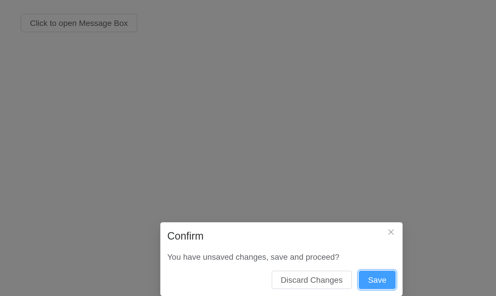
Centered content
Content of MessageBox can be centered.
Setting center to true will center the
content.
ui <- el_page(el_button("open", "Click to open Message Box", plain = TRUE))
server <- function(input, output, session) {
  observeEvent(
    input$open,
    el_message_box(
      session,
      "answer",
      "proxy will permanently delete the file. Continue?",
      title = "Warning",
      type = "warning",
      center = TRUE,
      confirm_button_text = "OK",
      cancel_button_text = "Cancel"
    )
  )
}
shinyApp(ui, server)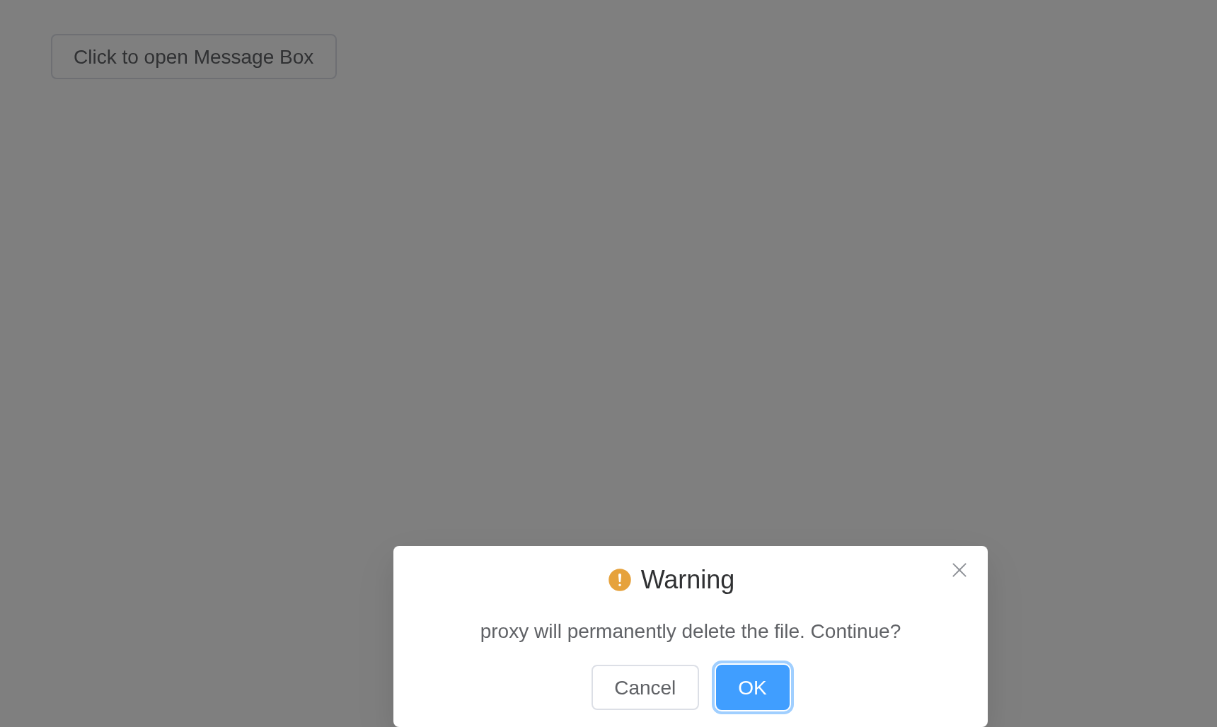
Customized Icon
The icon can be customized to any Vue component or render function (JSX).
ui <- el_page(el_button("open", "Click to open Message Box", plain = TRUE))
server <- function(input, output, session) {
  observeEvent(
    input$open,
    el_message_box(
      session,
      "answer",
      "Are you sure to delete this?",
      title = "Warning",
      type = "warning",
      icon = "Delete",
      confirm_button_text = "OK",
      cancel_button_text = "Cancel"
    )
  )
}
shinyApp(ui, server)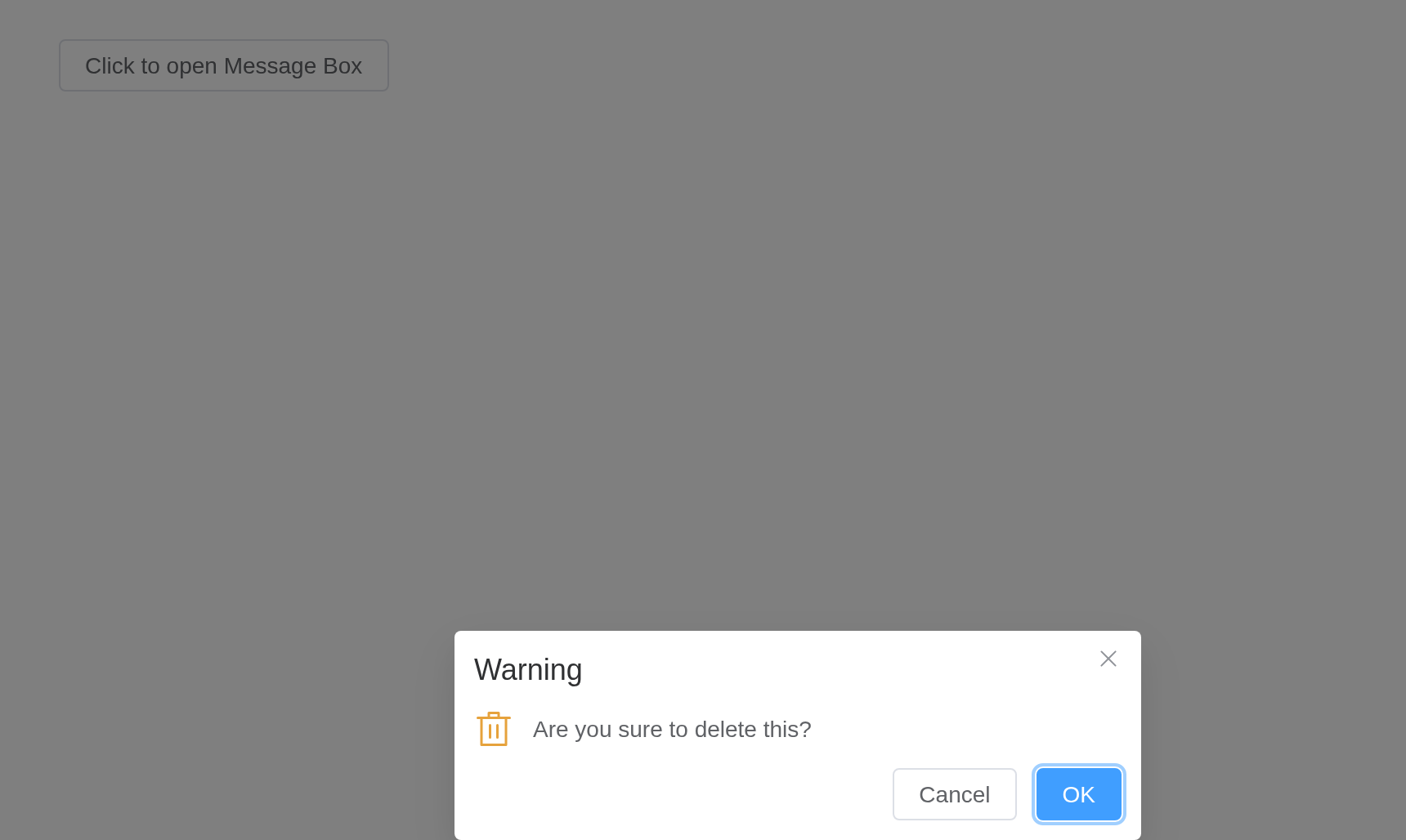
Draggable
MessageBox can be draggable.
Setting draggable to true allows user to
drag MessageBox. Set overflow 2.5.4 to true
can drag overflow the viewport.
ui <- el_page(el_button("open", "Click to open Message Box", plain = TRUE))
server <- function(input, output, session) {
  observeEvent(
    input$open,
    el_message_box(
      session,
      "answer",
      "proxy will permanently delete the file. Continue?",
      title = "Warning",
      type = "warning",
      draggable = TRUE,
      confirm_button_text = "OK",
      cancel_button_text = "Cancel"
    )
  )
}
shinyApp(ui, server)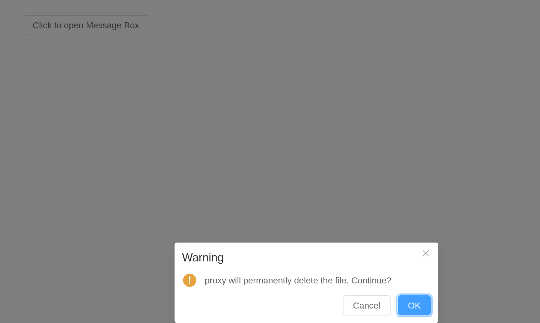
Global method
If Element Plus is fully imported, it will add the following global
methods for app.config.globalProperties:
$msgbox, $alert, $confirm and
$prompt. So in a Vue instance you can call
MessageBox like what we did in this page. The parameters
are:
$msgbox(options)-
$alert(message, title, options)or$alert(message, options) -
$confirm(message, title, options)or$confirm(message, options) -
$prompt(message, title, options)or$prompt(message, options)
App context inheritance > 2.0.4
Now message box accepts a context as second (fourth if
you are using message box variants) parameter of the message constructor
which allows you to inject current app’s context to message which allows
you to inherit all the properties of the app.
Local import
If you prefer importing MessageBox on demand:
The corresponding methods are: ElMessageBox,
ElMessageBox.alert, ElMessageBox.confirm and
ElMessageBox.prompt. The parameters are the same as
above.
API
Element Plus’s tables, and beside each entry where it is in R.
Options
| Element | In R | Description | Type | Accepted | Default |
|---|---|---|---|---|---|
autofocus |
autofocus |
auto focus when open MessageBox | 1 | true | |
title |
title |
title of the MessageBox | 2 | ’’ | |
message |
message |
content of the MessageBox |
3 /
4 / 5() => VNode ^(2.2.17) / 6({ confirm, cancel, close }) => VNode
^(2.14.0) |
— | |
dangerouslyUseHTMLString |
dangerously_use_html_string |
whether message is treated as HTML string |
7 | false | |
type |
type |
message type, used for icon display |
8'primary' (2.9.11) \\| 'success' \\| 'info' \\| 'warning' \\| 'error'
|
’’ | |
icon |
icon |
custom icon component, overrides type
|
9 / 10 | ’’ | |
closeIcon |
close_icon |
custom close icon component, default is Close | 11 / 12 | ’’ | |
customClass |
custom_class |
custom class name for MessageBox | 13 | ’’ | |
customStyle |
custom_style |
custom inline style for MessageBox | 14 | {} | |
modal |
modal |
whether a mask is displayed | 15 | true | |
modalClass |
modal_class |
custom class names for mask | string | — | |
callback |
`input$<id>, the
answer| MessageBox closing callback if you don't prefer Promise | ^[Function](value:
string, action: Action) => any \ |
(action: Action) =>
any| | null | |showClose|show_close| whether to show close icon of MessageBox | ^[boolean] | | true | |beforeClose|before_close| callback before MessageBox closes, and it will prevent MessageBox from closing | ^[Function](action:
Action, instance: MessageBoxState, done: () => void) =>
void| | null | |distinguishCancelAndClose|distinguish_cancel_and_close| whether to distinguish canceling and closing the MessageBox | ^[boolean] | | false | |lockScroll|lock_scroll| whether to lock body scroll when MessageBox prompts | ^[boolean] | | true | |showCancelButton|show_cancel_button| whether to show a cancel button | ^[boolean] | | false (true when called with confirm and prompt) | |showConfirmButton|show_confirm_button| whether to show a confirm button | ^[boolean] | | true | |cancelButtonText|cancel_button_text| text content of cancel button | ^[string] | | Cancel | |confirmButtonText|confirm_button_text| text content of confirm button | ^[string] | | OK | |cancelButtonType|cancel_button_type| type of cancel button | ^[enum]‘primary’
\ |
‘success’ \ | ‘warning’ \ | ‘danger’ \ |