Use Date Picker for date input.
Enter Date
Basic date picker measured by ‘day’.
The measurement is determined by the type attribute. You
can enable quick options via shortcuts property. The
disabled date is set by disabledDate, which is a
function.
The radio buttons resize both pickers with
update_el_date_picker(size =).
ui <- el_page(
  tags$style(
    ".demo-date-picker { display: flex; width: 100%; flex-wrap: wrap; }
     .demo-date-picker .block { padding: 1.5rem 0; text-align: center;
       border-right: solid 1px var(--el-border-color); flex: 1; min-width: 300px; }
     .demo-date-picker .block:last-child { border-right: none; }
     .demo-date-picker .demonstration { display: block; margin-bottom: 20px;
       color: var(--el-text-color-secondary); font-size: 14px; }"
  ),
  el_radio_group(
    "dp_size",
    choices = c("large", "default", "small"),
    selected = "default",
    button = TRUE
  ),
  tags$div(
    class = "demo-date-picker",
    tags$div(
      class = "block",
      tags$span(class = "demonstration", "Default"),
      el_date_picker("dp_default", placeholder = "Pick a day")
    ),
    tags$div(
      class = "block",
      tags$span(class = "demonstration", "Picker with quick options"),
      el_date_picker(
        "dp_quick",
        placeholder = "Pick a day",
        shortcuts = list(
          list(text = "Today", value = JS("new Date()")),
          list(
            text = "Yesterday",
            value = JS(
              "function() { var d = new Date(); d.setTime(d.getTime() - 3600 * 1000 * 24); return d; }"
            )
          ),
          list(
            text = "A week ago",
            value = JS(
              "function() { var d = new Date(); d.setTime(d.getTime() - 3600 * 1000 * 24 * 7); return d; }"
            )
          )
        ),
        disabled_date = JS(
          "function(time) { return time.getTime() > Date.now(); }"
        )
      )
    )
  )
)
server <- function(input, output, session) {
  observeEvent(input$dp_size, ignoreInit = TRUE, {
    for (id in c("dp_default", "dp_quick")) {
      update_el_date_picker(session, id, size = input$dp_size)
    }
  })
}
shinyApp(ui, server)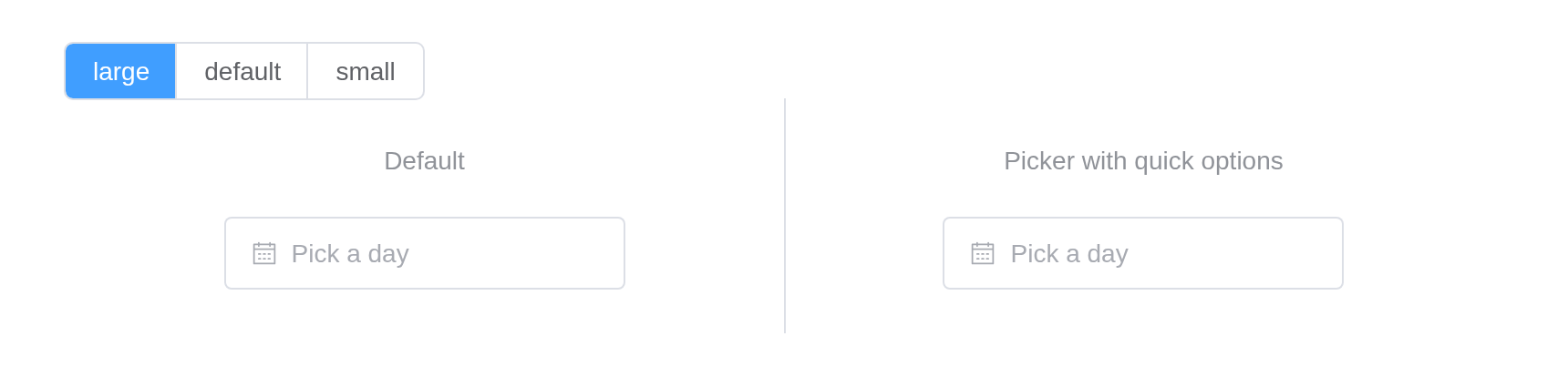
Other measurements
You can choose week, month, year, quarter or multiple dates by extending the standard date picker component.
pick <- function(id, type, placeholder, format = NULL) {
  tags$div(
    style = "margin-bottom: 12px",
    tags$div(type),
    el_date_picker(id, type = type, placeholder = placeholder, format = format)
  )
}
tagList(
  pick("dp_week", "week", "Pick a week", format = "[Week] ww"),
  pick("dp_month", "month", "Pick a month"),
  pick("dp_year", "year", "Pick a year"),
  pick("dp_years", "years", "Pick years"),
  pick("dp_months", "months", "Pick months"),
  pick("dp_dates", "dates", "Pick one or more dates")
)Date Range
Picking a date range is supported.
When in range mode, the left and right panels are linked by default.
If you want the two panels to switch current months independently, you
can use the unlink-panels attribute.
The radio buttons resize both pickers with
update_el_date_picker(size =).
ui <- el_page(
  tags$style(
    ".demo-date-picker { display: flex; width: 100%; flex-wrap: wrap; }
     .demo-date-picker .block { padding: 1.5rem 0; text-align: center;
       border-right: solid 1px var(--el-border-color); flex: 1; min-width: 300px; }
     .demo-date-picker .block:last-child { border-right: none; }
     .demo-date-picker .demonstration { display: block; margin-bottom: 20px;
       color: var(--el-text-color-secondary); font-size: 14px; }"
  ),
  el_radio_group(
    "dp_range_size",
    choices = c("large", "default", "small"),
    selected = "default",
    button = TRUE
  ),
  tags$div(
    class = "demo-date-picker",
    tags$div(
      class = "block",
      tags$span(class = "demonstration", "Default"),
      el_date_picker(
        "dp_range",
        type = "daterange",
        range_separator = "To",
        start_placeholder = "Start date",
        end_placeholder = "End date"
      )
    ),
    tags$div(
      class = "block",
      tags$span(class = "demonstration", "With quick options"),
      el_date_picker(
        "dp_range_quick",
        type = "daterange",
        unlink_panels = TRUE,
        range_separator = "To",
        start_placeholder = "Start date",
        end_placeholder = "End date",
        shortcuts = list(
          list(
            text = "Last week",
            value = JS(
              "function() { var e = new Date(), s = new Date(); s.setTime(s.getTime() - 3600 * 1000 * 24 * 7); return [s, e]; }"
            )
          ),
          list(
            text = "Last month",
            value = JS(
              "function() { var e = new Date(), s = new Date(); s.setMonth(s.getMonth() - 1); return [s, e]; }"
            )
          ),
          list(
            text = "Last 3 months",
            value = JS(
              "function() { var e = new Date(), s = new Date(); s.setMonth(s.getMonth() - 3); return [s, e]; }"
            )
          )
        )
      )
    )
  )
)
server <- function(input, output, session) {
  observeEvent(input$dp_range_size, ignoreInit = TRUE, {
    for (id in c("dp_range", "dp_range_quick")) {
      update_el_date_picker(session, id, size = input$dp_range_size)
    }
  })
}
shinyApp(ui, server)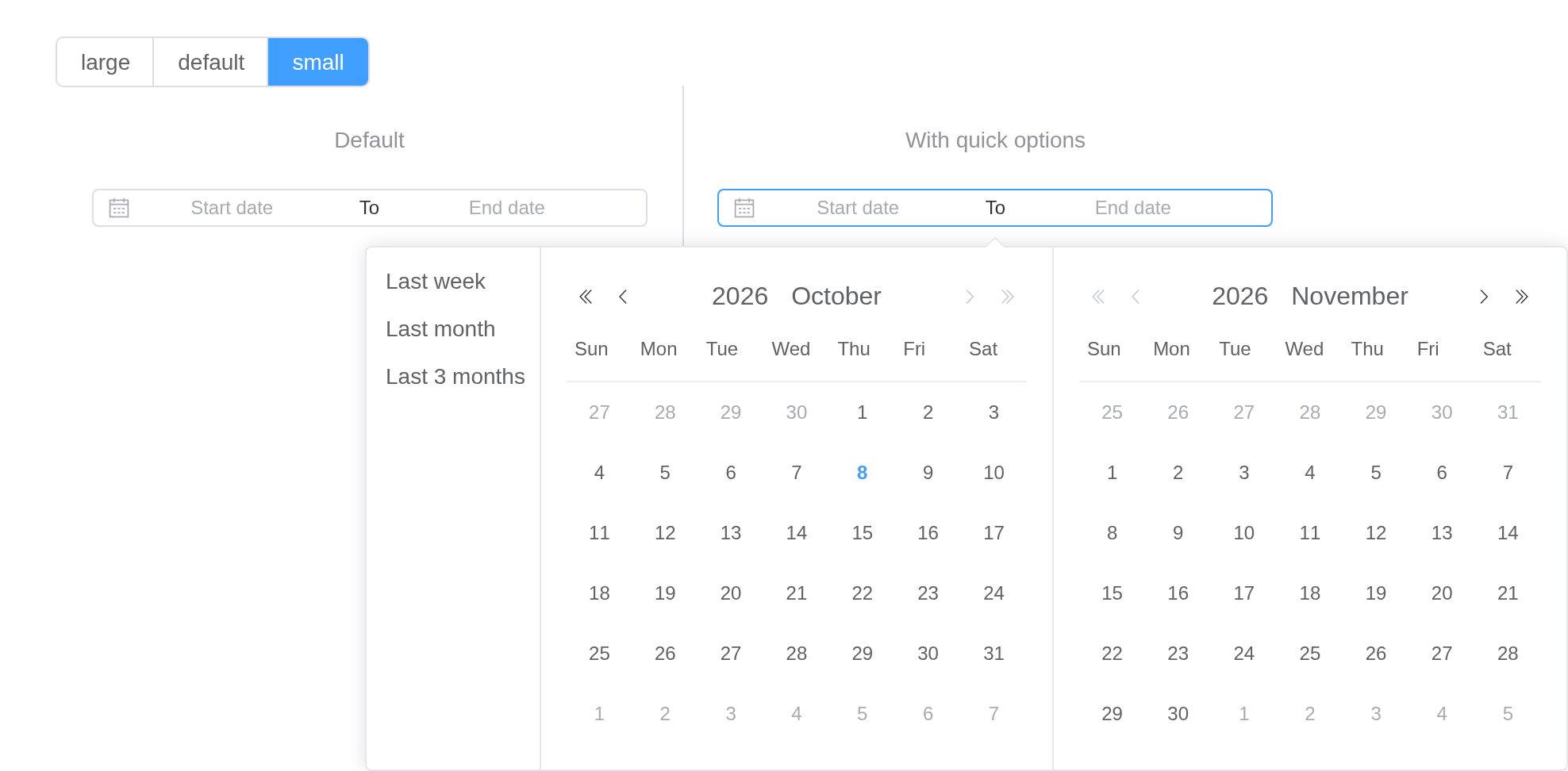
Month Range
Picking a month range is supported.
When in range mode, the left and right panels are linked by default.
If you want the two panels to switch current years independently, you
can use the unlink-panels attribute.
el_date_picker(
  "dp_mrange",
  type = "monthrange",
  range_separator = "To",
  start_placeholder = "Start month",
  end_placeholder = "End month"
)
Year Range
Picking a year range is supported.
When in range mode, the left and right panels are linked by default.
If you want the two panels to switch years independently, you can use
the unlink-panels attribute.
el_date_picker(
  "dp_yrange",
  type = "yearrange",
  range_separator = "To",
  start_placeholder = "Start Year",
  end_placeholder = "End Year"
)
Quarter Range
Picking a quarter range is supported.
When in range mode, the left and right panels are linked by default.
If you want the two panels to switch years independently, you can use
the unlink-panels attribute.
el_date_picker(
  "dp_qrange",
  type = "quarterrange",
  range_separator = "To",
  start_placeholder = "Start quarter",
  end_placeholder = "End quarter"
)
Single Panel
By default date picker ranges have two panels. If you want one panel
set the single-panel attribute.
el_date_picker(
  "dp_single",
  type = "daterange",
  single_panel = TRUE,
  start_placeholder = "Start date",
  end_placeholder = "End date"
)
Default Value
If user hasn’t picked a date, shows today’s calendar by default. You
can use default-value to set another date. Its value should
be parsable by new Date().
If type is daterange, default-value sets
the left side calendar.
tagList(
  el_date_picker(
    "dp_dv1",
    type = "date",
    placeholder = "Pick a date",
    default_value = "2010-10-01"
  ),
  el_date_picker(
    "dp_dv2",
    type = "daterange",
    start_placeholder = "Start Date",
    end_placeholder = "End Date",
    default_value = c("2010-09-01", "2010-10-01")
  )
)
Date Formats
Use format to control displayed text’s format in the
input box. Use value-format to control binding value’s
format.
By default, the component accepts and emits a Date
object.
Check the list here of all available formats of Day.js.
Warning
Pay attention to capitalization
value_format is the value reported to Shiny;
format what the input shows. Both in day.js’s tokens.
tagList(
  tags$div("Emits Date object"),
  el_date_picker("dp_fmt1", value = "2021-10-29", format = "YYYY/MM/DD"),
  tags$div("Use value-format"),
  el_date_picker(
    "dp_fmt2",
    value = "2021-10-29",
    format = "YYYY/MM/DD",
    value_format = "x"
  )
)Default time for start date and end date
When picking a date range, you can assign the time part for start date and end date.
By default, the time part of start date and end date are both
00:00:00. Setting default-time can change
their time respectively. It accepts an array of up to two Date objects.
The first string sets the time for the start date, and the second for
the end date.
el_date_picker(
  "dp_dt",
  type = "daterange",
  start_placeholder = "Start date",
  end_placeholder = "End date",
  default_time = list(
    JS("new Date(2000, 1, 1, 12, 0, 0)"),
    JS("new Date(2000, 2, 1, 8, 0, 0)")
  )
)
Set custom content of prefix
The content of prefix can be customized.
Setting prefix-icon to component which you import form
other .vue or generated by the render function.
el_date_picker(
  "dp_prefix",
  placeholder = "Pick a day",
  prefix_icon = "Calendar"
)
Custom content
The content of cell can be customized, in scoped-slot you can get the cell data. Note that the custom content structure should be consistent with the default structure, otherwise style misalignment may occur.
el_date_picker(
  "dp_cell",
  placeholder = "Pick a day",
  slots = list(
    default = template(
      htmltools::HTML(
        "<div class=\"cell\" :class=\"{ current: cell.isCurrent }\"><span class=\"cell__text\">{{ cell.text }}</span></div>"
      ),
      scope = "cell"
    )
  )
)
Custom icon
Custom icons available with slots.
The panel’s arrows are slots: prev-month,
next-month, prev-year,
next-year.
arrows <- function(months = TRUE) {
  c(
    if (months) {
      list(
        `prev-month` = el_icon("CaretLeft"),
        `next-month` = el_icon("CaretRight")
      )
    },
    list(`prev-year` = el_icon("Back"), `next-year` = el_icon("Right"))
  )
}
block <- function(title, picker) {
  tags$div(class = "block", tags$div(class = "demonstration", title), picker)
}
tagList(
  tags$style(
    ".demo-date-picker-icon { display: grid; width: 100%;
       grid-template-columns: repeat(2, 1fr); }
     .demo-date-picker-icon .block { padding: 1.5rem 1rem; text-align: center;
       display: flex; flex-direction: column; align-items: center;
       border-right: solid 1px var(--el-border-color);
       border-bottom: solid 1px var(--el-border-color); }
     .demo-date-picker-icon .block:nth-child(2n) { border-right: none; }
     .demo-date-picker-icon .block:nth-child(5) { grid-column: span 2;
       border-right: none; border-bottom: none; }
     .demo-date-picker-icon .block .el-date-editor { width: 100%; max-width: 360px; }
     .demo-date-picker-icon .demonstration { color: var(--el-text-color-secondary);
       font-size: 14px; margin-bottom: 1rem; }"
  ),
  tags$div(
    class = "demo-date-picker-icon",
    block(
      "date",
      el_date_picker(
        "dp_icon_date",
        placeholder = "Pick a day",
        format = "YYYY/MM/DD",
        value_format = "YYYY-MM-DD",
        slots = arrows()
      )
    ),
    block(
      "date range",
      el_date_picker(
        "dp_icon_range",
        type = "daterange",
        start_placeholder = "Start date",
        end_placeholder = "End date",
        format = "YYYY/MM/DD",
        value_format = "YYYY-MM-DD",
        unlink_panels = TRUE,
        slots = arrows()
      )
    ),
    block(
      "month range",
      el_date_picker(
        "dp_icon_month",
        type = "monthrange",
        start_placeholder = "Start date",
        end_placeholder = "End date",
        format = "YYYY/MM/DD",
        value_format = "YYYY-MM-DD",
        unlink_panels = TRUE,
        slots = arrows()
      )
    ),
    block(
      "year range",
      el_date_picker(
        "dp_icon_year",
        type = "yearrange",
        range_separator = "To",
        start_placeholder = "Start Year",
        end_placeholder = "End Year",
        slots = arrows(FALSE)
      )
    ),
    block(
      "quarter range",
      el_date_picker(
        "dp_icon_quarter",
        type = "quarterrange",
        range_separator = "To",
        start_placeholder = "Start quarter",
        end_placeholder = "End quarter",
        slots = arrows(FALSE)
      )
    )
  )
)For data details, please refer:
Localization
The default locale of is English, if you need to use other languages, please check Internationalization
Note, date time locale (month name, first day of the week …) are also configured in localization.
API
Element Plus’s tables, and beside each entry where it is in R.
Attributes
| Element | In R | Description | Type | Accepted | Default |
|---|---|---|---|---|---|
model-value |
value; input$<id>
|
binding value, if it is an range picker, the length of
the array should be 2 |
1 /
2 / 3 / 4number[] \\| string[] \\| Date[]
|
’’ | |
readonly |
readonly |
whether DatePicker is read only | 5 | false | |
disabled |
disabled |
whether DatePicker is disabled | 6 | false | |
size |
size |
size of Input |
7'' \\| 'large' \\| 'default' \\| 'small'
|
— | |
editable |
editable |
whether the input is editable | 8 | true | |
clearable |
clearable |
whether to show clear button | 9 | true | |
placeholder |
placeholder |
placeholder in non-range mode | 10 | ’’ | |
start-placeholder |
start_placeholder |
placeholder for the start date in range mode | 11 | — | |
end-placeholder |
end_placeholder |
placeholder for the end date in range mode | 12 | — | |
type |
type |
type of the picker. quarter, quarters, and
quarterrange are supported since ^(2.14.5) |
13'year' \\| 'years' \\|'month' \\| 'months' \\| 'date' \\| 'dates' \\| 'datetime' \\| 'week' \\| 'quarter' \\| 'quarters' \\| 'datetimerange' \\| 'daterange' \\| 'monthrange' \\| 'yearrange' \\| 'quarterrange'
|
date | |
format |
format |
format of the displayed value in the input box | 14 see date formats | YYYY-MM-DD | |
popper-class |
popper_class |
custom class name for DatePicker’s dropdown | 15 | — | |
popper-style |
popper_style |
custom style for DatePicker’s dropdown | 16 / 17 | — | |
popper-options |
popper_options |
Customized popper option see more at popper.js |
18Partial<PopperOptions>
|
{} | |
range-separator |
range_separator |
range separator | 19 | ‘-’ | |
default-value |
default_value |
optional, default date of the calendar |
20Date \\| [Date, Date]
|
— | |
default-time |
default_time |
optional, the time value to use when selecting date range |
21Date \\| [Date, Date]
|
— | |
value-format |
value_format |
optional, format of binding value. If not specified, the binding value will be a Date object | 22 see date formats | — | |
id |
id, the Shiny input’s |
same as id in native input |
23
/ 24[string, string]
|
— | |
unlink-panels |
unlink_panels |
unlink two date-panels in range-picker | 25 | false | |
single-panel |
single_panel |
show only one panel in range-picker | 26 | false | |
prefix-icon |
prefix_icon |
custom prefix icon component. By default, if the value of
type is TimeLikeType, the value is
Clock, else is Calendar
|
27
/ 28Component
|
’’ | |
clear-icon |
clear_icon |
custom clear icon component |
29
/ 30Component
|
CircleClose |
|
validate-event |
validate_event |
whether to trigger form validation | 31 | true | |
disabled-date |
disabled_date |
a function determining if a date is disabled with that date as its parameter. Should return a Boolean |
32(data: Date) => boolean
|
— | |
shortcuts |
shortcuts |
an object array to set shortcut options |
33Array<{ text: string, value: Date \\| Function }>
|
[] | |
cell-class-name |
cell_class_name |
set custom className |
34(data: Date) => string
|
— | |
teleported |
teleported |
whether date-picker dropdown is teleported to the body | 35 | true | |
empty-values |
empty_values |
empty values of component, see config-provider | 36 | — | |
value-on-clear |
value_on_clear |
clear return value, see config-provider | 37 / 38 / 39 / 40 | — | |
fallback-placements |
fallback_placements |
list of possible positions for Tooltip popper.js |
41Placement[]
|
[‘bottom’, ‘top’, ‘right’, ‘left’] | |
placement |
placement |
position of dropdown | Placement |
bottom | |
show-footer |
show_footer |
whether to show footer where the date picker is one 42'dates' \\| 'months' \\| 'years' \\| 'quarters'
|
43 | true | |
show-confirm |
show_confirm |
whether to show the confirm button | 44 | true | |
show-week-number |
show_week_number |
show the week number besides the week | 45 | false | |
automatic-dropdown |
automatic_dropdown |
this prop decides if the date picker panel pops up when the input is focused. (The default value will be set to false in version 3.0) | 46 | true |
Events
| Element | In R | Description |
|---|---|---|
change |
input$<id>, the value |
triggers when user confirms the value or click outside |
blur |
input$<id>_blur |
triggers when Input blurs |
focus |
input$<id>_focus |
triggers when Input focuses |
clear |
input$<id>_clear |
triggers when a clear button is clicked |
calendar-change |
input$<id>_calendar_change |
triggers when the calendar selected date is changed. Only for
range
|
panel-change |
input$<id>_panel_change |
triggers when the navigation button click. |
visible-change |
input$<id>_visible_change |
triggers when the DatePicker’s dropdown appears/disappears |
Slots
| Element | In R | Description |
|---|---|---|
default |
default content | custom cell content |
range-separator |
slots = list(range-separator = ) |
custom range separator content |
prev-month |
slots = list(prev-month = ) |
prev month icon |
next-month |
slots = list(next-month = ) |
next month icon |
prev-year |
slots = list(prev-year = ) |
prev year icon |
next-year |
slots = list(next-year = ) |
next year icon |
Exposes
| Element | In R | Description |
|---|---|---|
focus |
call_el(session, id, "focus") |
focus the DatePicker component |
blur |
call_el(session, id, "blur") |
blur the DatePicker component |
handleOpen |
call_el(session, id, "handleOpen") |
open the DatePicker popper |
handleClose |
call_el(session, id, "handleClose") |
close the DatePicker popper |