Form consists of input, radio,
select, checkbox and so on. With form, you can
collect, verify and submit data.
Tip
The component has been upgraded with a flex layout to replace the old float layout.
Basic Form
It includes all kinds of input items, such as input,
select, radio and checkbox.
In each form component, you need a
form-item field to be the container of your input item.
el_form_item() puts the date and the time under one
label, in columns.
el_form(
  id = "activity",
  label_width = "auto",
  width = "600px",
  submit_label = "Create",
  reset_label = "Cancel",
  el_form_field("name", "input", label = "Activity name"),
  el_form_field(
    "region",
    "select",
    label = "Activity zone",
    choices = c("Zone one" = "shanghai", "Zone two" = "beijing"),
    placeholder = "please select your zone"
  ),
  el_form_item(
    "Activity time",
    el_form_field(
      "date1",
      "date-picker",
      placeholder = "Pick a date",
      style = "width: 100%"
    ),
    "-",
    el_form_field(
      "date2",
      "time-picker",
      placeholder = "Pick a time",
      style = "width: 100%"
    )
  ),
  el_form_field("delivery", "switch", label = "Instant delivery"),
  el_form_field(
    "type",
    "checkbox-group",
    label = "Activity type",
    choices = c(
      "Online activities",
      "Promotion activities",
      "Offline activities",
      "Simple brand exposure"
    )
  ),
  el_form_field(
    "resource",
    "radio-group",
    label = "Resources",
    choices = c("Sponsor", "Venue")
  ),
  el_form_field("desc", "textarea", label = "Activity form")
)
Tip
W3C regulates that
When there is only one single-line text input field in a form, the user agent should accept Enter in that field as a request to submit the form.
To prevent this behavior, you can add
@submit.preventon<el-form>.
Inline Form
When the vertical space is limited and the form is relatively simple, you can put it in one line.
Set the inline attribute to true and the
form will be inline.
el_form(
  id = "search",
  inline = TRUE,
  label_width = NULL,
  submit_label = "Query",
  el_form_field(
    "user",
    "input",
    label = "Approved by",
    placeholder = "Approved by",
    clearable = TRUE
  ),
  el_form_field(
    "region",
    "select",
    label = "Activity zone",
    choices = c("Zone one" = "shanghai", "Zone two" = "beijing"),
    placeholder = "Activity zone",
    clearable = TRUE
  ),
  el_form_field(
    "date",
    "date-picker",
    label = "Activity time",
    placeholder = "Pick a date",
    clearable = TRUE
  )
)
Alignment
Depending on your design, there are several different ways to align your label element.
You can set label-position of el-form-item
separately 2.7.7. If the value is empty, the label-position
of el-form is used.
The label-position attribute decides how labels align,
it can be top or left. When set to
top, labels will be placed at the top of the form
field.
The two radio groups are fields with report = TRUE: they
report as input$align_position and
input$align_item_position as they change, and the server
moves the labels – the form’s with
update_el_form(label_position =), the fields’ by giving the
fields again with their own label_position.
positions <- c(Left = "left", Right = "right", Top = "top")
fields <- function(item_position = "") {
  list(
    el_form_field(
      "position",
      "radio-group",
      label = "Form Align",
      label_position = "right",
      choices = positions,
      value = "right",
      button = TRUE,
      report = TRUE
    ),
    el_form_field(
      "item_position",
      "radio-group",
      label = "Form Item Align",
      label_position = "right",
      choices = c(Empty = "", positions),
      value = item_position,
      button = TRUE,
      report = TRUE
    ),
    el_form_field(
      "name",
      "input",
      label = "Name",
      label_position = item_position
    ),
    el_form_field(
      "region",
      "input",
      label = "Activity zone",
      label_position = item_position
    ),
    el_form_field(
      "type",
      "input",
      label = "Activity form",
      label_position = item_position
    )
  )
}
ui <- el_page(
  do.call(
    el_form,
    c(
      list(
        id = "align",
        label_position = "right",
        label_width = "auto",
        width = "600px",
        submit_label = NULL
      ),
      fields()
    )
  )
)
server <- function(input, output, session) {
  observeEvent(input$align_position, ignoreInit = TRUE, {
    update_el_form(session, "align", label_position = input$align_position)
  })
  observeEvent(input$align_item_position, ignoreInit = TRUE, {
    update_el_form(
      session,
      "align",
      fields = fields(input$align_item_position)
    )
  })
}
shinyApp(ui, server)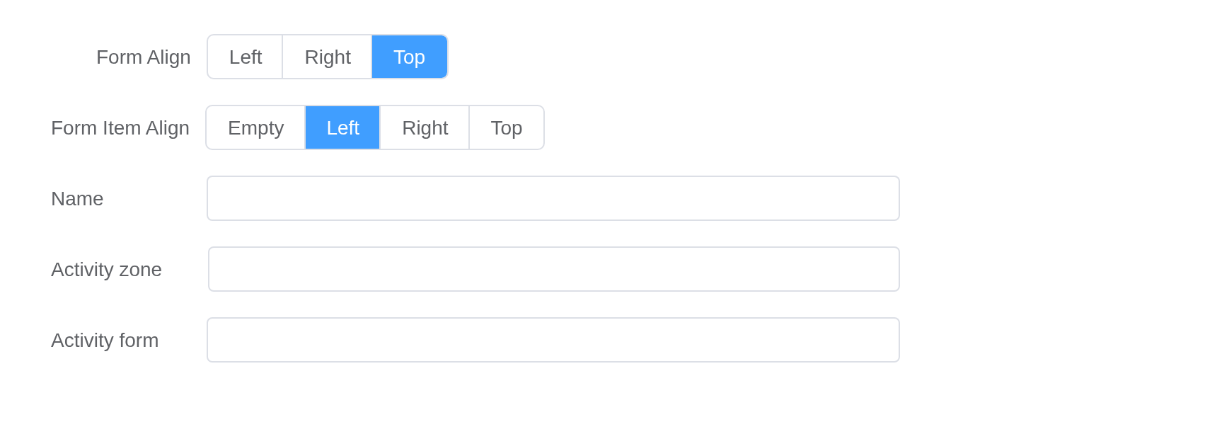
Validation
Form component allows you to verify your data, helping you find and correct errors.
Just add the rules attribute for Form
component, pass validation rules, and set prop attribute
for FormItem as a specific key that needs to be validated.
See more information at async-validator.
ui <- el_page(
  el_form(
    id = "rules",
    label_width = "120px",
    submit_label = "Create",
    reset_label = "Reset",
    el_form_field(
      "name",
      "input",
      label = "Activity name",
      rules = list(
        el_rule(required = TRUE, message = "Please input Activity name"),
        el_rule(min = 3, max = 5, message = "Length should be 3 to 5")
      )
    ),
    el_form_field(
      "region",
      "select",
      label = "Activity zone",
      choices = c("Zone one" = "shanghai", "Zone two" = "beijing"),
      rules = el_rule(
        required = TRUE,
        message = "Please select Activity zone",
        trigger = "change"
      )
    ),
    el_form_field(
      "type",
      "checkbox-group",
      label = "Activity type",
      choices = c("Online activities", "Promotion activities"),
      rules = el_rule(
        type = "array",
        required = TRUE,
        trigger = "change",
        message = "Please select at least one activity type"
      )
    )
  ),
  verbatimTextOutput("verdict")
)

server <- function(input, output, session) {
  output$verdict <- renderPrint({
    req(input$rules_submit)
    input$rules_valid
  })
}

shinyApp(ui, server)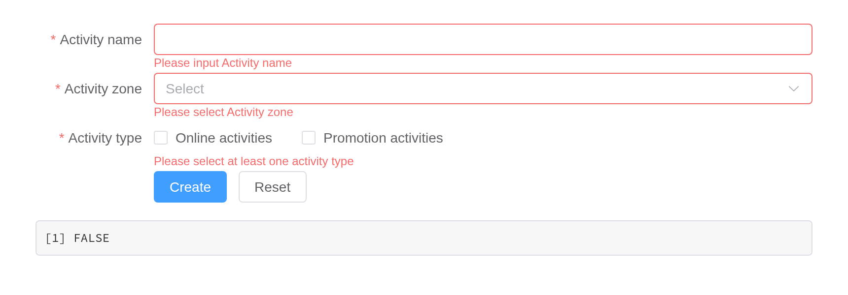
Custom Validation Rules
This example shows how to customize your own validation rules to finish a two-factor password verification.
Here we use status-icon to reflect validation result as
an icon.
ui <- el_page(el_form(
  id = "account",
  status_icon = TRUE,
  label_width = "120px",
  submit_label = "Submit",
  width = "480px",
  el_form_field(
    "pass",
    "password",
    label = "Password",
    rules = el_rule(required = TRUE, message = "Please input the password")
  ),
  el_form_field(
    "check",
    "password",
    label = "Confirm",
    rules = el_rule(
      trigger = "blur",
      validator = JS(
        "function(rule, value, callback, source) {",
        "  if (!value) return callback(new Error('Please input the password again'));",
        "  value !== source.pass ? callback(new Error(\"Two inputs don't match!\")) : callback();",
        "}"
      )
    )
  ),
  el_form_field(
    "age",
    "input",
    label = "Age",
    rules = el_rule(
      trigger = "blur",
      validator = JS(
        "function(rule, value, callback) {",
        "  var n = Number(value);",
        "  if (!value) return callback(new Error('Please input the age'));",
        "  if (isNaN(n)) return callback(new Error('Please input digits'));",
        "  n < 18 ? callback(new Error('Age must be greater than 18')) : callback();",
        "}"
      )
    )
  )
))

shinyApp(ui, function(input, output, session) {})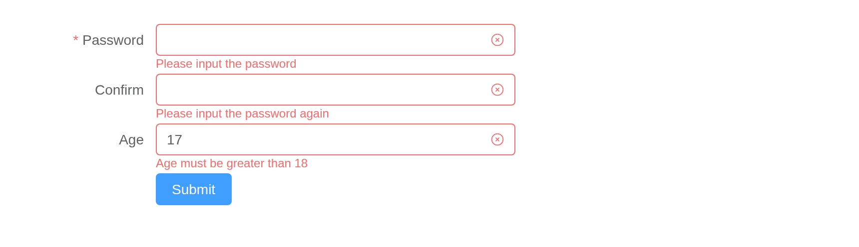
Tip
Custom validate callback function must be called. See more advanced usage at async-validator.
Add/Delete Form Item
In addition to passing all validation rules at once on the form component, you can also pass the validation rules or delete rules on a single form field dynamically.
domain <- function(i) {
  el_form_field(
    paste0("domain", i),
    "input",
    label = paste("Domain", i),
    rules = el_rule(required = TRUE, message = "Domain can not be null")
  )
}

ui <- el_page(
  el_form(
    id = "domains",
    submit_label = NULL,
    label_width = "100px",
    width = "480px",
    el_form_field(
      "email",
      "input",
      label = "Email",
      rules = el_rule(type = "email", message = "Please input a correct email")
    ),
    domain(1)
  ),
  el_button("more", "New domain"),
  el_button("fewer", "Remove last")
)

server <- function(input, output, session) {
  n <- reactiveVal(1)
  redraw <- function() {
    update_el_form(
      id = "domains",
      fields = c(
        list(el_form_field("email", "input", label = "Email")),
        lapply(seq_len(n()), domain)
      )
    )
  }
  observeEvent(input$more, {
    n(n() + 1)
    redraw()
  })
  observeEvent(input$fewer, {
    n(max(1, n() - 1))
    redraw()
  })
}

shinyApp(ui, server)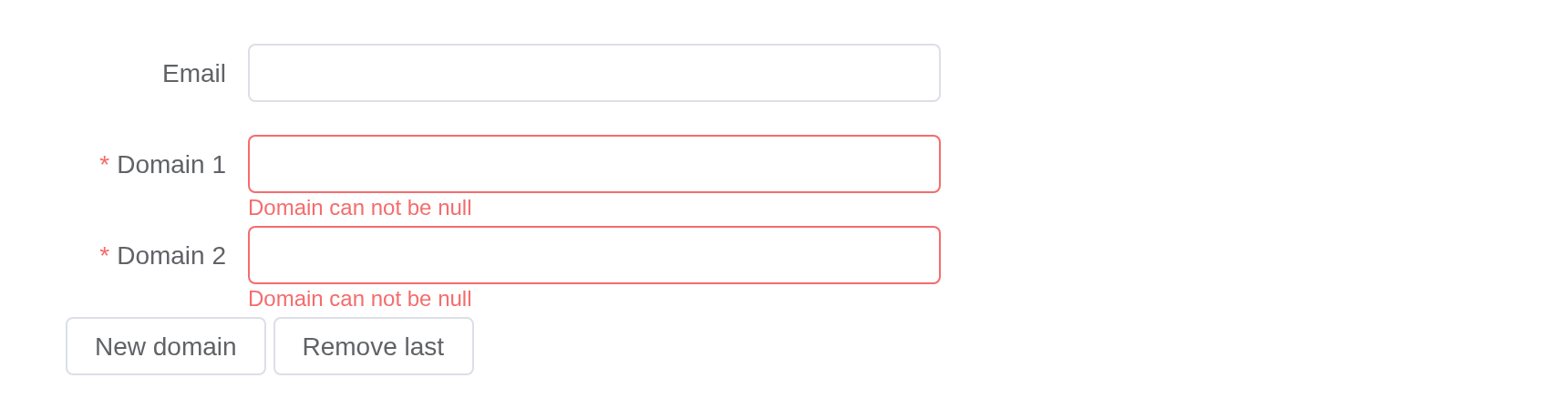
Number Validate
Number Validate need a .number modifier added on the
input v-model binding,it’s used to transform the string
value to the number which is provided by Vue.
ui <- el_page(el_form(
  id = "aged",
  submit_label = "Submit",
  label_width = "100px",
  width = "420px",
  el_form_field(
    "age",
    "input",
    label = "Age",
    rules = list(
      el_rule(required = TRUE, message = "Age is required"),
      el_rule(
        type = "number",
        message = "Age must be a number",
        transform = JS("function(v) { return Number(v); }")
      )
    )
  )
))

shinyApp(ui, function(input, output, session) {})
Tip
When an
el-form-itemis nested in anotherel-form-item, its label width will be0. You can setlabel-widthon thatel-form-itemif needed.
Size Control
All components in a Form inherit their size attribute
from that Form. Similarly, FormItem also has a size
attribute.
Still you can fine tune each component’s size if you
don’t want that component to inherit its size from From or FormItem.
The radio buttons set the form’s size and
label_position with update_el_form().
ui <- el_page(
  tags$div(
    el_radio_group(
      "form_size",
      choices = c("large", "default", "small"),
      selected = "default",
      button = TRUE
    ),
    el_radio_group(
      "form_position",
      choices = c(Left = "left", Right = "right", Top = "top"),
      selected = "right",
      button = TRUE
    )
  ),
  tags$br(),
  el_form(
    id = "sized",
    label_width = "auto",
    label_position = "right",
    width = "600px",
    submit_label = "Create",
    reset_label = "Cancel",
    el_form_field("name", "input", label = "Activity name"),
    el_form_field(
      "region",
      "select",
      label = "Activity zone",
      choices = c("Zone one" = "shanghai", "Zone two" = "beijing"),
      placeholder = "please select your zone"
    ),
    el_form_item(
      "Activity time",
      el_form_field(
        "date1",
        "date-picker",
        placeholder = "Pick a date",
        style = "width: 100%"
      ),
      "-",
      el_form_field(
        "date2",
        "time-picker",
        placeholder = "Pick a time",
        style = "width: 100%"
      )
    ),
    el_form_field(
      "type",
      "checkbox-group",
      label = "Activity type",
      choices = c("Online activities", "Promotion activities"),
      button = TRUE
    ),
    el_form_field(
      "resource",
      "radio-group",
      label = "Resources",
      choices = c("Sponsor", "Venue"),
      border = TRUE
    )
  )
)
server <- function(input, output, session) {
  observeEvent(input$form_size, ignoreInit = TRUE, {
    update_el_form(session, "sized", size = input$form_size)
  })
  observeEvent(input$form_position, ignoreInit = TRUE, {
    update_el_form(session, "sized", label_position = input$form_position)
  })
}
shinyApp(ui, server)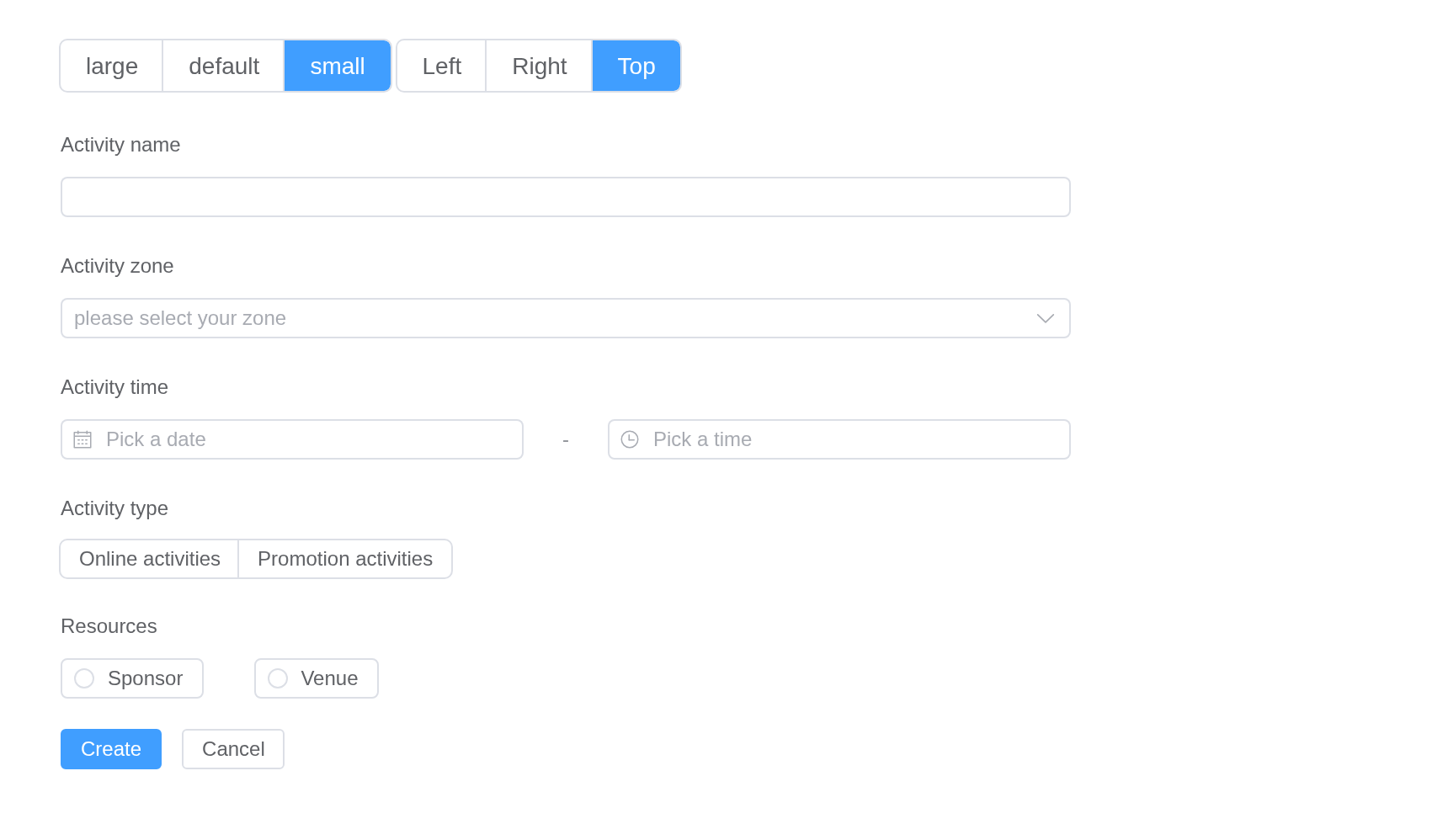
Accessibility
When only a single input (or related control such as select or
checkbox) is inside of a el-form-item, the form item’s
label will automatically be attached to that input. However, if multiple
inputs are inside of the el-form-item, the form item will
be assigned the WAI-ARIA
role of group
instead. In this case, it is your responsibility to assign assistive
labels to the individual inputs.
A field’s label is tied to its control, so a screen reader announces
it. Under a label for a group, each control needs a label of its own:
aria_label. The notes are beside the forms here, a form
holding only fields.
el_space(
  fill = TRUE,
  direction = "vertical",
  width = "600px",
  el_alert(
    type = "info",
    show_icon = TRUE,
    closable = FALSE,
    title = '"Full Name" label is automatically attached to the input:'
  ),
  el_form(
    id = "a11y_name",
    label_position = "left",
    label_width = "140px",
    submit_label = NULL,
    el_form_field("full_name", "input", label = "Full Name")
  ),
  el_alert(
    type = "info",
    show_icon = TRUE,
    closable = FALSE,
    title = paste(
      '"Your Information" serves as a label for the group of inputs.',
      "You must specify labels on the individal inputs. Placeholders are",
      'not replacements for using the "label" attribute.'
    )
  ),
  el_form(
    id = "a11y_group",
    label_position = "left",
    label_width = "140px",
    submit_label = NULL,
    el_form_item(
      "Your Information",
      el_form_field(
        "first_name",
        "input",
        aria_label = "First Name",
        placeholder = "First Name"
      ),
      el_form_field(
        "last_name",
        "input",
        aria_label = "Last Name",
        placeholder = "Last Name"
      ),
      gutter = 20
    )
  )
)
API
Element Plus’s tables, and beside each entry where it is in R.
Form Attributes
| Element | In R | Description | Type | Accepted | Default |
|---|---|---|---|---|---|
model |
each field'svalue; update_el_form(model =)
|
Data of form component. |
1Record<string, any>
|
— | |
rules |
el_form_field(rules =) |
Validation rules of form. |
2FormRules
|
— | |
inline |
el_form(inline =) |
Whether the form is inline. | 3 | false | |
label-position |
el_form(label_position =) |
Position of label. If set to 'left' or
'right', label-width prop is also
required. |
4'left' \\| 'right' \\| 'top'
|
right | |
label-width |
el_form(label_width =) |
Width of label, e.g. '50px'. All its direct child form
items will inherit this value. auto is supported. |
5 / 6 | ’’ | |
label-suffix |
el_form(label_suffix =) |
Suffix of the label. | 7 | ’’ | |
hide-required-asterisk |
el_form(hide_required_asterisk =) |
Whether to hide required fields should have a red asterisk (star) beside their labels. | 8 | false | |
require-asterisk-position |
el_form(require_asterisk_position =) |
Position of asterisk. |
9'left' \\| 'right'
|
left | |
show-message |
el_form(show_message =) |
Whether to show the error message. | 10 | true | |
inline-message |
el_form(inline_message =) |
Whether to display the error message inline with the form item. | 11 | false | |
status-icon |
el_form(status_icon =) |
Whether to display an icon indicating the validation result. | 12 | false | |
validate-on-rule-change |
el_form(validate_on_rule_change =) |
Whether to trigger validation when the rules prop is
changed. |
13 | true | |
size |
el_form(size =) |
Control the size of components in this form. |
14'' \\| 'large' \\| 'default' \\| 'small'
|
— | |
disabled |
el_form(disabled =) |
Whether to disable all components in this form. Before ^(2.12.0), if
set to true, it will override the disabled
prop of the inner component. After ^(2.12.0), the configuration of the
internal components takes precedence. |
15 | false | |
scroll-to-error |
el_form(scroll_to_error =) |
When validation fails, scroll to the first error form entry. | 16 | false | |
scroll-into-view-options |
el_form(scroll_into_view_options =) |
When validation fails, it scrolls to the first error item based on the scrollIntoView option. scrollIntoView. |
17ScrollIntoViewOptions / 18
|
true |
Form Events
| Element | In R | Description |
|---|---|---|
validate |
input$<id>_validate |
triggers after a form item is validated |
Form Exposes
| Element | In R | Description |
|---|---|---|
validate |
call_el(session, id, "validate") |
Validate the whole form. Receives a callback or returns
Promise. |
validateField |
call_el(session, id, "validateField") |
Validate specified fields. |
resetFields |
call_el(session, id, "resetFields") |
Reset specified fields and remove validation result. |
scrollToField |
call_el(session, id, "scrollToField") |
Scroll to the specified fields. |
clearValidate |
call_el(session, id, "clearValidate") |
Clear validation messages for all or specified fields. |
getField |
call_el(session, id, "getField") |
Get a field context. |
setInitialValues |
call_el(session, id, "setInitialValues") |
Set initial values for form fields. When resetFields is
called, fields will reset to these values. |
FormItem Attributes
| Element | In R | Description | Type | Accepted | Default |
|---|---|---|---|---|---|
prop |
el_form_field(prop =) |
A key of model. It could be a path of the property (e.g
a.b.0 or ['a', 'b', '0']). In the use of
validate and resetFields method, the attribute
is required. |
19 / 20 | — | |
label |
el_form_field(label =) |
Label text. | 21 | — | |
label-position |
el_form(label_position =) |
Position of item label. If set to 'left' or
'right', label-width prop is also required.
Default extend label-position of form. |
22'left' \\| 'right' \\| 'top'
|
’’ | |
label-width |
el_form(label_width =) |
Width of label, e.g. '50px'. 'auto' is
supported. |
23 / 24 | — | |
required |
el_form_field(required =) |
Whether the field is required or not, will be determined by validation rules if omitted. | 25 | — | |
rules |
el_form_field(rules =) |
Validation rules of form, see the following table, more advanced usage at async-validator. |
26Arrayable<FormItemRule>
|
— | |
error |
el_form_field(error =) |
Field error message, set its value and the field will validate error and show this message immediately. | 27 | — | |
show-message |
el_form(show_message =) |
Whether to show the error message. | 28 | true | |
inline-message |
el_form(inline_message =) |
Inline style validate message. | 29 | false | |
size |
el_form(size =) |
Control the size of components in this form-item. |
30'' \\| 'large' \\| 'default' \\| 'small'
|
— | |
for |
el_form_field(for =) |
Same as for in native label. | 31 | — | |
validate-status |
el_form_field(validate_status =) |
Validation state of formItem. |
32'' \\| 'error' \\| 'validating' \\| 'success'
|
— |
FormItem Slots
| Element | In R | Description |
|---|---|---|
default |
default content | Content of Form Item. |
label |
slots = list(label = ) |
Custom content to display on label. |
error |
slots = list(error = ) |
Custom content to display validation message. |
FormItem Exposes
| Element | In R | Description |
|---|---|---|
validate |
call_el(session, id, "validate") |
Validate form item. |
resetField |
call_el(session, id, "resetField") |
Reset current field and remove validation result. |
clearValidate |
call_el(session, id, "clearValidate") |
Remove validation status of the field. |
setInitialValue |
call_el(session, id, "setInitialValue") |
Set initial value for this field. When resetField is
called, the field will reset to this value. |