If the options have a clear hierarchical structure, Cascader can be used to view and select them.
Basic usage
There are two ways to expand child option items.
Assigning the options attribute to an array of options
renders a Cascader. The props.expandTrigger attribute
defines how child options are expanded.
tree <- list(
  list(
    value = "guide",
    label = "Guide",
    children = list(
      list(
        value = "disciplines",
        label = "Disciplines",
        children = list(
          list(value = "consistency", label = "Consistency"),
          list(value = "feedback", label = "Feedback")
        )
      ),
      list(
        value = "navigation",
        label = "Navigation",
        children = list(
          list(value = "side", label = "Side Navigation"),
          list(value = "top", label = "Top Navigation")
        )
      )
    )
  ),
  list(
    value = "component",
    label = "Component",
    children = list(
      list(
        value = "basic",
        label = "Basic",
        children = list(
          list(value = "layout", label = "Layout"),
          list(value = "color", label = "Color")
        )
      )
    )
  )
)
tagList(
  tags$p("Child options expand when clicked (default)"),
  el_cascader("cas_click", options = tree),
  tags$p("Child options expand when hovered"),
  el_cascader(
    "cas_hover",
    options = tree,
    props = list(expandTrigger = "hover")
  )
)
Child options expand when clicked (default)
Child options expand when hovered
Disabled option
Disable an option by setting a disabled field in the
option object.
In this example, the first item in options array has a
disabled: true field, so it is disabled. By default,
Cascader checks the disabled field in each option object;
if you are using another field name to indicate whether an option is
disabled, you can assign it in the props.disabled attribute
(see the API table below for details). And of course, field name
value, label and children can
also be customized in the same way.
el_cascader(
  "cas_dis",
  options = list(
    list(
      value = "guide",
      label = "Guide",
      disabled = TRUE,
      children = list(
        list(value = "disciplines", label = "Disciplines")
      )
    ),
    list(
      value = "component",
      label = "Component",
      children = list(
        list(value = "basic", label = "Basic")
      )
    )
  )
)
Clearable
Set clearable attribute for el-cascader and
a clear icon will appear when selected and hovered
el_cascader(
  "cas_clear",
  clearable = TRUE,
  options = list(
    list(
      value = "guide",
      label = "Guide",
      children = list(
        list(value = "disciplines", label = "Disciplines")
      )
    )
  )
)
Custom Clear Icon
You can customize the clear icon by setting the
clear-icon attribute
el_cascader(
  "cas_clear_icon",
  clearable = TRUE,
  clear_icon = "CloseBold",
  placeholder = "Custom clear icon",
  options = list(
    list(
      value = "guide",
      label = "Guide",
      children = list(
        list(value = "disciplines", label = "Disciplines")
      )
    )
  )
)
Display only the last level
The input can display only the last level instead of all levels.
The show-all-levels attribute defines if all levels are
displayed. If it is false, only the last level is
displayed.
el_cascader(
  "cas_last",
  show_all_levels = FALSE,
  options = list(
    list(
      value = "guide",
      label = "Guide",
      children = list(
        list(
          value = "disciplines",
          label = "Disciplines",
          children = list(
            list(value = "consistency", label = "Consistency")
          )
        )
      )
    )
  )
)
Multiple Selection
Add :props="props" in tag and set data
props = { multiple: true } to use multiple selection.
Do:
Don’t do:
When using multiple selection, all selected tags will display by
default. You can set collapse-tags = true to fold selected
tags. You can set max-collapse-tags to show max tags
number, default 1. You can check them when mouse hover collapse text by
using collapse-tags-tooltip attribute.
world <- list(list(
  value = 1,
  label = "Asia",
  children = list(
    list(
      value = 2,
      label = "China",
      children = list(
        list(value = 3, label = "Beijing"),
        list(value = 4, label = "Shanghai"),
        list(value = 5, label = "Hangzhou")
      )
    ),
    list(
      value = 6,
      label = "Japan",
      children = list(
        list(value = 7, label = "Tokyo"),
        list(value = 8, label = "Osaka")
      )
    )
  )
))
tagList(
  tags$p("Display all tags (default)"),
  el_cascader(
    "cas_m1",
    options = world,
    props = list(multiple = TRUE),
    clearable = TRUE
  ),
  tags$p("Collapse tags"),
  el_cascader(
    "cas_m2",
    options = world,
    props = list(multiple = TRUE),
    collapse_tags = TRUE,
    clearable = TRUE
  ),
  tags$p("Collapse tags tooltip"),
  el_cascader(
    "cas_m3",
    options = world,
    props = list(multiple = TRUE),
    collapse_tags = TRUE,
    collapse_tags_tooltip = TRUE,
    clearable = TRUE
  ),
  tags$p("Max Collapse Tags"),
  el_cascader(
    "cas_m4",
    options = world,
    props = list(multiple = TRUE),
    collapse_tags = TRUE,
    collapse_tags_tooltip = TRUE,
    max_collapse_tags = 3,
    clearable = TRUE
  )
)
Display all tags (default)
Collapse tags
Collapse tags tooltip
Max Collapse Tags
Select any level of options
In single selection, only the leaf nodes can be checked, and in multiple selection, check parent nodes will lead to leaf nodes be checked eventually. When enable this feature, it can make parent and child nodes unlinked and you can select any level of options.
Set props.checkStrictly = true to make checked state of
a node not affects its parent nodes and child nodes, and then you can
select any level of options.
tree <- list(list(
  value = "guide",
  label = "Guide",
  children = list(
    list(
      value = "disciplines",
      label = "Disciplines",
      children = list(
        list(value = "consistency", label = "Consistency")
      )
    )
  )
))
tagList(
  tags$p("Select any level of options (Single selection)"),
  el_cascader(
    "cas_any1",
    options = tree,
    props = list(checkStrictly = TRUE),
    clearable = TRUE
  ),
  tags$p("Select any level of options (Multiple selection)"),
  el_cascader(
    "cas_any2",
    options = tree,
    props = list(multiple = TRUE, checkStrictly = TRUE),
    clearable = TRUE
  )
)
Select any level of options (Single selection)
Select any level of options (Multiple selection)
Dynamic loading
Dynamic load its child nodes when checked a node.
Set lazy = true to use dynamic loading, and you have to
specify how to load the data source by lazyload. There are
two parameters of lazyload,the first parameter
node is the node currently clicked, and the
resolve is a callback that indicate loading is finished
which must invoke. To display the status of node more accurately, you
can add a leaf field (can be modified by
props.leaf) to indicate whether it is a leaf node.
Otherwise, it will be inferred by if has any child nodes.
The server answers each level:
input$<id>_lazy_load asks, and
el_load_children() replies – see the Shiny integration
guide.
el_cascader("cas_lazy", props = list(lazy = TRUE))Filterable
Search and select options with a keyword.
Adding filterable to el-cascader enables
filtering. Cascader will match nodes whose label or parent’s label
(according to show-all-levels) includes input keyword. Of
course, you can customize search logic by filter-method
which accepts a function, the first parameter is node, the
second is keyword, and need return a boolean value
indicating whether it hits.
tree <- list(list(
  value = "guide",
  label = "Guide",
  children = list(
    list(value = "disciplines", label = "Disciplines"),
    list(value = "navigation", label = "Navigation")
  )
))
tagList(
  tags$p("Filterable (Single selection)"),
  el_cascader(
    "cas_f1",
    options = tree,
    filterable = TRUE,
    placeholder = "Try searching: Guide"
  ),
  tags$p("Filterable (Multiple selection)"),
  el_cascader(
    "cas_f2",
    options = tree,
    filterable = TRUE,
    props = list(multiple = TRUE),
    placeholder = "Try searching: Guide"
  )
)
Filterable (Single selection)
Filterable (Multiple selection)
Custom option content
You can customize the content of cascader node.
You can customize the content of cascader node by
scoped slot. You’ll have access to node and
data in the scope, standing for the Node object and node
data of the current node respectively.
el_cascader(
  "cas_content",
  options = list(
    list(
      value = "guide",
      label = "Guide",
      children = list(
        list(value = "disciplines", label = "Disciplines"),
        list(value = "navigation", label = "Navigation")
      )
    )
  ),
  slots = list(
    default = template(
      htmltools::HTML(paste0(
        "<span>{{ data.label }}</span>",
        "<span v-if=\"!node.isLeaf\"> ({{ data.children.length }}) </span>"
      )),
      scope = "{ node, data }"
    )
  )
)
Custom suggestion item
You can customize the filter suggestion item by
suggestion-item slot. You’ll have access to
item in the scope, standing for the suggestion item.
el_cascader(
  "cas_sugg",
  filterable = TRUE,
  placeholder = "Try searching: Guide",
  options = list(
    list(
      value = "guide",
      label = "Guide",
      children = list(
        list(value = "disciplines", label = "Disciplines")
      )
    )
  ),
  slots = list(
    `suggestion-item` = template(
      htmltools::HTML(
        "<span>\U0001F50D {{ item.pathLabels.join(' > ') }}</span>"
      ),
      slot = "suggestion-item",
      scope = "{ item }"
    )
  )
)
Cascader panel
CascaderPanel is the core component of
Cascader which has various of features such as single
selection, multiple selection, dynamic loading and so on.
Just like el-cascader, you can set alternative options
by options, and enable other features by
props, see the API form below for details.
el_cascader_panel(
  "cas_panel",
  options = list(
    list(
      value = "guide",
      label = "Guide",
      children = list(
        list(value = "disciplines", label = "Disciplines"),
        list(value = "navigation", label = "Navigation")
      )
    ),
    list(
      value = "component",
      label = "Component",
      children = list(
        list(value = "basic", label = "Basic")
      )
    )
  )
)
Custom Tag
You can customize tags.
Insert customized tags into the slot of el-cascader.
collapse-tags, collapse-tags-tooltip,
max-collapse-tags will not work.
world <- list(list(
  value = 1,
  label = "Asia",
  children = list(
    list(value = 2, label = "China"),
    list(value = 3, label = "Japan")
  )
))
el_cascader(
  "cas_tag",
  options = world,
  props = list(multiple = TRUE),
  clearable = TRUE,
  slots = list(
    tag = template(
      htmltools::HTML(
        "<el-tag v-for=\"(item, index) in data\" :key=\"item.key\" :color=\"index % 2 === 0 ? '#FFDE0A' : ''\">{{ item.text }}</el-tag>"
      ),
      slot = "tag",
      scope = "{ data }"
    )
  )
)
Show Checked Strategy
Control how selected values are displayed in multiple selection mode.
In multiple selection mode, you can use
show-checked-strategy to control how selected values are
displayed. The default strategy is child, which shows all
selected child nodes. The parent strategy only shows parent
nodes when all their children are selected.
world <- list(list(
  value = 1,
  label = "Asia",
  children = list(
    list(
      value = 2,
      label = "China",
      children = list(
        list(value = 3, label = "Beijing"),
        list(value = 4, label = "Shanghai")
      )
    )
  )
))
tagList(
  tags$p("Strategy: child (default, show all selected child nodes)"),
  el_cascader(
    "cas_s1",
    options = world,
    props = list(multiple = TRUE),
    show_checked_strategy = "child",
    clearable = TRUE
  ),
  tags$p(
    "Strategy: parent (show only parent nodes when all children are selected)"
  ),
  el_cascader(
    "cas_s2",
    options = world,
    props = list(multiple = TRUE),
    show_checked_strategy = "parent",
    clearable = TRUE
  )
)
Strategy: child (default, show all selected child nodes)
Strategy: parent (show only parent nodes when all children are selected)
Click to Check Node
Only using multiple or checkStrictly
attributes.
You can add checkOnClickNode to be able to click on the
node in addition with the prefix icon.
Toggle the visibility of the prefix with showPrefix. :::tip
Add checkOnClickLeaf to check only the leaf node (last
children), enabled by default. :::
The switch shows or hides each node’s prefix – its radio or checkbox
– with update_el_cascader(props =).
tree <- list(list(
  value = "guide",
  label = "Guide",
  children = list(
    list(
      value = "disciplines",
      label = "Disciplines",
      children = list(list(value = "consistency", label = "Consistency"))
    ),
    list(
      value = "navigation",
      label = "Navigation",
      children = list(list(value = "side nav", label = "Side Navigation"))
    )
  )
))
strict <- function(prefix) {
  list(showPrefix = prefix, checkStrictly = TRUE, checkOnClickNode = TRUE)
}
multiple <- function(prefix) {
  list(showPrefix = prefix, multiple = TRUE, checkOnClickNode = TRUE)
}
ui <- el_page(
  el_switch(
    "show_prefix",
    value = TRUE,
    active_text = "show prefix",
    inactive_text = "hide prefix"
  ),
  tags$p("checkStrictly | Single mode"),
  el_cascader(
    "cas_c1",
    options = tree,
    clearable = TRUE,
    props = strict(TRUE)
  ),
  tags$p("Multiple mode"),
  el_cascader(
    "cas_c2",
    options = tree,
    clearable = TRUE,
    show_checked_strategy = "parent",
    props = multiple(TRUE)
  )
)
server <- function(input, output, session) {
  observeEvent(input$show_prefix, ignoreInit = TRUE, {
    update_el_cascader(session, "cas_c1", props = strict(input$show_prefix))
    update_el_cascader(session, "cas_c2", props = multiple(input$show_prefix))
  })
}
shinyApp(ui, server)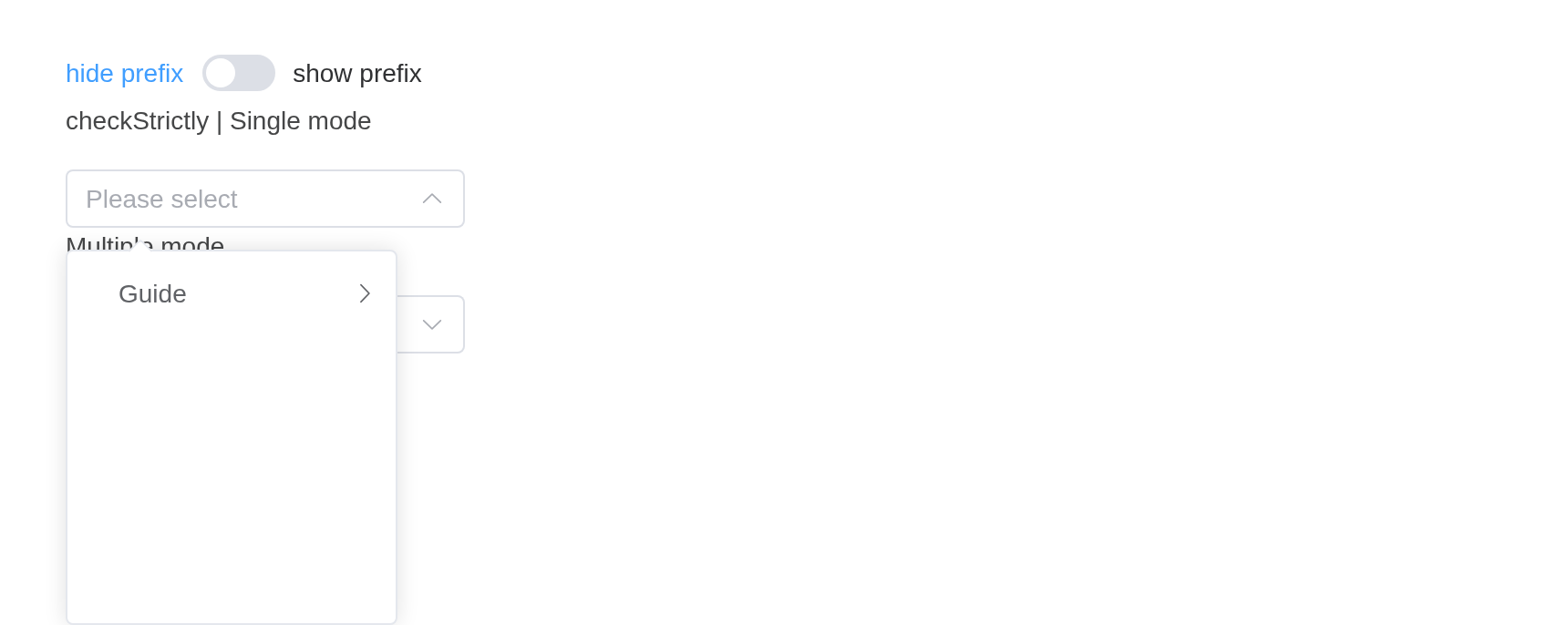
Custom Header & Footer
You can customize both the header and footer of the dropdown using slots.
Use slot to customize the content.
tree <- list(list(
  value = "guide",
  label = "Guide",
  children = list(
    list(value = "disciplines", label = "Disciplines")
  )
))
tagList(
  tags$p("Custom header content"),
  el_cascader(
    "cas_h",
    options = tree,
    props = list(multiple = TRUE),
    clearable = TRUE,
    slots = list(header = "All")
  ),
  tags$p("Custom footer content"),
  el_cascader(
    "cas_ft",
    options = tree,
    clearable = TRUE,
    slots = list(footer = "Footer content")
  )
)
Custom header content
Custom footer content
Virtual Scroll
When dealing with large amounts of data, you can enable virtual scrolling to improve performance.
Set virtual-scroll to true to enable
virtual scrolling. You can also customize the menu height with
height and node height with item-size. Default
height is 204px and default item size is 34px.
big <- lapply(1:100, function(i) {
  list(
    value = paste0("v", i),
    label = paste("Option", i),
    children = lapply(1:100, function(j) {
      list(value = paste0("v", i, "-", j), label = paste("Option", i, j))
    })
  )
})
el_cascader(
  "cas_virtual",
  options = big,
  filterable = TRUE,
  virtual_scroll = TRUE,
  clearable = TRUE,
  placeholder = "Select with large data"
)
Custom Suggestion Width
The width of the suggestion panel (when filtering) is calculated by
default based on the maximum width of the matched options. If you
customize the suggestion options through the
suggestion-item slot, it is likely that the text displayed
in the options is not equal to the value of label,
resulting in calculation errors. In this case, you can use the
fit-input-width attribute to fix its width. When the value
is number, the width is a specific fixed pixel value.
Tip
The
fit-input-widthattribute only controls the width of the suggestion panel during searching, it does not affect the default cascader panel.
el_cascader(
  "cas_fit",
  fit_input_width = TRUE,
  options = list(
    list(
      value = "guide",
      label = "Guide",
      children = list(
        list(value = "disciplines", label = "Disciplines")
      )
    )
  )
)
API
Element Plus’s tables, and beside each entry where it is in R.
Cascader Attributes
| Element | In R | Description | Type | Accepted | Default |
|---|---|---|---|---|---|
model-value |
value; input$<id>
|
binding value |
1 /
2 /3string[] \\| number[] \\| any
|
— | |
options |
el_cascader(options =) |
data of the options, the key of value and
label can be customize by CascaderProps. |
4CascaderOption[]
|
— | |
props |
el_cascader(props =) |
configuration options, see the following CascaderProps
table. |
5CascaderProps
|
— | |
size |
el_cascader(size =) |
size of input |
6'large' \\| 'default' \\| 'small'
|
— | |
placeholder |
el_cascader(placeholder =) |
placeholder of input | 7 | — | |
disabled |
el_cascader(disabled =) |
whether Cascader is disabled | 8 | — | |
clearable |
el_cascader(clearable =) |
whether selected value can be cleared | 9 | — | |
clear-icon |
el_cascader(clear_icon =) |
custom clear icon component |
10
/ 11Component
|
CircleClose | |
show-all-levels |
el_cascader(show_all_levels =) |
whether to display all levels of the selected value in the input | 12 | true | |
collapse-tags |
el_cascader(collapse_tags =) |
whether to collapse tags in multiple selection mode | 13 | — | |
collapse-tags-tooltip |
el_cascader(collapse_tags_tooltip =) |
whether show all selected tags when mouse hover text of
collapse-tags. To use this, collapse-tags must be true |
14 | false | |
max-collapse-tags-tooltip-height |
el_cascader(max_collapse_tags_tooltip_height =) |
max height of collapse-tags tooltip. | 15 / 16 | — | |
separator |
el_cascader(separator =) |
option label separator | 17 | ’ / ’ | |
filterable |
el_cascader(filterable =) |
whether the options can be searched | 18 | — | |
filter-method |
el_cascader(filter_method =) |
customize search logic, the first parameter is node,
the second is keyword, and need return a boolean value
indicating whether it hits. |
19(node: CascaderNode, keyword: string) => boolean
|
— | |
debounce |
el_cascader(debounce =) |
debounce delay when typing filter keyword, in milliseconds | 20 | 300 | |
before-filter |
el_cascader(before_filter =) |
hook function before filtering with the value to be filtered as its
parameter. If false is returned or a Promise
is returned and then is rejected, filtering will be aborted |
21(value: string) => boolean
|
— | |
popper-class |
el_cascader(popper_class =) |
custom class name for Cascader’s dropdown and tags’ tooltip | 22 | ’’ | |
popper-style |
el_cascader(popper_style =) |
custom style for Cascader’s dropdown and tags’ tooltip | 23 / 24 | — | |
teleported |
el_cascader(teleported =) |
whether cascader popup is teleported | 25 | true | |
effect |
el_cascader(effect =) |
tooltip theme, built-in theme: dark /
light
|
26'dark' \\| 'light' / 27
|
light | |
tag-type |
el_cascader(tag_type =) |
tag type |
28'success' \\| 'info' \\| 'warning' \\| 'danger'
|
info | |
tag-effect |
el_cascader(tag_effect =) |
tag effect |
29'light' \\| 'dark' \\| 'plain'
|
light | |
validate-event |
el_cascader(validate_event =) |
whether to trigger form validation | 30 | true | |
max-collapse-tags |
el_cascader(max_collapse_tags =) |
The max tags number to be shown. To use this,
collapse-tags must be true |
31 | 1 | |
empty-values |
el_cascader(empty_values =) |
empty values of component, see config-provider | 32 | — | |
value-on-clear |
el_cascader(value_on_clear =) |
clear return value, see config-provider | 33 / 34 / 35 / 36 | — | |
persistent |
el_cascader(persistent =) |
when dropdown is inactive and persistent is
false, dropdown will be destroyed |
37 | true | |
fallback-placements |
el_cascader(fallback_placements =) |
list of possible positions for Tooltip popper.js |
38Placement[]
|
— | |
placement |
el_cascader(placement =) |
position of dropdown |
39'top' \\| 'top-start' \\| 'top-end' \\| 'bottom' \\| 'bottom-start' \\| 'bottom-end' \\| 'left' \\| 'left-start' \\| 'left-end' \\| 'right' \\| 'right-start' \\| 'right-end'
|
bottom-start | |
popper-append-to-body |
el_cascader(popper_append_to_body =) |
whether to append the popper menu to body. If the positioning of the popper is wrong, you can try to set this prop to false | 40 | true | |
show-checked-strategy |
el_cascader(show_checked_strategy =) |
strategy for displaying checked nodes in multiple selection mode.
Use parent when you want things tidy. Use
child when every single item matters |
41'parent' \\| 'child'
|
child | |
virtual-scroll |
el_cascader(virtual_scroll =) |
whether to enable virtual scrolling for large data | 42 | false | |
fit-input-width |
el_cascader(fit_input_width =) |
whether the width of the suggestion panel is the same as the input,
if the value is number, then the width is fixed |
43 / 44 | false | |
item-size |
el_cascader(item_size =) |
node height for virtual scrolling (px) | 45 | 34 | |
height |
el_cascader(height =) |
menu height for virtual scrolling (px) | 46 | 204 |
Cascader Events
| Element | In R | Description |
|---|---|---|
change |
input$<id>, the value |
triggers when the binding value changes |
expand-change |
input$<id>_expand_change |
triggers when expand option changes |
blur |
input$<id>_blur |
triggers when Cascader blurs |
focus |
input$<id>_focus |
triggers when Cascader focuses |
clear |
input$<id>_clear |
triggers when the clear icon is clicked in a clearable Select |
visible-change |
input$<id>_visible_change |
triggers when the dropdown appears/disappears |
remove-tag |
input$<id>_remove_tag |
triggers when remove tag in multiple selection mode |
Cascader Slots
| Element | In R | Description |
|---|---|---|
default |
default content | the custom content of cascader node, which are current Node object and node data respectively. |
empty |
slots = list(empty = ) |
content when there is no matched options. |
prefix |
slots = list(prefix = ) |
content as Input prefix |
suggestion-item |
slots = list(suggestion-item = ) |
custom content for suggestion item when searching |
tag |
slots = list(tag = ) |
custom tags style |
header |
slots = list(header = ) |
content at the top of the dropdown |
footer |
slots = list(footer = ) |
content at the bottom of the dropdown |
Cascader Exposes
| Element | In R | Description |
|---|---|---|
getCheckedNodes |
call_el(session, id, "getCheckedNodes") |
get an array of currently selected node,(leafOnly) whether only
return the leaf checked nodes, default is false
|
togglePopperVisible |
call_el(session, id, "togglePopperVisible") |
toggle the visible type of popper |
focus |
call_el(session, id, "focus") |
focus the input element |
blur |
call_el(session, id, "blur") |
blur the input element |
CascaderPanel Attributes
| Element | In R | Description | Type | Accepted | Default |
|---|---|---|---|---|---|
model-value |
value; input$<id>
|
binding value |
47/48/49string[] \\| number[] \\| any
|
— | |
options |
el_cascader(options =) |
data of the options, the key of value and
label can be customize by CascaderProps. |
50CascaderOption[]
|
— | |
props |
el_cascader(props =) |
configuration options, see the following CascaderProps
table. |
51CascaderProps
|
— | |
virtual-scroll |
el_cascader(virtual_scroll =) |
whether to enable virtual scrolling for large data | 52 | false | |
item-size |
el_cascader(item_size =) |
node height for virtual scrolling (px) | 53 | 34 | |
height |
el_cascader(height =) |
menu height for virtual scrolling (px) | 54 | 204 |
CascaderPanel Events
| Element | In R | Description |
|---|---|---|
change |
input$<id>, the value |
triggers when the binding value changes |
expand-change |
input$<id>_expand_change |
triggers when expand option changes |
close |
input$<id>_close |
close panel event, provided to Cascader to put away the panel judgment. |