Progress is used to show the progress of current operation, and inform the user the current status.
Linear progress bar
Use percentage attribute to set the percentage. It’s
required and must be between 0-100. You
can custom text format by setting format.
tags$div(
  style = "max-width: 600px; display: grid; gap: 15px",
  el_progress("pr1", percentage = 50),
  el_progress(
    "pr2",
    percentage = 100,
    format = JS("function(p) { return p === 100 ? 'Full' : p + '%'; }")
  ),
  el_progress("pr3", percentage = 100, status = "success"),
  el_progress("pr4", percentage = 100, status = "warning"),
  el_progress("pr5", percentage = 50, status = "exception")
)
Internal percentage
In this case the percentage takes no additional space.
stroke-width attribute decides the width of
progress bar, and use text-inside attribute to put
description inside the progress bar.
tags$div(
  style = "max-width: 600px; display: grid; gap: 15px",
  el_progress("pri1", percentage = 70, text_inside = TRUE, stroke_width = 26),
  el_progress(
    "pri2",
    percentage = 100,
    text_inside = TRUE,
    stroke_width = 24,
    status = "success"
  ),
  el_progress(
    "pri3",
    percentage = 80,
    text_inside = TRUE,
    stroke_width = 22,
    status = "warning"
  ),
  el_progress(
    "pri4",
    percentage = 50,
    text_inside = TRUE,
    stroke_width = 20,
    status = "exception"
  )
)
Custom color
You can use color attr to set the progress bar color. it
accepts color string, function, or array.
The buttons step every bar by ten, with
update_el_progress().
colors <- list(
  list(color = "#f56c6c", percentage = 20),
  list(color = "#e6a23c", percentage = 40),
  list(color = "#5cb87a", percentage = 60),
  list(color = "#1989fa", percentage = 80),
  list(color = "#6f7ad3", percentage = 100)
)
ids <- c("prc1", "prc2", "prc3", "prc4")
ui <- el_page(
  tags$style(
    ".demo-progress .el-progress--line { margin-bottom: 15px; max-width: 600px; }"
  ),
  tags$div(
    class = "demo-progress",
    el_progress("prc1", percentage = 20, color = "#409eff"),
    el_progress(
      "prc2",
      percentage = 20,
      color = JS(
        "function(p) { return p < 30 ? '#909399' : p < 70 ? '#e6a23c' : '#67c23a'; }"
      )
    ),
    el_progress("prc3", percentage = 20, color = colors),
    el_progress("prc4", percentage = 20, color = colors),
    tags$div(
      el_button_group(
        el_button("prc_minus", label = NULL, icon = "Minus"),
        el_button("prc_plus", label = NULL, icon = "Plus")
      )
    )
  )
)
server <- function(input, output, session) {
  percentage <- reactiveVal(20)
  step <- function(by) {
    percentage(min(100, max(0, percentage() + by)))
    for (id in ids) {
      update_el_progress(session, id, percentage = percentage())
    }
  }
  observeEvent(input$prc_minus, step(-10))
  observeEvent(input$prc_plus, step(10))
}
shinyApp(ui, server)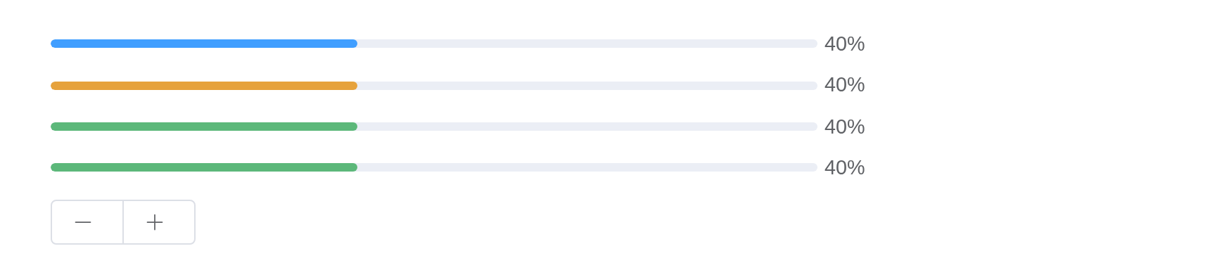
Circular progress bar
You can specify type attribute to circle to
use circular progress bar, and use width attribute to
change the size of circle.
tags$div(
  style = "display: flex; gap: 20px",
  el_progress("prcl1", type = "circle", percentage = 0),
  el_progress("prcl2", type = "circle", percentage = 25),
  el_progress("prcl3", type = "circle", percentage = 100, status = "success"),
  el_progress("prcl4", type = "circle", percentage = 70, status = "warning"),
  el_progress("prcl5", type = "circle", percentage = 50, status = "exception")
)
Dashboard progress bar
You also can specify type attribute to
dashboard to use dashboard progress bar.
The buttons step the first dial; the second goes round on its own, updated from the server every half second.
colors <- list(
  list(color = "#f56c6c", percentage = 20),
  list(color = "#e6a23c", percentage = 40),
  list(color = "#5cb87a", percentage = 60),
  list(color = "#1989fa", percentage = 80),
  list(color = "#6f7ad3", percentage = 100)
)
ui <- el_page(
  tags$div(
    class = "demo-progress",
    el_progress("prd1", type = "dashboard", percentage = 10, color = colors),
    el_progress("prd2", type = "dashboard", percentage = 0, color = colors),
    tags$div(
      el_button_group(
        el_button("prd_minus", label = NULL, icon = "Minus"),
        el_button("prd_plus", label = NULL, icon = "Plus")
      )
    )
  )
)
server <- function(input, output, session) {
  percentage <- reactiveVal(10)
  step <- function(by) {
    percentage(min(100, max(0, percentage() + by)))
    update_el_progress(session, "prd1", percentage = percentage())
  }
  observeEvent(input$prd_minus, step(-10))
  observeEvent(input$prd_plus, step(10))
  going <- reactiveVal(0)
  observe({
    invalidateLater(500)
    going(isolate(going()) %% 100 + 10)
    update_el_progress(session, "prd2", percentage = isolate(going()))
  })
}
shinyApp(ui, server)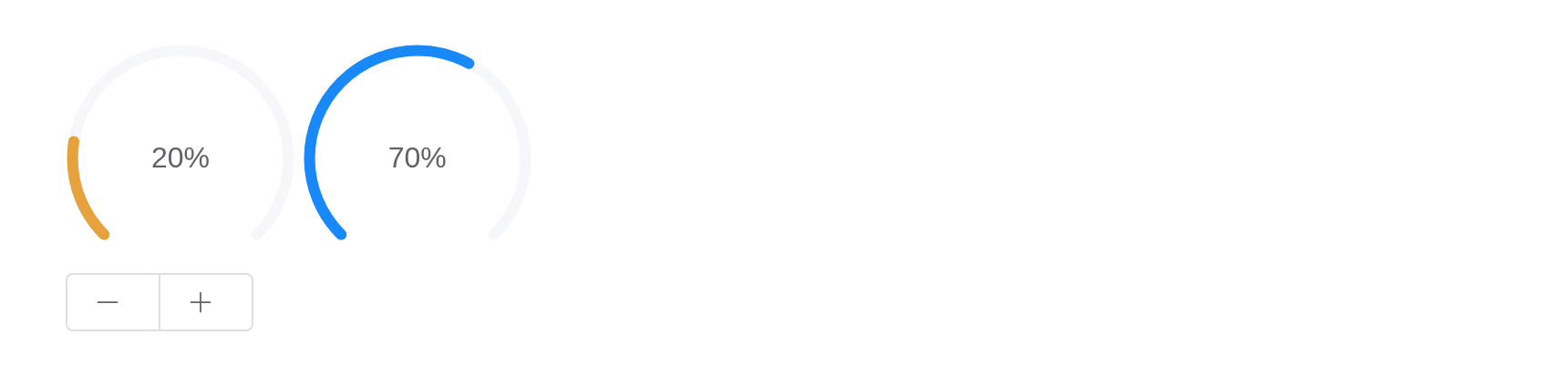
Customized content
Use default slot to add customized content.
tags$div(
  style = "display: flex; gap: 20px; align-items: center",
  el_progress(
    "prx1",
    percentage = 50,
    slots = list(default = el_button("prx_b", "Content", text = TRUE))
  ),
  el_progress(
    "prx2",
    type = "circle",
    percentage = 50,
    slots = list(
      default = template(
        htmltools::HTML(
          "<span class=\"percentage-value\">{{ percentage }}%</span><span class=\"percentage-label\">Progressing</span>"
        ),
        scope = "{ percentage }"
      )
    )
  )
)
Indeterminate progress
Use indeterminate attribute to set indeterminate
progress, with duration to control the animation
duration.
tags$div(
  style = "max-width: 600px; display: grid; gap: 15px",
  el_progress("prin1", percentage = 50, indeterminate = TRUE),
  el_progress(
    "prin2",
    percentage = 100,
    format = JS("function() { return 'Full'; }"),
    indeterminate = TRUE
  ),
  el_progress(
    "prin3",
    percentage = 100,
    status = "success",
    indeterminate = TRUE,
    duration = 5
  )
)
Striped progress
Use striped attribute to set striped progress. You can
use striped-flow to get the stripes to flow, with
duration to control the animation duration.
The buttons step the last bar by ten, and its stripes’
duration with it.
ui <- el_page(
  tags$style(
    ".demo-progress .el-progress--line { margin-bottom: 15px; max-width: 600px; }"
  ),
  tags$div(
    class = "demo-progress",
    el_progress("prs1", percentage = 50, stroke_width = 15, striped = TRUE),
    el_progress(
      "prs2",
      percentage = 30,
      stroke_width = 15,
      status = "warning",
      striped = TRUE,
      striped_flow = TRUE
    ),
    el_progress(
      "prs3",
      percentage = 100,
      stroke_width = 15,
      status = "success",
      striped = TRUE,
      striped_flow = TRUE,
      duration = 10
    ),
    el_progress(
      "prs4",
      percentage = 70,
      stroke_width = 15,
      status = "exception",
      striped = TRUE,
      striped_flow = TRUE,
      duration = 7
    ),
    el_button_group(
      el_button("prs_minus", label = NULL, icon = "Minus"),
      el_button("prs_plus", label = NULL, icon = "Plus")
    )
  )
)
server <- function(input, output, session) {
  percentage <- reactiveVal(70)
  step <- function(by) {
    percentage(min(100, max(0, percentage() + by)))
    update_el_progress(
      session,
      "prs4",
      percentage = percentage(),
      duration = floor(percentage() / 10)
    )
  }
  observeEvent(input$prs_minus, step(-10))
  observeEvent(input$prs_plus, step(10))
}
shinyApp(ui, server)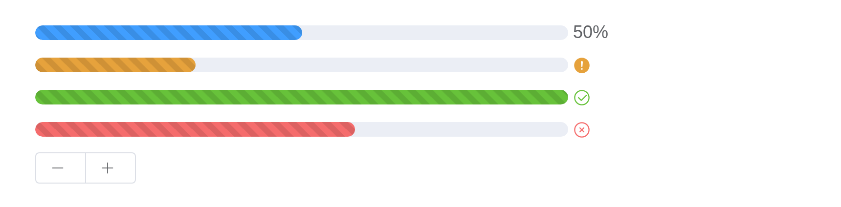
API
Element Plus’s tables, and beside each entry where it is in R.
Attributes
| Element | In R | Description | Type | Accepted | Default |
|---|---|---|---|---|---|
percentage |
percentage |
percentage |
1(0-100)
|
0 | |
type |
type |
the type of progress bar |
2'line' \\| 'circle' \\| 'dashboard'
|
line | |
stroke-width |
stroke_width |
the width of progress bar | 3 | 6 | |
text-inside |
text_inside |
whether to place the percentage inside progress bar, only works when
type is ‘line’ |
4 | false | |
status |
status |
the current status of progress bar |
5'success' \\| 'exception' \\| 'warning'
|
— | |
indeterminate |
indeterminate |
set indeterminate progress | 6 | false | |
duration |
duration |
control the animation duration of indeterminate progress or striped flow progress | 7 | 3 | |
color |
color |
background color of progress bar. Overrides status
prop |
8 /
9(percentage: number) => string
/ 10{ color: string; percentage: number }[]
|
’’ | |
width |
width |
the canvas width of circle progress bar | 11 | 126 | |
show-text |
show_text |
whether to show percentage | 12 | true | |
stroke-linecap |
stroke_linecap |
circle/dashboard type shape at the end path |
13'butt' \\| 'round' \\| 'square'
|
round | |
format |
format |
custom text format |
14(percentage: number) => string
|
— | |
striped |
striped |
stripe over the progress bar’s color | 15 | false | |
striped-flow |
striped_flow |
get the stripes to flow | 16 | false |