Display multiple data with similar format. You can sort, filter, compare your data in a table.
Basic table
Basic table is just for data display.
After setting attribute data of el-table
with an object array, you can use prop (corresponding to a
key of the object in data array) in
el-table-column to insert data to table columns, and set
the attribute label to define the column name. You can also
use the attribute width to define the width of columns.
tableData <- data.frame(
  date = c("2016-05-03", "2016-05-02", "2016-05-04", "2016-05-01"),
  name = "Tom",
  address = "No. 189, Grove St, Los Angeles"
)
el_table(
  data = tableData,
  columns = list(
    el_table_column("date", "Date", width = 180),
    el_table_column("name", "Name", width = 180),
    el_table_column("address", "Address")
  )
)
Striped Table
Striped table makes it easier to distinguish different rows.
Attribute stripe accepts a Boolean. If
true, table will be striped.
tableData <- data.frame(
  date = c("2016-05-03", "2016-05-02", "2016-05-04", "2016-05-01"),
  name = "Tom",
  address = "No. 189, Grove St, Los Angeles"
)
el_table(
  data = tableData,
  stripe = TRUE,
  columns = list(
    el_table_column("date", "Date", width = 180),
    el_table_column("name", "Name", width = 180),
    el_table_column("address", "Address")
  )
)
Table with border
By default, Table has no vertical border. If you need it, you can set
attribute border to true.
tableData <- data.frame(
  date = c("2016-05-03", "2016-05-02", "2016-05-04", "2016-05-01"),
  name = "Tom",
  address = "No. 189, Grove St, Los Angeles"
)
el_table(
  data = tableData,
  border = TRUE,
  columns = list(
    el_table_column("date", "Date", width = 180),
    el_table_column("name", "Name", width = 180),
    el_table_column("address", "Address")
  )
)
Table with status
You can highlight your table content to distinguish between “success, information, warning, danger” and other states.
Use row-class-name in el-table to add
custom classes to a certain row. Then you can style it with custom
classes.
tableData <- data.frame(
  date = c("2016-05-03", "2016-05-02", "2016-05-04", "2016-05-01"),
  name = "Tom",
  address = "No. 189, Grove St, Los Angeles"
)
tagList(
  tags$style(
    ".el-table .warning-row {
  --el-table-tr-bg-color: var(--el-color-warning-light-9);
}
.el-table .success-row {
  --el-table-tr-bg-color: var(--el-color-success-light-9);
}"
  ),
  el_table(
    data = tableData,
    row_class_name = JS(
      "function({ row, rowIndex }) {",
      "  if (rowIndex === 1) return 'warning-row';",
      "  if (rowIndex === 3) return 'success-row';",
      "  return '';",
      "}"
    ),
    columns = list(
      el_table_column("date", "Date", width = 180),
      el_table_column("name", "Name", width = 180),
      el_table_column("address", "Address")
    )
  )
)
Table with show overflow tooltip
When the content is too long, it will break into multiple lines, you
can use show-overflow-tooltip to keep it in one line.
Attribute show-overflow-tooltip, which accepts a
Boolean value. When set true, the extra
content will show in tooltip when hover on the cell.
tableData <- data.frame(
  date = c("2016-05-04", "2016-05-03", "2016-05-02", "2016-05-01"),
  name = c("Aleyna Kutzner", "Helen Jacobi", "Brandon Deckert", "Margie Smith"),
  address = c(
    "Lohrbergstr. 86c, Süd Lilli, Saarland",
    "760 A Street, South Frankfield, Illinois",
    "Arnold-Ohletz-Str. 41a, Alt Malinascheid, Thüringen",
    "23618 Windsor Drive, West Ricardoview, Idaho"
  )
)
el_table(
  data = tableData,
  columns = list(
    el_table_column(type = "selection", width = 55),
    el_table_column(label = "Date", width = 120, cell = "{{ scope.row.date }}"),
    el_table_column("name", "Name", width = 120),
    el_table_column(
      "address",
      "use show-overflow-tooltip",
      width = 240,
      show_overflow_tooltip = TRUE
    ),
    el_table_column("address", "address")
  )
)
Table with fixed header
When there are too many rows, you can use a fixed header.
By setting the attribute height of
el-table, you can fix the table header without any other
codes.
tableData <- data.frame(
  date = c(
    "2016-05-03",
    "2016-05-02",
    "2016-05-04",
    "2016-05-01",
    "2016-05-08",
    "2016-05-06",
    "2016-05-07"
  ),
  name = "Tom",
  address = "No. 189, Grove St, Los Angeles"
)
el_table(
  data = tableData,
  height = 250,
  columns = list(
    el_table_column("date", "Date", width = 180),
    el_table_column("name", "Name", width = 180),
    el_table_column("address", "Address")
  )
)
Table with fixed column
When there are too many columns, you can fix some of them.
Attribute fixed is used in el-table-column,
it accepts a Boolean. If true, the column will
be fixed at left. It also accepts two string literals: ‘left’ and
‘right’, both indicating that the column will be fixed at corresponding
direction.
The buttons report to the server with rowAction(): in an
app, Detail sets input$<id>_detail to the row.
tableData <- data.frame(
  date = c("2016-05-03", "2016-05-02", "2016-05-04", "2016-05-01"),
  name = "Tom",
  state = "California",
  city = "Los Angeles",
  address = "No. 189, Grove St, Los Angeles",
  zip = "CA 90036",
  tag = c("Home", "Office", "Home", "Office")
)
el_table(
  data = tableData,
  columns = list(
    el_table_column("date", "Date", width = 150, fixed = TRUE),
    el_table_column("name", "Name", width = 120),
    el_table_column("state", "State", width = 120),
    el_table_column("city", "City", width = 120),
    el_table_column("address", "Address", width = 600),
    el_table_column("zip", "Zip", width = 120),
    el_table_column(
      label = "Operations",
      fixed = "right",
      min_width = 120,
      cell = tagList(
        el$button(
          link = NA,
          type = "primary",
          size = "small",
          "@click" = "rowAction('detail', scope)",
          "Detail"
        ),
        el$button(link = NA, type = "primary", size = "small", "Edit")
      )
    )
  )
)
Table with fixed columns and header
When you have huge chunks of data to put in a table, you can fix the header and columns at the same time.
Fix columns and header at the same time by combining the above two examples.
tableData <- data.frame(
  date = c(
    "2016-05-03",
    "2016-05-02",
    "2016-05-04",
    "2016-05-01",
    "2016-05-08",
    "2016-05-06",
    "2016-05-07"
  ),
  name = "Tom",
  state = "California",
  city = "Los Angeles",
  address = "No. 189, Grove St, Los Angeles",
  zip = "CA 90036"
)
el_table(
  data = tableData,
  height = 250,
  columns = list(
    el_table_column("date", "Date", width = 150, fixed = TRUE),
    el_table_column("name", "Name", width = 120),
    el_table_column("state", "State", width = 120),
    el_table_column("city", "City", width = 320),
    el_table_column("address", "Address", width = 600),
    el_table_column("zip", "Zip")
  )
)
Fluid-height Table with fixed header (and columns)
When the the data is dynamically changed, you might want the table to have a maximum height rather than a fixed height and to show the scroll bar if needed.
By setting the attribute max-height of
el-table, you can fix the table header. The table body
scrolls only if the height of the rows exceeds the max height value.
The rows are the server’s, rendered from a reactive value: Remove
reports its row as input$fluid_remove, Add Item asks for
one more, and the table is rendered again with the rows that are
left.
row <- function(date) {
  data.frame(
    date = format(date),
    name = "Tom",
    state = "California",
    city = "Los Angeles",
    address = "No. 189, Grove St, Los Angeles",
    zip = "CA 90036"
  )
}
tableData <- do.call(rbind, lapply(as.Date("2016-05-01") + 0:2, row))

ui <- el_page(
  el_table_output("fluid"),
  tags$div(
    style = "margin-top: 12px",
    el_button("add_item", "Add Item", width = "100%")
  )
)

server <- function(input, output, session) {
  rows <- reactiveVal(tableData)
  day <- reactiveVal(Sys.Date())
  output$fluid <- render_el_table(el_table(
    data = rows(),
    max_height = 250,
    columns = list(
      el_table_column("date", "Date", width = 150, fixed = TRUE),
      el_table_column("name", "Name", width = 120),
      el_table_column("state", "State", width = 120),
      el_table_column("city", "City", width = 120),
      el_table_column("address", "Address", width = 600),
      el_table_column("zip", "Zip", width = 120),
      el_table_column(
        label = "Operations",
        fixed = "right",
        min_width = 120,
        cell = el$button(
          link = NA,
          type = "primary",
          size = "small",
          "@click.prevent" = "rowAction('remove', scope)",
          "Remove"
        )
      )
    )
  ))
  observeEvent(input$fluid_remove, {
    rows(rows()[-input$fluid_remove$row_index, ])
  })
  observeEvent(input$add_item, {
    day(day() + 1)
    rows(rbind(rows(), row(day())))
  })
}

shinyApp(ui, server)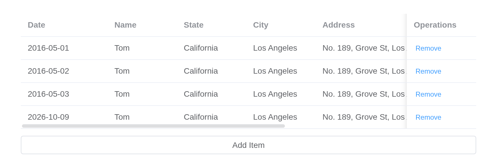
Grouping table head
When the data structure is complex, you can use group header to show the data hierarchy.
Only need to place el-table-column inside a el-table-column, you can achieve group header.
tableData <- data.frame(
  date = c(
    "2016-05-03",
    "2016-05-02",
    "2016-05-04",
    "2016-05-01",
    "2016-05-08",
    "2016-05-06",
    "2016-05-07"
  ),
  name = "Tom",
  state = "California",
  city = "Los Angeles",
  address = "No. 189, Grove St, Los Angeles",
  zip = "CA 90036"
)
el_table(
  data = tableData,
  columns = list(
    el_table_column("date", "Date", width = 150),
    el_table_column(
      label = "Delivery Info",
      el_table_column("name", "Name", width = 120),
      el_table_column(
        label = "Address Info",
        el_table_column("state", "State", width = 120),
        el_table_column("city", "City", width = 120),
        el_table_column("address", "Address"),
        el_table_column("zip", "Zip", width = 120)
      )
    )
  )
)
Table with fixed group header
fixed group head is supported
The attribute fixed of the group header is determined by
the outermost el-table-column
tableData <- data.frame(
  date = c(
    "2016-05-03",
    "2016-05-02",
    "2016-05-04",
    "2016-05-01",
    "2016-05-08",
    "2016-05-06",
    "2016-05-07"
  ),
  name = "Tom",
  state = "California",
  city = "Los Angeles",
  address = "No. 189, Grove St, Los Angeles",
  zip = "CA 90036"
)
el_table(
  data = tableData,
  height = 250,
  columns = list(
    el_table_column("date", "Date"),
    el_table_column("name", "Name"),
    el_table_column("zip", "Zip"),
    el_table_column(
      label = "Address Info",
      fixed = "right",
      el_table_column("state", "State"),
      el_table_column("city", "City"),
      el_table_column("address", "Address", min_width = 200)
    )
  )
)
Single select
Single row selection is supported.
Table supports single row selection. You can activate it by adding
the highlight-current-row attribute. An event called
current-change will be triggered when row selection
changes, and its parameters are the rows after and before this change:
currentRow and oldCurrentRow. If you need to
display row index, you can add a new el-table-column with
its type attribute assigned to index, and you
will see the index starting from 1.
The buttons call the table’s setCurrentRow() from the
server; the row clicked or set arrives as
input$single_current_change.
tableData <- data.frame(
  date = c("2016-05-03", "2016-05-02", "2016-05-04", "2016-05-01"),
  name = "Tom",
  address = "No. 189, Grove St, Los Angeles"
)

ui <- el_page(
  el_table_output("single"),
  tags$div(
    style = "margin-top: 20px",
    el_button("second", "Select second row"),
    el_button("clear", "Clear selection")
  )
)

server <- function(input, output, session) {
  output$single <- render_el_table(el_table(
    data = tableData,
    highlight_current_row = TRUE,
    columns = list(
      el_table_column(type = "index", width = 50),
      el_table_column("date", "Date", width = 120),
      el_table_column("name", "Name", width = 120),
      el_table_column("address", "Address")
    )
  ))
  observeEvent(input$second, {
    call_el(session, "single", "setCurrentRow", list(el_table_row(2)))
  })
  observeEvent(input$clear, call_el(session, "single", "setCurrentRow"))
}

shinyApp(ui, server)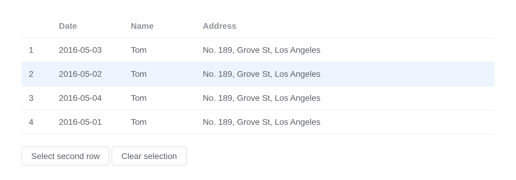
Multiple select
You can also select multiple rows.
After 2.8.3, toggleRowSelection supports the third
parameter ignoreSelectable to determine whether to ignore
the selectable attribute.
Activating multiple selection is easy: simply add an
el-table-column with its type set to
selection.
Rows 1 and 2 cannot be ticked (selectable). The first
button toggles rows 2 and 3 whatever selectable says, the
second only where it allows; the rows ticked arrive as
input$multi_selection_rows (their numbers) and
input$multi_selection_change (the rows).
tableData <- data.frame(
  id = 1:7,
  date = c(
    "2016-05-03",
    "2016-05-02",
    "2016-05-04",
    "2016-05-01",
    "2016-05-08",
    "2016-05-06",
    "2016-05-07"
  ),
  name = "Tom",
  address = "No. 189, Grove St, Los Angeles"
)

ui <- el_page(
  el_table_output("multi"),
  tags$div(
    style = "margin-top: 20px",
    el_button("toggle", "Toggle selection status of second and third rows"),
    el_button(
      "toggle_selectable",
      "Toggle selection status based on selectable"
    ),
    el_button("clear", "Clear selection")
  )
)

server <- function(input, output, session) {
  output$multi <- render_el_table(el_table(
    data = tableData,
    row_key = "id",
    columns = list(
      el_table_column(
        type = "selection",
        width = 55,
        selectable = JS("function(row) { return ![1, 2].includes(row.id); }")
      ),
      el_table_column(
        label = "Date",
        width = 120,
        cell = "{{ scope.row.date }}"
      ),
      el_table_column("name", "Name", width = 120),
      el_table_column("address", "Address")
    )
  ))
  toggle <- function(ignore_selectable) {
    for (i in 2:3) {
      call_el(
        session,
        "multi",
        "toggleRowSelection",
        list(el_table_row(i), NULL, ignore_selectable)
      )
    }
  }
  observeEvent(input$toggle, toggle(TRUE))
  observeEvent(input$toggle_selectable, toggle(FALSE))
  observeEvent(input$clear, call_el(session, "multi", "clearSelection"))
}

shinyApp(ui, server)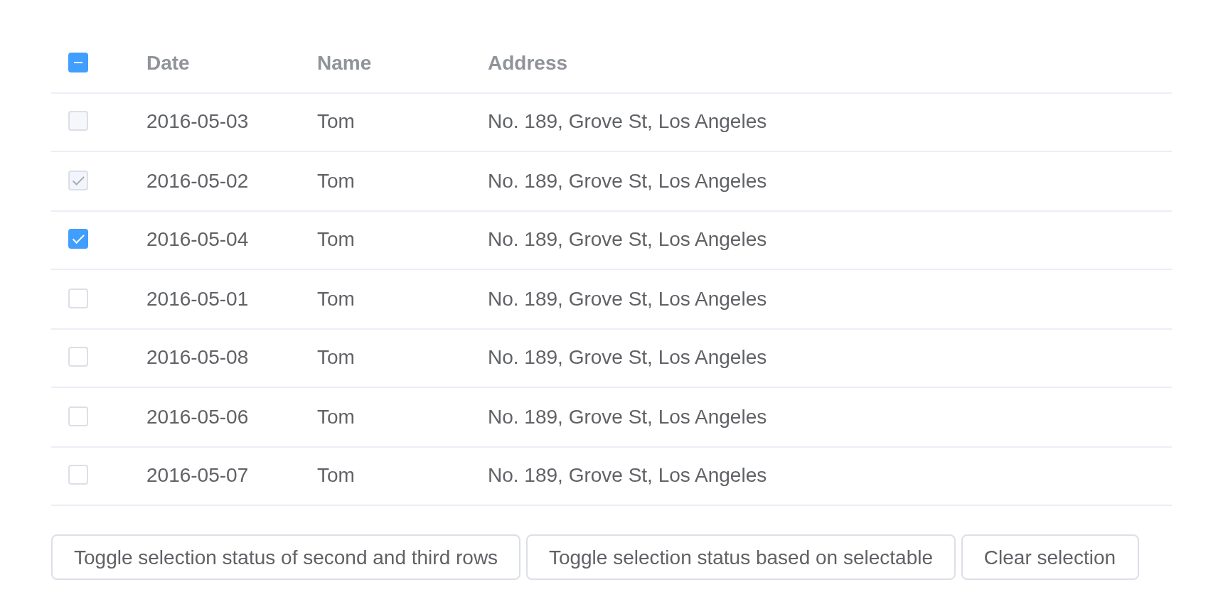
Sorting
Sort the data to find or compare data quickly.
Set attribute sortable in a certain column to sort the
data based on this column. It accepts Boolean with a
default value false. Set table attribute
default-sort to determine default sort column and order. To
apply your own sorting rules, use sort-method or
sort-by. If you need remote sorting from backend, set
sortable to custom, and listen to the
sort-change event on Table. In the event handler, you have
access to the sorting column and sorting order so that you can fetch
sorted table data from API. In this example we use another attribute
named formatter to format the value of certain columns. It
accepts a function which has two parameters: row and
column. You can handle it according to your own needs.
tableData <- data.frame(
  date = c("2016-05-03", "2016-05-02", "2016-05-04", "2016-05-01"),
  name = "Tom",
  address = "No. 189, Grove St, Los Angeles"
)
el_table(
  data = tableData,
  default_sort = list(prop = "date", order = "descending"),
  columns = list(
    el_table_column("date", "Date", sortable = TRUE, width = 180),
    el_table_column("name", "Name", width = 180),
    el_table_column(
      "address",
      "Address",
      formatter = JS("function(row, column) { return row.address; }")
    )
  )
)
Filter
Filter the table to find desired data.
Set attribute filters and filter-method in
el-table-column makes this column filterable.
filters is an array, and filter-method is a
function deciding which rows are displayed. It has three parameters:
value, row and column.
The buttons call the table’s clearFilter() from the
server: with the date column’s column_key, or with nothing
for every column.
tableData <- data.frame(
  date = c("2016-05-03", "2016-05-02", "2016-05-04", "2016-05-01"),
  name = "Tom",
  address = "No. 189, Grove St, Los Angeles",
  tag = c("Home", "Office", "Home", "Office")
)

ui <- el_page(
  el_button("reset_date", "reset date filter"),
  el_button("reset_all", "reset all filters"),
  el_table_output("filtered")
)

server <- function(input, output, session) {
  output$filtered <- render_el_table(el_table(
    data = tableData,
    row_key = "date",
    columns = list(
      el_table_column(
        "date",
        "Date",
        sortable = TRUE,
        width = 180,
        column_key = "date",
        filters = lapply(
          c("2016-05-01", "2016-05-02", "2016-05-03", "2016-05-04"),
          function(d) list(text = d, value = d)
        ),
        filter_method = JS(
          "function(value, row, column) {",
          "  return row[column['property']] === value;",
          "}"
        )
      ),
      el_table_column("name", "Name", width = 180),
      el_table_column(
        "address",
        "Address",
        formatter = JS("function(row, column) { return row.address; }")
      ),
      el_table_column(
        "tag",
        "Tag",
        width = 100,
        filters = list(
          list(text = "Home", value = "Home"),
          list(text = "Office", value = "Office")
        ),
        filter_method = JS(
          "function(value, row) { return row.tag === value; }"
        ),
        filter_placement = "bottom-end",
        cell = el$tag(
          ":type" = "scope.row.tag === 'Home' ? 'primary' : 'success'",
          "disable-transitions" = NA,
          "{{ scope.row.tag }}"
        )
      )
    )
  ))
  observeEvent(input$reset_date, {
    call_el(session, "filtered", "clearFilter", list(list("date")))
  })
  observeEvent(input$reset_all, call_el(session, "filtered", "clearFilter"))
}

shinyApp(ui, server)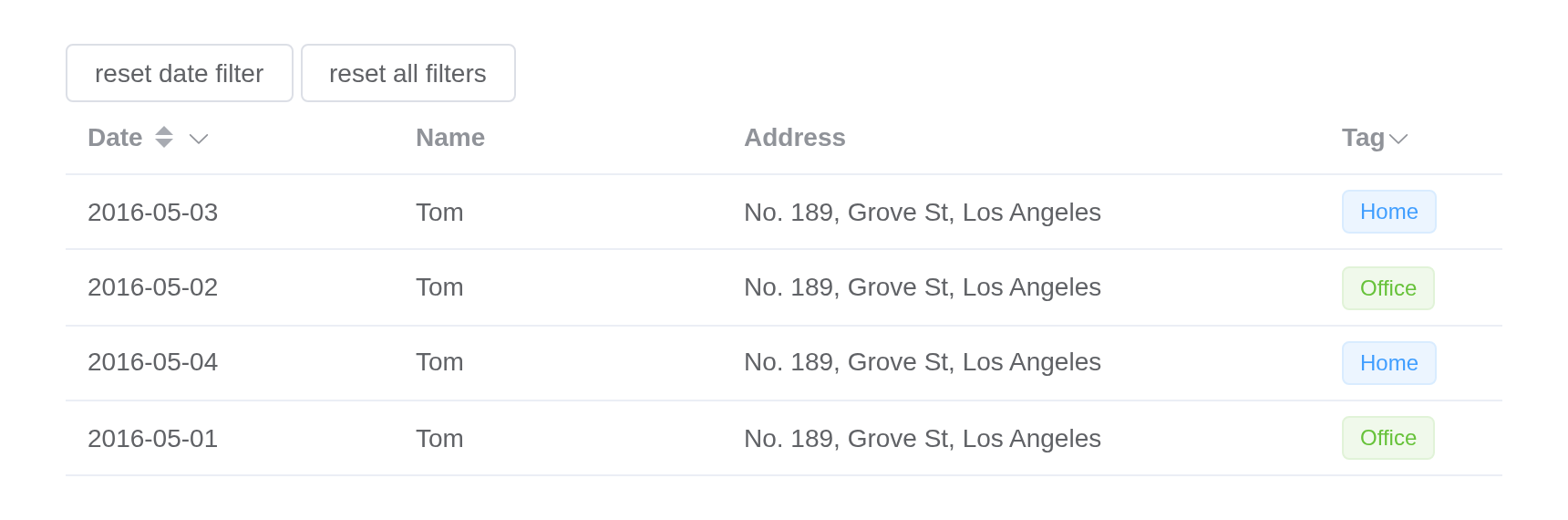
Custom column template
Customize table column so it can be integrated with other components.
You have access to the following data: row, column, $index and store (state management of Table) by slot.
Edit and Delete report to the server with rowAction(),
as input$custom_edit and input$custom_delete:
the row’s number and the row.
tableData <- data.frame(
  date = c("2016-05-03", "2016-05-02", "2016-05-04", "2016-05-01"),
  name = "Tom",
  address = "No. 189, Grove St, Los Angeles"
)

ui <- el_page(
  el_table_output("custom"),
  verbatimTextOutput("which")
)

server <- function(input, output, session) {
  output$custom <- render_el_table(el_table(
    data = tableData,
    columns = list(
      el_table_column(
        label = "Date",
        width = 180,
        cell = tags$div(
          style = "display: flex; align-items: center",
          htmltools::tag("el-icon", list(htmltools::tag("timer", list()))),
          tags$span(style = "margin-left: 10px", "{{ scope.row.date }}")
        )
      ),
      el_table_column(
        label = "Name",
        width = 180,
        cell = el$popover(
          effect = "light",
          trigger = "hover",
          placement = "top",
          width = "auto",
          tags$template(
            `v-slot:default` = NA,
            tags$div("name: {{ scope.row.name }}"),
            tags$div("address: {{ scope.row.address }}")
          ),
          tags$template(
            `v-slot:reference` = NA,
            el$tag("{{ scope.row.name }}")
          )
        )
      ),
      el_table_column(
        label = "Operations",
        cell = tagList(
          el$button(
            size = "small",
            "@click" = "rowAction('edit', scope)",
            "Edit"
          ),
          el$button(
            size = "small",
            type = "danger",
            "@click" = "rowAction('delete', scope)",
            "Delete"
          )
        )
      )
    )
  ))
  output$which <- renderPrint(list(
    edit = input$custom_edit$row_index,
    delete = input$custom_delete$row_index
  ))
}

shinyApp(ui, server)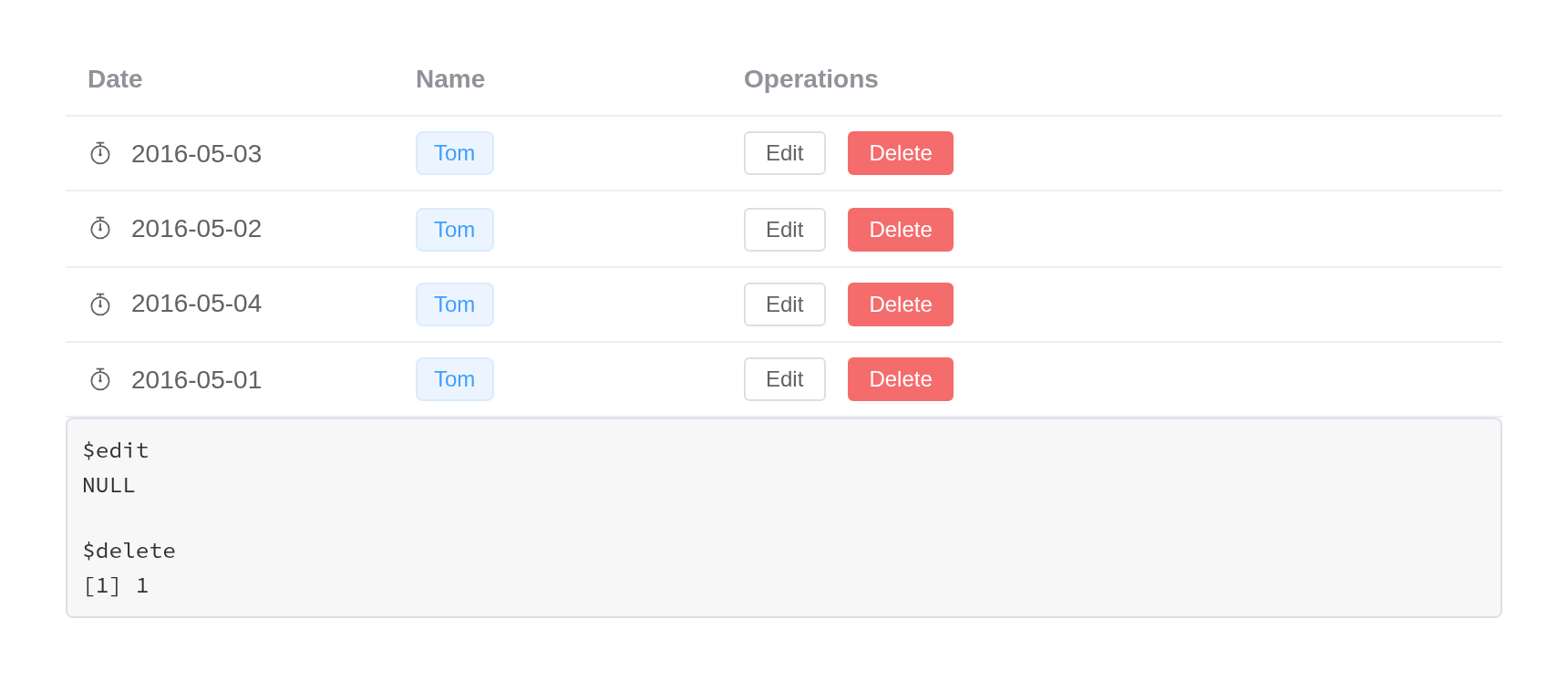
Table with custom header
Customize table header so it can be even more customized.
You can customize how the header looks by header slots.
The search box is the column’s header template. What is
typed lives in a store, $store.search.text, reported as
input$search; the table is rendered again with the rows
that match.
tableData <- data.frame(
  date = c("2016-05-03", "2016-05-02", "2016-05-04", "2016-05-01"),
  name = c("Tom", "John", "Morgan", "Jessy"),
  address = "No. 189, Grove St, Los Angeles"
)

ui <- el_page(
  vue_store("search", data = list(text = ""), input = "text"),
  el_table_output("searchable")
)

server <- function(input, output, session) {
  matches <- reactive({
    text <- input$search %||% ""
    !nzchar(text) | grepl(tolower(text), tolower(tableData$name), fixed = TRUE)
  })
  output$searchable <- render_el_table(el_table(
    data = tableData[matches(), ],
    columns = list(
      el_table_column("date", "Date"),
      el_table_column("name", "Name"),
      el_table_column(
        align = "right",
        header = el$input(
          "v-model" = "$store.search.text",
          size = "small",
          placeholder = "Type to search"
        ),
        cell = tagList(
          el$button(
            size = "small",
            "@click" = "rowAction('edit', scope)",
            "Edit"
          ),
          el$button(
            size = "small",
            type = "danger",
            "@click" = "rowAction('delete', scope)",
            "Delete"
          )
        )
      )
    )
  ))
}

shinyApp(ui, server)
Expandable row
When the row content is too long and you do not want to display the horizontal scroll bar, you can use the expandable row feature.
After 2.9.7, preserve-expanded-content is added to
control whether to preserve expanded row content in DOM when
collapsed.
Activate expandable row by adding type=“expand” and slot. The
template for el-table-column will be rendered as the contents of the
expanded row, and you can access the same attributes as when you are
using slot in custom column templates.
Each row opens to its details and a table of its own, the family. The
switches are the server’s: the parent’s border and
preserve_expanded_content render the table again – patched
in place, the open rows stay open – the child tables’ border goes
through a store their template reads,
$store.expand.child.
family <- data.frame(
  name = c("Jerry", "Spike", "Tyke"),
  state = "California",
  city = "San Francisco",
  address = "3650 21st St, San Francisco",
  zip = "CA 94114"
)
tableData <- lapply(
  c(
    "2016-05-03",
    "2016-05-02",
    "2016-05-04",
    "2016-05-01",
    "2016-05-08",
    "2016-05-06",
    "2016-05-07"
  ),
  function(date) {
    list(
      date = date,
      name = "Tom",
      state = "California",
      city = "San Francisco",
      address = "3650 21st St, San Francisco",
      zip = "CA 94114",
      family = family
    )
  }
)

ui <- el_page(
  vue_store("expand", data = list(child = FALSE)),
  tags$div(
    style = "display: flex; gap: 8px; align-items: center",
    "switch parent border:",
    el_switch("parent_border"),
    "switch child border:",
    el_switch("child_border"),
    "preserve expanded:",
    el_switch("preserve")
  ),
  el_table_output("expandable")
)

server <- function(input, output, session) {
  output$expandable <- render_el_table(el_table(
    data = tableData,
    border = isTRUE(input$parent_border),
    preserve_expanded_content = isTRUE(input$preserve),
    columns = list(
      el_table_column(
        type = "expand",
        cell = tags$div(
          style = "margin: 16px",
          tags$p("State: {{ scope.row.state }}"),
          tags$p("City: {{ scope.row.city }}"),
          tags$p("Address: {{ scope.row.address }}"),
          tags$p("Zip: {{ scope.row.zip }}"),
          tags$h3("Family"),
          el$table(
            ":data" = "scope.row.family",
            ":border" = "$store.expand.child",
            el$table_column(label = "Name", prop = "name"),
            el$table_column(label = "State", prop = "state"),
            el$table_column(label = "City", prop = "city"),
            el$table_column(label = "Address", prop = "address"),
            el$table_column(label = "Zip", prop = "zip")
          )
        )
      ),
      el_table_column("date", "Date"),
      el_table_column("name", "Name")
    )
  ))
  observeEvent(input$child_border, {
    update_vue(session, "expand", child = input$child_border)
  })
}

shinyApp(ui, server)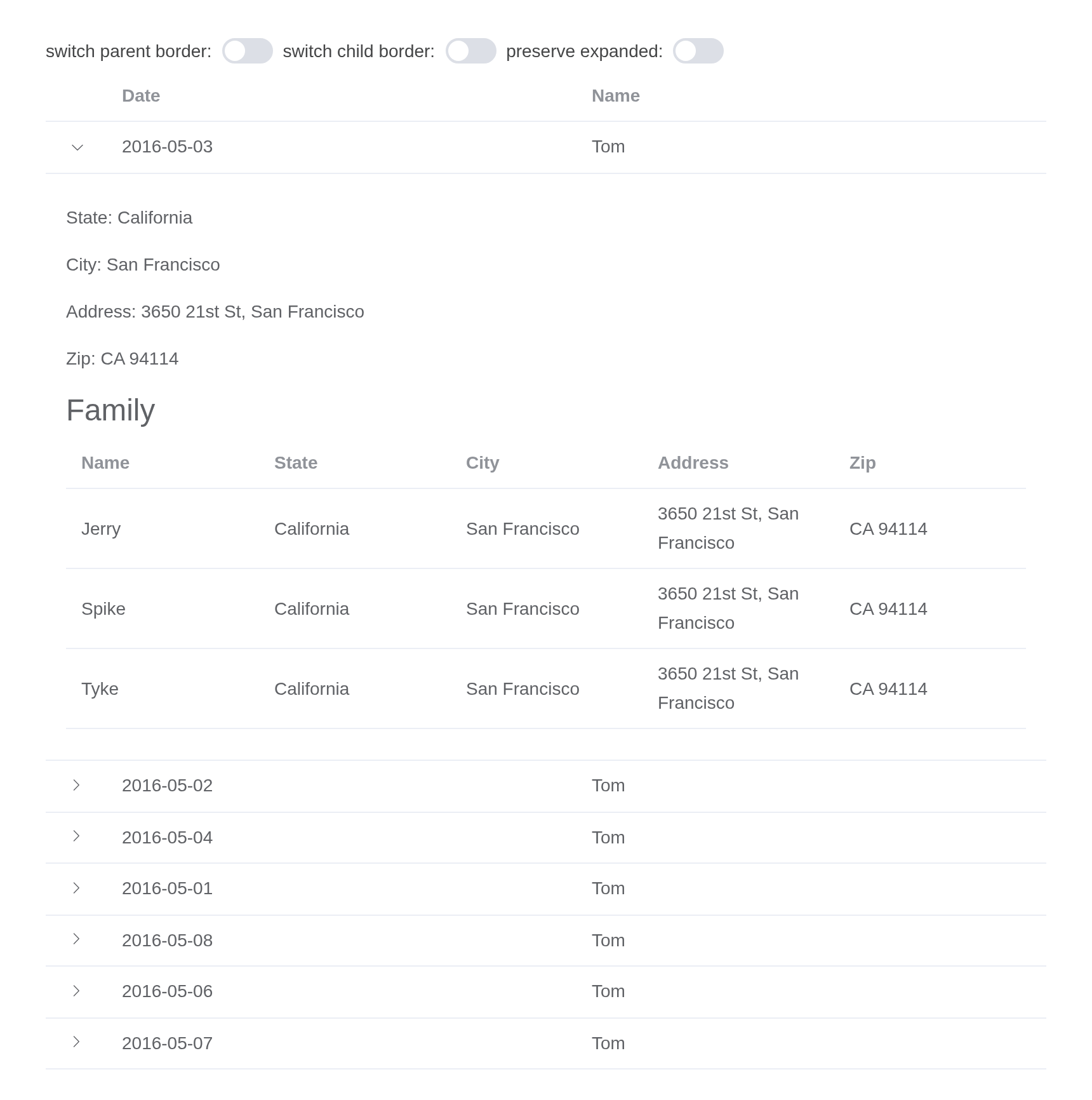
Tree data and lazy mode
You can display tree structure data. When row contains the
children field, it is treated as nested data. For rendering
nested data, the prop row-key is required. Also, child row
data can be loaded asynchronously. Set lazy property of
Table to true and the function load. Specify
hasChildren attribute in row to determine which row
contains children. Both children and
hasChildren can be configured via
tree-props.
The second table loads a row’s children when it is opened, with
load, in the browser. Without load the server
loads them: see el_load_children().
tableData <- list(
  list(
    id = 1,
    date = "2016-05-02",
    name = "wangxiaohu",
    address = "No. 189, Grove St, Los Angeles"
  ),
  list(
    id = 2,
    date = "2016-05-04",
    name = "wangxiaohu",
    address = "No. 189, Grove St, Los Angeles"
  ),
  list(
    id = 3,
    date = "2016-05-01",
    name = "wangxiaohu",
    address = "No. 189, Grove St, Los Angeles",
    children = list(
      list(
        id = 31,
        date = "2016-05-01",
        name = "wangxiaohu",
        address = "No. 189, Grove St, Los Angeles"
      ),
      list(
        id = 32,
        date = "2016-05-01",
        name = "wangxiaohu",
        address = "No. 189, Grove St, Los Angeles"
      )
    )
  ),
  list(
    id = 4,
    date = "2016-05-03",
    name = "wangxiaohu",
    address = "No. 189, Grove St, Los Angeles"
  )
)
tableData1 <- data.frame(
  id = 1:4,
  date = c("2016-05-02", "2016-05-04", "2016-05-01", "2016-05-03"),
  name = "wangxiaohu",
  hasChildren = c(FALSE, FALSE, TRUE, FALSE),
  address = "No. 189, Grove St, Los Angeles"
)
tags$div(
  el_table(
    data = tableData,
    row_key = "id",
    border = TRUE,
    default_expand_all = TRUE,
    columns = list(
      el_table_column("date", "Date", sortable = TRUE),
      el_table_column("name", "Name", sortable = TRUE),
      el_table_column("address", "Address", sortable = TRUE)
    )
  ),
  tags$div(style = "height: 20px"),
  el_table(
    data = tableData1,
    row_key = "id",
    border = TRUE,
    lazy = TRUE,
    tree_props = list(children = "children", hasChildren = "hasChildren"),
    load = JS(
      "function(row, treeNode, resolve) {",
      "  setTimeout(function() {",
      "    resolve([",
      "      { id: 31, date: '2016-05-01', name: 'wangxiaohu',",
      "        address: 'No. 189, Grove St, Los Angeles' },",
      "      { id: 32, date: '2016-05-01', name: 'wangxiaohu',",
      "        address: 'No. 189, Grove St, Los Angeles' }",
      "    ]);",
      "  }, 1000);",
      "}"
    ),
    columns = list(
      el_table_column("date", "Date"),
      el_table_column("name", "Name"),
      el_table_column("address", "Address")
    )
  )
)
Selectable tree
When treeProps.checkStrictly is true, the selection
state of parent and child nodes is no longer associated, that is, when
the parent node is selected, its child nodes will not be selected; when
treeProps.checkStrictly is false, the selection state of
parent and child nodes will be associated with the selection state of
child nodes, that is, when the parent node is selected, all its child
nodes will be selected.
The radio buttons set
tree_props = list(checkStrictly =), rendering the table
again: ticked strictly, a row ticks on its own, not with its children.
Rows 1 and 31 cannot be ticked.
row <- function(id, date, children = NULL) {
  r <- list(
    id = id,
    date = date,
    name = "wangxiaohu",
    address = "No. 189, Grove St, Los Angeles"
  )
  if (length(children)) {
    r$children <- children
  }
  r
}
tableData <- list(
  row(1, "2016-05-02"),
  row(2, "2016-05-04"),
  row(
    3,
    "2016-05-01",
    list(row(31, "2016-05-01"), row(32, "2016-05-01"), row(33, "2016-05-01"))
  ),
  row(4, "2016-05-03")
)

ui <- el_page(
  el_radio_group(
    "strict_mode",
    choices = c("true", "false"),
    value = "false",
    button = TRUE
  ),
  el_table_output("strict")
)

server <- function(input, output, session) {
  output$strict <- render_el_table(el_table(
    data = tableData,
    row_key = "id",
    default_expand_all = TRUE,
    tree_props = list(checkStrictly = identical(input$strict_mode, "true")),
    columns = list(
      el_table_column(
        type = "selection",
        width = 55,
        selectable = JS("function(row) { return ![1, 31].includes(row.id); }")
      ),
      el_table_column("date", "Date"),
      el_table_column("name", "Name"),
      el_table_column("address", "Address")
    )
  ))
}

shinyApp(ui, server)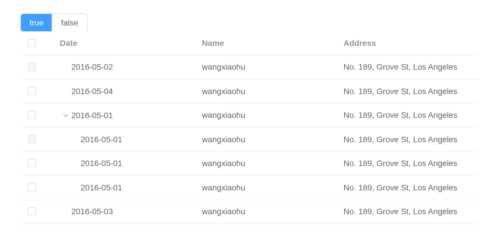
Summary row
For table of numbers, you can add an extra row at the table footer displaying each column’s sum.
You can add the summary row by setting show-summary to
true. By default, for the summary row, the first column
does not sum anything up but always displays ‘Sum’ (you can configure
the displayed text using sum-text), while other columns sum
every number in that column up and display them. You can of course
define your own sum behaviour. To do so, pass a method to
summary-method, which returns an array, and each element of
the returned array will be displayed in the columns of the summary row,
It can be a VNode or string. The second table of this example is a
detailed demo.
tableData <- data.frame(
  id = c("12987122", "12987123", "12987124", "12987125", "12987126"),
  name = "Tom",
  amount1 = c("234", "165", "324", "621", "539"),
  amount2 = c("3.2", "4.43", "1.9", "2.2", "4.1"),
  amount3 = c(10, 12, 9, 17, 15)
)
tags$div(
  el_table(
    data = tableData,
    border = TRUE,
    show_summary = TRUE,
    columns = list(
      el_table_column("id", "ID", width = 180),
      el_table_column("name", "Name"),
      el_table_column("amount1", "Amount 1", sortable = TRUE),
      el_table_column("amount2", "Amount 2", sortable = TRUE),
      el_table_column("amount3", "Amount 3", sortable = TRUE)
    )
  ),
  tags$div(style = "height: 20px"),
  el_table(
    data = tableData,
    border = TRUE,
    height = 200,
    show_summary = TRUE,
    summary_method = JS(
      "function({ columns, data }) {",
      "  return columns.map(function(column, index) {",
      "    if (index === 0) {",
      "      return Vue.h('div', { style: { textDecoration: 'underline' } }, ['Total Cost']);",
      "    }",
      "    var values = data.map(function(item) { return Number(item[column.property]); });",
      "    if (values.every(function(value) { return Number.isNaN(value); })) return 'N/A';",
      "    return '$ ' + values.reduce(function(prev, curr) {",
      "      return Number.isNaN(curr) ? prev : prev + curr;",
      "    }, 0);",
      "  });",
      "}"
    ),
    columns = list(
      el_table_column("id", "ID", width = 180),
      el_table_column("name", "Name"),
      el_table_column("amount1", "Cost 1 ($)"),
      el_table_column("amount2", "Cost 2 ($)"),
      el_table_column("amount3", "Cost 3 ($)")
    )
  )
)
Rowspan and colspan
Configuring rowspan and colspan allows you to merge cells
Use the span-method attribute to configure rowspan and
colspan. It accepts a method, and passes an object to that method
including current row row, current column
column, current row index rowIndex and current
column index columnIndex. The method should return an array
of two numbers, the first number being rowspan and second
colspan. It can also return an object with
rowspan and colspan props.
tableData <- data.frame(
  id = c("12987122", "12987123", "12987124", "12987125", "12987126"),
  name = "Tom",
  amount1 = c("234", "165", "324", "621", "539"),
  amount2 = c("3.2", "4.43", "1.9", "2.2", "4.1"),
  amount3 = c(10, 12, 9, 17, 15)
)
tags$div(
  el_table(
    data = tableData,
    border = TRUE,
    span_method = JS(
      "function({ row, column, rowIndex, columnIndex }) {",
      "  if (rowIndex % 2 === 0) {",
      "    if (columnIndex === 0) return [1, 2];",
      "    if (columnIndex === 1) return [0, 0];",
      "  }",
      "}"
    ),
    columns = list(
      el_table_column("id", "ID", width = 180),
      el_table_column("name", "Name"),
      el_table_column("amount1", "Amount 1", sortable = TRUE),
      el_table_column("amount2", "Amount 2", sortable = TRUE),
      el_table_column("amount3", "Amount 3", sortable = TRUE)
    )
  ),
  tags$div(style = "height: 20px"),
  el_table(
    data = tableData,
    border = TRUE,
    span_method = JS(
      "function({ row, column, rowIndex, columnIndex }) {",
      "  if (columnIndex === 0) {",
      "    return rowIndex % 2 === 0",
      "      ? { rowspan: 2, colspan: 1 }",
      "      : { rowspan: 0, colspan: 0 };",
      "  }",
      "}"
    ),
    columns = list(
      el_table_column("id", "ID", width = 180),
      el_table_column("name", "Name"),
      el_table_column("amount1", "Amount 1"),
      el_table_column("amount2", "Amount 2"),
      el_table_column("amount3", "Amount 3")
    )
  )
)
Custom index
You can customize row index in type=index columns.
To customize row indices, use index attribute on
el-table-column with type=index. If it is
assigned to a number, all indices will have an offset of that number. It
also accepts a method with each index (starting from 0) as
parameter, and the returned value will be displayed as index.
tableData <- data.frame(
  date = c("2016-05-03", "2016-05-02", "2016-05-04", "2016-05-01"),
  name = "Tom",
  state = "California",
  city = "Los Angeles",
  address = "No. 189, Grove St, Los Angeles",
  zip = "CA 90036",
  tag = c("Home", "Office", "Home", "Office")
)
el_table(
  data = tableData,
  columns = list(
    el_table_column(
      type = "index",
      index = JS("function(index) { return index * 2; }")
    ),
    el_table_column("date", "Date", width = 180),
    el_table_column("name", "Name", width = 180),
    el_table_column("address", "Address")
  )
)
Table Layout
The table-layout property sets the algorithm used to lay out table cells, rows, and columns.
The radio buttons set table_layout from the server.
tableData <- data.frame(
  date = c("2016-05-03", "2016-05-02", "2016-05-04", "2016-05-01"),
  name = "Tom",
  address = "No. 189, Grove St, Los Angeles"
)

ui <- el_page(
  el_radio_group(
    "layout",
    choices = c("fixed", "auto"),
    value = "fixed",
    button = TRUE
  ),
  el_table_output("layout_table")
)

server <- function(input, output, session) {
  output$layout_table <- render_el_table(el_table(
    data = tableData,
    table_layout = "fixed",
    columns = list(
      el_table_column("date", "Date"),
      el_table_column("name", "Name"),
      el_table_column("address", "Address")
    )
  ))
  observeEvent(input$layout, {
    update_el_table(session, "layout_table", table_layout = input$layout)
  })
}

shinyApp(ui, server)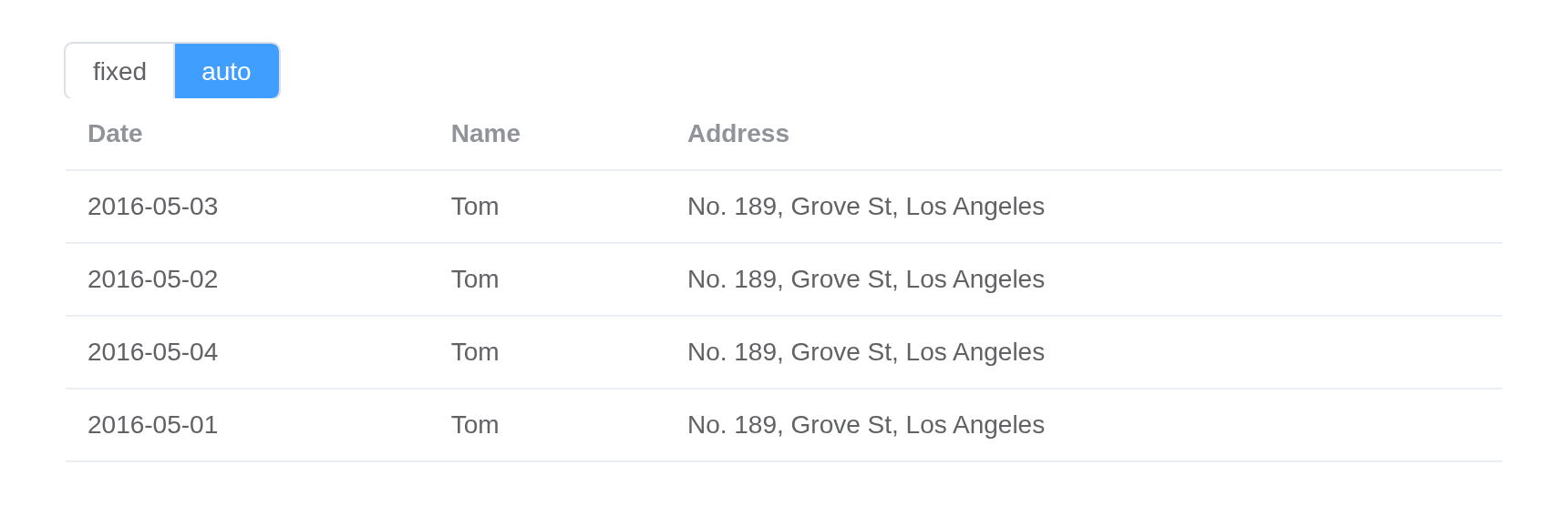
Tooltip formatter
You can use tooltip-formatter to customize the tooltip
content.
tableData <- list(
  list(
    address = "Lohrbergstr. 86c, Süd Lilli, Saarland",
    tags = list("Office", "Home", "Park", "Garden"),
    url = "https://github.com/element-plus/element-plus/issues"
  ),
  list(
    address = "760 A Street, South Frankfield, Illinois",
    tags = list("error", "warning", "success", "info"),
    url = "https://github.com/element-plus/element-plus/pulls"
  ),
  list(
    address = "Arnold-Ohletz-Str. 41a, Alt Malinascheid, Thüringen",
    tags = list("one", "two", "three", "four", "five"),
    url = "https://github.com/element-plus/element-plus/discussions"
  ),
  list(
    address = "23618 Windsor Drive, West Ricardoview, Idaho",
    tags = list("blue", "white", "dark", "gray", "red", "bright"),
    url = "https://github.com/element-plus/element-plus/actions"
  )
)
tagList(
  tags$style(".tag-item + .tag-item { margin-left: 5px; }"),
  el_table(
    data = tableData,
    show_overflow_tooltip = TRUE,
    tooltip_formatter = JS(
      "function(data) { return data.cellValue + ': table formatter'; }"
    ),
    columns = list(
      el_table_column("address", "extends table formatter", width = 240),
      el_table_column(
        "tags",
        "formatter object",
        width = 240,
        tooltip_formatter = JS(
          "function({ row }) { return row.tags.join(', '); }"
        ),
        cell = el$tag(
          "v-for" = "tag in scope.row.tags",
          ":key" = "tag",
          class = "tag-item",
          type = "primary",
          "{{ tag }}"
        )
      ),
      el_table_column(
        "url",
        "with vnode",
        width = 240,
        tooltip_formatter = JS(
          "function(data) {",
          "  return Vue.h(ElementPlus.ElLink, { type: 'primary', href: data.cellValue },",
          "    function() { return Vue.h('span', null, data.cellValue); });",
          "}"
        )
      )
    )
  )
)
In Shiny
In an app a table is an output, as DT’s and reactable’s are: the page
holds el_table_output("cars"), the server renders
el_table() into it with render_el_table(), and
the output’s id names the table’s inputs. The table above every example
on this page is el_table() alone, which is how it goes in R
Markdown, Quarto or a static page. | Input | Value | |—|—| |
input$cars_selection_rows | the selected row numbers,
integers; NULL with none | |
input$cars_selection_change | the selected rows,
data[rows, , drop = FALSE]: the columns, types and row
names as R holds them | | input$cars_current_change,
_sort_change, _filter_change,
_expand_change | reported by every table | |
input$cars_<event> | any other of Element’s events,
asked for with el_on() or el_table(events =) |
Rendering again with the same rows keeps the user’s ticks, sort and open
rows; other rows clear the selection, as Element does, unless the rows
carry a row_key and the selection column
reserve_selection = TRUE. update_el_table()
and call_el() reach the table by the output’s id:
update_el_table(insert =, replace =, delete =) changes a
few rows and sends only those, and el_table_data() reads
the data the table shows.
#'
#'
cars <- head(mtcars[, 1:4], 6)
cars$made <- as.Date("2024-01-01") + 0:5

ui <- el_page(
  el_input_number("n", value = 6, min = 1, max = 6),
  el_table_output("cars"),
  verbatimTextOutput("picked")
)

server <- function(input, output, session) {
  output$cars <- render_el_table(
    el_table(data = head(cars, input$n), selection = TRUE) |>
      el_on("row-dblclick")
  )
  # the ticked rows, as R subsets them: Dates stay Dates
  output$picked <- renderPrint(input$cars_selection_change)
  observeEvent(input$cars_row_dblclick, {
    el_message(message = paste("Row", input$cars_row_dblclick$row_index))
  })
}

shinyApp(ui, server)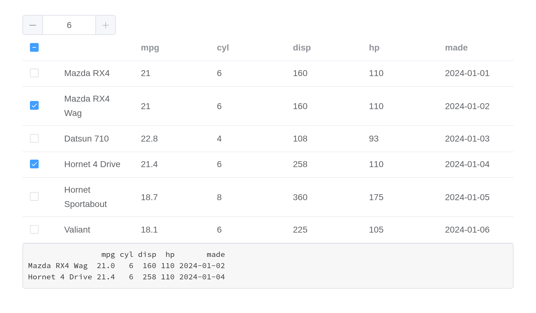
Editing cells
A column with editable is edited in place, in Element’s
own input, input-number, select or date picker: double-click a cell,
then Enter or leave it to commit, Escape to abandon, Tab to commit and
go on to the next editable cell. The edit is shown at once, applied to
the server’s copy of the data – el_table_data() – and
reported as input$cars_cell_edit,
list(row, column, value, old) with the column’s type: a
Date stays a Date, a factor a factor. An observer saves it, or puts the
old value back with update_el_table(replace =).
#'
cars <- head(mtcars[, 1:2], 4)
cars$made <- as.Date("2024-01-01") + 0:3
cars$grade <- factor(c("A", "B", "A", "C"))

ui <- el_page(
  el_table_output("cars"),
  verbatimTextOutput("edited")
)

server <- function(input, output, session) {
  output$cars <- render_el_table(el_table(
    data = cars,
    columns = list(
      el_table_column(
        "mpg",
        "MPG",
        editable = "number",
        editor = list(min = 0)
      ),
      el_table_column("cyl", "Cylinders"),
      el_table_column("made", "Made", editable = "date"),
      el_table_column(
        "grade",
        "Grade",
        editable = "select",
        editor = list(choices = c("A", "B", "C"))
      )
    )
  ))
  output$edited <- renderPrint(input$cars_cell_edit)
}

shinyApp(ui, server)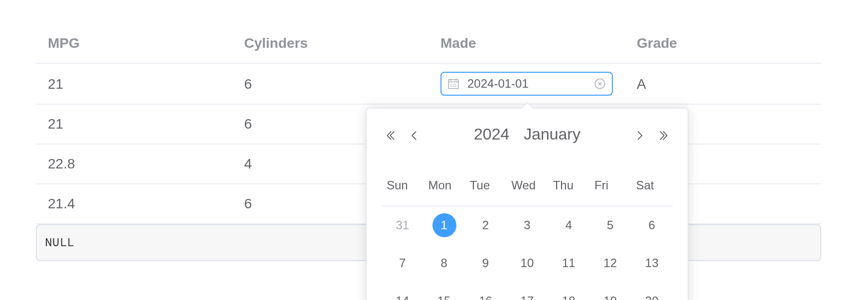
Rows from the server
update_el_table() changes a few rows and sends only
those: insert (before row at, or at the end),
replace (rows at) and delete. The
server’s copy changes as R would change the data, and the rows not
touched keep their ticks. el_table_data() is that copy, a
reactive read; data replaces every row, as rendering again
does.
#'
todo <- data.frame(
  task = c("Write the docs", "Run the tests"),
  done = c(FALSE, TRUE)
)

ui <- el_page(
  el_button("add", "Add a task"),
  el_button("remove", "Remove the ticked"),
  el_table_output("todo"),
  textOutput("count")
)

server <- function(input, output, session) {
  output$todo <- render_el_table(el_table(
    data = todo,
    selection = TRUE,
    columns = list(
      el_table_column("task", "Task", editable = TRUE),
      el_table_column("done", "Done")
    )
  ))
  observeEvent(input$add, {
    update_el_table(
      session,
      "todo",
      insert = data.frame(task = paste("Task", input$add), done = FALSE),
      at = 1
    )
  })
  observeEvent(input$remove, {
    req(input$todo_selection_rows)
    update_el_table(session, "todo", delete = input$todo_selection_rows)
  })
  output$count <- renderText(
    paste(nrow(el_table_data(id = "todo")), "tasks")
  )
}

shinyApp(ui, server)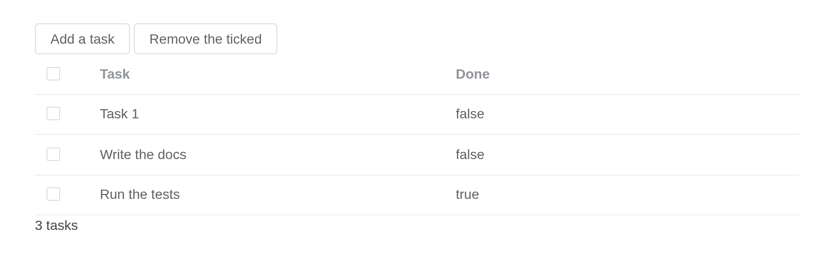
API
Element Plus’s tables, and beside each entry where it is in R.
Table Attributes
| Element | In R | Description | Type | Accepted | Default |
|---|---|---|---|---|---|
data |
data |
table data |
1any[]
|
[] | |
height |
height |
table’s height. By default it has an auto height. If
its value is a number, the height is measured in pixels; if its value is
a string, the value will be assigned to element’s style.height, the
height is affected by external styles |
2 / 3 | — | |
max-height |
max_height |
table’s max-height. The legal value is a number or the height in px | 4 / 5 | — | |
stripe |
stripe |
whether Table is striped | 6 | false | |
border |
border |
whether Table has vertical border | 7 | false | |
size |
size |
size of Table |
8'' \\| 'large' \\| 'default' \\| 'small'
|
— | |
fit |
fit |
whether width of column automatically fits its container | 9 | true | |
show-header |
show_header |
whether Table header is visible | 10 | true | |
highlight-current-row |
highlight_current_row |
whether current row is highlighted | 11 | false | |
current-row-key |
current_row_key |
key of current row, a set only prop | 12 / 13 | — | |
row-class-name |
row_class_name |
function that returns custom class names for a row, or a string assigning class names for every row |
14(data: { row: any, rowIndex: number }) => string
/ 15
|
— | |
row-style |
row_style |
function that returns custom style for a row, or an object assigning custom style for every row |
16(data: { row: any, rowIndex: number }) => CSSProperties
/ 17CSSProperties
|
— | |
cell-class-name |
cell_class_name |
function that returns custom class names for a cell, or a string assigning class names for every cell |
18(data: { row: any, column: TableColumnCtx<T>, rowIndex: number, columnIndex: number }) => string
/ 19
|
— | |
cell-style |
cell_style |
function that returns custom style for a cell, or an object assigning custom style for every cell |
20(data: { row: any, column: TableColumnCtx<T>, rowIndex: number, columnIndex: number }) => CSSProperties
/ 21CSSProperties
|
— | |
header-row-class-name |
header_row_class_name |
function that returns custom class names for a row in table header, or a string assigning class names for every row in table header |
22(data: { row: any, rowIndex: number }) => string
/ 23
|
— | |
header-row-style |
header_row_style |
function that returns custom style for a row in table header, or an object assigning custom style for every row in table header |
24(data: { row: any, rowIndex: number }) => CSSProperties
/ 25CSSProperties
|
— | |
header-cell-class-name |
header_cell_class_name |
function that returns custom class names for a cell in table header, or a string assigning class names for every cell in table header |
26(data: { row: any, column: TableColumnCtx<T>, rowIndex: number, columnIndex: number }) => string
/ 27
|
— | |
header-cell-style |
header_cell_style |
function that returns custom style for a cell in table header, or an object assigning custom style for every cell in table header |
28(data: { row: any, column: TableColumnCtx<T>, rowIndex: number, columnIndex: number }) => CSSProperties
/ 29CSSProperties
|
— | |
row-key |
row_key |
key of row data, used for optimizing rendering. Required if
reserve-selection is on or display tree data. When its type
is String, multi-level access is supported,
e.g. user.info.id, but user.info[0].id is not
supported, in which case Function should be used |
30(row: any) => string / 31
|
— | |
empty-text |
empty_text |
displayed text when data is empty. You can customize this area with
#empty
|
32 | No Data | |
default-expand-all |
default_expand_all |
whether expand all rows by default, works when the table has a column type=“expand” or contains tree structure data | 33 | false | |
expand-row-keys |
expand_row_keys |
set expanded rows by this prop, prop’s value is the keys of expand rows, you should set row-key before using this prop. |
34Array<string>
|
— | |
default-sort |
default_sort |
set the default sort column and order. property prop is
used to set default sort column, property order is used to
set default sort order |
35Sort
|
if prop is set, and order is not set, then
order is default to ascending |
|
tooltip-effect |
tooltip_effect |
the effect of the overflow tooltip |
36'dark' \\| 'light'
|
dark | |
tooltip-options |
tooltip_options |
the options for the overflow tooltip, see the following tooltip component |
37Pick<ElTooltipProps, 'effect' \\| 'enterable' \\| 'hideAfter' \\| 'offset' \\| 'placement' \\| 'popperClass' \\| 'popperOptions' \\| 'showAfter' \\| 'showArrow'>
|
38{ enterable: true, placement: 'top', showArrow: true, hideAfter: 200, popperOptions: { strategy: 'fixed' } }
|
|
append-filter-panel-to |
append_filter_panel_to |
which element the filter panels appends to | 39 | — | |
show-summary |
show_summary |
whether to display a summary row | 40 | false | |
sum-text |
sum_text |
displayed text for the first column of summary row | 41 | Sum | |
summary-method |
summary_method |
custom summary method |
42(data: { columns: any[], data: any[] }) => (VNode \\| string)[]
|
— | |
span-method |
span_method |
method that returns rowspan and colspan |
43(data: { row: any, column: TableColumnCtx<T>, rowIndex: number, columnIndex: number }) => number[] \\| { rowspan: number, colspan: number } \\| void
|
— | |
select-on-indeterminate |
select_on_indeterminate |
controls the behavior of master checkbox in multi-select tables when only some rows are selected (but not all). If true, all rows will be selected, else deselected | 44 | true | |
indent |
indent |
horizontal indentation of tree data | 45 | 16 | |
lazy |
lazy |
whether to lazy loading data | 46 | false | |
load |
load |
method for loading child row data, only works when lazy
is true |
47(row: any, treeNode: TreeNode, resolve: (data: any[]) => void) => void
|
— | |
tree-props |
tree_props |
configuration for rendering nested data |
48{ hasChildren?: string, children?: string, checkStrictly?: boolean }
|
49{ hasChildren: 'hasChildren', children: 'children', checkStrictly: false }
|
|
table-layout |
table_layout |
sets the algorithm used to lay out table cells, rows, and columns |
50'fixed' \\| 'auto'
|
fixed | |
scrollbar-always-on |
scrollbar_always_on |
always show scrollbar | 51 | false | |
show-overflow-tooltip |
show_overflow_tooltip |
whether to hide extra content and show them in a tooltip when hovering on the cell.It will affect all the table columns, refer to table tooltip-options |
52
/ object ^(2.3.7) |
— | |
flexible |
flexible |
ensure main axis minimum-size doesn’t follow the content | 53 | false | |
scrollbar-tabindex |
scrollbar_tabindex |
body scrollbar’s wrap container tabindex | 54 / 55 | — | |
allow-drag-last-column |
allow_drag_last_column |
whether to allow drag the last column | 56 | true | |
tooltip-formatter |
tooltip_formatter |
customize tooltip content when using
show-overflow-tooltip
|
57(data: { row: any, column: TableColumnCtx<T>, cellValue: any }) => VNode \\| string
|
— | |
preserve-expanded-content |
preserve_expanded_content |
whether to preserve expanded row content in DOM when collapsed | 58 | false | |
native-scrollbar |
native_scrollbar |
whether to use native scrollbars | 59 | false | |
row-expandable |
row_expandable |
enable expandable rows, works when the table has a column type=“expand” |
60(row: any, index: number) => boolean
|
— |
Table Events
| Element | In R | Description |
|---|---|---|
select |
input$<id>_select, with el_on()
|
triggers when user clicks the checkbox in a row |
select-all |
input$<id>_select_all, with
el_on()
|
triggers when user clicks the checkbox in table header |
selection-change |
input$<id>_selection_change, the rows;
input$<id>_selection_rows, their numbers |
triggers when selection changes |
cell-mouse-enter |
input$<id>_cell_mouse_enter, with
el_on()
|
triggers when hovering into a cell |
cell-mouse-leave |
input$<id>_cell_mouse_leave, with
el_on()
|
triggers when hovering out of a cell |
cell-click |
input$<id>_cell_click, with
el_on()
|
triggers when clicking a cell |
cell-dblclick |
input$<id>_cell_dblclick, with
el_on()
|
triggers when double clicking a cell |
cell-contextmenu |
input$<id>_cell_contextmenu, with
el_on()
|
triggers when user right clicks on a cell |
row-click |
input$<id>_row_click, with
el_on()
|
triggers when clicking a row |
row-contextmenu |
input$<id>_row_contextmenu, with
el_on()
|
triggers when user right clicks on a row |
row-dblclick |
input$<id>_row_dblclick, with
el_on()
|
triggers when double clicking a row |
header-click |
input$<id>_header_click, with
el_on()
|
triggers when clicking a column header |
header-contextmenu |
input$<id>_header_contextmenu, with
el_on()
|
triggers when user right clicks on a column header |
sort-change |
input$<id>_sort_change |
triggers when Table’s sorting changes |
filter-change |
input$<id>_filter_change |
triggers when the table’s filter changes |
current-change |
input$<id>_current_change |
triggers when current row changes |
header-dragend |
input$<id>_header_dragend, with
el_on()
|
triggers after changing a column’s width by dragging the column header’s border |
expand-change |
input$<id>_expand_change |
triggers when user expands or collapses a row (for expandable table, second param is expandedRows; for tree Table, second param is expanded) |
scroll |
input$<id>_scroll, with el_on()
|
Invoked after scrolled |
Table Slots
| Element | In R | Description |
|---|---|---|
default |
default content | customize default content |
append |
slots = list(append = ) |
Contents to be inserted after the last row. You may need this slot if you want to implement infinite scroll for the table. This slot will be displayed above the summary row if there is one. |
empty |
slots = list(empty = ) |
you can customize content when data is empty. |
Table Exposes
| Element | In R | Description |
|---|---|---|
clearSelection |
call_el(session, id, "clearSelection") |
used in multiple selection Table, clear user selection |
getSelectionRows |
input$<id>_selection_rows;
call_el(session, id, "getSelectionRows")
|
returns the currently selected rows |
getHalfSelectionRows |
call_el(session, id, "getHalfSelectionRows") |
returns the currently half-selected rows |
toggleRowSelection |
call_el(session, id, "toggleRowSelection") |
used in multiple selection Table, toggle if a certain row is selected. With the second parameter, you can directly set if this row is selected |
toggleAllSelection |
call_el(session, id, "toggleAllSelection") |
used in multiple selection Table, toggle select all and deselect all |
toggleRowExpansion |
call_el(session, id, "toggleRowExpansion") |
used in expandable Table or tree Table, toggle if a certain row is expanded. With the second parameter, you can directly set if this row is expanded or collapsed |
setCurrentRow |
call_el(session, id, "setCurrentRow") |
used in single selection Table, set a certain row selected. If called without any parameter, it will clear selection |
clearSort |
call_el(session, id, "clearSort") |
clear sorting, restore data to the original order |
clearFilter |
call_el(session, id, "clearFilter") |
clear filters of the columns whose columnKey are passed
in. If no params, clear all filters |
doLayout |
call_el(session, id, "doLayout") |
refresh the layout of Table. When the visibility of Table changes, you may need to call this method to get a correct layout |
sort |
call_el(session, id, "sort") |
sort Table manually. Property prop is used to set sort
column, property order is used to set sort order |
scrollTo |
call_el(session, id, "scrollTo") |
scrolls to a particular set of coordinates |
setScrollTop |
call_el(session, id, "setScrollTop") |
set vertical scroll position |
setScrollLeft |
call_el(session, id, "setScrollLeft") |
set horizontal scroll position |
updateKeyChildren |
call_el(session, id, "updateKeyChildren") |
used in lazy Table, must set rowKey, update key
children |
Table-column Attributes
| Element | In R | Description | Type | Accepted | Default |
|---|---|---|---|---|---|
type |
el_table_column(type =) |
type of the column. If set to selection, the column
will display checkbox. If set to index, the column will
display index of the row (staring from 1). If set to
expand, the column will display expand icon |
61'default' \\| 'selection' \\| 'index' \\| 'expand'
|
default | |
index |
el_table_column(index =) |
customize indices for each row, works on columns with
type=index
|
62
/ 63(index: number) => number
|
— | |
label |
el_table_column(label =) |
column label | 64 | — | |
column-key |
el_table_column(column_key =) |
column’s key. If you need to use the filter-change event, you need this attribute to identify which column is being filtered | 65 | — | |
prop |
el_table_column(prop =) |
field name. You can also use its alias: property
|
66 | — | |
width |
el_table_column(width =) |
column width | 67 / 68 | ’’ | |
min-width |
el_table_column(min_width =) |
column minimum width. Columns with width has a fixed
width, while columns with min-width has a width that is
distributed in proportion |
69 / 70 | ’’ | |
fixed |
el_table_column(fixed =) |
whether column is fixed at left / right. Will be fixed at left if
true
|
71'left' \\| 'right' / 72
|
false | |
render-header |
el_table_column(render_header =) |
render function for table header of this column |
73(data: { column: TableColumnCtx<T>, $index: number }) => void
|
— | |
sortable |
el_table_column(sortable =) |
whether column can be sorted. Remote sorting can be done by setting
this attribute to ‘custom’ and listening to the sort-change
event of Table |
74 / 75 | false | |
sort-method |
el_table_column(sort_method =) |
sorting method, works when sortable is
true. Should return a number, just like Array.sort |
76<T = any>(a: T, b: T) => number
|
— | |
sort-by |
el_table_column(sort_by =) |
specify which property to sort by, works when sortable
is true and sort-method is
undefined. If set to an Array, the column will sequentially
sort by the next property if the previous one is equal |
77(row: any, index: number) => string
/ 78 /
79string[]
|
— | |
sort-orders |
el_table_column(sort_orders =) |
the order of the sorting strategies used when sorting the data,
works when sortable is true. Accepts an array,
as the user clicks on the header, the column is sorted in order of the
elements in the array |
80('ascending' \\| 'descending' \\| null)[]
|
[‘ascending’, ‘descending’, null] | |
resizable |
el_table_column(resizable =) |
whether column width can be resized, works when border
of el-table is true
|
81 | true | |
formatter |
el_table_column(formatter =) |
function that formats cell content |
82(row: any, column: TableColumnCtx<T>, cellValue: any, index: number) => VNode \\| string
|
— | |
show-overflow-tooltip |
el_table_column(show_overflow_tooltip =) |
whether to hide extra content and show them in a tooltip when hovering on the cell |
83
/ object ^(2.2.28) |
undefined | |
align |
el_table_column(align =) |
alignment |
84'left' \\| 'center' \\| 'right'
|
left | |
header-align |
el_table_column(header_align =) |
alignment of the table header. If omitted, the value of the above
align attribute will be applied |
85'left' \\| 'center' \\| 'right'
|
left | |
class-name |
el_table_column(class_name =) |
class name of cells in the column | 86 | — | |
label-class-name |
el_table_column(label_class_name =) |
class name of the label of this column | 87 | — | |
selectable |
el_table_column(selectable =) |
function that determines if a certain row can be selected, works
when type is ‘selection’ |
88(row: any, index: number) => boolean
|
— | |
reserve-selection |
el_table_column(reserve_selection =) |
whether to reserve selection after data refreshing, works when
type is ‘selection’. Note that row-key is
required for this to work |
89 | false | |
filters |
el_table_column(filters =) |
an array of data filtering options. For each element in this array,
text and value are required |
90Array<{text: string, value: string}>
|
— | |
filter-placement |
el_table_column(filter_placement =) |
placement for the filter dropdown |
91'top' \\| 'top-start' \\| 'top-end' \\| 'bottom' \\| 'bottom-start' \\| 'bottom-end' \\| 'left' \\| 'left-start' \\| 'left-end' \\| 'right' \\| 'right-start' \\| 'right-end'
|
— | |
filter-class-name |
el_table_column(filter_class_name =) |
className for the filter dropdown | 92 | — | |
filter-multiple |
el_table_column(filter_multiple =) |
whether data filtering supports multiple options | 93 | true | |
filter-method |
el_table_column(filter_method =) |
data filtering method. If filter-multiple is on, this
method will be called multiple times for each row, and a row will
display if one of the calls returns true
|
94(value: any, row: any, column: TableColumnCtx<T>) => void
|
— | |
filtered-value |
el_table_column(filtered_value =) |
filter value for selected data, might be useful when table header is
rendered with render-header
|
95string[]
|
— | |
tooltip-formatter |
el_table_column(tooltip_formatter =) |
customize tooltip content when using
show-overflow-tooltip
|
96(data: { row: any, column: TableColumnCtx<T>, cellValue: any }) => VNode \\| string
|
— |
Table-column Slots
| Element | In R | Description |
|---|---|---|
default |
default content | Custom content for table columns |
header |
slots = list(header = ) |
Custom content for table header |
filter-icon |
slots = list(filter-icon = ) |
Custom content for filter icon |
expand |
slots = list(expand = ) |
Custom content for expand columns. The expandable
property is supported starting from v2.13.2. |