Divide data collections which are related yet belong to different types.
Basic usage
Basic and concise tabs.
Tabs provide a selective card functionality. By default the first tab
is selected as active, and you can activate any tab by setting the
value attribute.
el_tabs(
  "basic",
  selected = "first",
  tabs = list(
    el_tab_pane("User", "User", name = "first"),
    el_tab_pane("Config", "Config", name = "second"),
    el_tab_pane("Role", "Role", name = "third"),
    el_tab_pane("Task", "Task", name = "fourth")
  )
)Card Style
Tabs styled as cards.
Set type to card can get a card-styled
tab.
el_tabs(
  "card",
  type = "card",
  tabs = list(
    el_tab_pane("User", "User", name = "first"),
    el_tab_pane("Config", "Config", name = "second"),
    el_tab_pane("Role", "Role", name = "third"),
    el_tab_pane("Task", "Task", name = "fourth")
  )
)Border card
Border card tabs.
Set type to border-card.
el_tabs(
  "bc",
  type = "border-card",
  tabs = list(
    el_tab_pane("User", "User", name = "first"),
    el_tab_pane("Config", "Config", name = "second"),
    el_tab_pane("Role", "Role", name = "third"),
    el_tab_pane("Task", "Task", name = "fourth")
  )
)Tab position
You can use tab-position attribute to set the tab’s
position.
You can choose from four directions:
tabPosition="left|right|top|bottom"
The radios move the tabs, with
update_el_tabs(tab_position =).
ui <- el_page(
  el_radio_group(
    "position",
    choices = c("top", "right", "bottom", "left"),
    value = "top",
    button = TRUE
  ),
  tags$div(style = "height: 16px"),
  el_tabs(
    "tabs_pos",
    tab_position = "top",
    tabs = list(
      el_tab_pane("User", "User"),
      el_tab_pane("Config", "Config"),
      el_tab_pane("Role", "Role"),
      el_tab_pane("Task", "Task")
    )
  )
)
server <- function(input, output, session) {
  observeEvent(input$position, ignoreInit = TRUE, {
    update_el_tabs(session, "tabs_pos", tab_position = input$position)
  })
}
shinyApp(ui, server)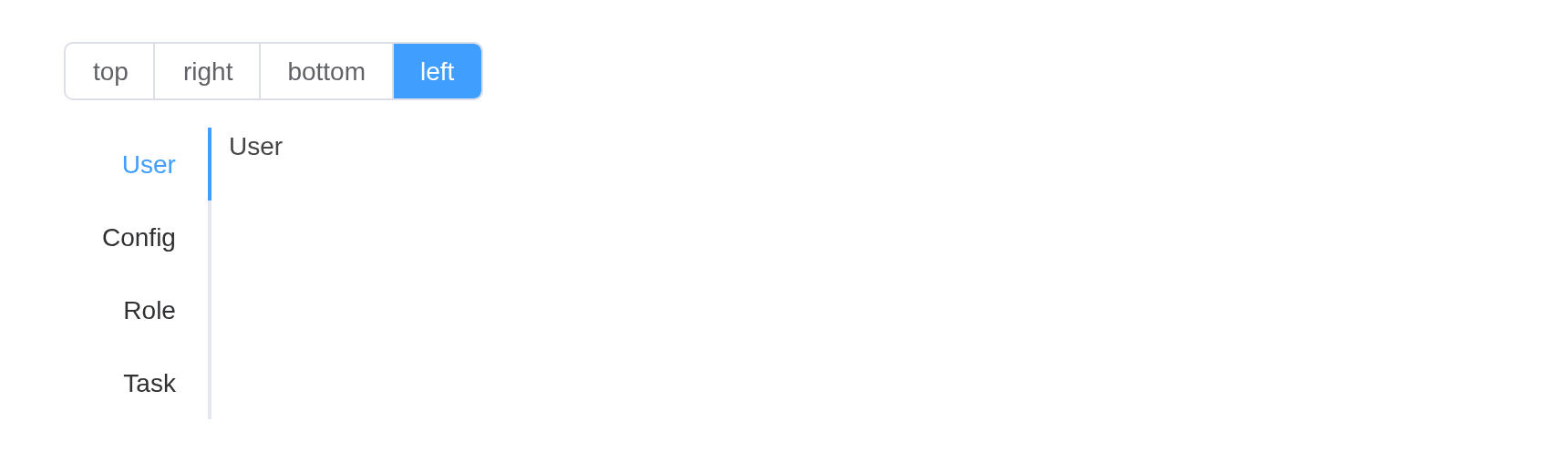
Custom Tab
You can use named slot to customize the tab label content.
A label may be markup.
el_tabs(
  "cus",
  type = "border-card",
  tabs = list(
    el_tab_pane(
      tagList(el_icon("Calendar"), " Route"),
      "Route",
      name = "route"
    ),
    el_tab_pane("Config", "Config", name = "config"),
    el_tab_pane("Role", "Role", name = "role"),
    el_tab_pane("Task", "Task", name = "task")
  )
)Add & close tab
Only card type Tabs support addable & closeable.
editable = TRUE adds the close buttons and the new-tab
button; the tabs close themselves, and a new one is the server’s to
make, with insert_el_tab().
ui <- el_page(el_tabs(
  "docs",
  type = "card",
  editable = TRUE,
  tabs = list(
    el_tab_pane("Tab 1", "Tab 1 content", name = "1"),
    el_tab_pane("Tab 2", "Tab 2 content", name = "2")
  )
))

server <- function(input, output, session) {
  n <- 2
  observeEvent(input$docs_tab_add, {
    n <<- n + 1
    insert_el_tab(
      id = "docs",
      tab = el_tab_pane("New Tab", "New Tab content", name = as.character(n))
    )
  })
}

shinyApp(ui, server)
Customized add button icon
el_tabs(
  "icon",
  type = "card",
  editable = TRUE,
  add_icon = "CirclePlus",
  tabs = list(
    el_tab_pane("Tab 1", "Tab 1 content", name = "1"),
    el_tab_pane("Tab 2", "Tab 2 content", name = "2")
  )
)Customized trigger button of new tab
ui <- el_page(
  el_button("add", "add tab", size = "small"),
  el_tabs(
    "docs",
    type = "card",
    closable = TRUE,
    tabs = list(
      el_tab_pane("Tab 1", "Tab 1 content", name = "1"),
      el_tab_pane("Tab 2", "Tab 2 content", name = "2")
    )
  )
)

server <- function(input, output, session) {
  n <- 2
  observeEvent(input$add, {
    n <<- n + 1
    insert_el_tab(
      id = "docs",
      tab = el_tab_pane("New Tab", "New Tab content", name = as.character(n))
    )
  })
}

shinyApp(ui, server)
Default value
selected opens a tab other than the first.
el_tabs(
  "dv",
  selected = "third",
  type = "card",
  tabs = list(
    el_tab_pane("User", "User", name = "first"),
    el_tab_pane("Config", "Config", name = "second"),
    el_tab_pane("Role", "Role", name = "third"),
    el_tab_pane("Task", "Task", name = "fourth")
  )
)API
Element Plus’s tables, and beside each entry where it is in R.
Tabs Attributes
| Element | In R | Description | Type | Accepted | Default |
|---|---|---|---|---|---|
model-value |
selected; input$<id>
|
binding value, name of the selected tab, the default value is the name of first tab | 1 / 2 | — | |
default-value |
selected |
The value of the tab that should be active when initially rendered. (avoid initial transition) | 3 / 4 | — | |
type |
type |
type of Tab |
5'' \\| 'card' \\| 'border-card'
|
’’ | |
closable |
closable |
whether Tab is closable | 6 | false | |
addable |
addable |
whether Tab is addable | 7 | false | |
editable |
editable |
whether Tab is addable and closable | 8 | false | |
tab-position |
tab_position |
position of tabs |
9'top' \\| 'right' \\| 'bottom' \\| 'left'
|
top | |
stretch |
stretch |
whether width of tab automatically fits its container | 10 | false | |
before-leave |
before_leave |
hook function before switching tab. If false is
returned or a Promise is returned and then is rejected,
switching will be prevented |
11(activeName: TabPaneName, oldActiveName: TabPaneName) => Awaitable<void \\| boolean>
|
() => true | |
tabindex |
(set by the tabs) |
tabs tabindex | 12 / 13 | 0 |
Tabs Events
| Element | In R | Description |
|---|---|---|
tab-click |
input$<id>_tab_click |
triggers when a tab is clicked |
tab-change |
input$<id>_tab_change |
triggers when activeName is changed |
tab-remove |
input$<id>_tab_remove |
triggers when tab-remove button is clicked |
tab-add |
input$<id>_tab_add |
triggers when tab-add button is clicked |
edit |
input$<id>_edit |
triggers when tab-add button or tab-remove is clicked |
Tabs Slots
| Element | In R | Description |
|---|---|---|
default |
default content | customize default content |
add-icon |
slots = list(add-icon = ) |
customize add button icon |
addIcon |
slots = list(addIcon = ) |
customize add button icon |
Tab-pane Attributes
| Element | In R | Description | Type | Accepted | Default |
|---|---|---|---|---|---|
label |
el_tab_pane(label =) |
title of the tab | 14 | ’’ | |
disabled |
el_tab_pane(disabled =) |
whether Tab is disabled | 15 | false | |
closable |
el_tab_pane(closable =) |
whether Tab is closable | 16 | false | |
lazy |
el_tab_pane(lazy =) |
whether Tab is lazily rendered | 17 | false |