Used to mention someone or something in an input.
Basic Usage
The most basic usage.
el_mention(
  "mention",
  value = "@",
  width = "320px",
  placeholder = "Please input",
  options = c("Fuphoenixes", "kooriookami", "Jeremy", "btea")
)
Props
You can customize the alias of the options through the
props attribute.
el_mention(
  "mention_props",
  value = "@",
  width = "320px",
  placeholder = "Please input",
  props = list(label = "name", value = "id", disabled = "unable"),
  options = list(
    list(name = "Fuphoenixes", id = "Fuphoenixes", unable = TRUE),
    list(name = "kooriookami", id = "kooriookami"),
    list(name = "Jeremy", id = "Jeremy", unable = TRUE),
    list(name = "btea", id = "btea")
  )
)
Textarea
The input type can be set to textarea.
el_mention(
  "mention_area",
  type = "textarea",
  width = "320px",
  placeholder = "Please input",
  options = c("Fuphoenixes", "kooriookami", "Jeremy", "btea")
)
Customize label
Customize label by label slot.
avatars <- c(
  Fuphoenixes = "https://avatars.githubusercontent.com/u/27912232",
  kooriookami = "https://avatars.githubusercontent.com/u/38392315",
  Jeremy = "https://avatars.githubusercontent.com/u/15975785",
  btea = "https://avatars.githubusercontent.com/u/24516654"
)
el_mention(
  "mention_label",
  width = "320px",
  placeholder = "Please input",
  options = unname(Map(
    function(value, avatar) list(value = value, avatar = avatar),
    names(avatars),
    avatars
  )),
  slots = list(
    label = template(
      slot = "label",
      scope = "{ item }",
      htmltools::HTML(paste0(
        "<div style=\"display: flex; align-items: center\">",
        "<el-avatar :size=\"24\" :src=\"item.avatar\" />",
        "<span style=\"margin-left: 6px\">{{ item.value }}</span></div>"
      ))
    )
  )
)
Load remote options
Load options asynchronously.
input$<id>_search is the text after the prefix, as
it is typed; the server shows loading while it looks, then
answers with the options.
ui <- el_page(
  el_mention("mention_load", width = "320px", placeholder = "Please input")
)
server <- function(input, output, session) {
  observeEvent(input$mention_load_search, {
    pattern <- input$mention_load_search$pattern
    update_el_mention(session, "mention_load", loading = TRUE)
    later::later(
      function() {
        names <- paste0(
          pattern,
          c("Fuphoenixes", "kooriookami", "Jeremy", "btea")
        )
        update_el_mention(
          session,
          "mention_load",
          options = stats::setNames(names, names),
          loading = FALSE
        )
      },
      1.5
    )
  })
}
shinyApp(ui, server)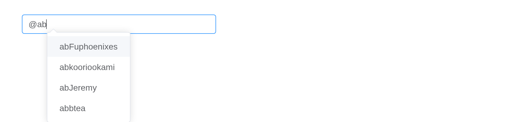
Customize trigger token
Customize trigger token by prefix props. Default to
@, Array<string> also supported.
Which list the server answers with depends on the prefix typed.
mock <- list(
  "@" = c("Fuphoenixes", "kooriookami", "Jeremy", "btea"),
  "#" = c("1.0", "2.0", "3.0")
)
ui <- el_page(
  el_mention(
    "mention_prefix",
    width = "320px",
    prefix = c("@", "#"),
    placeholder = "input @ to mention people, # to mention tag"
  )
)
server <- function(input, output, session) {
  observeEvent(input$mention_prefix_search, {
    update_el_mention(
      session,
      "mention_prefix",
      options = mock[[input$mention_prefix_search$prefix]] %||% character()
    )
  })
}
shinyApp(ui, server)
Delete as a whole
Set the whole attribute to true, and when
you press the backspace, the mention will be deleted as a whole. Set the
check-is-whole attribute to customize the checking
logic.
With whole = TRUE a backspace deletes a mention whole;
the second input’s check_is_whole decides what counts as
one.
mock <- list(
  "@" = c("Fuphoenixes", "kooriookami", "Jeremy", "btea"),
  "#" = c("1.0", "2.0", "3.0")
)
ui <- el_page(
  el_mention(
    "mention_whole",
    whole = TRUE,
    width = "320px",
    placeholder = "Please input",
    options = mock[["@"]]
  ),
  el_divider(),
  el_mention(
    "mention_whole2",
    prefix = c("@", "#"),
    whole = TRUE,
    width = "320px",
    placeholder = "input @ to mention people, # to mention tag",
    check_is_whole = JS(sprintf(
      "function(pattern, prefix) { return (%s[prefix] || []).indexOf(pattern) >= 0; }",
      jsonlite::toJSON(mock)
    ))
  )
)
server <- function(input, output, session) {
  observeEvent(input$mention_whole2_search, {
    update_el_mention(
      session,
      "mention_whole2",
      options = mock[[input$mention_whole2_search$prefix]] %||% character()
    )
  })
}
shinyApp(ui, server)
Work with form
to work with el-form.
people <- c("Fuphoenixes", "kooriookami", "Jeremy", "btea")
el_form(
  id = "mention_form",
  label_width = NULL,
  width = "600px",
  submit_label = "Submit",
  reset_label = "Reset",
  el_form_field(
    "name",
    "mention",
    label = "name",
    choices = people,
    rules = el_rule(required = TRUE, message = "Please input name")
  ),
  el_form_field(
    "desc",
    "mention-textarea",
    label = "desc",
    choices = people,
    rules = el_rule(required = TRUE, message = "Please input desc")
  )
)
Since this component is developed based on the component el-input , the original
properties have not changed, so no repetition here, and please go to the
original component to view the documentation.
API
Element Plus’s tables, and beside each entry where it is in R.
Attributes
| Element | In R | Description | Type | Accepted | Default |
|---|---|---|---|---|---|
options |
options |
mention options list |
1MentionOption[]
|
[] |
|
props |
props |
configuration options |
2MentionOptionProps
|
{value: 'value', label: 'label', disabled: 'disabled'} |
|
prefix |
prefix |
prefix character to trigger mentions. The string length must be exactly 1 | 3 \ |
4string[]
|
|
split |
split |
character to split mentions. The string length must be exactly 1 | 5 | ' ' |
|
filter-option |
filter_option |
customize filter option logic | 6 \ |
7(pattern: string, option: MentionOption) => boolean
|
|
placement |
placement |
set popup placement |
8'bottom' \\| 'top'
|
'bottom' |
|
show-arrow |
show_arrow |
whether the dropdown panel has an arrow | 9 | false |
|
offset |
offset |
offset of the dropdown panel | 10 | 0 |
|
whole |
whole |
when backspace is pressed to delete, whether the mention content is deleted as a whole | 11 | false |
|
check-is-whole |
check_is_whole |
when backspace is pressed to delete, check if the mention is a whole |
12(pattern: string, prefix: string) => boolean
|
— | |
loading |
loading |
whether the dropdown panel of mentions is in a loading state | 13 | false |
|
model-value |
value; input$<id>
|
input value | 14 | — | |
popper-class |
popper_class |
custom class name for dropdown panel | 15 / 16 | ’’ | |
popper-style |
popper_style |
custom style for dropdown panel | 17 / 18 | — | |
popper-options |
popper_options |
popper.js parameters | 19 refer to popper.js doc | — |