Menu that provides navigation for your website.
If you want to override the default height of el-menu, you can use the following CSS:
Top bar
Top bar Menu can be used in a variety of scenarios.
By default Menu is vertical, but you can change it to horizontal by
setting the mode prop to ‘horizontal’. In addition, you can use the
sub-menu component to create a second level menu. Menu provides
background-color, text-color and
active-text-color to customize the colors.
workspace <- function() {
  el_sub_menu(
    "Workspace",
    "2",
    el_menu_item("item one", "2-1"),
    el_menu_item("item two", "2-2"),
    el_menu_item("item three", "2-3"),
    el_sub_menu(
      "item four",
      "2-4",
      el_menu_item("item one", "2-4-1"),
      el_menu_item("item two", "2-4-2"),
      el_menu_item("item three", "2-4-3")
    )
  )
}
items <- list(
  el_menu_item("Processing Center", "1"),
  workspace(),
  el_menu_item("Info", "3", disabled = TRUE),
  el_menu_item("Orders", "4")
)
tagList(
  el_menu(
    "top_menu",
    active = "1",
    class = "el-menu-demo",
    mode = "horizontal",
    items = items
  ),
  tags$div(style = "height: 24px"),
  el_menu(
    "top_menu_dark",
    active = "1",
    class = "el-menu-demo",
    mode = "horizontal",
    background_color = "#545c64",
    text_color = "#fff",
    active_text_color = "#ffd04b",
    items = items
  )
)
Left And Right
You can make the menu items to the left or right.
The first item is pushed to the left by its own
margin-right: auto.
tagList(
  tags$style(
    ".el-menu--horizontal > .el-menu-item:nth-child(1) { margin-right: auto; }"
  ),
  el_menu(
    "lr_menu",
    active = "1",
    class = "el-menu-demo",
    mode = "horizontal",
    ellipsis = FALSE,
    items = list(
      el_menu_item(
        tags$img(
          style = "width: 100px",
          src = "https://element-plus.org/images/element-plus-logo.svg",
          alt = "Element logo"
        ),
        "0"
      ),
      el_menu_item("Processing Center", "1"),
      el_sub_menu(
        "Workspace",
        "2",
        el_menu_item("item one", "2-1"),
        el_menu_item("item two", "2-2"),
        el_menu_item("item three", "2-3"),
        el_sub_menu(
          "item four",
          "2-4",
          el_menu_item("item one", "2-4-1"),
          el_menu_item("item two", "2-4-2"),
          el_menu_item("item three", "2-4-3")
        )
      )
    )
  )
)
Side bar
Vertical Menu with sub-menus.
You can use the el-menu-item-group component to create a menu group, and the name of the group is determined by the title prop or a named slot.
items <- list(
  el_sub_menu(
    "Navigator One",
    "1",
    el_menu_item_group(
      "Group One",
      el_menu_item("item one", "1-1"),
      el_menu_item("item two", "1-2")
    ),
    el_menu_item_group("Group Two", el_menu_item("item three", "1-3")),
    el_sub_menu("item four", "1-4", el_menu_item("item one", "1-4-1")),
    icon = "Location"
  ),
  el_menu_item("Navigator Two", "2", icon = "Menu"),
  el_menu_item("Navigator Three", "3", icon = "Document", disabled = TRUE),
  el_menu_item("Navigator Four", "4", icon = "Setting")
)
el_row(
  class = "tac",
  el_col(
    span = 12,
    tags$h5(style = "margin-bottom: 8px", "Default colors"),
    el_menu(
      "v_menu",
      active = "2",
      class = "el-menu-vertical-demo",
      items = items
    )
  ),
  el_col(
    span = 12,
    tags$h5(style = "margin-bottom: 8px", "Custom colors"),
    el_menu(
      "v_menu_dark",
      active = "2",
      class = "el-menu-vertical-demo",
      items = items,
      background_color = "#545c64",
      text_color = "#fff",
      active_text_color = "#ffd04b"
    )
  )
)
Default colors
Custom colors
Collapse
Vertical Menu could be collapsed.
The radio buttons fold the menu with
update_el_menu(collapse =).
ui <- el_page(
  tags$style(
    ".el-menu-vertical-demo:not(.el-menu--collapse) { width: 200px;
       min-height: 400px; }"
  ),
  tags$div(
    style = "margin-bottom: 20px",
    el_radio_group(
      "menu_fold",
      choices = c(expand = "expand", collapse = "collapse"),
      selected = "collapse",
      button = TRUE
    )
  ),
  el_menu(
    "col_menu",
    active = "2",
    class = "el-menu-vertical-demo",
    collapse = TRUE,
    items = list(
      el_sub_menu(
        "Navigator One",
        "1",
        el_menu_item_group(
          "Group One",
          el_menu_item("item one", "1-1"),
          el_menu_item("item two", "1-2")
        ),
        el_menu_item_group("Group Two", el_menu_item("item three", "1-3")),
        el_sub_menu("item four", "1-4", el_menu_item("item one", "1-4-1")),
        icon = "Location"
      ),
      el_menu_item("Navigator Two", "2", icon = "Menu"),
      el_menu_item("Navigator Three", "3", icon = "Document", disabled = TRUE),
      el_menu_item("Navigator Four", "4", icon = "Setting")
    )
  )
)
server <- function(input, output, session) {
  observeEvent(input$menu_fold, ignoreInit = TRUE, {
    update_el_menu(
      session,
      "col_menu",
      collapse = input$menu_fold == "collapse"
    )
  })
}
shinyApp(ui, server)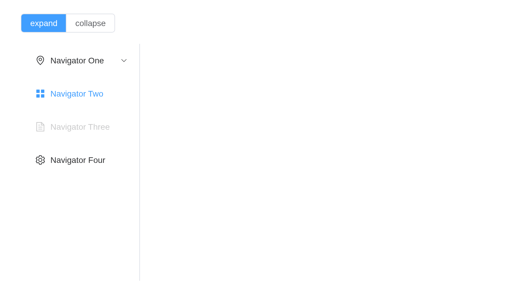
Popper Offset
Submenu with popperOffset will override Menu’s
popper-offset.
el_menu(
  "off_menu",
  class = "el-menu-popper-demo",
  mode = "horizontal",
  ellipsis = TRUE,
  popper_offset = 16,
  style = "max-width: 600px",
  items = list(
    el_menu_item("Processing Center", "1"),
    el_sub_menu(
      "Workspace",
      "2",
      el_menu_item("item one", "2-1"),
      el_menu_item("item two", "2-2"),
      el_menu_item("item three", "2-3"),
      el_sub_menu(
        "item four",
        "2-4",
        el_menu_item("item one", "2-4-1"),
        el_menu_item("item two", "2-4-2"),
        el_menu_item("item three", "2-4-3")
      )
    ),
    el_sub_menu(
      "Override Popper Offset",
      "3",
      el_menu_item("item one", "3-1"),
      el_menu_item("item two", "3-2"),
      el_menu_item("item three", "3-3"),
      el_sub_menu(
        "override child",
        "3-4",
        el_menu_item("item one", "3-4-1"),
        el_menu_item("item two", "3-4-2"),
        el_menu_item("item three", "3-4-3"),
        popper_offset = 20
      ),
      popper_offset = 8
    ),
    el_menu_item("Info", "4", disabled = TRUE),
    el_menu_item("Orders", "5")
  )
)
API
Element Plus’s tables, and beside each entry where it is in R.
Menu Attributes
| Element | In R | Description | Type | Accepted | Default |
|---|---|---|---|---|---|
mode |
mode |
menu display mode |
1'horizontal' \\| 'vertical'
|
vertical | |
collapse |
collapse |
whether the menu is collapsed (available only in vertical mode) | 2 | false | |
ellipsis |
ellipsis |
whether the menu is ellipsis (available only in horizontal mode) | 3 | true | |
ellipsis-icon |
ellipsis_icon |
custom ellipsis icon (available only in horizontal mode and ellipsis is true) | 4 / 5 | — | |
popper-offset |
popper_offset |
offset of the popper (effective for all submenus) | 6 | 6 | |
default-active |
active |
index of active menu on page load | 7 | ’’ | |
default-openeds |
default_openeds |
array that contains indexes of currently active sub-menus |
8string[]
|
[] | |
unique-opened |
unique_opened |
whether only one sub-menu can be active | 9 | false | |
menu-trigger |
menu_trigger |
how sub-menus are triggered, only works when mode is
‘horizontal’ |
10'hover' \\| 'click'
|
hover | |
router |
router |
whether vue-router mode is activated. If true, index
will be used as ‘path’ to activate the route action. Use with
default-active to set the active item on load. |
11 | false | |
collapse-transition |
collapse_transition |
whether to enable the collapse transition | 12 | true | |
popper-effect |
popper_effect |
Tooltip theme, built-in theme: dark /
light when menu is collapsed |
13'dark' \\| 'light' / 14
|
dark | |
close-on-click-outside |
close_on_click_outside |
optional, whether menu is collapsed when clicking outside | 15 | false | |
popper-class |
popper_class |
custom class name for all popup menus and titles’ tooltips | 16 | — | |
popper-style |
popper_style |
custom style for all popup menus and titles’ tooltips | 17 / 18 | — | |
show-timeout |
show_timeout |
control timeout for all menus before showing | 19 | 300 | |
hide-timeout |
hide_timeout |
control timeout for all menus before hiding | 20 | 300 | |
background-color |
background_color |
background color of Menu (hex format) (use
--el-menu-bg-color in a style class instead) |
21 | #ffffff | |
text-color |
text_color |
text color of Menu (hex format) ( use
--el-menu-text-color in a style class instead) |
22 | #303133 | |
active-text-color |
active_text_color |
text color of currently active menu item (hex format) ( use
--el-menu-active-color in a style class instead) |
23 | #409eff | |
persistent |
persistent |
when menu inactive and persistent is false
, dropdown menu will be destroyed |
24 | true |
Menu Events
| Element | In R | Description |
|---|---|---|
select |
one of the component’s inputs – see its reference page | callback function when menu is activated |
open |
input$<id>_open |
callback function when sub-menu expands |
close |
input$<id>_close |
callback function when sub-menu collapses |
Menu Exposes
| Element | In R | Description |
|---|---|---|
open |
call_el(session, id, "open") |
open a specific sub-menu, the param is index of the sub-menu to open |
close |
call_el(session, id, "close") |
close a specific sub-menu, the param is index of the sub-menu to close |
handleResize |
call_el(session, id, "handleResize") |
manually trigger menu width recalculation |
updateActiveIndex |
call_el(session, id, "updateActiveIndex") |
set index of active menu |
SubMenu Attributes
| Element | In R | Description | Type | Accepted | Default |
|---|---|---|---|---|---|
index |
el_sub_menu(index =) |
unique identification | 25 | — | |
popper-class |
el_sub_menu(popper_class =) |
custom class name for the popup menu | 26 | — | |
popper-style |
el_sub_menu(popper_style =) |
custom style for the popup menu | 27 / 28 | — | |
show-timeout |
el_sub_menu(show_timeout =) |
timeout before showing a sub-menu(inherit show-timeout
of the menu by default.) |
29 | — | |
hide-timeout |
el_sub_menu(hide_timeout =) |
timeout before hiding a sub-menu(inherit hide-timeout
of the menu by default.) |
30 | — | |
disabled |
el_sub_menu(disabled =) |
whether the sub-menu is disabled | 31 | false | |
teleported |
el_sub_menu(teleported =) |
whether popup menu is teleported to the body, the default is true for the level one SubMenu, false for other SubMenus | 32 | undefined | |
popper-offset |
el_sub_menu(popper_offset =) |
offset of the popper (overrides the popper of
menu) |
33 | — | |
expand-close-icon |
el_sub_menu(expand_close_icon =) |
Icon when menu are expanded and submenu are closed,
expand-close-icon and expand-open-icon need to
be passed together to take effect |
34 / 35 | — | |
expand-open-icon |
el_sub_menu(expand_open_icon =) |
Icon when menu are expanded and submenu are opened,
expand-open-icon and expand-close-icon need to
be passed together to take effect |
36 / 37 | — | |
collapse-close-icon |
el_sub_menu(collapse_close_icon =) |
Icon when menu are collapsed and submenu are closed,
collapse-close-icon and collapse-open-icon
need to be passed together to take effect |
38 / 39 | — | |
collapse-open-icon |
el_sub_menu(collapse_open_icon =) |
Icon when menu are collapsed and submenu are opened,
collapse-open-icon and collapse-close-icon
need to be passed together to take effect |
40 / 41 | — |
SubMenu Slots
| Element | In R | Description |
|---|---|---|
default |
default content | customize default content |
title |
slots = list(title = ) |
customize title content |
Menu-Item Attributes
| Element | In R | Description | Type | Accepted | Default |
|---|---|---|---|---|---|
index |
el_menu_item(index =) |
unique identification | 42 | — | |
route |
el_menu_item(route =) |
Vue Router Route Location Parameters | 43 / 44 | — | |
disabled |
el_menu_item(disabled =) |
whether disabled | 45 | false |
Menu-Item Events
| Element | In R | Description |
|---|---|---|
click |
one of the component’s inputs – see its reference page | callback function when menu-item is clicked, the param is menu-item instance |
Menu-Item Slots
| Element | In R | Description |
|---|---|---|
default |
default content | customize default content |
title |
slots = list(title = ) |
customize title content |
Menu-Item-Group Attributes
| Element | In R | Description | Type | Accepted | Default |
|---|---|---|---|---|---|
title |
el_menu_item_group(title =) |
group title | 46 | — |