Toggleable menu for displaying lists of links and actions.
Basic usage
Hover on the dropdown menu to unfold it for more actions.
The triggering element is rendered by the default slot,
and the dropdown part is rendered by the slot named
dropdown. By default, dropdown list shows when you hover on
the triggering element without having to click it.
items <- list(
  list(command = "a", label = "Action 1"),
  list(command = "b", label = "Action 2"),
  list(command = "c", label = "Action 3"),
  list(command = "d", label = "Action 4", disabled = TRUE),
  list(command = "e", label = "Action 5", divided = TRUE)
)
el_dropdown("dd", trigger_label = "Dropdown List", items = items)
Placement
Support 6 placements.
Set placement property to make dropdown appear in
different locations.
items <- list(
  el_dropdown_item("1", "The Action 1st"),
  el_dropdown_item("2", "The Action 2nd"),
  el_dropdown_item("3", "The Action 3rd")
)
placements <- c(
  topStart = "top-start",
  top = "top",
  topEnd = "top-end",
  bottomStart = "bottom-start",
  bottom = "bottom",
  bottomEnd = "bottom-end"
)
tags$div(
  style = "display: flex; flex-wrap: wrap; align-items: center; gap: 16px",
  lapply(names(placements), function(label) {
    el_dropdown(
      paste0("dd_", label),
      placement = placements[[label]],
      items = items,
      trigger_label = el_button(label = label)
    )
  })
)
Triggering element
Use the button to trigger the dropdown list.
Use split-button to split the triggering element into a
button group with the left button being a normal button and right one
the actual triggering target. If you wanna insert a separator line
between item three and item four, just add the divided
attribute to item four.
With split_button = TRUE the left part is a button of
its own: its clicks are input$dd_split_click.
items <- function(divided = NULL) {
  lapply(1:5, function(i) {
    el_dropdown_item(
      paste0("a", i),
      paste("Action", i),
      divided = if (i == 4) divided
    )
  })
}
tags$div(
  style = "display: flex; flex-wrap: wrap; align-items: center; gap: 16px",
  el_dropdown(
    "dd_btn",
    items = items(),
    trigger_label = el_button(
      label = tagList(
        "Dropdown List",
        el_icon("ArrowDown", class = "el-icon--right")
      ),
      type = "primary"
    )
  ),
  el_dropdown(
    "dd_split",
    items = items(divided = TRUE),
    split_button = TRUE,
    type = "primary",
    trigger_label = "Dropdown List"
  )
)
How to trigger
Click the triggering element or hover on it.
Use the attribute trigger. By default, it is
hover.
items <- list(
  el_dropdown_item("a", "Action 1", icon = "Plus"),
  el_dropdown_item("b", "Action 2", icon = "CirclePlusFilled"),
  el_dropdown_item("c", "Action 3", icon = "CirclePlus"),
  el_dropdown_item("d", "Action 4", icon = "Check"),
  el_dropdown_item("e", "Action 5", icon = "CircleCheck")
)
col <- function(title, id, trigger) {
  el_col(
    span = 8,
    tags$span(class = "demonstration", title),
    el_dropdown(
      id,
      items = items,
      trigger = trigger,
      trigger_label = "Dropdown List"
    )
  )
}
tagList(
  tags$style(
    ".block-col-2 .demonstration { display: block; margin-bottom: 20px;
       color: var(--el-text-color-secondary); font-size: 14px; }
     .block-col-2 .el-dropdown-link { display: flex; align-items: center; }"
  ),
  el_row(
    class = "block-col-2",
    col("hover to trigger", "dd_hover", "hover"),
    col("click to trigger", "dd_click", "click"),
    col("right click to trigger", "dd_ctx", "contextmenu")
  )
)Menu hiding behavior
Use hide-on-click to define if menu closes on
clicking.
By default menu will close when you click on menu items, and it can be turned off by setting hide-on-click to false.
el_dropdown(
  "dd_keep",
  hide_on_click = FALSE,
  trigger_label = "Dropdown List",
  items = list(
    el_dropdown_item("a", "Action 1"),
    el_dropdown_item("b", "Action 2"),
    el_dropdown_item("c", "Action 3")
  )
)
Command event
Clicking each dropdown item fires an event whose parameter is assigned by each item.
The item clicked is input$<id>, its
command.
el_dropdown(
  "dd_cmd",
  trigger_label = "Dropdown List",
  items = list(
    el_dropdown_item("a", "Action 1"),
    el_dropdown_item("b", "Action 2"),
    el_dropdown_item("c", "Action 3")
  )
)
Dropdown methods
You can open or close the dropdown menu by manually use
handleOpen or handleClose
call_el(session, id, "handleOpen") opens a dropdown from
the server and "handleClose" closes it;
input$<id>_visible_change says when one opens or
closes.
items <- list(
  el_dropdown_item("1", "Action 1"),
  el_dropdown_item("2", "Action 2"),
  el_dropdown_item("3", "Action 3"),
  el_dropdown_item("4", "Action 4", disabled = TRUE),
  el_dropdown_item("5", "Action 5", divided = TRUE)
)
ui <- el_page(
  tags$div(
    style = "font-size: 14px",
    tags$p(
      "open(close) the Dropdown list2 will close(open) the Dropdown List1."
    )
  ),
  tags$div(style = "margin: 15px", el_button("dd_show", "show")),
  tags$div(
    style = "display: flex; gap: 30px",
    el_dropdown(
      "dd_list1",
      trigger = "contextmenu",
      trigger_label = tags$span(class = "el-dropdown-link", "Dropdown List1"),
      items = items
    ),
    el_dropdown(
      "dd_list2",
      trigger = "contextmenu",
      trigger_label = tags$span(class = "el-dropdown-link", "Dropdown List2"),
      items = items
    )
  )
)
server <- function(input, output, session) {
  observeEvent(input$dd_show, call_el(session, "dd_list1", "handleOpen"))
  observeEvent(input$dd_list2_visible_change, {
    method <- if (isTRUE(input$dd_list2_visible_change)) {
      "handleClose"
    } else {
      "handleOpen"
    }
    call_el(session, "dd_list1", method)
  })
}
shinyApp(ui, server)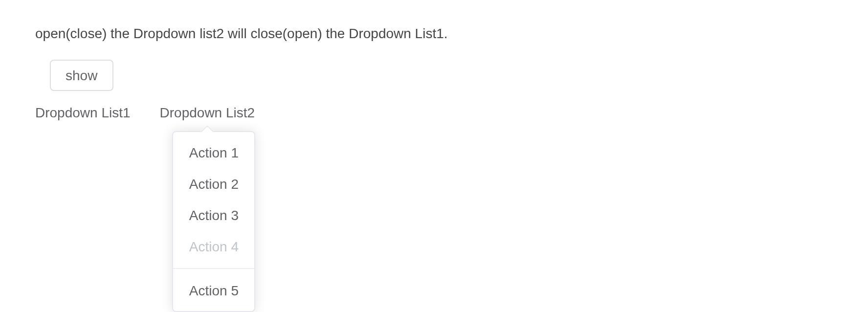
Sizes
Besides default size, Dropdown component provides three additional sizes for you to choose among different scenarios.
Use attribute size to set additional sizes with
large, default or small.
items <- list(
  list(command = "a", label = "Action 1"),
  list(command = "b", label = "Action 2")
)
tags$div(
  style = "display: flex; gap: 16px",
  lapply(c("large", "default", "small"), function(s) {
    el_dropdown(
      paste0("dd_s_", s),
      size = s,
      split_button = TRUE,
      type = "primary",
      trigger_label = s,
      items = items
    )
  })
)
Virtual triggering
Sometimes we want to render the dropdown on some other trigger element, we can separate the trigger and the content.
virtual_ref is a CSS selector for the element the menu
opens from, here a card: right-click it. Upstream also moves the menu to
the pointer, from its own script; here it opens at the card’s
corner.
tagList(
  tags$div(
    id = "ctx-card",
    el_card(
      tags$div(
        style = "height: 160px; display: flex; align-items: center;
          justify-content: center",
        "Right click"
      )
    )
  ),
  el_dropdown(
    "vdd",
    virtual_ref = "#ctx-card .el-card",
    trigger = "contextmenu",
    placement = "bottom-start",
    show_arrow = FALSE,
    items = list(
      el_dropdown_item("a1", "Action 1", icon = "Plus"),
      el_dropdown_item("a2", "Action 2", icon = "CirclePlusFilled"),
      el_dropdown_item("a3", "Action 3", icon = "CirclePlus"),
      el_dropdown_item("a4", "Action 4", icon = "Check"),
      el_dropdown_item("a5", "Action 5", icon = "CircleCheck")
    )
  )
)API
Element Plus’s tables, and beside each entry where it is in R.
Dropdown Attributes
| Element | In R | Description | Type | Accepted | Default |
|---|---|---|---|---|---|
type |
type |
menu button type, refer to Button Component, only works
when split-button is true |
1'' \\| 'default' \\| 'primary' \\| 'success' \\| 'warning' \\| 'info' \\| 'danger' \\| 'text' (deprecated)
|
’’ | |
size |
size |
menu size, also works on the split button |
2'' \\| 'large' \\| 'default' \\| 'small'
|
’’ | |
button-props |
button_props |
props for the button component, refer to Button Attributes | 3 | — | |
max-height |
max_height |
the max height of menu | 4 / 5 | ’’ | |
split-button |
split_button |
whether a button group is displayed | 6 | false | |
disabled |
disabled |
whether to disable | 7 | false | |
placement |
placement |
placement of pop menu |
8'top' \\| 'top-start' \\| 'top-end' \\| 'bottom' \\| 'bottom-start' \\| 'bottom-end'
|
bottom | |
effect |
effect |
Tooltip theme, built-in theme: dark /
light
|
9'dark' \\| 'light' / 10
|
light | |
trigger |
trigger |
how to trigger |
11'click' \\| 'hover' \\| 'contextmenu'
/ 12Array<'click' \\| 'hover' \\| 'contextmenu'>
|
hover | |
trigger-keys |
trigger_keys |
specify which keys on the keyboard can trigger when pressed |
13string[]
|
['Enter', 'Space', 'ArrowDown', 'NumpadEnter'] |
|
virtual-triggering |
virtual_triggering |
indicates whether virtual triggering is enabled | 14 | — | |
virtual-ref |
virtual_ref |
indicates the reference element to which the dropdown is attached | 15 | — | |
hide-on-click |
hide_on_click |
whether to hide menu after clicking menu-item | 16 | true | |
show-arrow |
show_arrow |
whether the tooltip content has an arrow | 17 | true | |
show-timeout |
show_timeout |
delay time before show a dropdown (only works when trigger is
hover) |
18 | 150 | |
hide-timeout |
hide_timeout |
delay time before hide a dropdown (only works when trigger is
hover) |
19 | 150 | |
role |
role |
the ARIA role attribute for the dropdown menu. Depending on the use case, you may want to change this to ‘navigation’ |
20'dialog' \\| 'grid' \\| 'group' \\| 'listbox' \\| 'menu' \\| 'navigation' \\| 'tooltip' \\| 'tree'
|
menu | |
tabindex |
tabindex |
tabindex of Dropdown | 21 / 22 | 0 | |
popper-class |
popper_class |
custom class name for Dropdown’s dropdown | 23 / 24 | ’’ | |
popper-style |
popper_style |
custom style for Dropdown’s dropdown | 25 / 26 | — | |
popper-options |
popper_options |
popper.js parameters | 27 | {modifiers: [{name: 'computeStyles',options: {gpuAcceleration: false}}]} |
|
teleported |
teleported |
whether the dropdown popup is teleported to the body | 28 | true | |
append-to |
append_to |
which element the dropdown CONTENT appends to | 29 / 30 | — | |
persistent |
persistent |
when dropdown inactive and persistent is
false , dropdown menu will be destroyed |
31 | true |
Dropdown Slots
| Element | In R | Description |
|---|---|---|
default |
default content | content of Dropdown. Notice: Must be a valid html dom element (ex.
<span>, <button> etc.) or
el-component, to attach the trigger listener |
dropdown |
slots = list(dropdown = ) |
content of the Dropdown Menu, usually a
<el-dropdown-menu> element |
Dropdown Events
| Element | In R | Description |
|---|---|---|
click |
input$<id>_click |
if split-button is true, triggers when
left button is clicked |
command |
one of the component’s inputs – see its reference page | triggers when a dropdown item is clicked, the parameters is the command dispatched from the dropdown item |
visible-change |
input$<id>_visible_change |
triggers when the dropdown appears/disappears, the param is true when it appears, and false otherwise |
Dropdown Exposes
| Element | In R | Description |
|---|---|---|
handleOpen |
call_el(session, id, "handleOpen") |
open the dropdown menu |
handleClose |
call_el(session, id, "handleClose") |
close the dropdown menu |
Dropdown-Item Attributes
| Element | In R | Description | Type | Accepted | Default |
|---|---|---|---|---|---|
command |
el_dropdown_item(command =) |
a command to be dispatched to Dropdown’s command
callback |
32 / 33 / 34 | — | |
disabled |
el_dropdown_item(disabled =) |
whether the item is disabled | 35 | false | |
divided |
el_dropdown_item(divided =) |
whether a divider is displayed | 36 | false | |
icon |
el_dropdown_item(icon =) |
custom icon | 37 / 38 | — |