If you have too much data to display in one page, use pagination.
Basic usage
Set layout with different pagination elements you wish
to display separated with a comma. Pagination elements are:
prev (a button navigating to the previous page),
next (a button navigating to the next page),
pager (page list), jumper (a jump-to input),
total (total item count), sizes (a select to
determine page size) and ->(every element after this
symbol will be pulled to the right).
tagList(
  tags$div(
    tags$div(style = "margin-bottom: 16px", "When you have few pages"),
    el_pagination("pg1", layout = "prev, pager, next", total = 50)
  ),
  tags$div(
    style = "margin-top: 10px",
    tags$div(style = "margin-bottom: 16px", "When you have more than 7 pages"),
    el_pagination("pg2", layout = "prev, pager, next", total = 1000)
  )
)Number of pagers
By default, Pagination collapses extra pager buttons when it has more
than 7 pages. This can be configured with the pager-count
attribute.
el_pagination(
  "pg_pagers",
  page_size = 20,
  pager_count = 11,
  layout = "prev, pager, next",
  total = 1000
)
Buttons with background color
Set the background attribute and the buttons will have a
background color.
el_pagination(
  "pg_bg",
  background = TRUE,
  layout = "prev, pager, next",
  total = 1000
)
Small Pagination
Use small pagination in the case of limited space.
set size to change the size. Here is a demonstration of
small
tagList(
  el_pagination(
    "pg_s1",
    size = "small",
    layout = "prev, pager, next",
    total = 50
  ),
  tags$div(
    style = "margin-top: 16px",
    el_pagination(
      "pg_s2",
      size = "small",
      background = TRUE,
      layout = "prev, pager, next",
      total = 50
    )
  )
)
Hide pagination when there is only one page
When there is only one page, hide the pagination by setting the
hide-on-single-page attribute.
The switch sets hide_on_single_page with
update_el_pagination().
ui <- el_page(
  el_switch("pg_hide_on", value = FALSE),
  tags$hr(style = "margin: 16px 0"),
  el_pagination(
    "pg_hide",
    hide_on_single_page = FALSE,
    total = 5,
    layout = "prev, pager, next"
  )
)
server <- function(input, output, session) {
  observeEvent(input$pg_hide_on, ignoreInit = TRUE, {
    update_el_pagination(
      session,
      "pg_hide",
      hide_on_single_page = input$pg_hide_on
    )
  })
}
shinyApp(ui, server)
More elements
Add more modules based on your scenario.
This example is a complete use case. It uses size-change
and current-change event to handle page size changes and
current page changes. page-sizes accepts an array of
integers, each of which represents a different page size in the
sizes select options,
e.g. [100, 200, 300, 400] indicates that the select will
have four options: 100, 200, 300 or 400 items per page.
The controls set every pagination’s size,
background and disabled with
update_el_pagination().
ids <- c("pg_m1", "pg_m2", "pg_m3", "pg_m4")
block <- function(title, ...) {
  tags$div(
    class = "demo-pagination-block",
    tags$div(class = "demonstration", title),
    el_pagination(...)
  )
}
ui <- el_page(
  tags$style(
    ".demo-pagination-block + .demo-pagination-block { margin-top: 10px; }
     .demo-pagination-block .demonstration { margin-bottom: 16px; }"
  ),
  tags$div(
    style = "display: flex; align-items: center; gap: 16px; margin-bottom: 16px",
    el_radio_group(
      "pg_size",
      choices = c("default", "large", "small"),
      selected = "default",
      button = TRUE
    ),
    tags$div("background: ", el_switch("pg_background", value = FALSE)),
    tags$div("disabled: ", el_switch("pg_disabled", value = FALSE))
  ),
  tags$hr(style = "margin: 16px 0"),
  block(
    "Total item count",
    "pg_m1",
    current_page = 5,
    page_size = 100,
    layout = "total, prev, pager, next",
    total = 1000
  ),
  block(
    "Change page size",
    "pg_m2",
    current_page = 5,
    page_size = 100,
    page_sizes = c(100, 200, 300, 400),
    layout = "sizes, prev, pager, next",
    total = 1000
  ),
  block(
    "Jump to",
    "pg_m3",
    current_page = 5,
    page_size = 100,
    layout = "prev, pager, next, jumper",
    total = 1000
  ),
  block(
    "All combined",
    "pg_m4",
    current_page = 4,
    page_size = 100,
    page_sizes = c(100, 200, 300, 400),
    layout = "total, sizes, prev, pager, next, jumper",
    total = 400
  )
)
server <- function(input, output, session) {
  observe({
    for (id in ids) {
      update_el_pagination(
        session,
        id,
        size = input$pg_size,
        background = isTRUE(input$pg_background),
        disabled = isTRUE(input$pg_disabled)
      )
    }
  })
}
shinyApp(ui, server)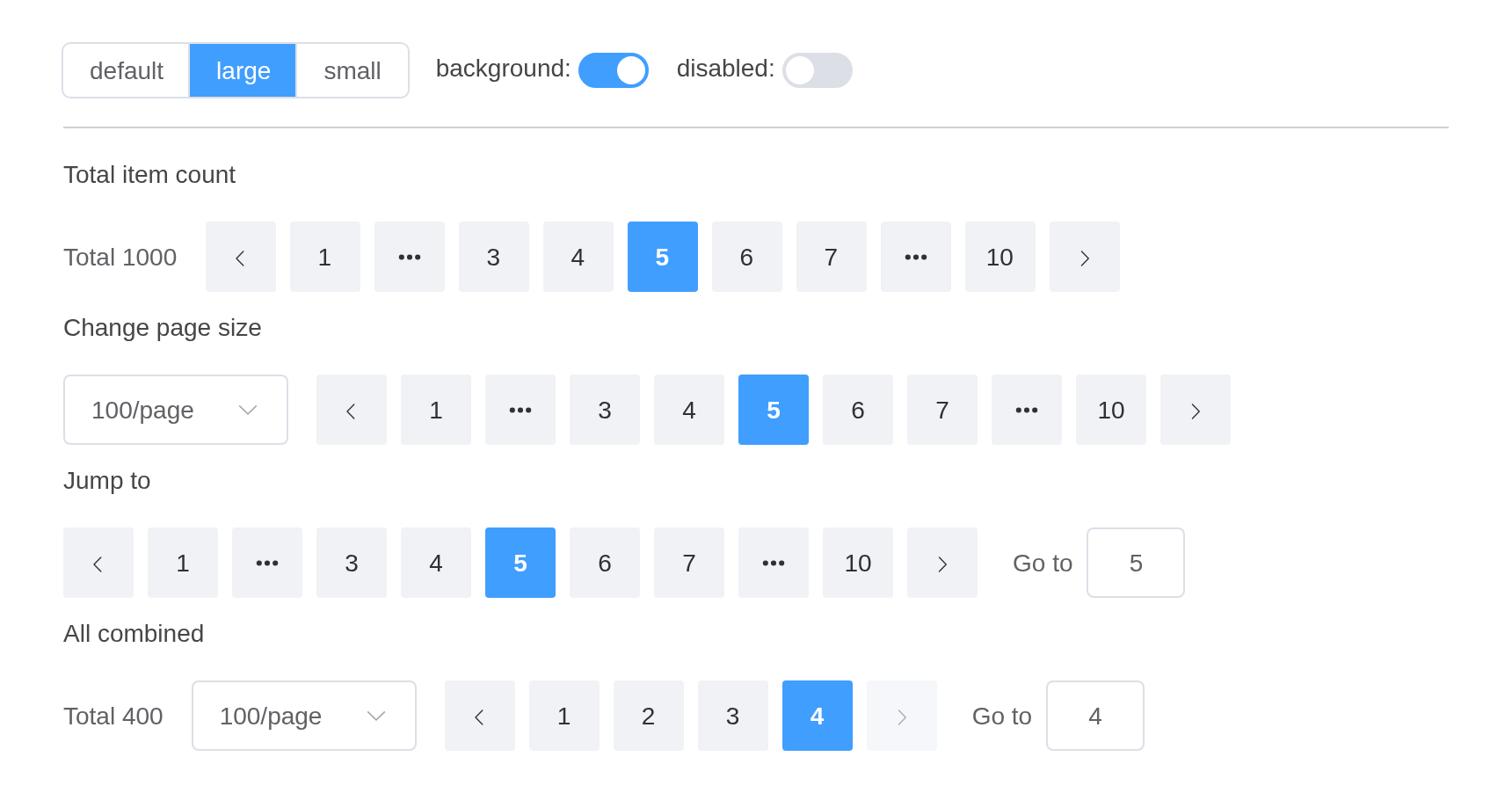
API
Element Plus’s tables, and beside each entry where it is in R.
Attributes
| Element | In R | Description | Type | Accepted | Default |
|---|---|---|---|---|---|
size |
size |
pagination size |
1'large' \\| 'default' \\| 'small'
|
‘default’ | |
background |
background |
whether the buttons have a background color | 2 | false | |
page-size |
page_size |
item count of each page | 3 | — | |
default-page-size |
default_page_size |
default initial value of page size, not setting is the same as setting 10 | 4 | — | |
total |
total |
total item count | 5 | — | |
page-count |
page_count |
total page count. Set either total or
page-count and pages will be displayed; if you need
page-sizes, total is required |
6 | — | |
pager-count |
pager_count |
number of pagers. Pagination collapses when the total page count exceeds this value |
75 \\| 7 \\| 9 \\| 11 \\| 13 \\| 15 \\| 17 \\| 19 \\| 21
|
7 | |
current-page |
current_page |
current page number | 8 | — | |
default-current-page |
default_current_page |
default initial value of current-page, not setting is the same as setting 1 | 9 | — | |
layout |
layout |
layout of Pagination, elements separated with a comma |
10string (consists of sizes, prev, pager, next, jumper, ->, total, slot)
|
prev, pager, next, jumper, ->, total | |
page-sizes |
page_sizes |
options of item count per page |
11number[]
|
[10, 20, 30, 40, 50, 100] | |
append-size-to |
append_size_to |
which element the size dropdown appends to | 12 | — | |
popper-class |
popper_class |
custom class name for the page size Select’s dropdown | 13 | ’’ | |
popper-style |
popper_style |
custom style for the page size Select’s dropdown | 14 / 15 | — | |
prev-text |
prev_text |
text for the prev button | 16 | ’’ | |
prev-icon |
prev_icon |
icon for the prev button, has a lower priority than
prev-text
|
17 / 18 | ArrowLeft | |
next-text |
next_text |
text for the next button | 19 | ’’ | |
next-icon |
next_icon |
icon for the next button, has a lower priority than
next-text
|
20 / 21 | ArrowRight | |
disabled |
disabled |
whether Pagination is disabled | 22 | false | |
teleported |
teleported |
whether Pagination select dropdown is teleported to the body | 23 | true | |
hide-on-single-page |
hide_on_single_page |
whether to hide when there’s only one page | 24 | false | |
small |
small |
whether to use small pagination | 25 | false |
Events
| Element | In R | Description |
|---|---|---|
size-change |
one of the component’s inputs – see its reference page | triggers when page-size changes |
current-change |
one of the component’s inputs – see its reference page | triggers when current-page changes |
change |
input$<id>_change |
triggers when current-page or page-size
changes |
prev-click |
input$<id>_prev_click |
triggers when the prev button is clicked and current page changes |
next-click |
input$<id>_next_click |
triggers when the next button is clicked and current page changes |